The network for creativity
Join 1.25M professional creatives like you
Connect with clients, get discovered, and run your business 100% commission-free
Creatives on Contra have earned over $150M and we are just getting started
Back to feedPost


Congrats

congratulations

Congratulations @Shater Tsavsar


Congrats man

great job!

Congratulations Shater

Congrats


Wish you more "Things" to do, congrats!


Congratulations to you 🎉


Congratulations


Congratulations

congratulations

Congratulations

Huge milestone Shater. Congratulations 🎉


A big thing.

Great Achievement! Congrates!!
The network for creativity
Join 1.25M professional creatives like you
Connect with clients, get discovered, and run your business 100% commission-free
Creatives on Contra have earned over $150M and we are just getting started







Related posts


Definitely

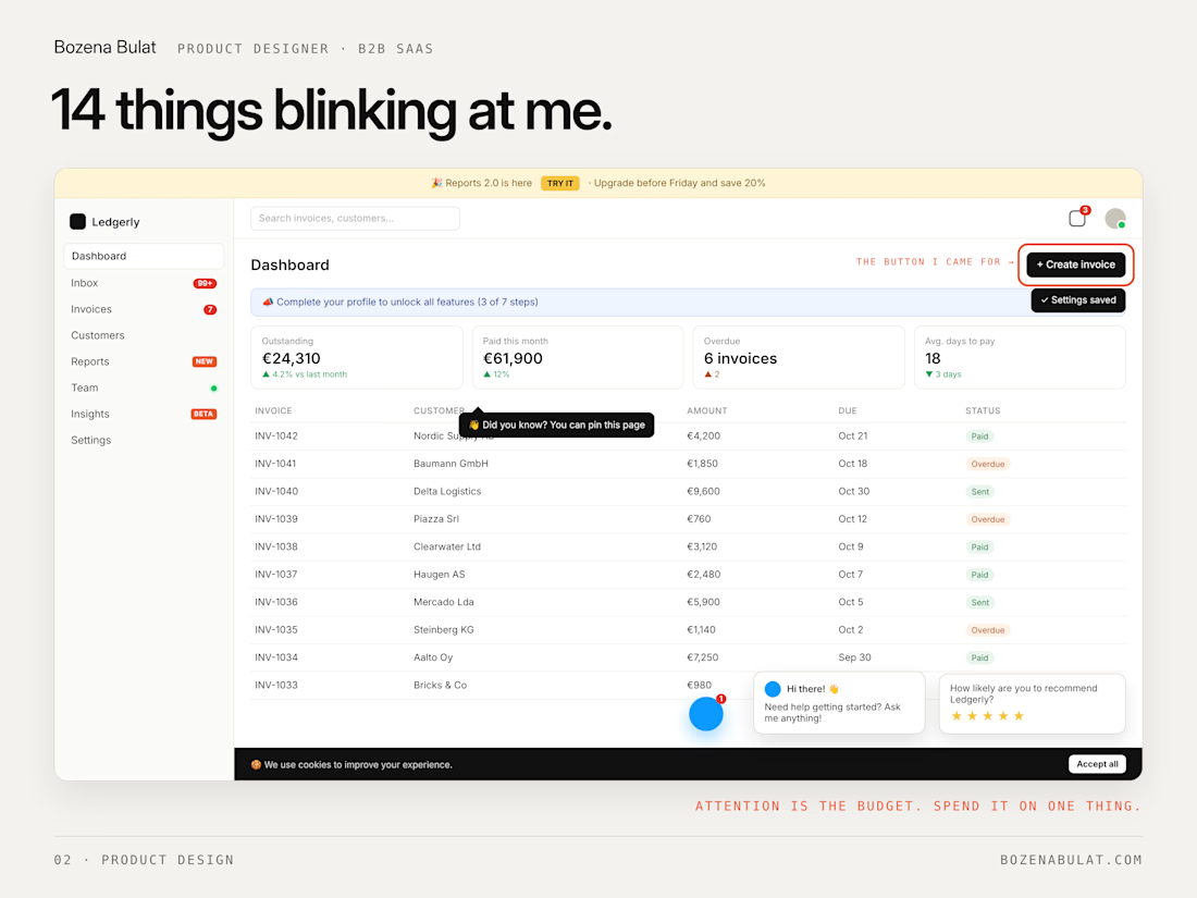
Your product has 14 things blinking at me.
A red badge. A green dot. A “New!” tag. A tooltip. A banner. A survey. A chatbot waving. And somewhere under all that, the button I came for.
Every notification was a good idea on its own. Together they’re a casino.
The quiet products win because:
→ One thing asks for attention at a time → “New” stops being new after a week → The main action is the loudest thing on the screen → Everything else waits its turn
Attention is the budget. Spend it on one thing.
This is most of what I do for B2B SaaS teams: find the one thing on each screen, and get everything else out of its way.
How many things are blinking in your product right now?


This is really amazing

Is this the freelancing equivalent of your prefrontal cortex fully developing at 25? 🤔