The network for creativity
Join 1.25M professional creatives like you
Connect with clients, get discovered, and run your business 100% commission-free
Creatives on Contra have earned over $150M and we are just getting started
Back to feedPost

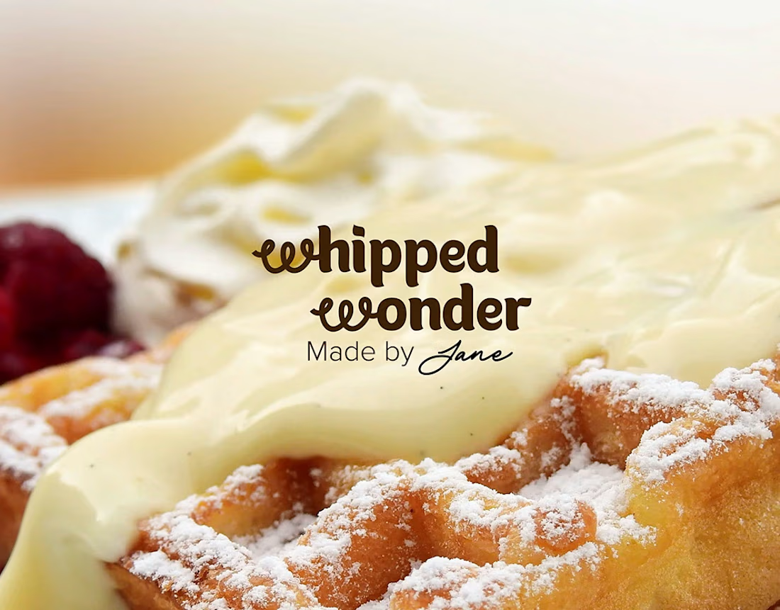
Visual Identity for a small town corner bakery by Jane. The design brief asked for warm, approachable, colourful, and delicious branding.
Did I deliver?
The network for creativity
Join 1.25M professional creatives like you
Connect with clients, get discovered, and run your business 100% commission-free
Creatives on Contra have earned over $150M and we are just getting started










Related posts

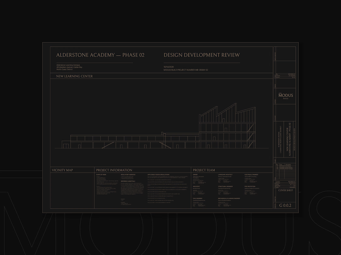
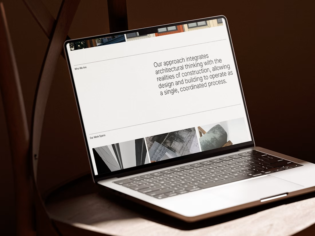
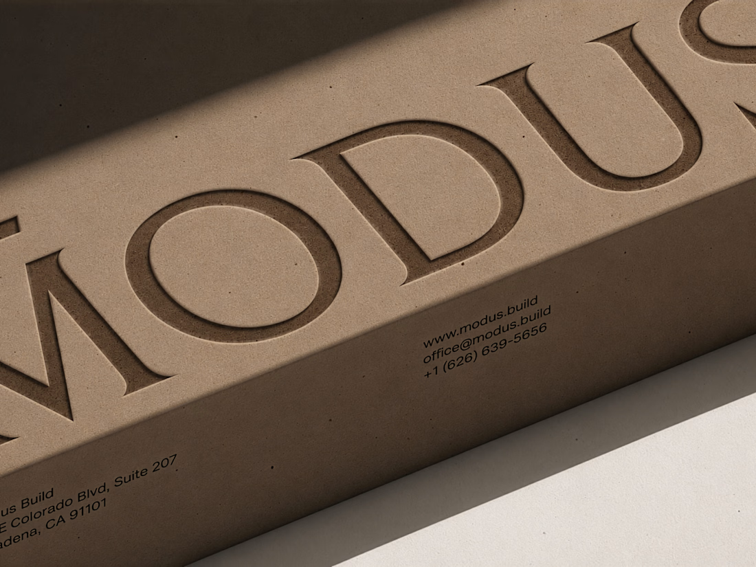
MODUS Build - Brand Identity & Web Design
Coming from an architectural background, I approached MODUS Build with a particular appreciation for precision, proportion, and thoughtful design.
The challenge was to create a distinctive identity that communicates these values without relying on conventional construction imagery.
The concept was built around a simple typography idea: “The Measure of Good Building.” A small detail above the letter M represents a reference measure - a fixed length against which other dimensions can be measured. This subtle intervention gives the logo its meaning and connects it directly to the brand's philosophy.
I carried this idea into a cohesive visual system, bringing together typography, graphic patterns, brand applications, and website design.
For me, the most rewarding part was creating something visually refined yet purposeful, where even the smallest detail has a reason to exist, keeping the same principle as in architecture.
#branding #logodesign #webdesign


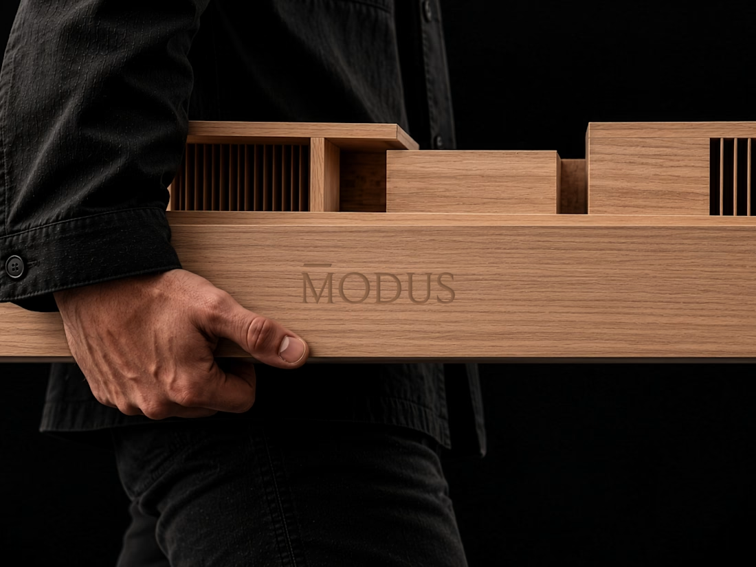

Great brand design Alexandar wooden style is so premium🔥🔥

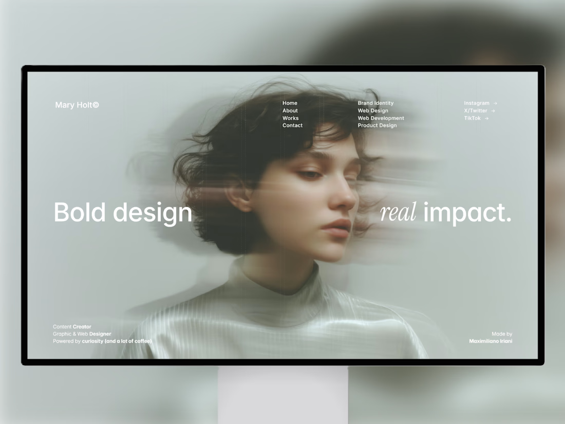
i built this portfolio template in framer a few months ago, and it’s been exciting to see how much traction it’s been gaining lately!
it’s now #81 overall and #25 in the designer category on the framer marketplace, bringing in more views, reach, and commissions along the way.
sharing the case study here if you want to take a closer look at the project and see how it came together! 🙌


Huge congrats Max! #81 overall and #25 in designer category on Framer marketplace is no small feat 🚀 Framer templates that actually get traction + commissions is the dream. Well deserved!


New case study is up on my profile! A fun passion project I worked on earlier this year🚲

super cool project! the typographic work is impeccable and super interesting