The network for creativity
Join 1.25M professional creatives like you
Connect with clients, get discovered, and run your business 100% commission-free
Creatives on Contra have earned over $150M and we are just getting started
Back to feedPost

Real estate branding often hides behind cold corporate roofline clichés.
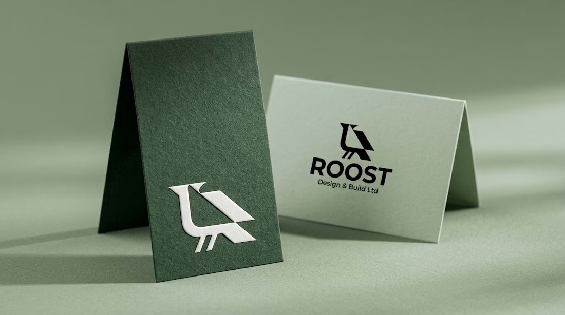
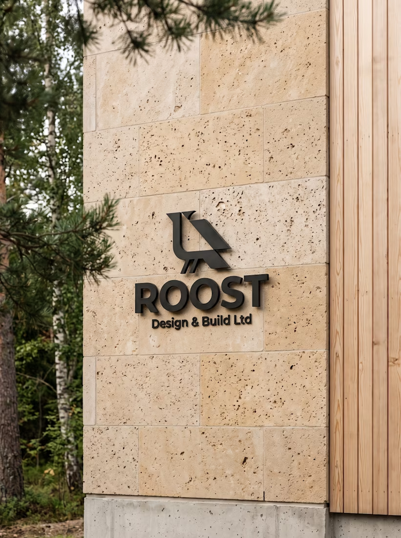
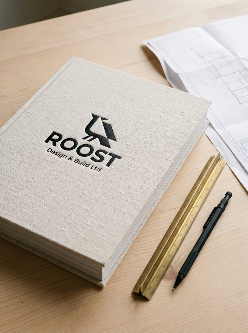
For ROOST in Oslo, my goal was to connect Nordic timber warmth with clean geometry. I paired the perched raven mark across folded sage cards, blackened steel facade signs, and linen handover books.
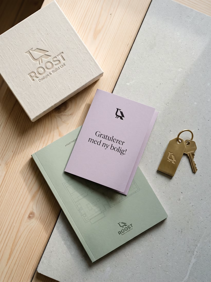
A brass key fob and lilac welcome card finish the move-in experience on a personal note.
How do you bring warmth into architectural branding without clutter?


What works for me is letting one material carry the warmth, here the timber and sage paper, while the mark itself stays plain geometry. Clutter usually creeps in when the texture and the logo both try to be the personality.
The network for creativity
Join 1.25M professional creatives like you
Connect with clients, get discovered, and run your business 100% commission-free
Creatives on Contra have earned over $150M and we are just getting started



Related posts

Brand work for HauntChain
I'm loving building this brand and the results so far
A deFi platform with some gamification


That's cute ❤️

Rebuilt my portfolio with AI and added new case studies.
Brand, web, and product UI. All custom coded, all in one page.

One page with brand, web and product UI together is a strong move. Clients see the range without clicking around. Rebuilding mine with AI coding tools taught me the same thing: the speed lets you spend the saved time on the case study writing, which is what actually wins work.