The network for creativity
Join 1.25M professional creatives like you
Connect with clients, get discovered, and run your business 100% commission-free
Creatives on Contra have earned over $150M and we are just getting started
Back to feedPost
Too much motion distracts; too little feels static. The best approach is using motion to support content, not dominate it. Think of it as rhythm, not fireworks.
If you want an animated website UI like this, inbox me or email me at nkamrunnessa@gmail.com let’s make your brand move.

Excellent!

Thank you

Looks awesome Kamrunnessa 🙌
Loved the subtle animations of watch 🔥
Thank You

Clean and good work
Thank You
The network for creativity
Join 1.25M professional creatives like you
Connect with clients, get discovered, and run your business 100% commission-free
Creatives on Contra have earned over $150M and we are just getting started
Related posts

The contact page is usually the last page anyone designs.
We made it one of the best
Recent client work: a contact section UI design for a company with offices across cities. Globe in the back, every location up front, and small interactions that make the whole web design feel alive.


Impressive work


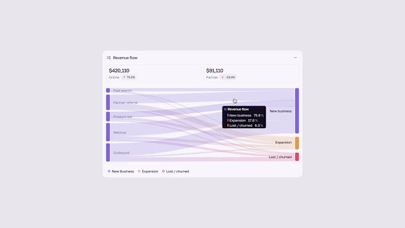
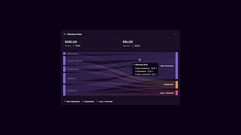


I experimented with a different illustration style for this section of my latest Framer template.
The goal was to make the UI feel more engaging without distracting from the content.
Which direction would you choose for a better user experience? Curious to hear your take. 👀
0 voted
0%
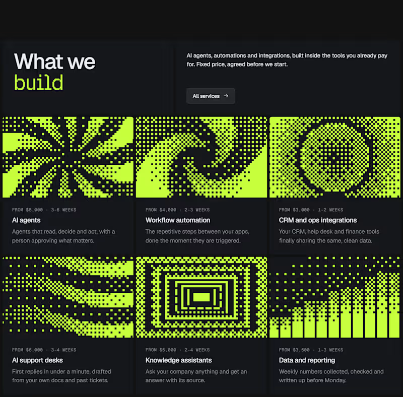
1 voted
100%
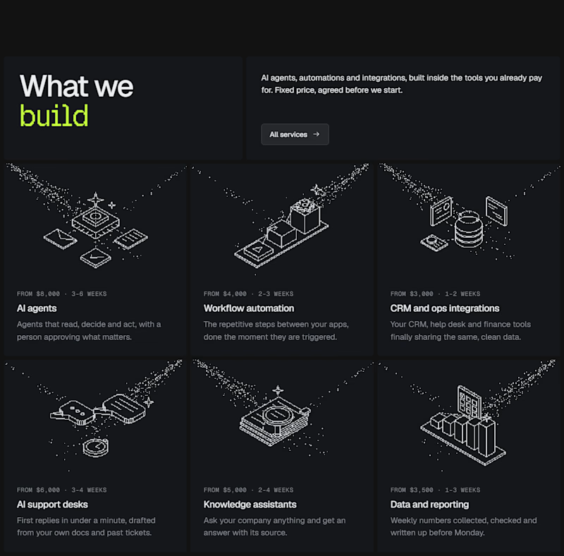
1 vote
Closed

This is a smart balance! Engaging but still content-focused. The Dither Pattern works really well here, not distracting at all.