The network for creativity
Join 1.25M professional creatives like you
Connect with clients, get discovered, and run your business 100% commission-free
Creatives on Contra have earned over $150M and we are just getting started
Back to feedPost

Aivot came to me with a product that had outgrown its own name.
For years it was called Gover, a form builder known in Germany's GovTech niche. But the name was generic, and the platform had become something bigger: an open, end-to-end system for running whole administrative processes, not just collecting forms. Ahead of version 5, they were relaunching it as Prosuna and needed a brand that made that leap visible.
The real challenge was the tightrope in the brief. German public administration is deeply risk-averse, so the brand had to signal trust and stability on sight. But it also had to avoid the two clichés that swallow this category: the tired bureaucratic blue of legacy GovTech, and the hyped startup look that feels gone in a year. Serious enough for a municipality to stake its reputation on. Modern enough to feel like a real way forward.
There was an extra layer too: everything lived in German. Every mockup, every texture, every line of copy had to work in the language it would actually ship in, which changes how type breathes and how a headline runs.
So I built Prosuna a full identity: logo, a visual language and pattern system, typography, and a ready-to-use Figma toolkit. Calm, clear and built to be trusted, ready for their September trade fairs and everything the platform is growing into.

Incredible work!

Amazing execution! 🥳


the move from gover to prosuna feels like a real upgrade. did the new name come from the broader system idea?

How much time it took?
The network for creativity
Join 1.25M professional creatives like you
Connect with clients, get discovered, and run your business 100% commission-free
Creatives on Contra have earned over $150M and we are just getting started











Related posts


Three weeks into building the Pasted website, after the design was approved, an 11-page document arrived with a whole new vision.
It was beautiful work, and it described a different project at the agreed price.
I asked them to decide: keep the approved scope, or pause and price the new idea separately. On day six, they chose the original. We shipped two weeks later.


Offering to price the new vision as its own phase also lets the client see what the idea costs without it feeling like a no. Was a change-order process already written into your contract, or did you build that path on the spot?

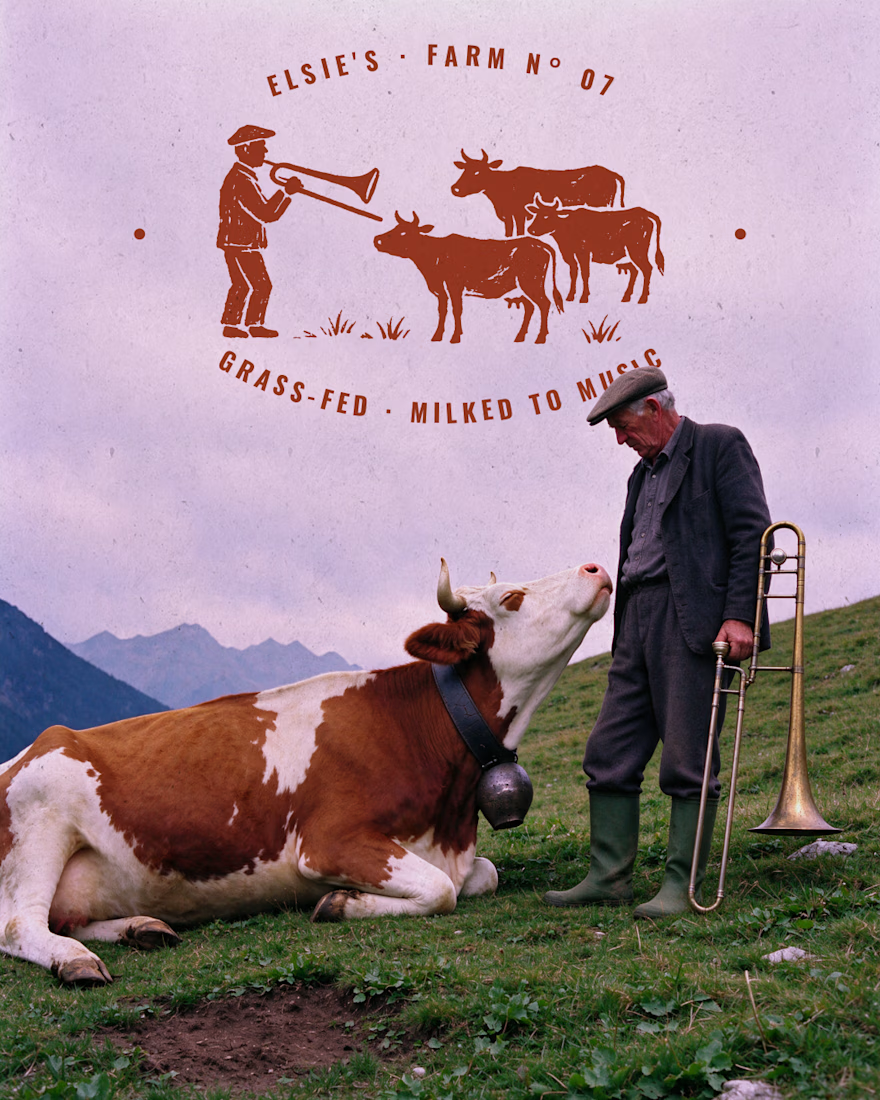
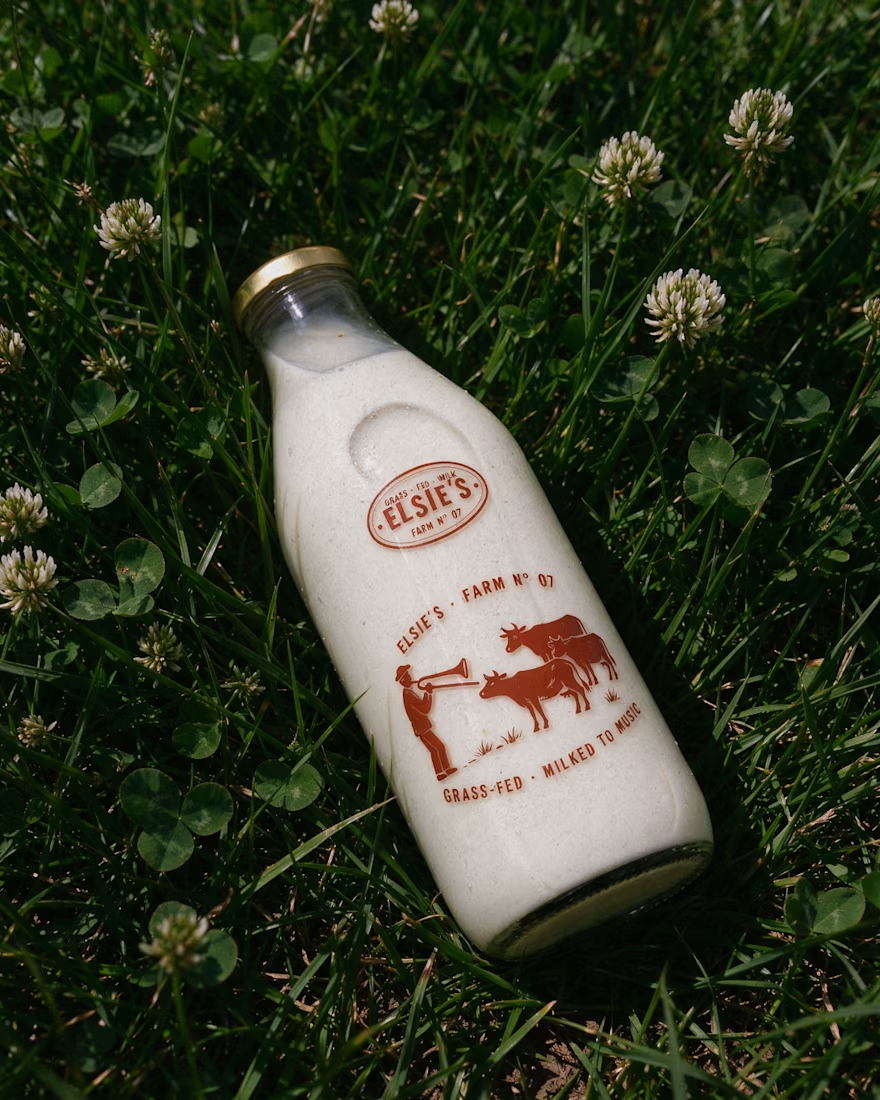
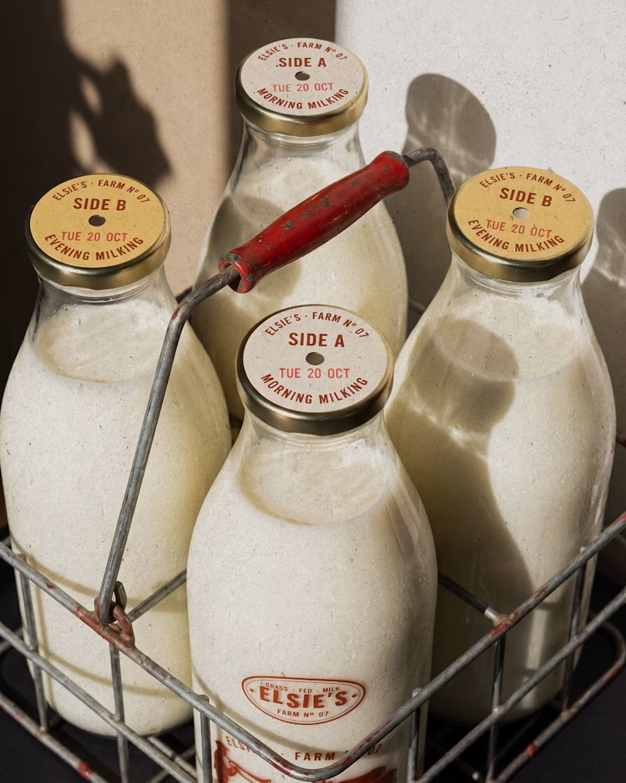
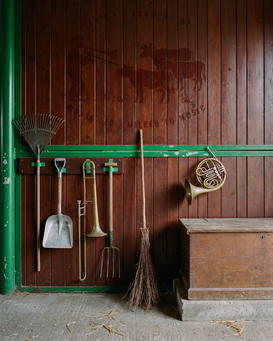
Elsie's: brand identity and packaging for the @designerbriefs weekly challenge (Brief 183). An organic milk brand from very happy cows who love fresh grass and good music.
The logo comes from the brass name plates farmers fixed to their milk cans, with every letter struck by hand. Then came a stamp-style illustration of a farmer playing to his herd, and a returnable glass bottle printed in barn red. All the imagery was made with my Augmented Art Direction process: AI as the tool, art direction and Photoshop retouching to finish every image by hand.
What song would you play to Elsie's cows? 🎺🐄


great work andreu

Little did I know this logo I designed would be seen billions of times.
And that kids would walk on the street rocking the logo on their chest 🤯

Seeing kids wear your logo on the street must be such a surreal feeling. Amazing work Tim!