The network for creativity
Join 1.25M professional creatives like you
Connect with clients, get discovered, and run your business 100% commission-free
Creatives on Contra have earned over $150M and we are just getting started
Back to feedPost

Milkshake Flavor Concept: Chocolate, Mango & Strawberry
I wanted to try something different with product layouts. For this project, I used a clean, split-screen style to show off three different flavors.
My main focus was making the colors look as delicious as the drinks! I used bold background colors to help each shake stand out and kept the text very simple so the focus stays on the product.
It was a fun way to play with "visual rhythm" and color matching.
The network for creativity
Join 1.25M professional creatives like you
Connect with clients, get discovered, and run your business 100% commission-free
Creatives on Contra have earned over $150M and we are just getting started





Related posts

Bland is a choice.
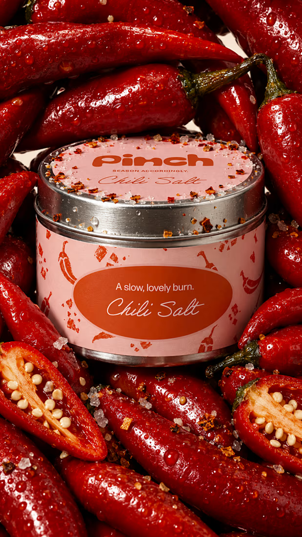
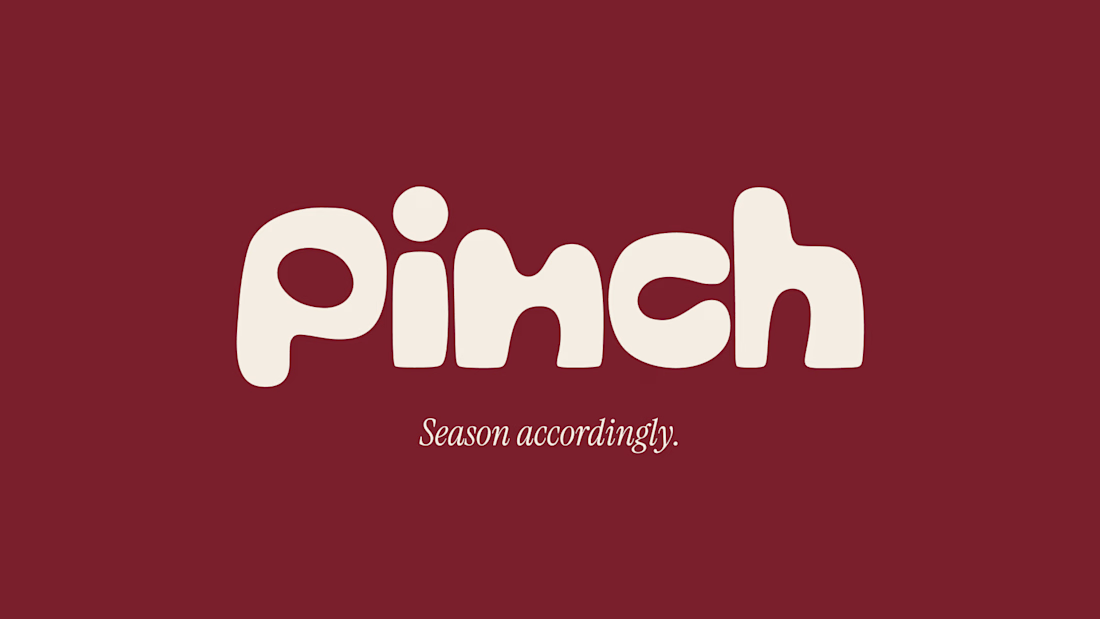
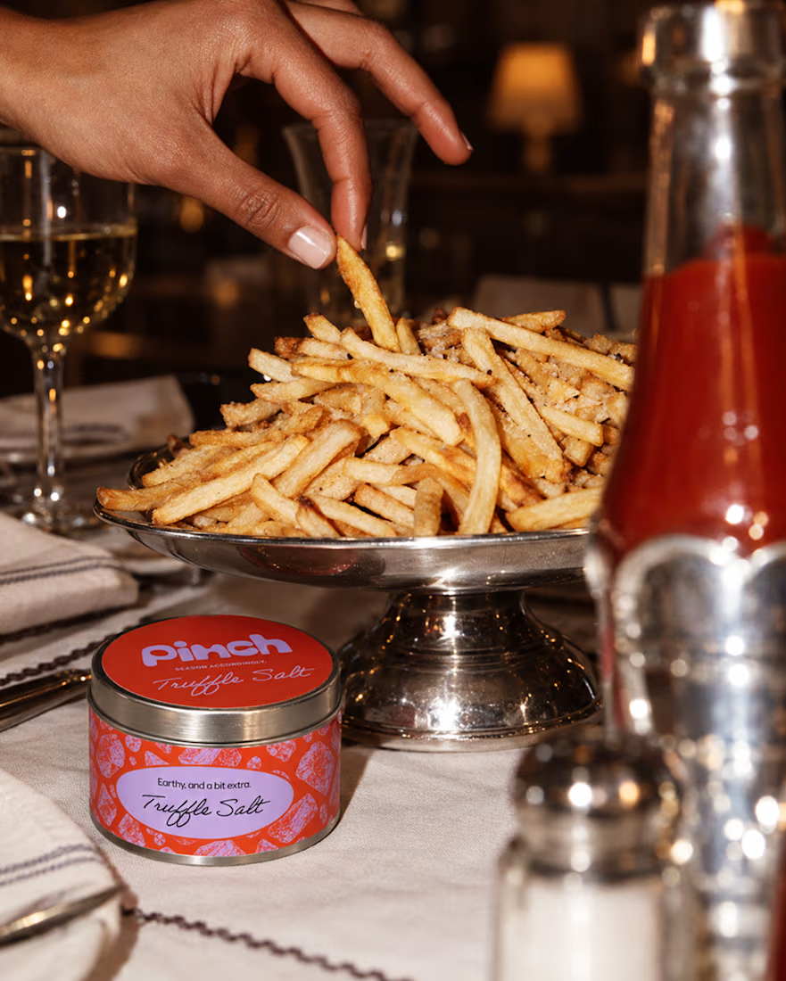
Pinch is a concept brand for a mid-high salt line made to live on the counter, not in the cupboard. Five flavors, five two-color tins, one refillable keepsake people leave next to the bar cart.
I built the full identity: wordmark, lid lockups, hand-stamped pattern system, tone of voice, and art direction.
More from the system coming soon.



Cool work 🔥


Ambrosia - Bodycare Brand Identity & Packaging
My favorite part of this branding and packaging project was working with the different materials. The dark glass, aluminum, and soft paper each bring something different, so I kept the typography and labels simple to help everything sit together.

Amazinnnggg

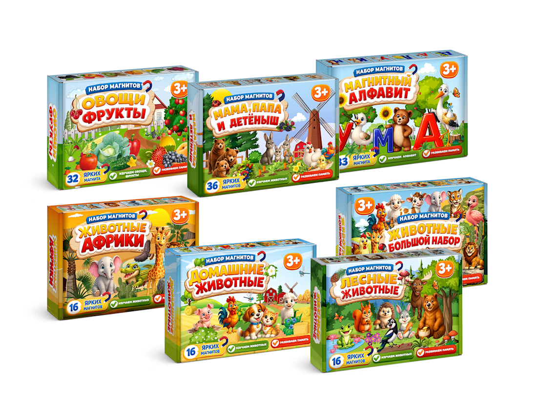
MagnoToys — Multi-SKU Children's Educational Packaging System
Design and systematic structural layout of a multi-SKU packaging line for children's magnetic educational games. I developed the unified brand grid, managed consistent color-coding across 5 different product variants, and created production-ready vector dielines with precise bleeding and folding lines.



Cool!