The network for creativity
Join 1.25M professional creatives like you
Connect with clients, get discovered, and run your business 100% commission-free
Creatives on Contra have earned over $150M and we are just getting started
Back to feedPost
Taste Test

Which hero section better captures the feeling of a premium beachside pizza experience?
3 voted
75%
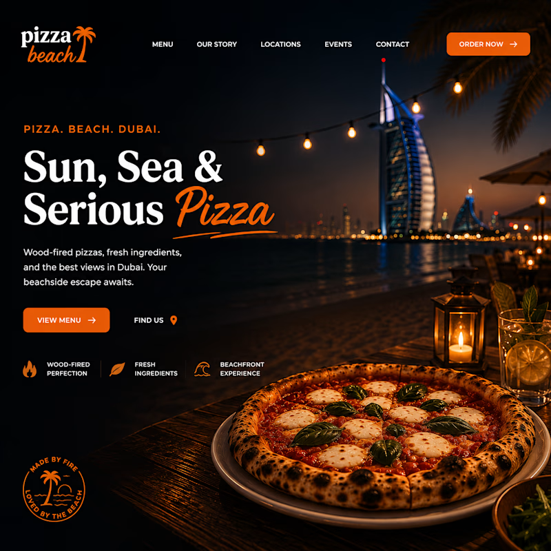
1 voted
25%
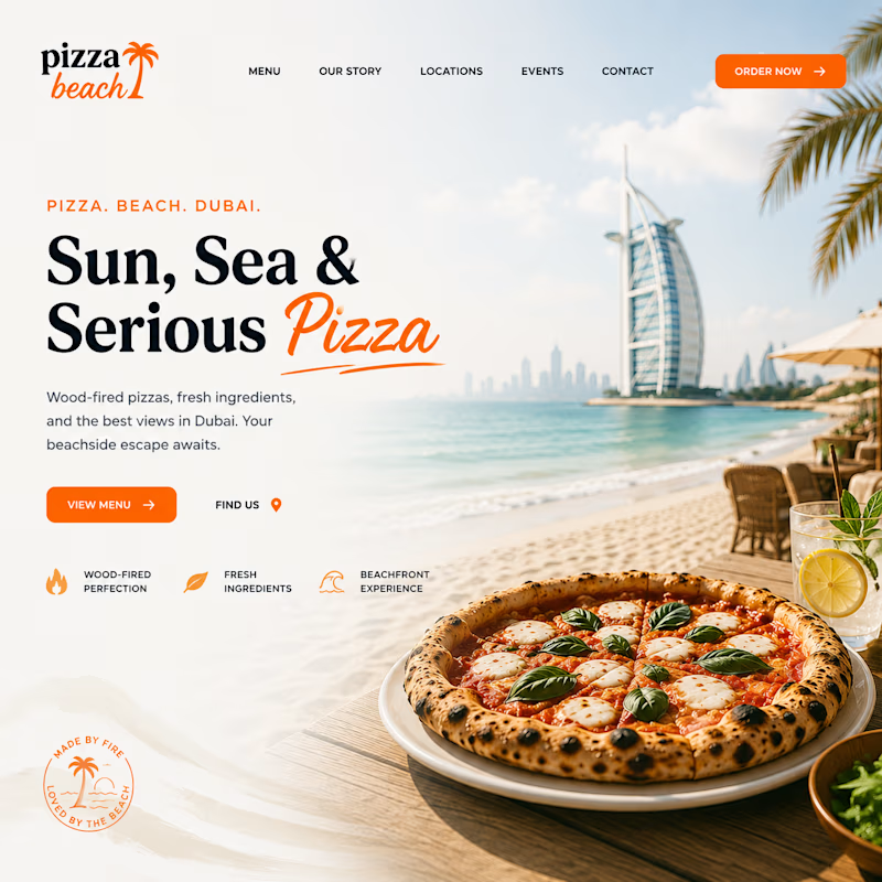
4 votes
Closed


Both looks good but the sunset one is better

First one is great, love the vibe. But second one fits better to brands vision. Since it's about sun, beach and getting delicious pizza 😄
The network for creativity
Join 1.25M professional creatives like you
Connect with clients, get discovered, and run your business 100% commission-free
Creatives on Contra have earned over $150M and we are just getting started








Related posts


Your Hero Section Has One Job: Be Clear.
You don’t need huge headlines or long explanations. You need the right image + short headline + clear offer.
For the first version, we worked on the branding, the image and the copy together, so at first glance it’s clear: this is a makeup course, and here’s what you’ll get.
The second version is still beautiful and still feels like beauty. But what are you actually getting? A makeup course? Products? A store? That’s the problem with a Hero that looks good but isn’t thought through.
Your first screen doesn’t need to say everything. It just needs to say the right thing.

22 voted
61%
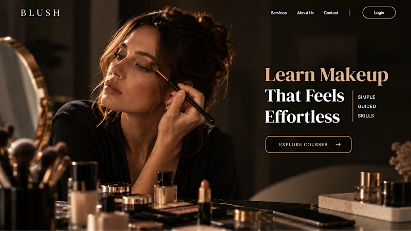
14 voted
39%
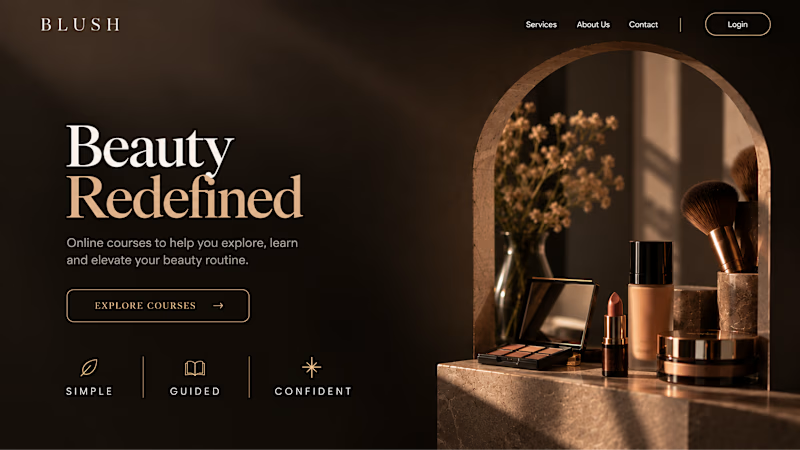
36 votes
Closed


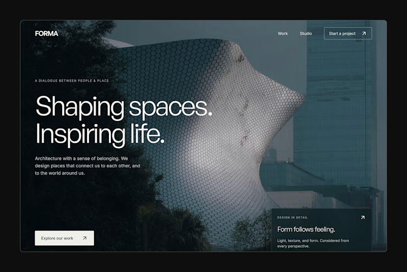
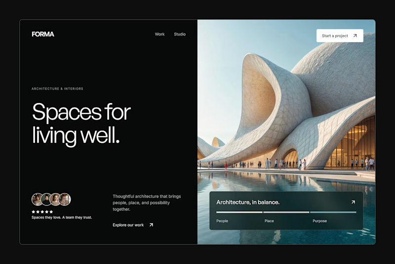
Design Exploration: Hero Section of Architecture Website. Which one do you think much better?


12 voted
43%
16 voted
57%
28 votes
Closed


Same Design.com promo, two crops. Square keeps the desk tight, wide gives the room its light. 1 or 2.
11 voted
73%
4 voted
27%
15 votes
Closed