The network for creativity
Join 1.25M professional creatives like you
Connect with clients, get discovered, and run your business 100% commission-free
Creatives on Contra have earned over $150M and we are just getting started
Back to feedPost
Taste Test

Two short vertical spots, made for product pages, landing pages and social. Which one do you like?
0 votes
Ends in 1d

Both looks amazing
Thank you bro!
The network for creativity
Join 1.25M professional creatives like you
Connect with clients, get discovered, and run your business 100% commission-free
Creatives on Contra have earned over $150M and we are just getting started



Related posts

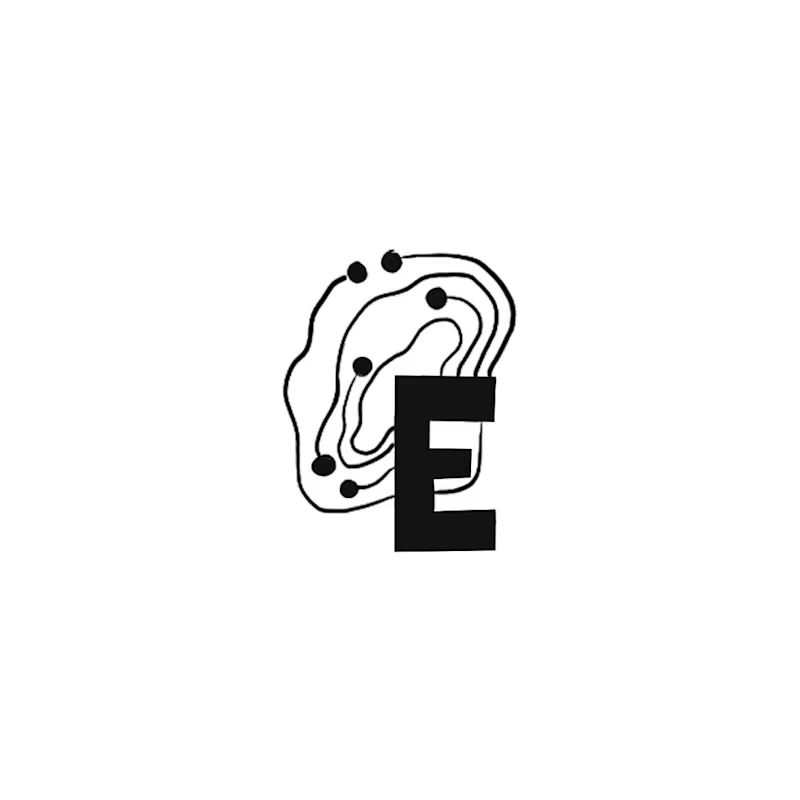
Happy Monday! Exploring early concept marks for a regional IT brand wanting to bridge modern IT services with Appalachian heritage.
Out of 10 sketches, my circle split right down the middle on these two:
A: The Ridge Monogram holds a bold silhouette where the "E" acts as the bedrock of the mountain ridge. It became a fast favorite with non-designer friends.
B: The Topo-Circuit idea plants a dynamic mark pairing circuit traces with elevation contours that can adapt to different locations as the business expands. (My personal pick!)
Which direction would you build out: A or B?
22 voted
73%

8 voted
27%
30 votes
Closed

I like the ridge monogram here!
because it is serving its purpose and it can be use in all applications.
The smallest ones as well.
Great work!🔥

Exploring two color palette directions for a women’s health app. Which one feels right to you? 👀
32 voted
56%
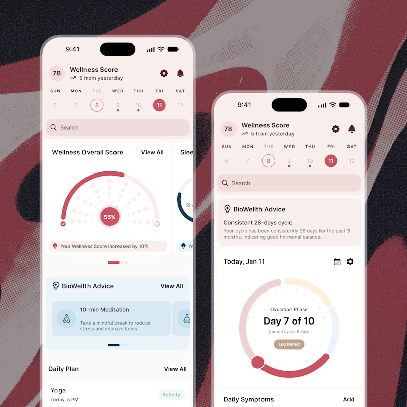
25 voted
44%
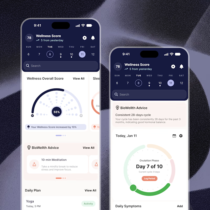
57 votes
Closed

Both are amazing! The purple definitely has better contrast, but I’d still go with the berry one, purely a personal preference

I created 2 concepts for the same tagline "Shaping Skylines", for a vertical construction company. Both of these are scroll triggered, which one you prefer? I'm biased towards the skewed option.
I'm giving a free component copy for both of them:
Zoom in: https://framer.link/CQNgUkU
Skewed: https://framer.link/XTmQcBK
Check them out and if you'd like, use them in your upcoming project!
29 voted
64%
16 voted
36%
45 votes
Closed

Flawless