The network for creativity
Join 1.25M professional creatives like you
Connect with clients, get discovered, and run your business 100% commission-free
Creatives on Contra have earned over $150M and we are just getting started
Back to feedPost
Taste Test
Help me define which one fits more the brands identity 🤔
Should I show the bts and put it as a project? 🤷🏻♂️
21 voted
53%
19 voted
47%
40 votes
Closed

The first one feels more natural, while the scale down for the second one dosen't feel so right
it wrong timing + maybe irrelevant

Nice one


Thank you @Mayowa Philip

Depends a lot on what the brand voice is elsewhere. If the rest of their marketing is loud and energetic, zooms and color sparks probably reads truer, if it's more premium and quiet, minimal wins by default. Which way does the rest of their identity lean?

Always minimal

the zoom and color sparks gives more energy to the motion


Personally a bigger fan of the first one. There's something not so satisfying about the heavier bounce in the 2nd one, and I also don't like how it almost touches the top edge of the screen. It makes the eyes stray away too much.


so close lol. zooms for me
The network for creativity
Join 1.25M professional creatives like you
Connect with clients, get discovered, and run your business 100% commission-free
Creatives on Contra have earned over $150M and we are just getting started

Challenges
View all


Related posts


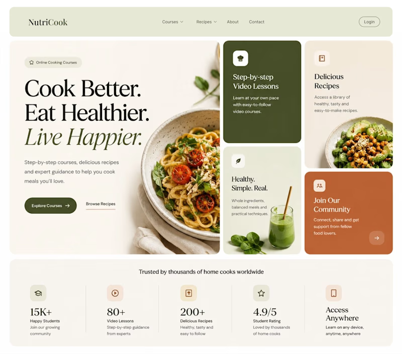
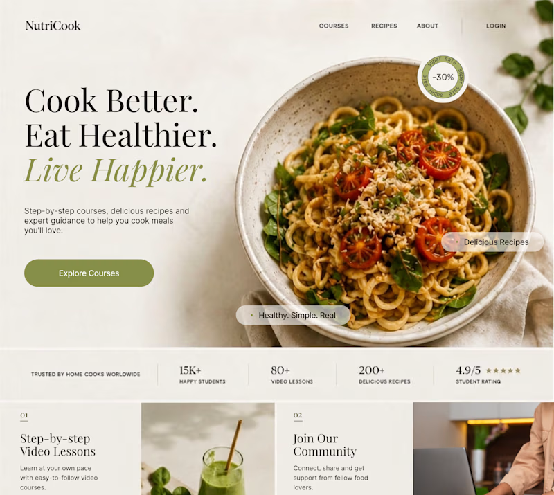
Same content. Two completely different vibes.
What happens when you keep the course content the same, but change the structure, typography, and color palette?
Two hero sections. One course. Two different visual experiences.
Which one would you choose? 1 or 2?
29 voted
41%
42 voted
59%
71 votes
Closed

Option 1 works well , the heirarchy and card layout on the hero is very smart

Client’s choice vs. Designer’s choice 👀
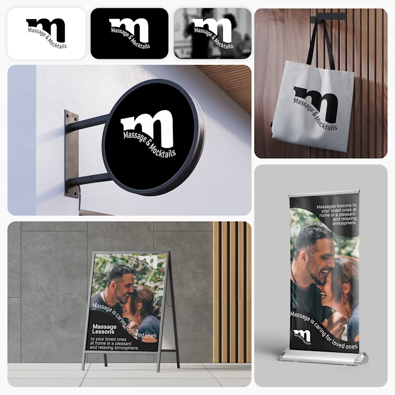
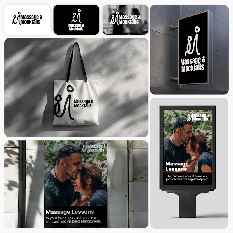
I’m currently working on a branding project for Massage & Mocktails — a concept built around couples learning massage together in a relaxed, social atmosphere.
These are two early, black & white directions from Stage 2 of my branding process, before moving into color, typography, and the full visual system.
The interesting part?
My client chose Concept 1. I chose Concept 2.
Now I’m curious what other creatives think.
Which direction would you choose — 1 or 2? And why?
Sometimes the most interesting part of branding is seeing how differently a client and a designer respond to the same brief.
21 voted
44%
27 voted
56%
48 votes
Closed

Concept 2 for me. That interlocking figure mark reads as two people meeting, which is the actual brief here, so it gives you more to build a system on. Concept 1 is the safer, more literal pick, which is usually why clients reach for it.

Which layout is better?
.
.
Curious which one wins? Follow along for more tests like this x.com/rightnextstep

20 voted
67%
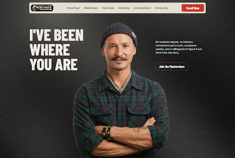
10 voted
33%
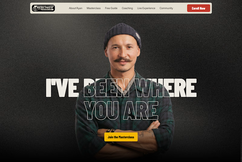
30 votes
Closed
Hero 1 shows the hero text very well but you might need to work on the Hero CTA for "join the masterclass", I will probable miss it as a key action if I was a regular user