The network for creativity
Join 1.25M professional creatives like you
Connect with clients, get discovered, and run your business 100% commission-free
Creatives on Contra have earned over $150M and we are just getting started
Back to feedPost

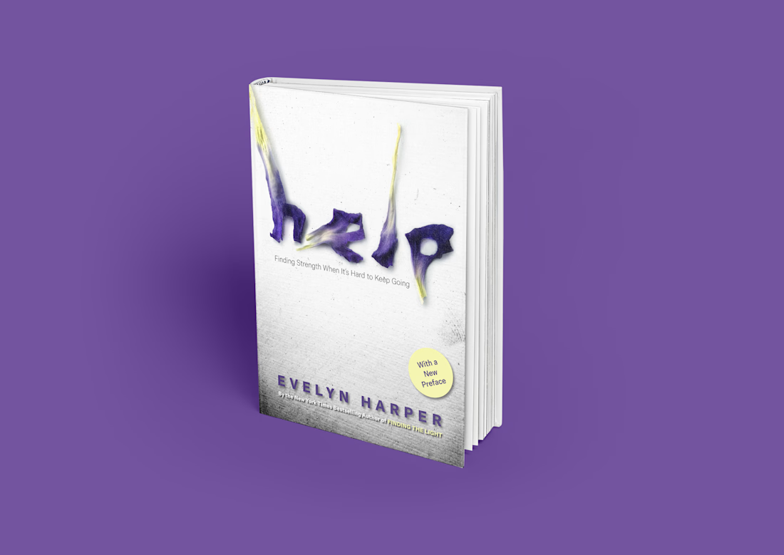
A cover that feels as human as the story inside.
These letters were built from real dried flower petals, carefully crafted by hand to create something soft, imperfect, and full of texture.
The result is a piece that naturally draws the eye, invites curiosity, and lingers—turning a quick glance into a deeper connection.
This is what happens when design leads with creativity, not convention.


The network for creativity
Join 1.25M professional creatives like you
Connect with clients, get discovered, and run your business 100% commission-free
Creatives on Contra have earned over $150M and we are just getting started





Related posts

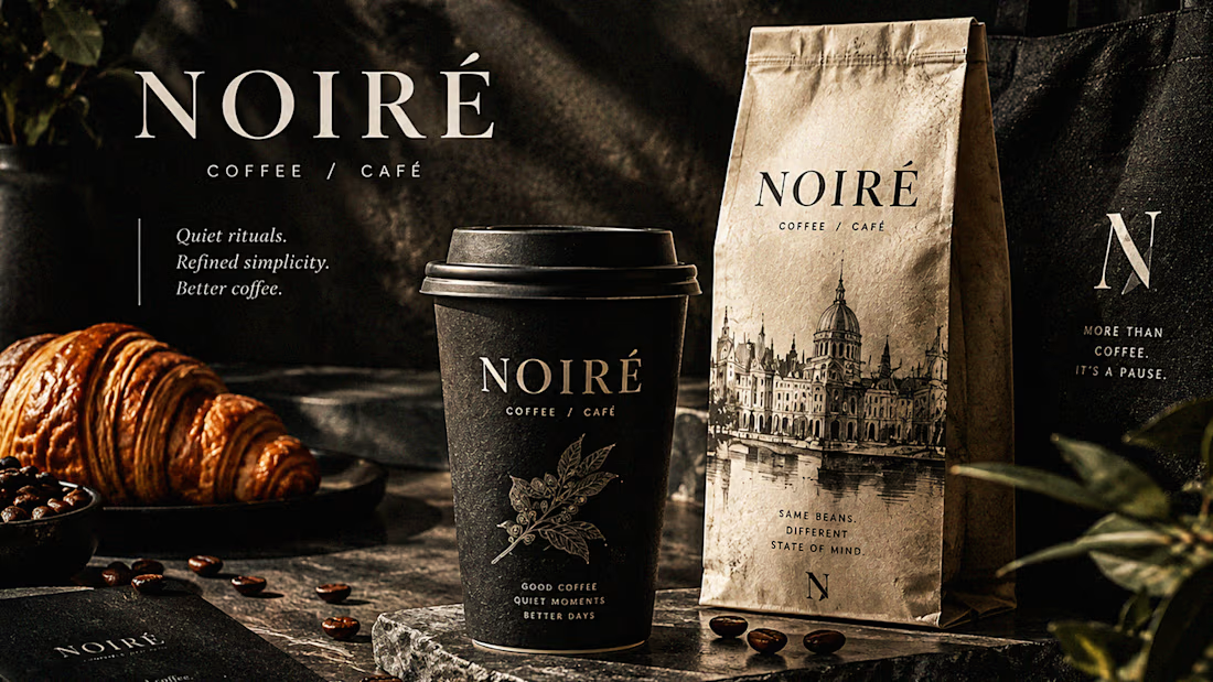
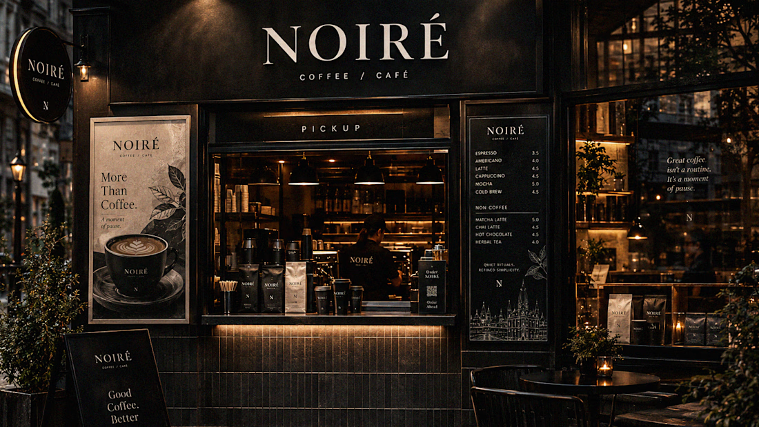
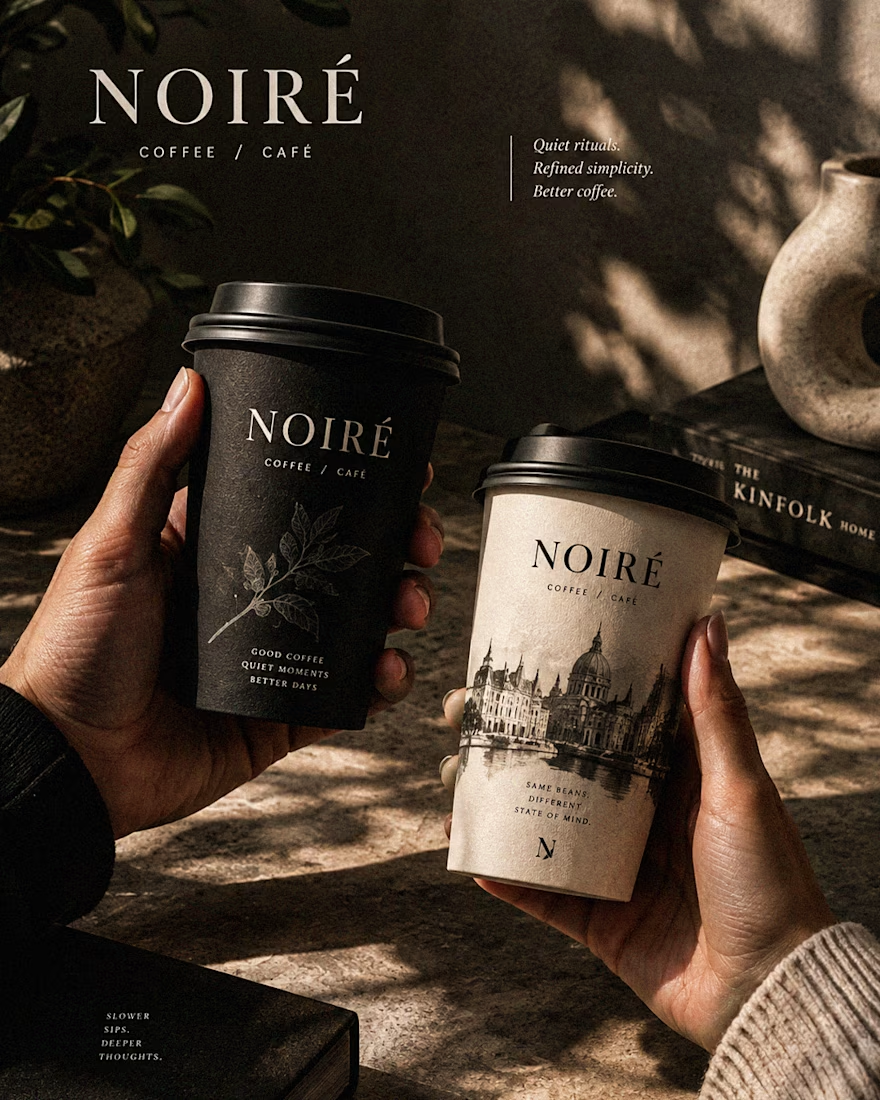
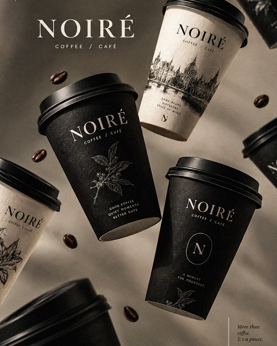
I Just Created NOIRÉ 🔥
A Coffee Brand Built Around the Pause.
NOIRÉ is a premium café brand built around a simple idea:
Great coffee should feel like a moment of pause, not another part of the
routine.
The project explores a complete visual identity, packaging
system, takeaway cups, coffee bags, tote bags, menu design, café applications and lifestyle campaign direction.
Instead of relying on the usual loud coffee aesthetics, I
built NOIRÉ around deep charcoal, warm ivory, soft graphite, refined
typography, subtle botanical illustrations and quiet editorial compositions.
The visual language is intentionally dark, tactile, and understated - giving every touchpoint the feeling of a slow morning, a quiet table, and coffee worth taking your time with.
From the cup in your hand to the café around you, every detail was designed to make the brand feel like a ritual.
Waiting for your thoughts in the comments 🙌🔥
branddesignertastetestBrand DesignGraphic DesignPackaging DesignAdobe IllustratorAdobe InDesignAdobe Photoshop



Created this custom 3D icon set for 3D Walkabout.
The icons are built around a cube-based system, with subtle variations to clearly represent different services while keeping a cohesive brand identity.


Hi Designers and Lurkers,
I just created a brand identity for a very niche market of wanderers.
🛣️ NIJA means crossing paths
🐼 The panda symbolizes the calm and paradise of vegetation
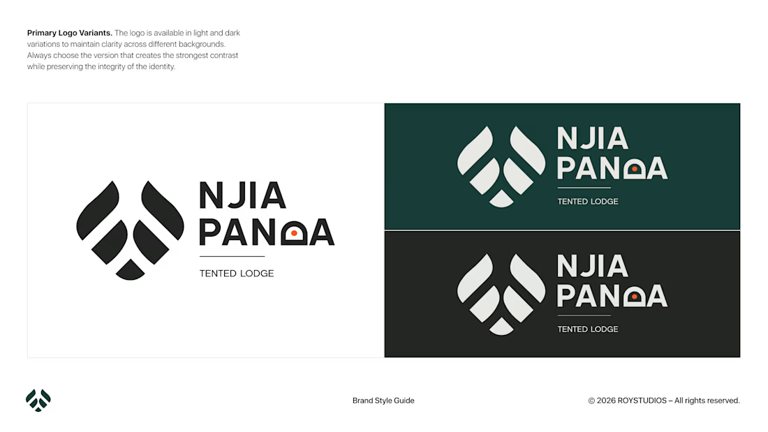
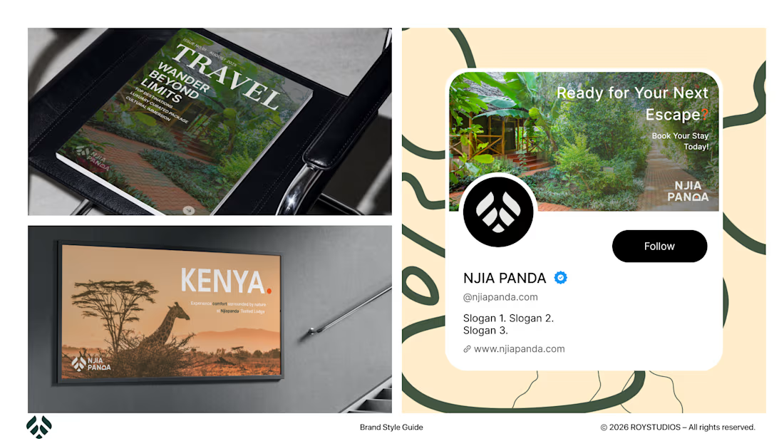
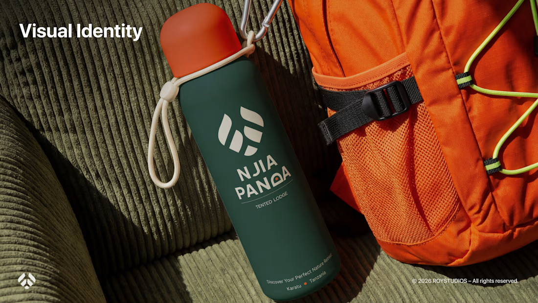
NJIA PANDA is a travel boutique company that provides tented lodges and predefined packages for travelers.
P.S. It is my first time ever using Photoshop for a mock-up. 🫣
Tell me your thoughts in the comments: if you were designing for a similar brand, what would you change? 🤔