Dalila Copeland
Award-winning Typography for Campaigns & Brand Moments
New to Contra
Dalila is ready for their next project!
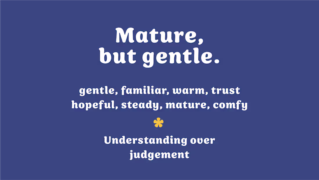
The Tiff Junke brand identity balances emotional warmth with professional trust, creating a visual system that feels safe, approachable, and credible for parents navigating complex caregiving challenges. The soft quilted textures, cloud forms, playful icons, and childlike visual language speak to comfort, memory, and relational safety, while the structured typography, mature color palette, and simplified monogram keep the brand grounded and expert-led. The result is a brand that feels gentle without feeling juvenile, and supportive without losing authority.
1
25
Most brands don’t have a design problem—they have a presence problem.
Across these projects, I created logos and full identity systems that give brands something clear, distinct, and impossible to ignore.
Not trend-based. Not interchangeable. Built to be recognized, remembered, and scaled.
Because a brand that blends in gets overlooked—and a brand with presence gets chosen.
If you’re done blending in and ready to build something people actually notice, you’re in the right place.
1
77
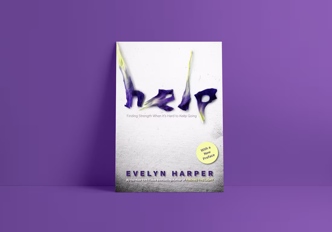
A cover that feels as human as the story inside.
These letters were built from real dried flower petals, carefully crafted by hand to create something soft, imperfect, and full of texture.
The result is a piece that naturally draws the eye, invites curiosity, and lingers—turning a quick glance into a deeper connection.
This is what happens when design leads with creativity, not convention.
0
94
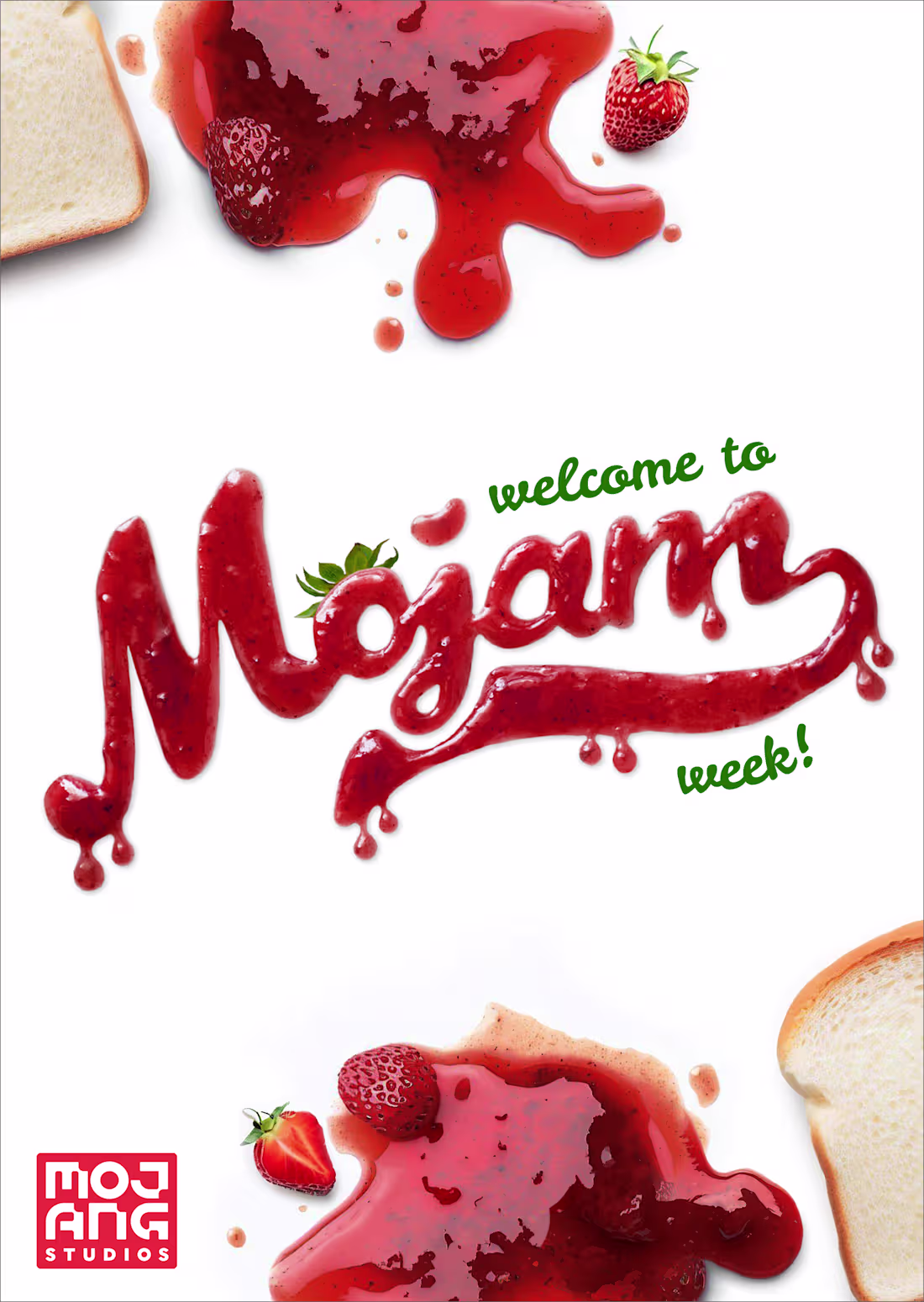
Turning everyday materials into something you can’t ignore.
For this campaign with Minecraft, I created custom lettering using real strawberry jam—transforming a simple message into something tactile, playful, and full of personality.
The result is a visual designed to grab attention instantly and make the moment feel as fun and unexpected as the brand itself.
Built for brands ready to move beyond safe, expected design—and lead with bold, creative ideas.
0
108
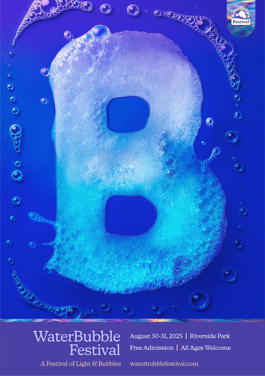
Typography, but make it the idea.
For this festival identity, I built the letter “B” entirely from real soap bubbles—turning material into message. The result is a visual designed to capture attention instantly and spark curiosity at first glance.
Built for brands ready to trade predictable for bold.
Typography as the main event—not decoration.
0
99
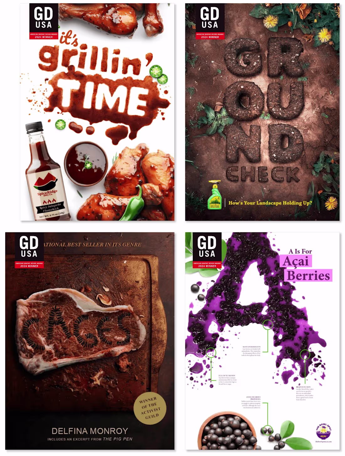
GDUSA Magazine Graphic Design USA 61ST Design Competition😍
These designs listed below are winners in the 61st GDUSA Design Awards, our annual end-of-year best-of-year competition. This year they saw 8,000+ entries. Only the top 10% have been selected as winners.
Goodbye Boring, Hello Bold
Creative ads with experimental typography grab attention and leave a lasting impression. Our creative director/lead designer recently won in the 61st GDUSA Design Awards for her three self-promotion experimental typography ads and a book cover. This prestigious competition, featuring over 8,000 entries, selects only the top 10% as winners.
It's truly a proud moment for me, especially because it's a project I'm incredibly passionate about. The lettering for these posters was all handcrafted using unconventional materials like dirt, berries, BBQ sauce, and even meat. Yes, you read that right - I actually sewed letters into a piece of meat for this unique project.
1
91