The network for creativity
Join 1.25M professional creatives like you
Connect with clients, get discovered, and run your business 100% commission-free
Creatives on Contra have earned over $150M and we are just getting started
Back to feedPost
Hi Designers and Lurkers,
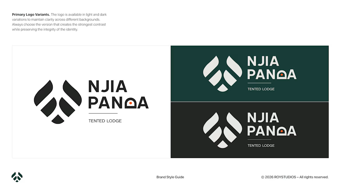
I just created a brand identity for a very niche market of wanderers.
🛣️ NIJA means crossing paths
🐼 The panda symbolizes the calm and paradise of vegetation
NJIA PANDA is a travel boutique company that provides tented lodges and predefined packages for travelers.
P.S. It is my first time ever using Photoshop for a mock-up. 🫣
Tell me your thoughts in the comments: if you were designing for a similar brand, what would you change? 🤔


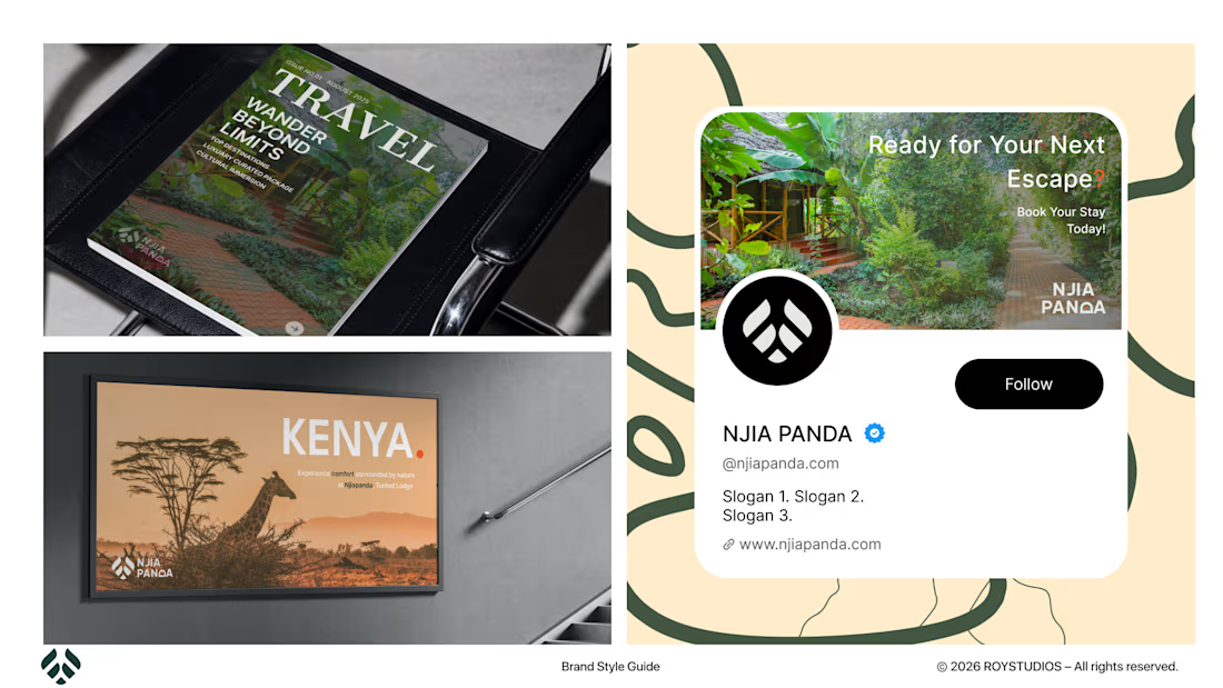
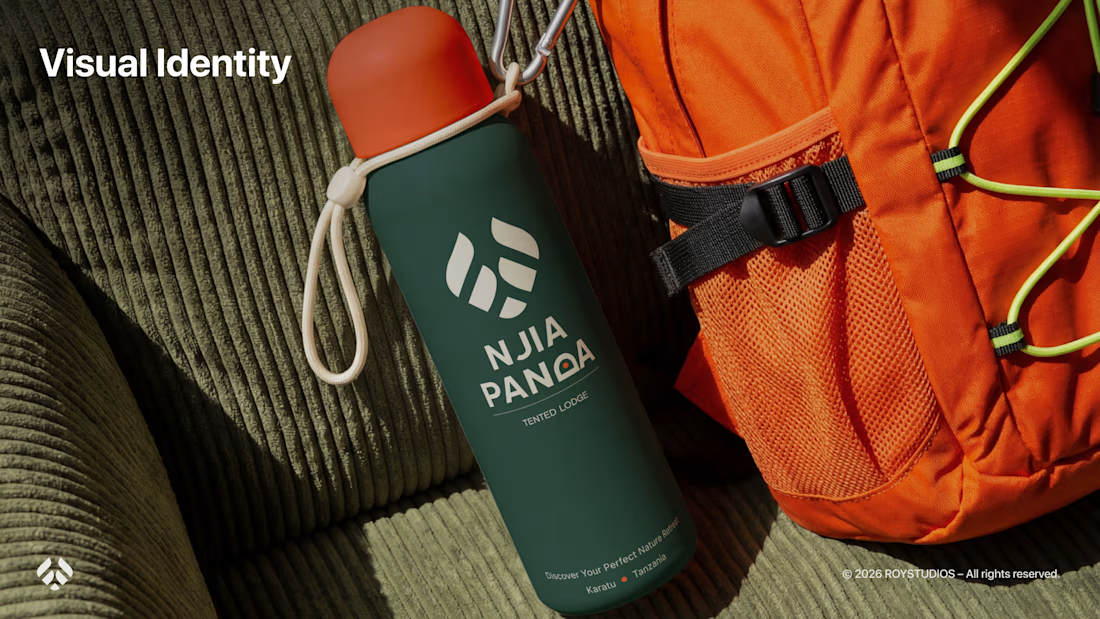

TOP!!

Thank You @Celia Sofia
The network for creativity
Join 1.25M professional creatives like you
Connect with clients, get discovered, and run your business 100% commission-free
Creatives on Contra have earned over $150M and we are just getting started


Related posts

What makes a brand feel more memorable?
I think a mascot can be one of many ways to make a brand more recognizable, expressive, and engaging.
Yet there are still so many brands that don't have a mascot of their own.
So I decided to imagine what a mascot for Chobani could look like.
Meet the Yogurt Sprite, a little magical creature born from a swirl of creamy yogurt.
But I didn't want it to remain just a static character, so I brought it to life with Rive, adding a little movement and personality.
Do you think this mascot feels like a good fit for Chobani?


The little leaf on top is a nice touch, it brings back the natural side of Chobani without saying it 🌱 I'd love to see it react when you hover it on their site, Rive is perfect for that. Did you already give it a few moods in the state machine?

This morning: a design exploration.
Tonight: a whole brand.
Calling. Numbered, glitched, answered.
Case study dropping soon.
Pick up.


Why don’t more DTC brands have mascots?!
I feel like mascots are such a fun way to give brands more personality and create something people can actually connect with.
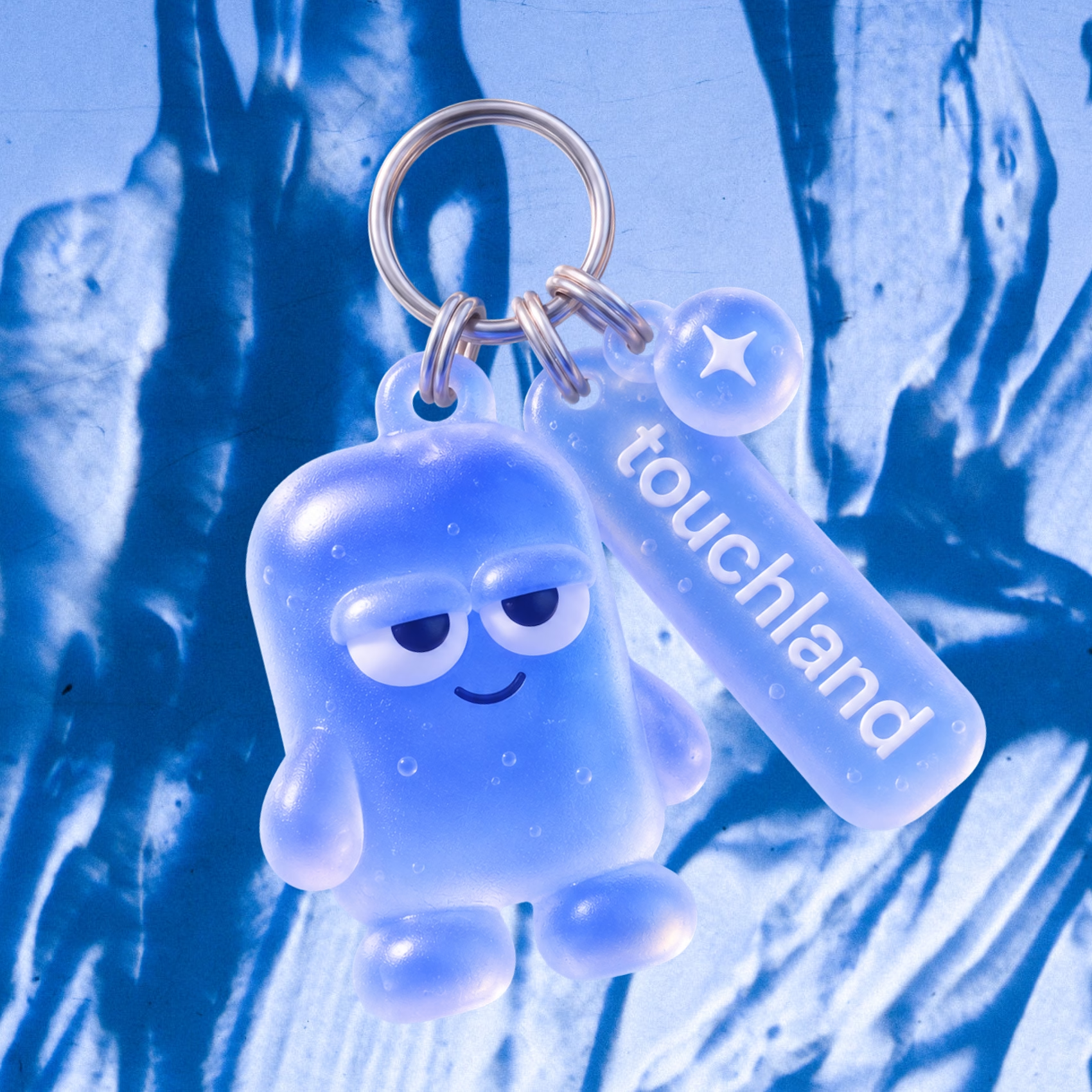
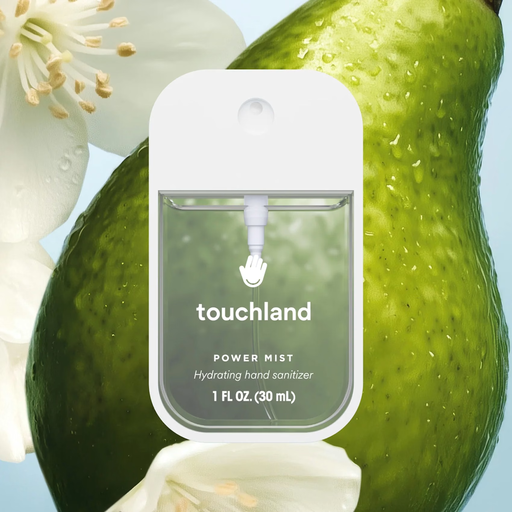
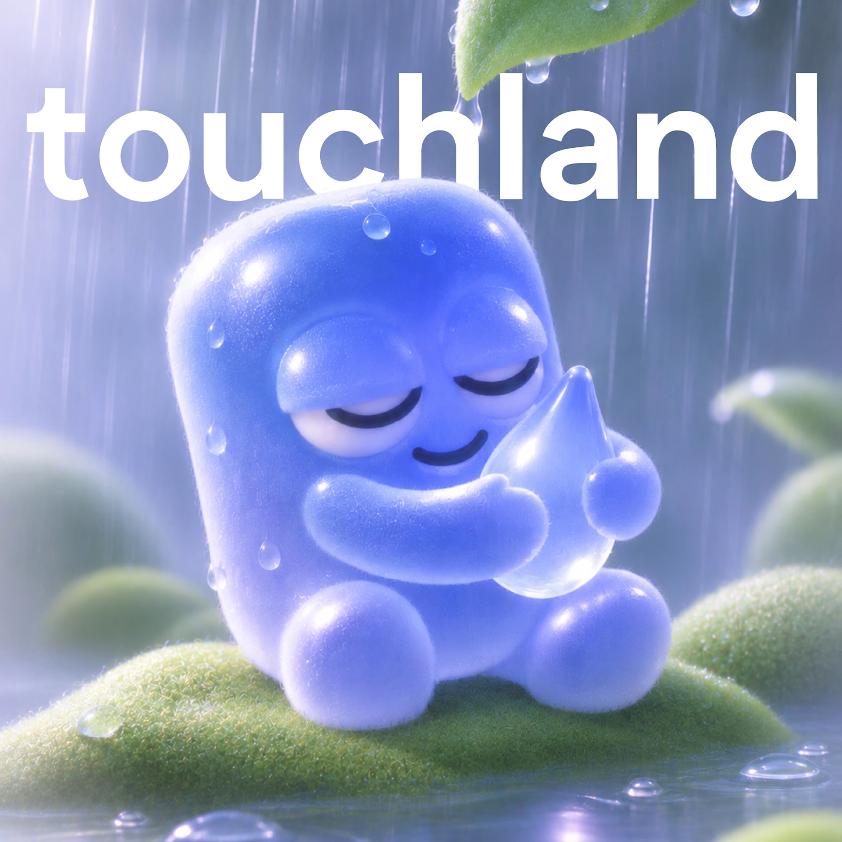
So I decided to give touchland its own little character! A squishy, jelly-like mascot that changes colors, expressions, and moods depending on the scent. And obviously, I had to turn it into a keychain too.
What other brands deserve their own mascot? 👀