The network for creativity
Join 1.25M professional creatives like you
Connect with clients, get discovered, and run your business 100% commission-free
Creatives on Contra have earned over $150M and we are just getting started
Back to feedPost

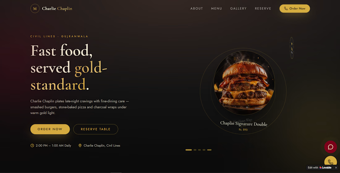
Premium Restaurant Website — Ready to Launch
Give your restaurant a professional online presence without spending weeks building a website from scratch.
This modern, responsive restaurant website is designed to showcase your menu, brand, location, opening hours, and contact information in a clean, premium layout that looks great on both desktop and mobile.
What You Get
🍔 Modern restaurant-focused design
📱 Fully responsive mobile and desktop layout
🍕 Dedicated menu sections for food and drinks
📍 Location and contact information
🕐 Opening hours display
🖼️ High-impact food imagery and promotional sections
⚡ Fast, clean and easy-to-navigate interface
🎨 Easily customizable branding, colors, images and menu items
🔗 Call-to-action sections designed to encourage customers to order or visit
The website is ideal for restaurants, cafés, burger joints, pizza shops, fast-food businesses, food trucks and other food brands looking for a polished website without the cost and time of a custom build.
Why Buy This?
Instead of paying a developer to start from zero, you get a ready-made website concept that can be adapted to your business and launched much faster.
Change the restaurant name, logo, menu, images, colors, contact details and branding — and turn the existing design into your own website.
A professional restaurant website shouldn't take months to build. Start with a finished design and make it yours.

The network for creativity
Join 1.25M professional creatives like you
Connect with clients, get discovered, and run your business 100% commission-free
Creatives on Contra have earned over $150M and we are just getting started








Related posts


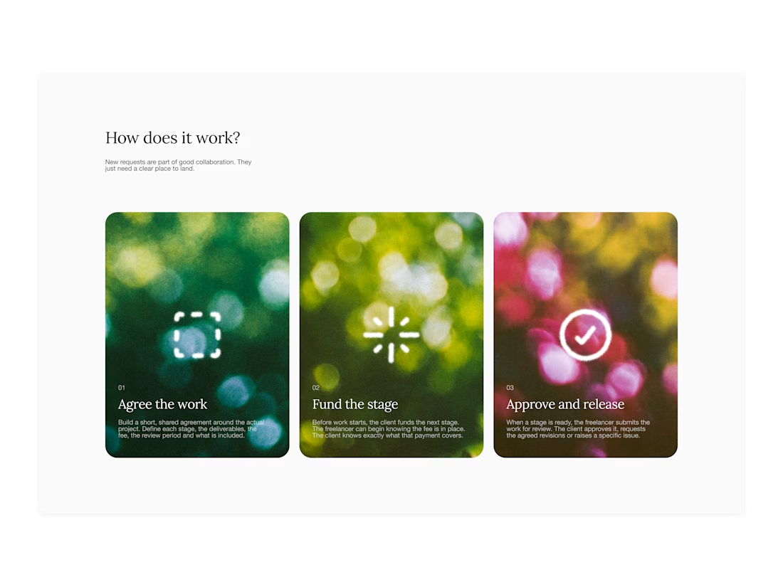

Your web sections always have such strong art direction. Great to see the brand carried right into the layout.

AI can build the UI in minutes.
Bringing it up to a good standard, still needs a designer. Agree or disagree?

I see some of your work and honestly your work is really premium 🎉🎉
Great job Alex🎉🎉🔥🔥


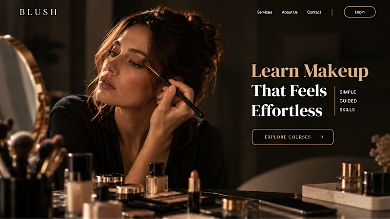
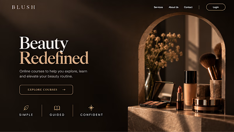
Your Hero Section Has One Job: Be Clear.
You don’t need huge headlines or long explanations. You need the right image + short headline + clear offer.
For the first version, we worked on the branding, the image and the copy together, so at first glance it’s clear: this is a makeup course, and here’s what you’ll get.
The second version is still beautiful and still feels like beauty. But what are you actually getting? A makeup course? Products? A store? That’s the problem with a Hero that looks good but isn’t thought through.
Your first screen doesn’t need to say everything. It just needs to say the right thing.

22 voted
61%
14 voted
39%
36 votes
Closed
