The network for creativity
Join 1.25M professional creatives like you
Connect with clients, get discovered, and run your business 100% commission-free
Creatives on Contra have earned over $150M and we are just getting started
Back to feedPost
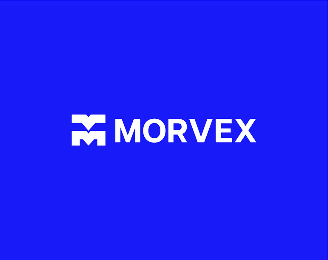
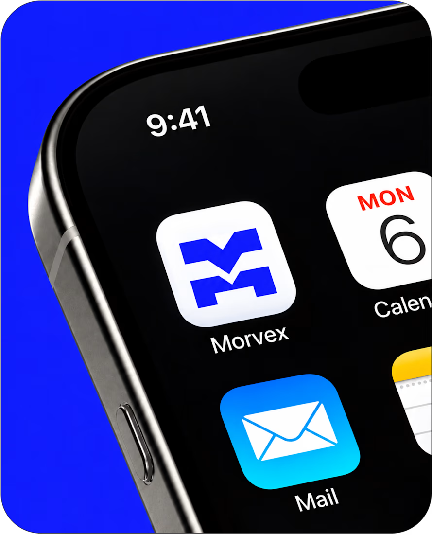
Morvex is a cybersecurity brand with a strong, bold visual identity. The idea behind the logo was to create something simple but recognizable, using a custom geometric M with sharp angles and carefully balanced shapes.
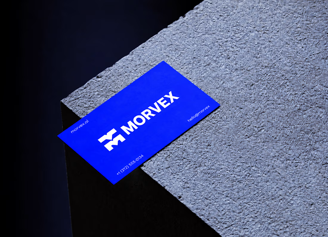
The identity brings together electric blue, bold typography, and a dark visual style to give the brand a modern, confident look. I carried the same design approach across the brand applications, keeping everything clean, consistent, and easy to recognize.




Yes, it does! I kept the geometry simple and the angles sharp so the M stays recognizable even at smaller sizes. Appreciate you noticing that! 🙌 😊

A custom geometric M is a solid choice for a security brand. Simple enough to work as an icon everywhere.
Thanks, Senad! That was exactly the idea. I wanted to keep the M simple and distinctive enough to work across different applications without losing its character.

The M holds up well on the phone icon with those sharp angles. Did you test it at favicon size, or was the app icon the smallest case you checked?
Thanks, Artur! So far, I've tested it at app icon size, but favicon size is definitely worth checking too. Appreciate you pointing that out!

Looks Good
Thank you so much for appreciating it 🎉 😍

Bold blue, sharp typography, and a striking identity was good.


This is a really creative piece! I love how the visual elements come together to create something that feels distinctive rather than predictable. The composition, the overall visual direction, and the way the idea has been executed all contribute to making this stand out. It’s a...
Thanks so much, Daniel! Really glad you noticed those little details. I had a lot of fun exploring this direction, so it means a lot to hear that. Appreciate you taking the time to share your thoughts! 🙌

Zarbaz, those sharp cuts in the M look so good 👏
Thank you, Thayline! I spent quite a bit of time getting those cuts just right 🙌 😍

Love how clean and confident this looks! The same goes for Accountant a clear, consistent system builds trust in the numbers.
Thanks so much, Fatima!
The network for creativity
Join 1.25M professional creatives like you
Connect with clients, get discovered, and run your business 100% commission-free
Creatives on Contra have earned over $150M and we are just getting started
Related posts

A logo reveal is easy. Explaining why the logo changed is the fun part.
OPTYO had spent a decade telling the stories of sports and fitness brands, and their old mark was a single ring for one unified team. The new identity breaks that ring into tiles, one for each channel they now cover. I created the brand story and logo animation that walks through that shift, from fast cuts of athletes to the tiles spinning into the new mark.
Check it out. How do you usually start a logo animation?


A masterpiece!

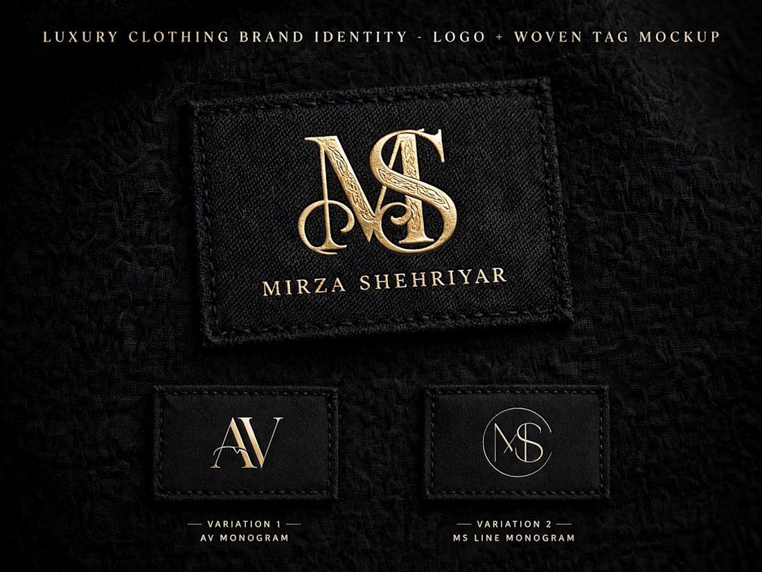
Luxury Clothing Brand Identity - Logo + Woven Tag Mockup | Mirza Shehriyar


Any good words for the packaging.