The network for creativity
Join 1.25M professional creatives like you
Connect with clients, get discovered, and run your business 100% commission-free
Creatives on Contra have earned over $150M and we are just getting started
Back to feedPost

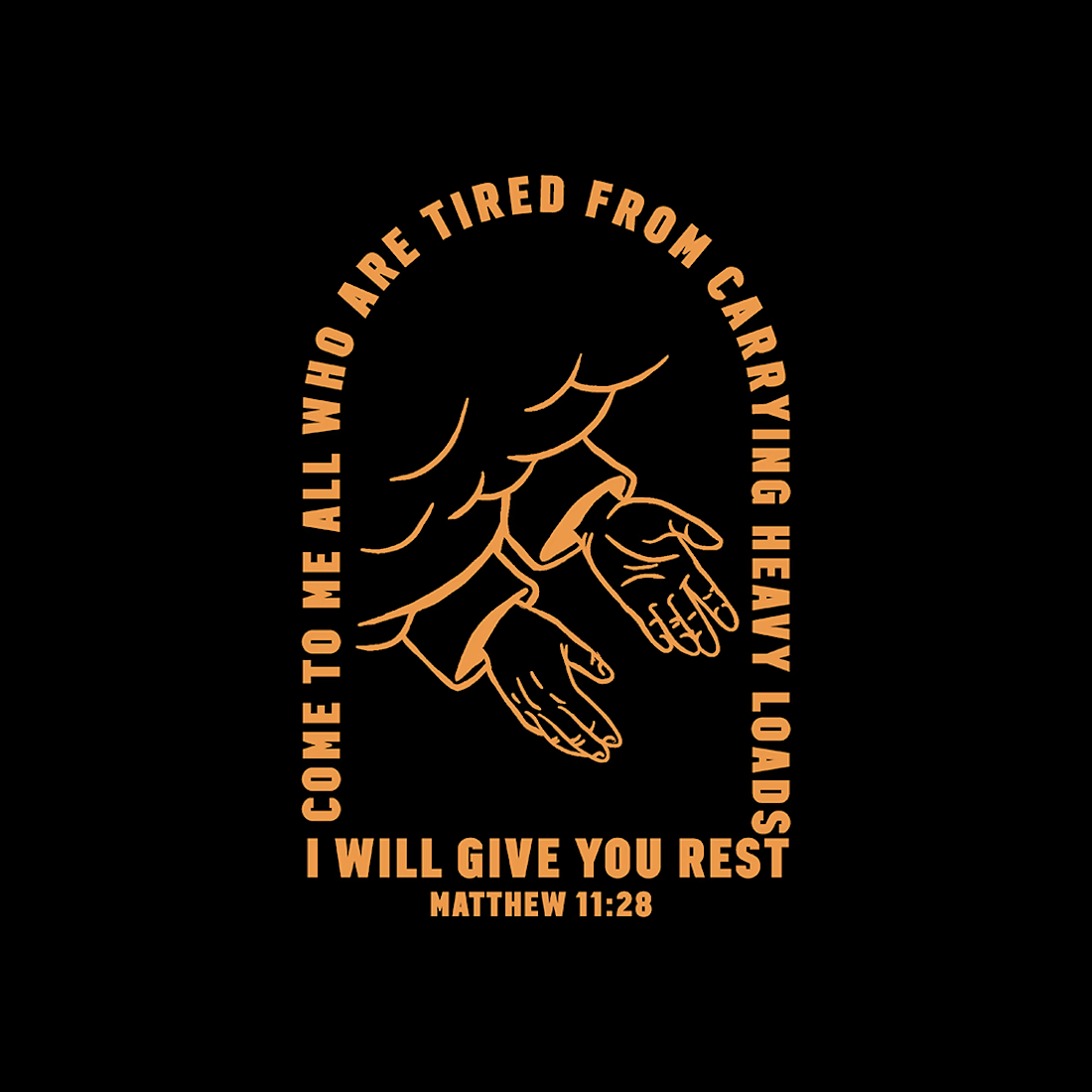
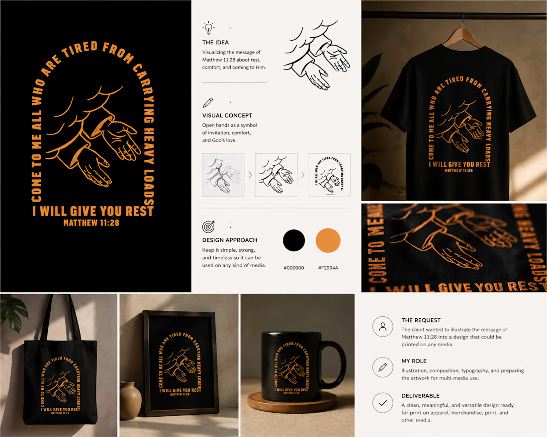
The client wanted to turn the message of Matthew 11:28 into a visual design that could be used across different types of media.
The idea was to create something that could communicate the meaning of the verse without relying only on the text itself. I chose a pair of open hands as the main visual, symbolizing the idea of giving our worries and burdens to God the Father and trusting Him to bring peace to our hearts and minds.
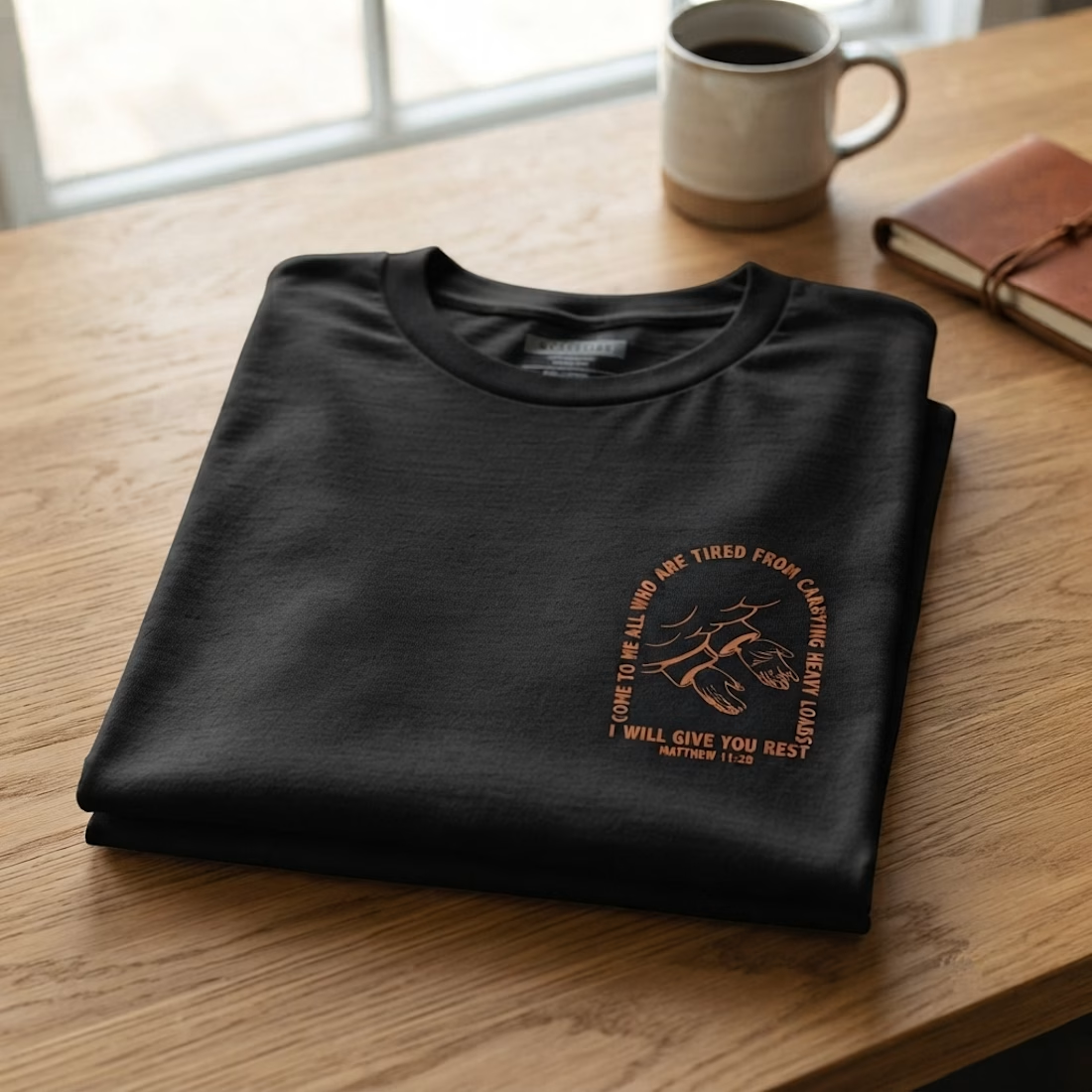
I then combined the illustration with the verse in a bold typographic layout, keeping the design simple and flexible so it could work on T-shirts, prints, posters, and other applications.
The goal was to create a design that feels meaningful on its own, while still keeping the message of the verse at the heart of the artwork

The network for creativity
Join 1.25M professional creatives like you
Connect with clients, get discovered, and run your business 100% commission-free
Creatives on Contra have earned over $150M and we are just getting started

Challenges
View all


Related posts

I'm working on a store concept mixing art supplies, gifts and tech. I presented two moodboards: one inspired by traditional art supply stores, and another cleaner, modern direction inspired by Japanese gift and tech stores. They chose option 2.
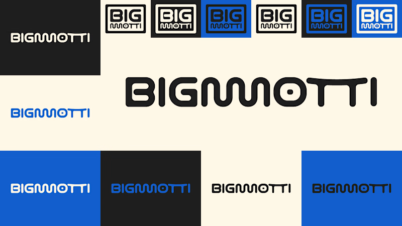
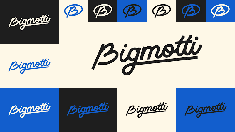
I presented four logo ideas. These two are my favorites and the ones the client liked most.
1_ Based on the second moodboard, with a more neutral and slightly futuristic feel. My favorite detail is the boxed version: its vertical weight balances with the I and O, making it feel tidy and visually appealing.
2_ Inspired by traditional art supply stores, but with a modern, clean style. Handwritten lettering adds a human touch and keeps it timeless.
Which one is your favorite and why?
Which one do you think the client chose?
1 voted
14%
6 voted
86%
7 votes
Closed

I'll guess they picked #1, the boxed Bigmotti reads cleaner next to a gift-and-tech assortment than the handwritten route. That vertical weight balance on the I and O is the kind of detail that's invisible until someone points it out, was there a runner-up logo the client seriously debated before landing on this one?

Creative Direction for Innerceuticals


The pivot from the real product bottle into that geometric particle animation is a smooth way to move from proof to brand world. Was Innerceuticals specifically asking for that split, ground it in the actual product first then get conceptual after, or did that pairing come together in the edit?

Exploring Dark vs. Light with AI
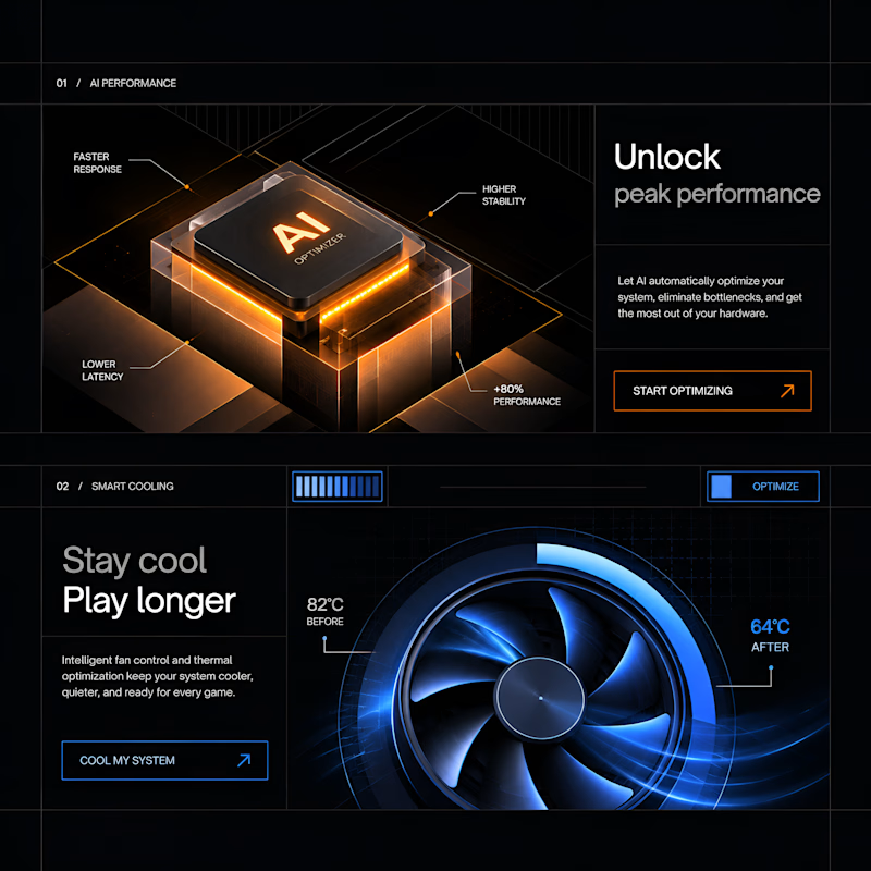
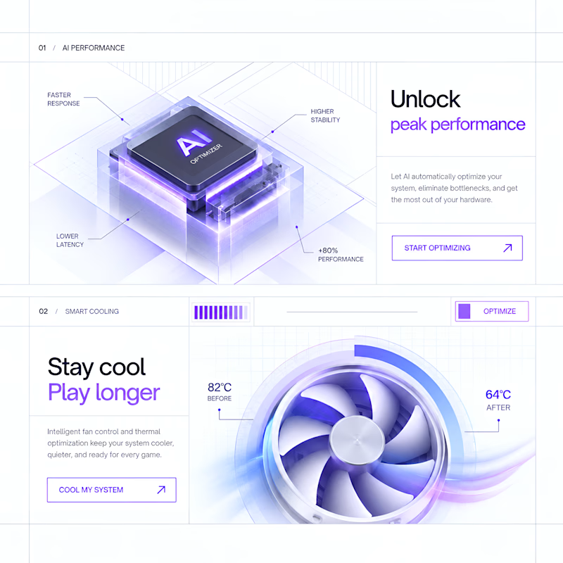
Exploring two visual directions for the same product experience. Testing how color, contrast, and lighting can completely change the feel of a design.
Which one would you choose?
5 voted
63%
3 voted
37%
8 votes
Closed

The dark direction has the stronger product-story arc for me—the warm chip glow against the cool blue controls gives the hierarchy more depth and energy.