bandaya jaya
Digital Illustrator | Characters, Mascots & Custom Artwork
New to Contra
bandaya is ready for their next project!
Helooo everyone
This is genuinely created by a human, not AI
it is currently a work in progress...
0
33
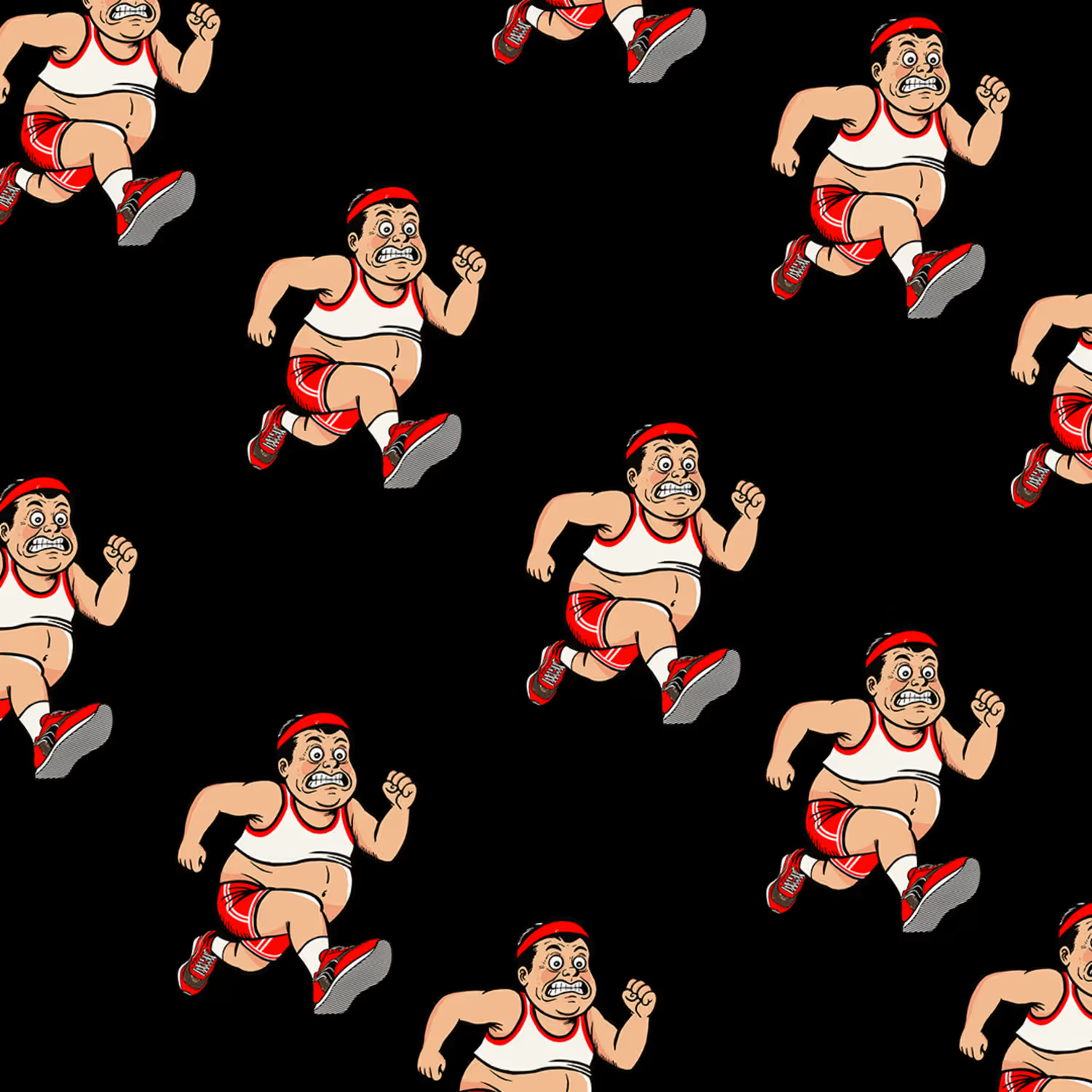
This project started with a simple idea from a local running club: creating a mascot that connects bananas with running and an active lifestyle.
The idea was based on the energy and nutrients we can get from bananas, which are often associated with sports and physical activity. I turned that idea into a fun character — a runner wearing a banana costume, full of energy and always on the move.
I wanted the character to feel playful, energetic, and easy to remember, while still representing the positive side of staying active and making exercise part of a healthy routine.
The final mascot was designed to work as a visual identity for the running club and could be used across social media, merchandise, and other club materials.
0
47
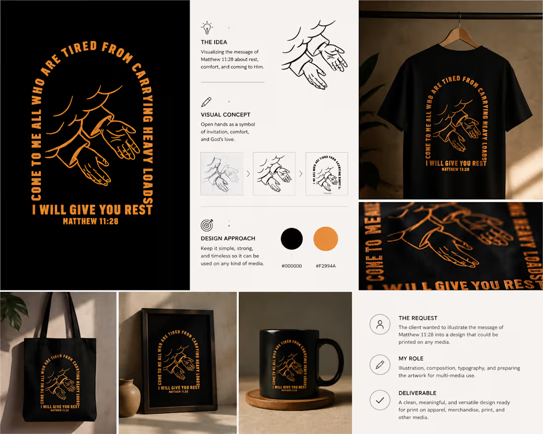
The client wanted to turn the message of Matthew 11:28 into a visual design that could be used across different types of media.
The idea was to create something that could communicate the meaning of the verse without relying only on the text itself. I chose a pair of open hands as the main visual, symbolizing the idea of giving our worries and burdens to God the Father and trusting Him to bring peace to our hearts and minds.
I then combined the illustration with the verse in a bold typographic layout, keeping the design simple and flexible so it could work on T-shirts, prints, posters, and other applications.
The goal was to create a design that feels meaningful on its own, while still keeping the message of the verse at the heart of the artwork
0
52
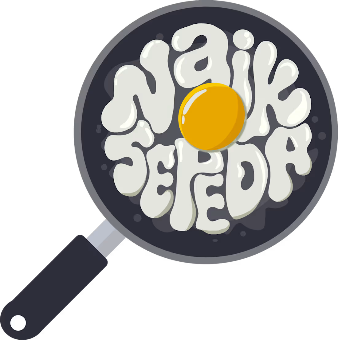
This started as a personal idea for an Instagram brand called "Naik Sepeda."
I wanted to create something simple, fun, and easy to remember. The main idea came from combining two things I like: cycling and fried eggs. The egg became a playful symbol of the journey — something familiar, simple, and enjoyable.
From there, I developed the main logo, icon, wordmark, colors, typography, and a few supporting illustrations. I also explored how the identity could work across different things like T-shirts, stickers, mugs, tote bags, and other everyday items.
It started as a simple logo idea, but eventually grew into a small visual identity of its own💯
0
61