The network for creativity
Join 1.25M professional creatives like you
Connect with clients, get discovered, and run your business 100% commission-free
Creatives on Contra have earned over $150M and we are just getting started
Back to feedPost


The network for creativity
Join 1.25M professional creatives like you
Connect with clients, get discovered, and run your business 100% commission-free
Creatives on Contra have earned over $150M and we are just getting started

Challenges
View all


Related posts

For this project, the Contra community chose these colors and the concept featured in this post: https://on.contra.com/ppTKmT
Now we’re moving forward. In one of the two animations, we’re thinking of showing the frames more clearly and adding a methane gas effect, but the client disagreed with us, so we decided to let the Contra community decide.
21 voted
78%
6 voted
22%
27 votes
Closed

Option 1 For me

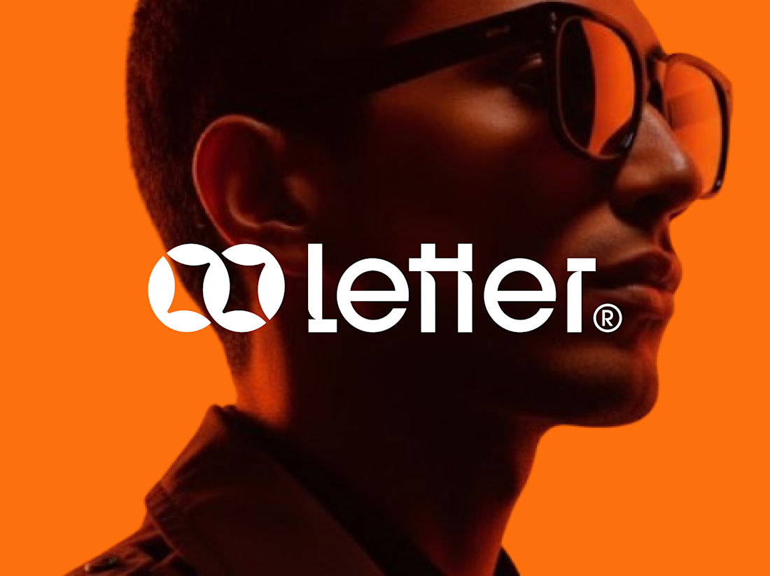
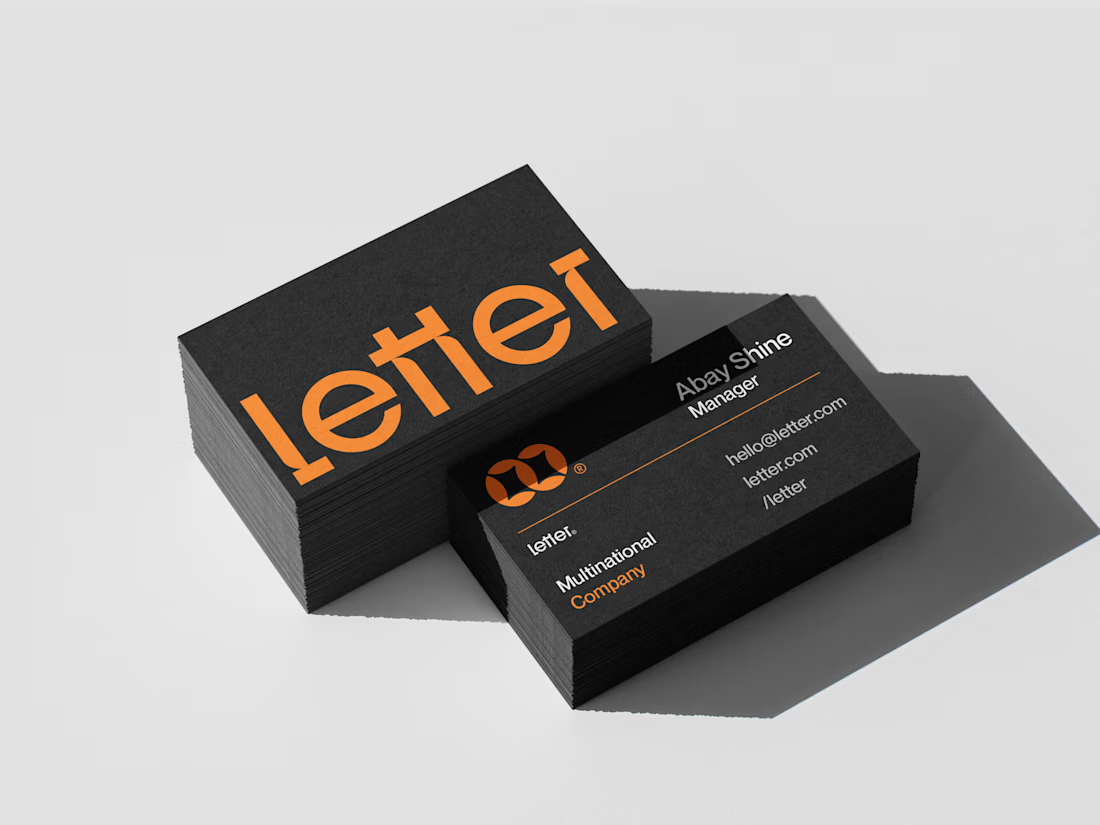
Letter — Visual Identity for a Multinational Company
For Letter, I built the mark around two interlocking loop forms — a subtle nod to connection and precision, the kind of detail that makes a logo feel deliberate at a glance.
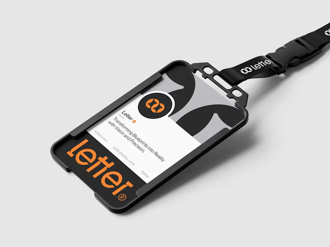
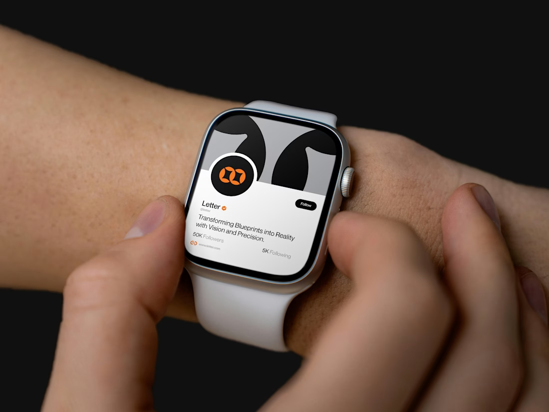
I developed the full system from there: wordmark, icon mark, a bold orange-and-black palette, and mockups across ID badges, business cards, lanyards, and even a smartwatch — showing the brand holding its identity everywhere it lands.
Transforming Blueprints into Reality with Vision and Precision.


Absolutely amazing work, well done!


Great design and beautiful presentation.