The network for creativity
Join 1.25M professional creatives like you
Connect with clients, get discovered, and run your business 100% commission-free
Creatives on Contra have earned over $150M and we are just getting started
Back to feedPost

Worst place you've ever broken down? Drop it below. Asking for an album cover.
Tenth Mountain Division named their album after the town in Louisiana where their van died. So the brief was: make a swamp look like a fond memory.
Cover, back, CD digipak, LP jacket, center labels, a badge that ended up on everything, and the poster for the release show at the Mishawaka. It sold out. I'm not saying the poster did that.
Drawn in Procreate, finished in Illustrator.
Full case study: https://contra.com/p/mggPbEkA-butte-la-rose-album-art-for-a-van-that-broke-down-in-louisiana
#albumart #illustration #handdrawn #vinyl #gigposter


The network for creativity
Join 1.25M professional creatives like you
Connect with clients, get discovered, and run your business 100% commission-free
Creatives on Contra have earned over $150M and we are just getting started



Related posts

New case study for the brand and digital work we did for Seeper Studios.
Go Check it out


Evolving a brand with almost 30 years of history is the hard version of brand work. You have to keep what people already trust while making it feel current. Nice job balancing both.


How do you sell houses that are not built yet?
On kalotespusynas.lt people pick their home on a map.
Switch between 3D and a flat 2D plan, zoom in, show only the cottages. Green means free, orange means reserved. Some plots hold two homes, so they split into A and B, each with its own size and plot.
One map instead of a price list PDF. Buyers get it in seconds.

This is so much better than a price list PDF. I build PlotToBuild, a sales tool for real estate firms selling plots in Nigeria, and the free / reserved / sold status is exactly what buyers ask about first. Splitting plots into A and B is a smart touch.


Is text on album covers really tacky?
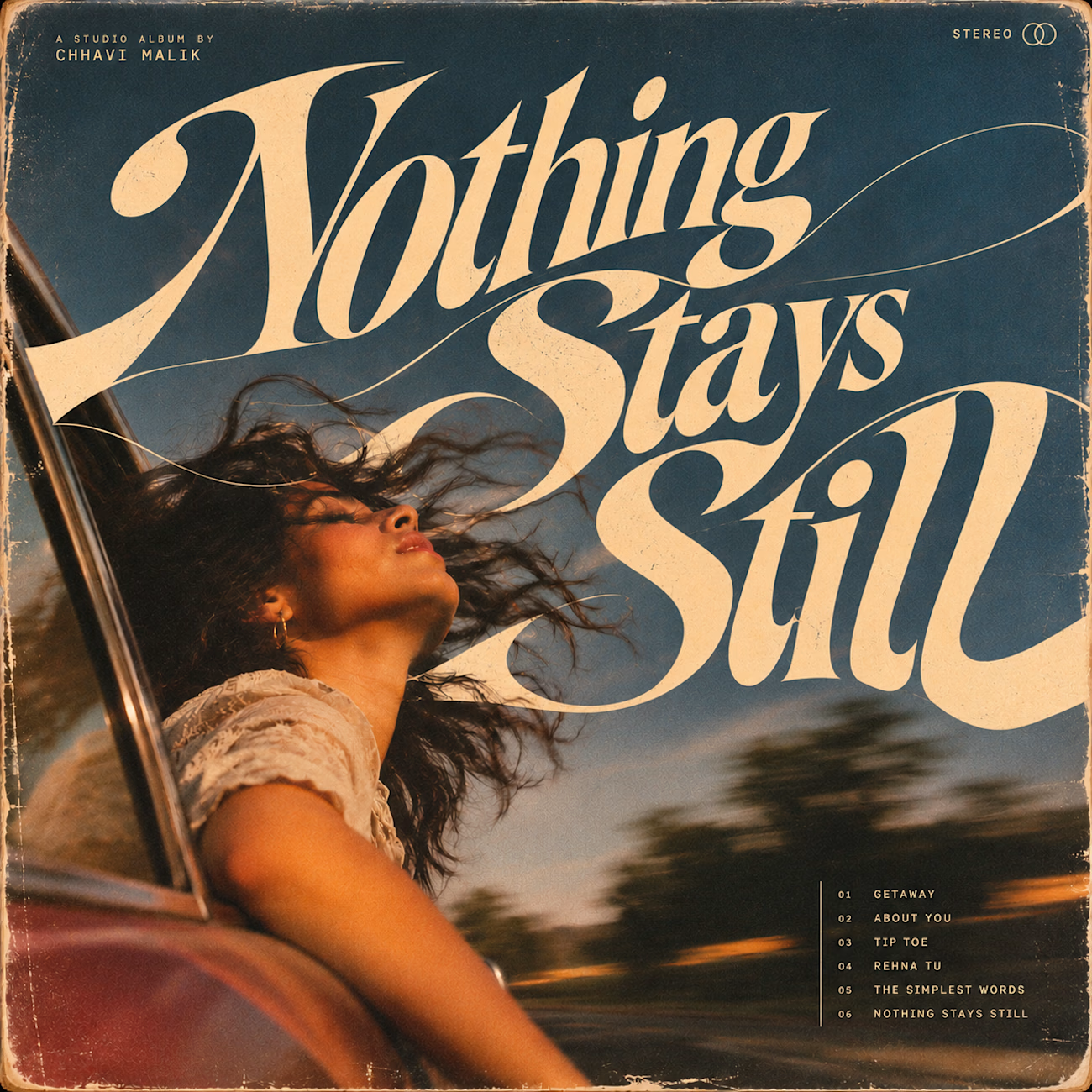
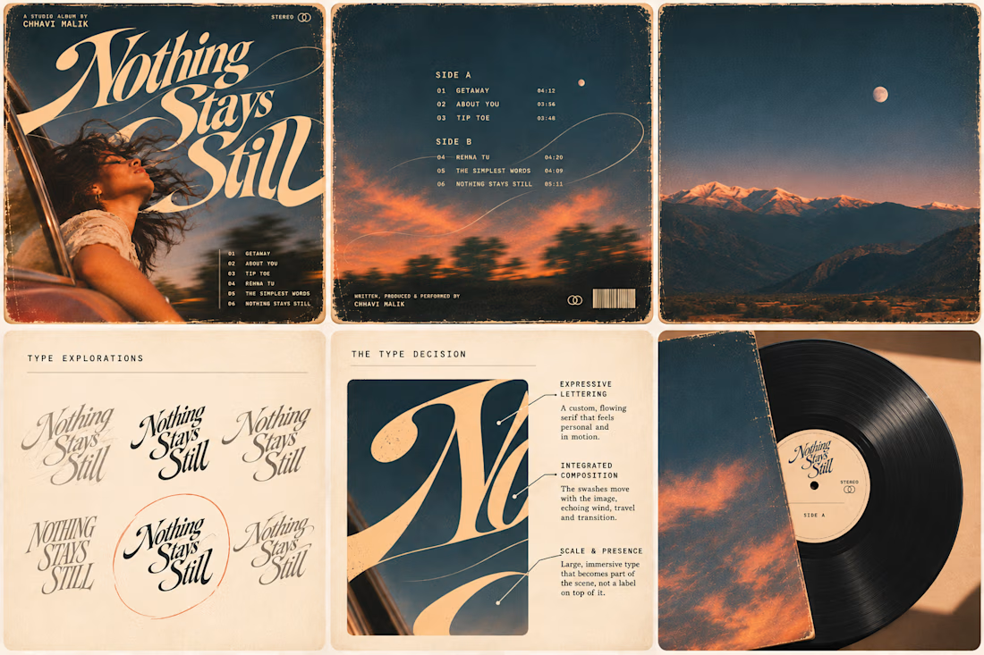
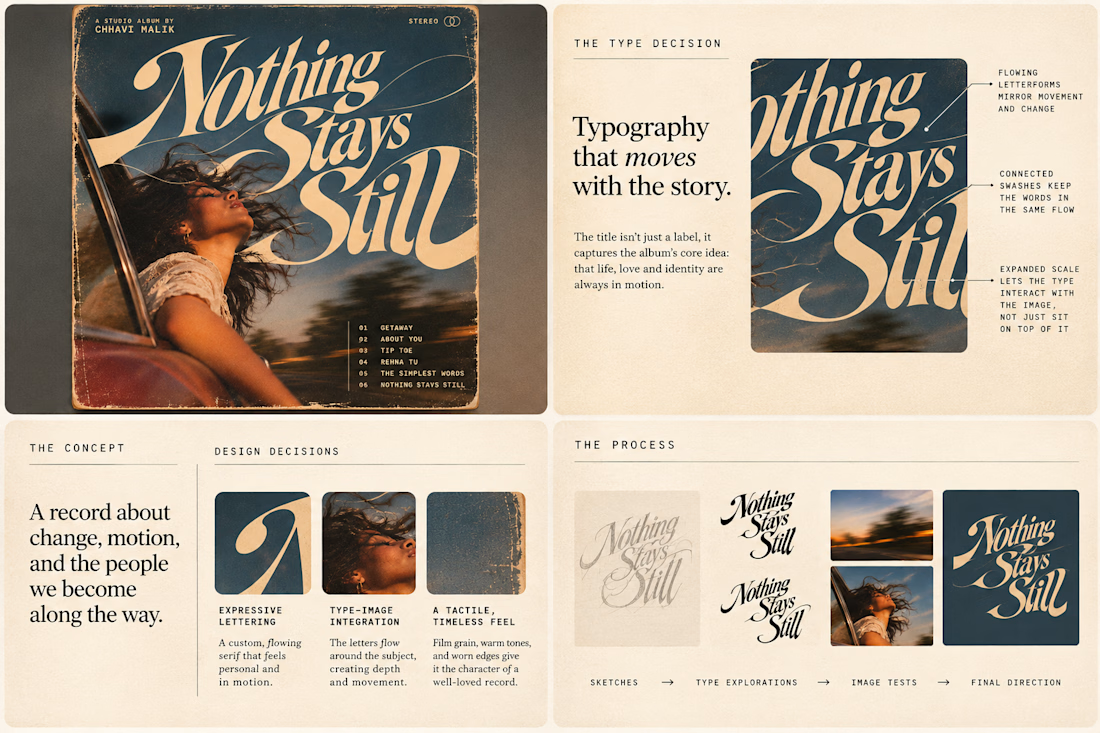
This question has been doing the rounds on X and I have to say, I'm firmly on the other side of that argument. I've always loved seeing typography become part of the artwork rather than just a title sitting on top of it.
So I wanted to put that idea to the test with an imagined album called Nothing Stays Still, inspired by change, fleeting moments and everything in between:)
I played around with the lettering until it felt expressive, a little restless, and inseparable from the photograph.
Because I think badly considered typography is tacky. Typography itself? Give it a chance :)
What's an album cover where the type really makes it for you?