The network for creativity
Join 1.25M professional creatives like you
Connect with clients, get discovered, and run your business 100% commission-free
Creatives on Contra have earned over $150M and we are just getting started
Back to feedPost
Fluxiom — AI-Powered Analytics Dashboard
A real-time monitoring dashboard that turns raw system metrics into decisions, not noise.
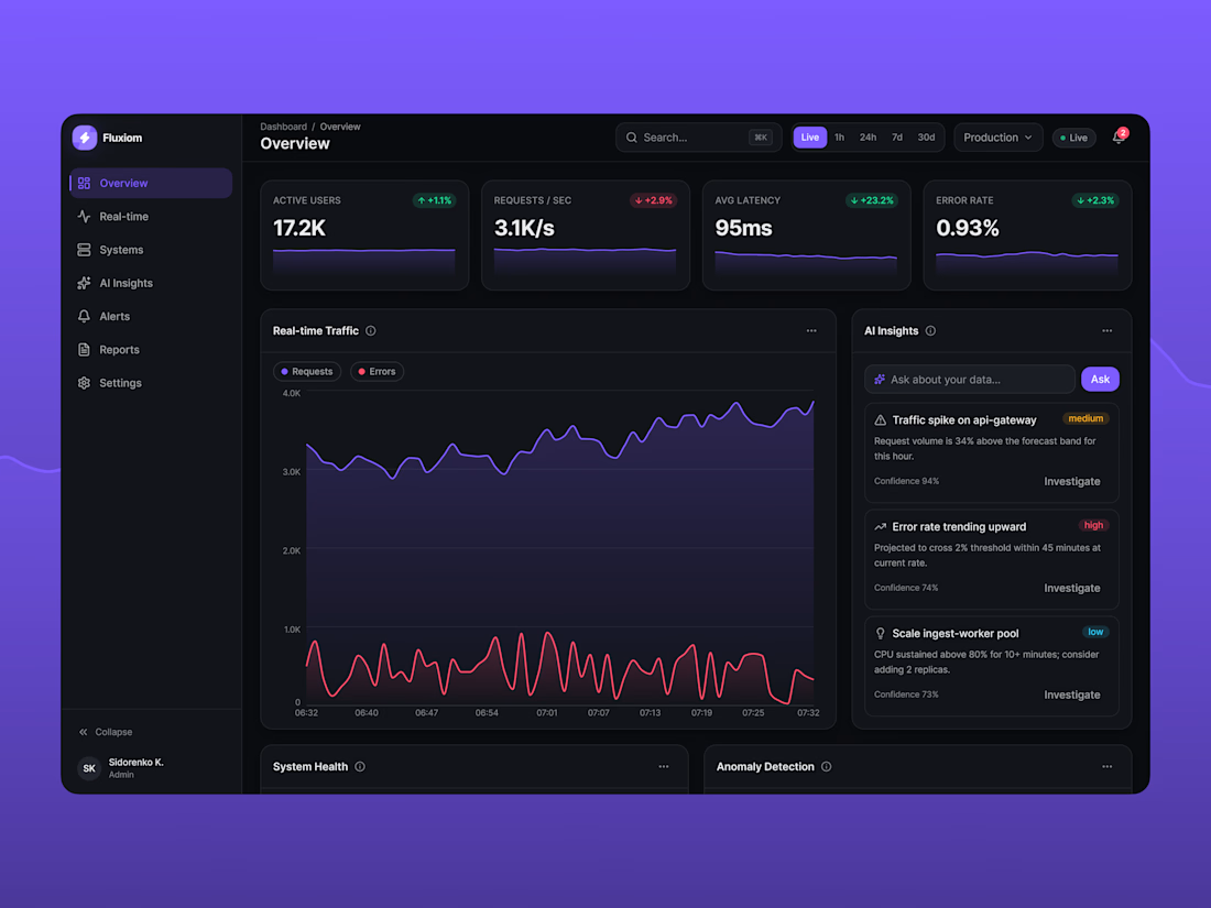
Pulse is a full analytics and observability platform concept designed for engineering and ops teams who need to watch live traffic, infrastructure health, and anomalies without digging through raw logs. It combines real-time data visualization with AI-generated insights, so teams can spot problems before they escalate — not after.
❓The problem
Most internal dashboards are either too sparse (a wall of numbers) or too busy (a wall of charts). Pulse was designed to sit in between: dense enough to be useful at a glance, calm enough to live on a screen all day.
What's inside:
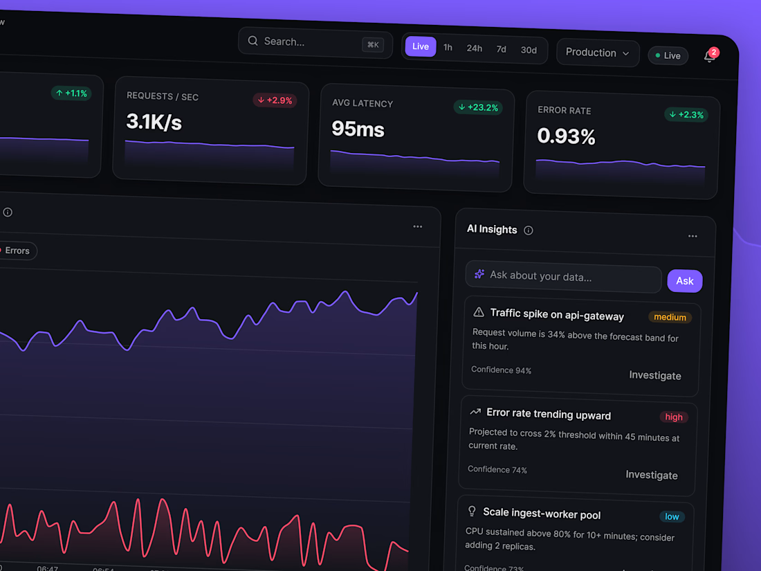
• Live KPI tracking — active users, request rate, latency, and error rate with animated deltas and sparklines
• Real-time traffic visualization — streaming charts that update every second without jank
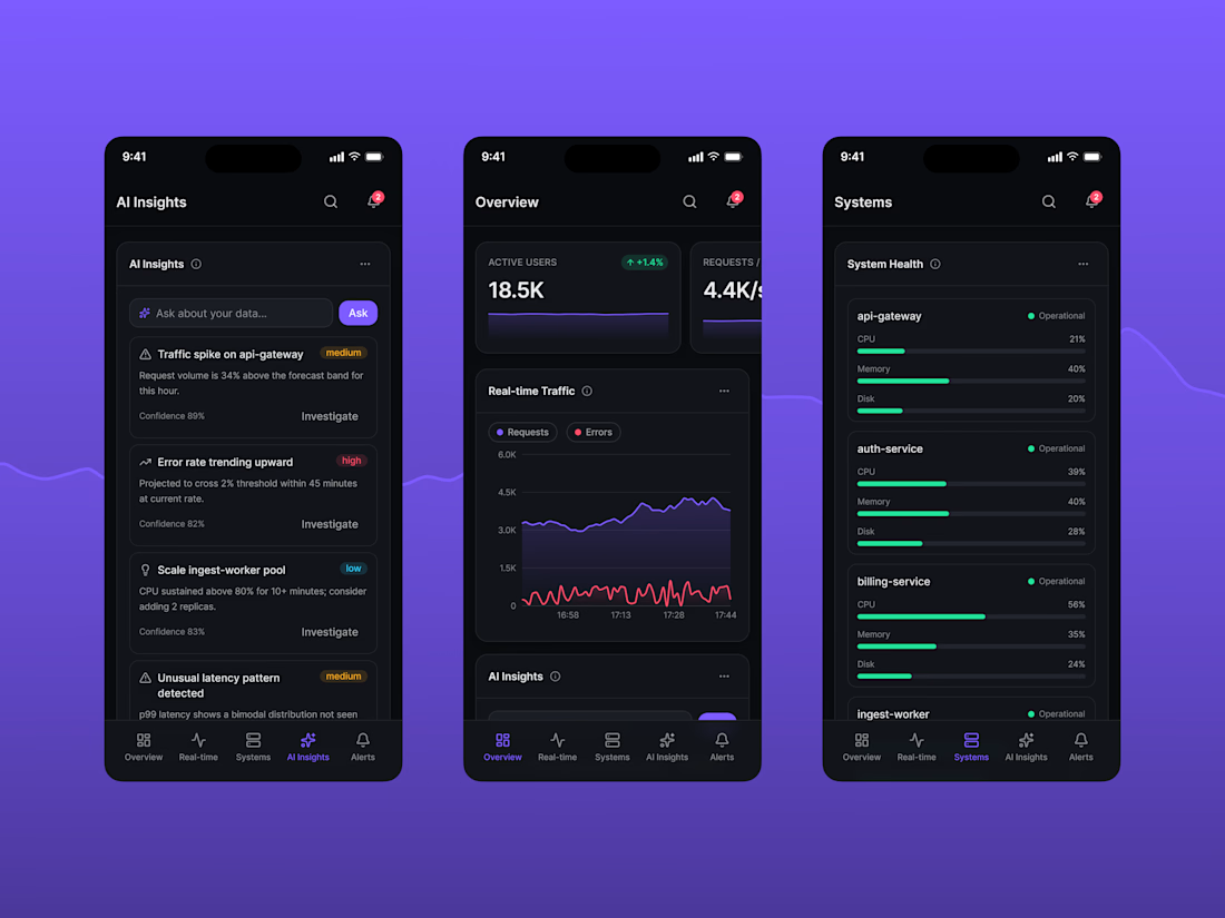
• AI Insights panel — surfaced anomalies, forecasts, and recommendations with confidence scores, plus a natural-language "ask your data" input
• System health grid — per-service CPU/memory/disk with threshold-based status coloring
• Anomaly detection — forecast bands with flagged outliers, so deviations are visible instantly, not buried in a table
• Live event stream & prioritized alerts — filterable, pausable, built for triage under pressure
🖼️ Design approach
Dark, high-contrast UI with a disciplined accent palette — color is used only to carry meaning (status, severity, trend), never decoration. Typography and spacing follow a strict 8px grid for consistency across dozens of data-dense components. Every widget has its own loading, empty, and error state — because a dashboard that only looks good with perfect data isn't production-ready.
🖥️ Fully responsive from a 375px phone to a 1920px ultra-wide monitor, with distinct, hand-tuned layouts for mobile, tablet, and desktop — not just a squeezed version of the same grid.



Hey guys 🌞
I’d love to hear what you think!
Any feedback is welcome, and I’m always up for a collab! ✨
The network for creativity
Join 1.25M professional creatives like you
Connect with clients, get discovered, and run your business 100% commission-free
Creatives on Contra have earned over $150M and we are just getting started







Related posts

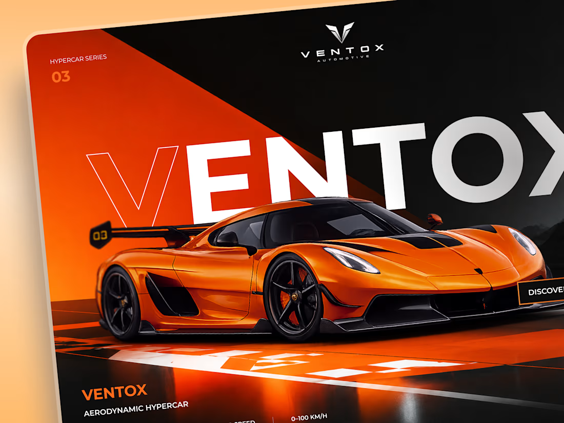
Ventox — Hypercar Landing Page 🏎️🔥
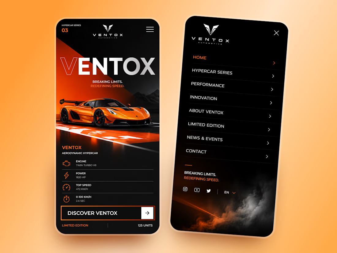
Ventox is a high-performance automotive landing page concept built around speed, exclusivity, and bold visual storytelling.
The design combines a striking orange hypercar, oversized typography, and a dramatic black-and-orange palette to create an immersive digital experience.
Special attention was given to:
A cinematic hero composition that puts the hypercar in the spotlight.
Oversized typography that reinforces the brand's identity.
Sharp geometric shapes and high-contrast colors inspired by speed.
Performance specifications presented in a clean, structured layout.
A prominent CTA that directs attention to the vehicle.
Responsive mobile layouts with simplified content and intuitive navigation.
The result is a bold automotive experience that brings together premium aesthetics, performance-focused storytelling, and clear navigation.
Looking to create a distinctive website for your automotive or luxury brand? Let's build something extraordinary. ⚡




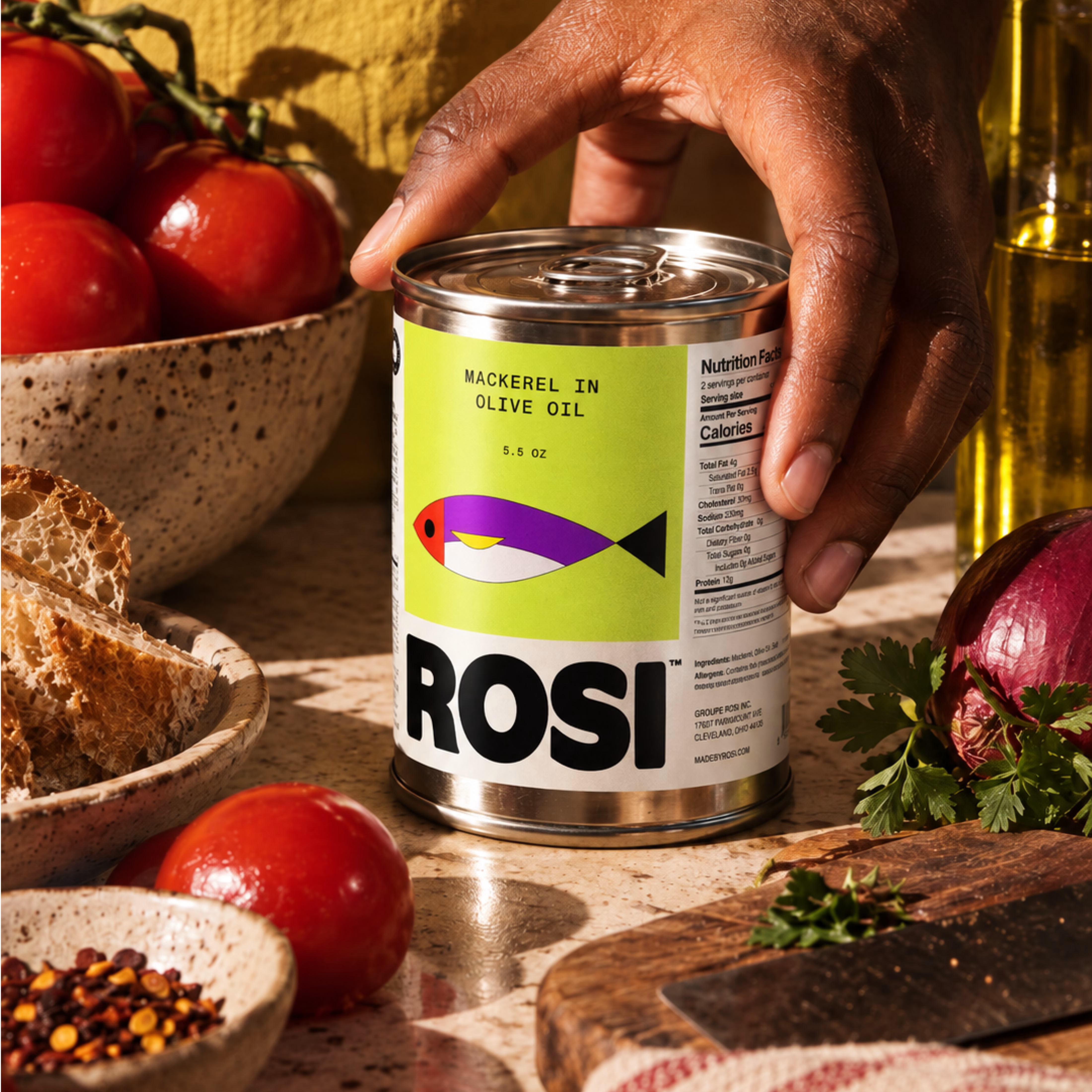
So, what is ROSI?
A few cans.
Five colours.
One very simple fish.
A ridiculously large wordmark.
And hopefully proof that everyday products don’t have to look everyday.

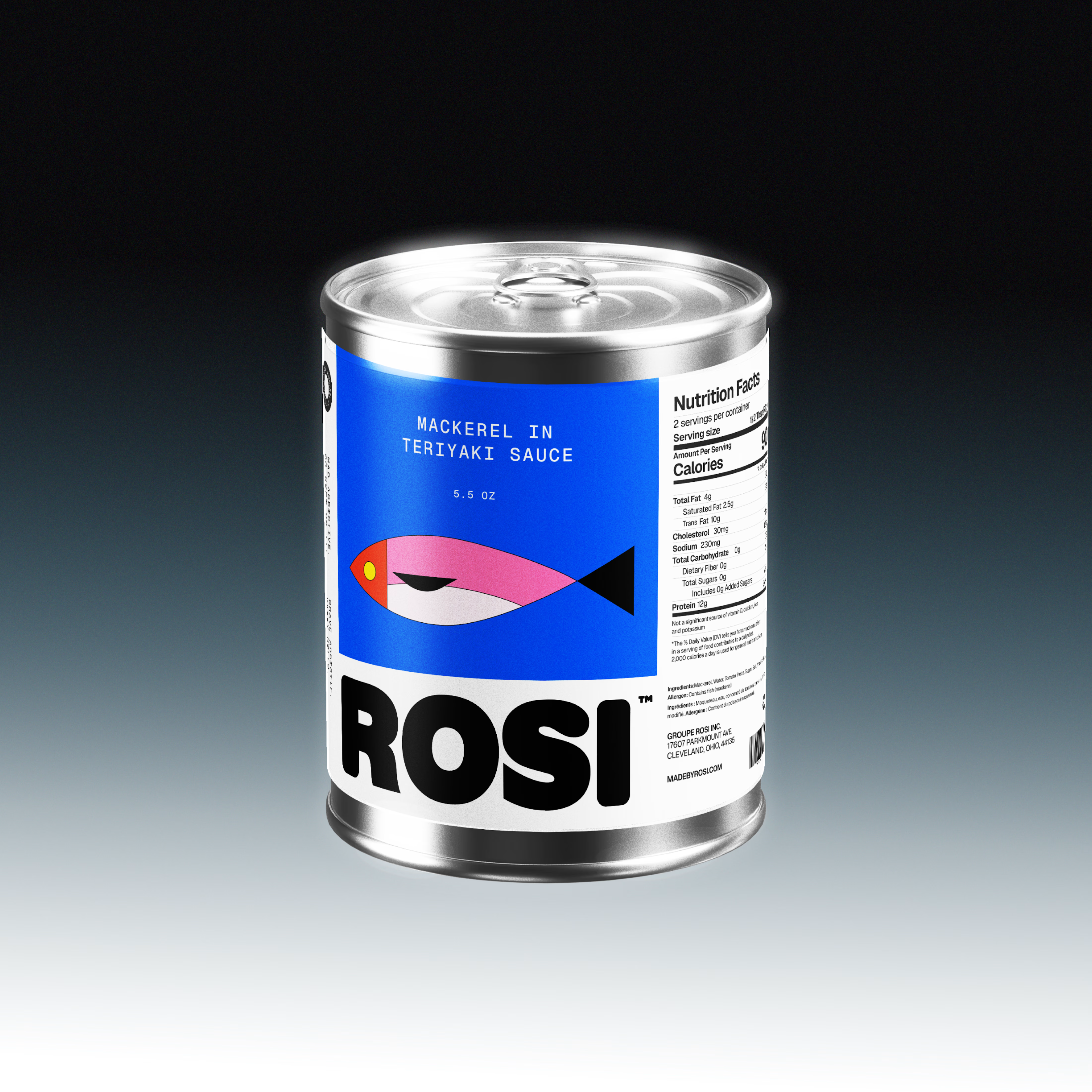
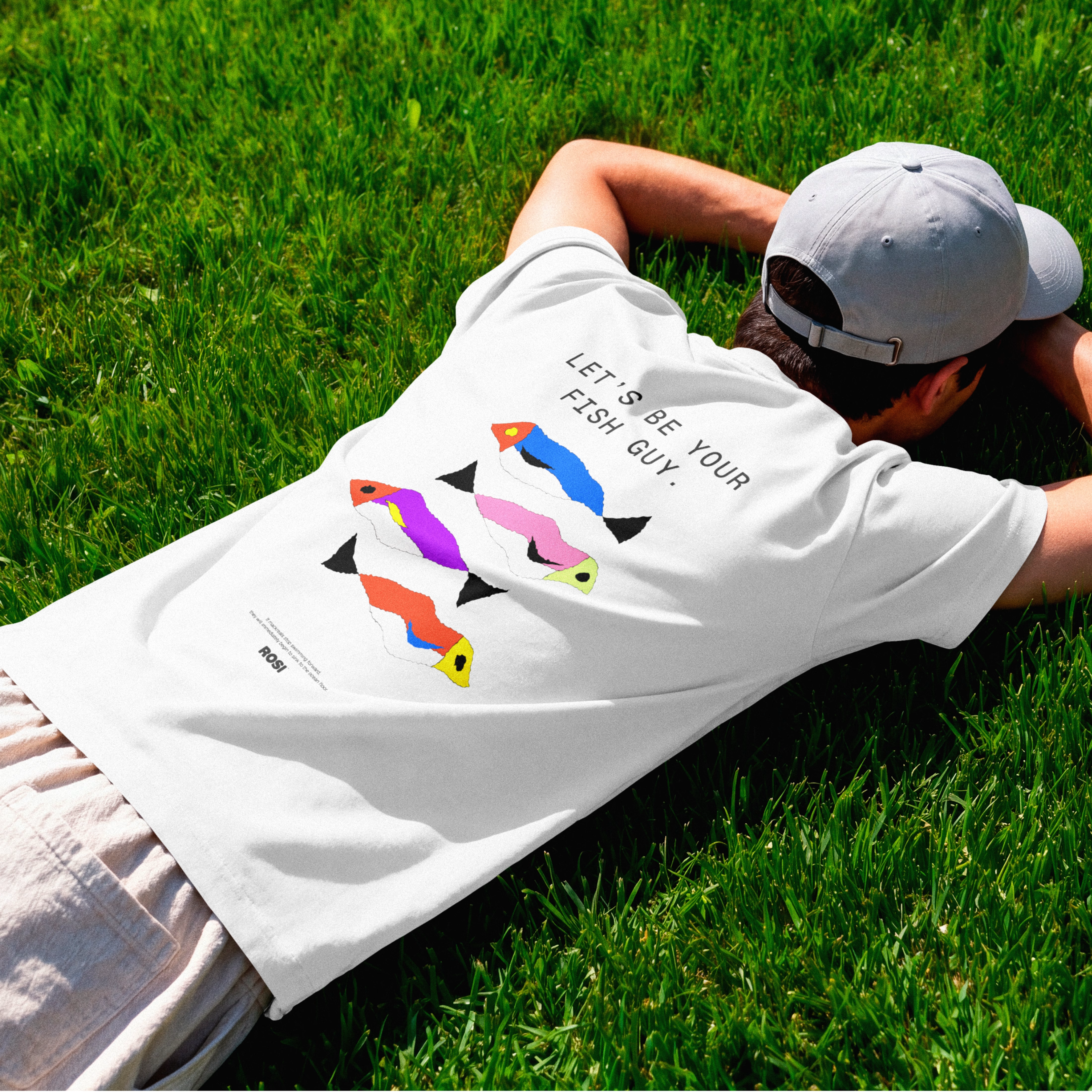

The ridiculously large wordmark is the entire personality, tinned fish has never strutted like this. Proof that confidence is a design decision, not a budget line.


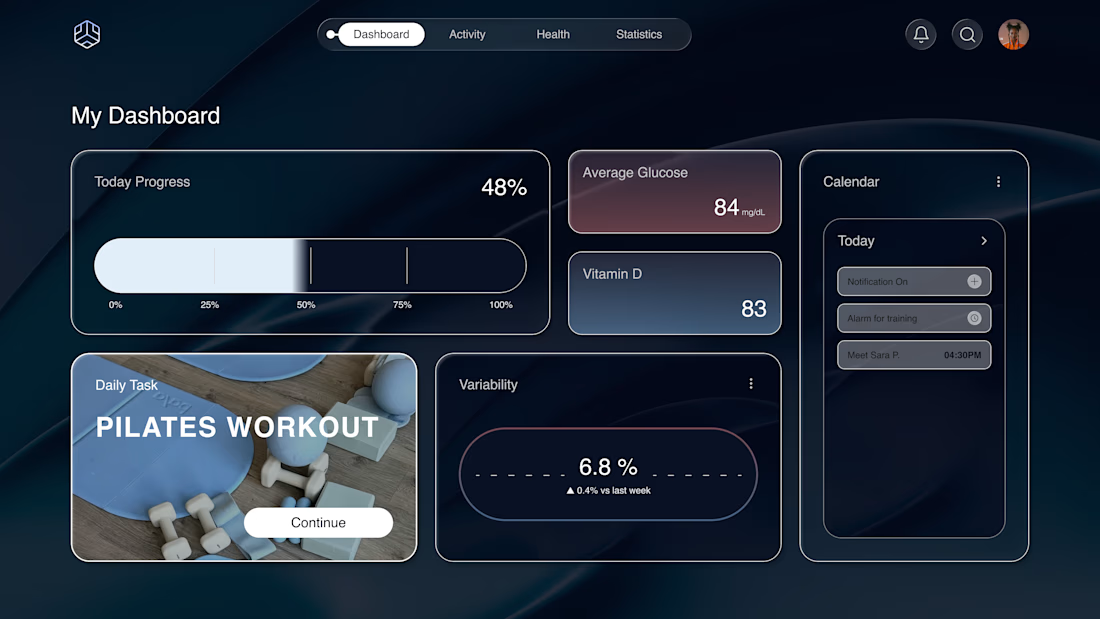
Why does a dashboard full of numbers still feel calm?
Bento grids are everywhere, and done right it's not a trend, it's information design. Each cell = one number, one meaning. The grid does the hierarchy for you.
Our three rules for a bento that works:
One idea per cell. Progress, glucose, one task. If a card needs two sentences, it needs two cards.
Mix the scale. One hero cell, a few mediums, one tiny stat, same gap everywhere.
One warm cell. A single card runs warm against the cool, dark screen; it carries the eye, and the rest stay quiet. No neon needed. Grids are calm. Content is loud. That's the whole trick.

Love the three rules. How do you handle this grid when it collapses to mobile without losing the hierarchy?