The network for creativity
Join 1.25M professional creatives like you
Connect with clients, get discovered, and run your business 100% commission-free
Creatives on Contra have earned over $150M and we are just getting started
Back to feedPost

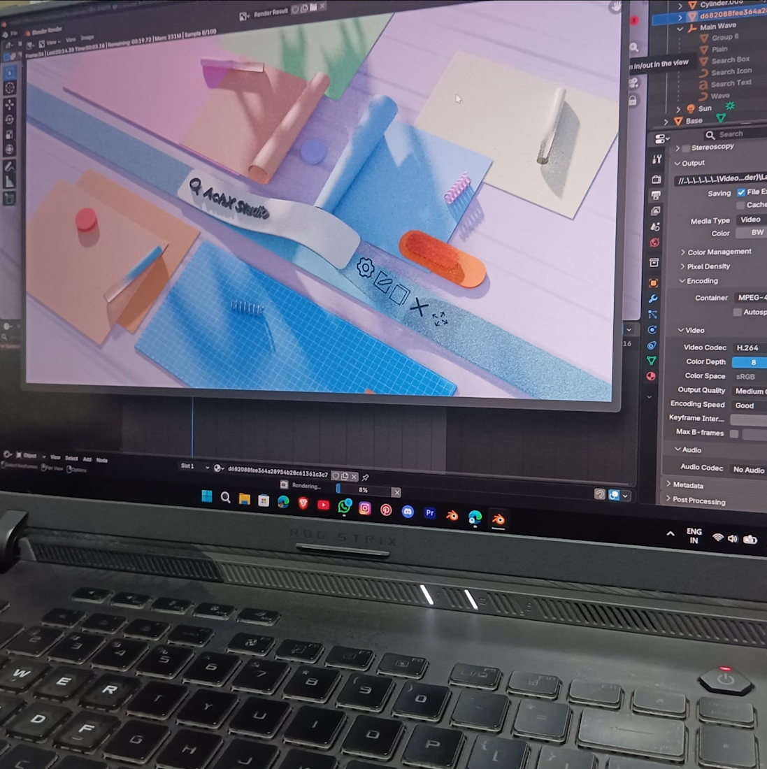
Day 3 of building our studio - achxstudio.com
Clients have been closed
work is in pace
About to launch something crazier soon!
working on a project soon to be posted.
Lets connect guys!
tell me what you guys building?
SaaS
Edit
Site
anything.

The network for creativity
Join 1.25M professional creatives like you
Connect with clients, get discovered, and run your business 100% commission-free
Creatives on Contra have earned over $150M and we are just getting started







Related posts

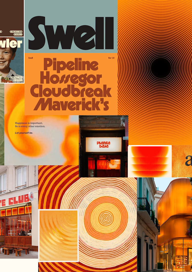
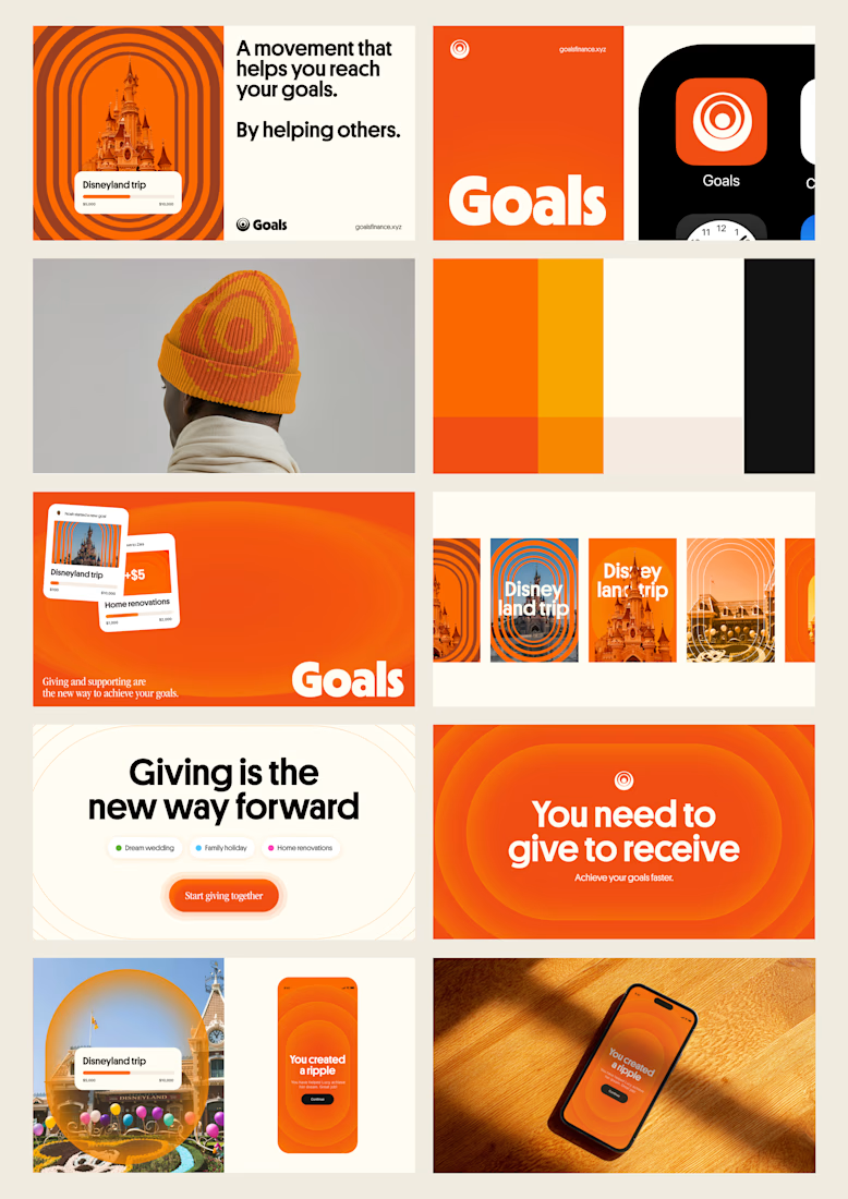
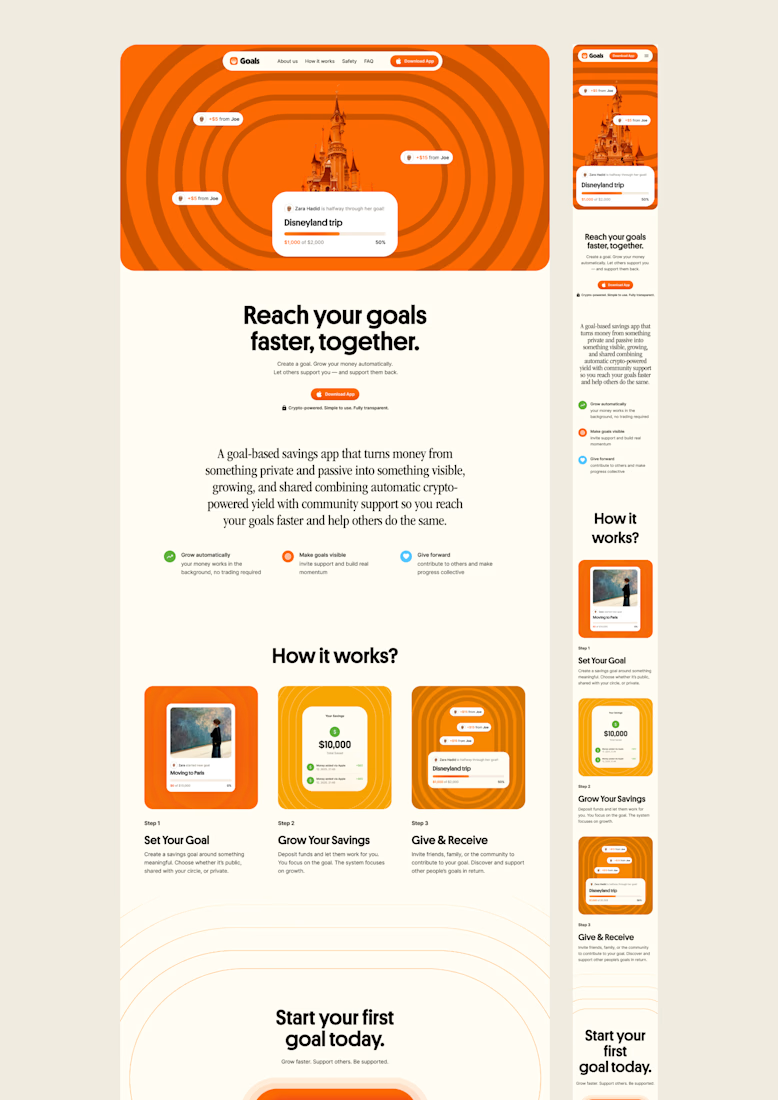
one of my favourite things about running a one-person studio is that nothing gets lost in translation.
the idea behind the brand is the same idea that shapes the website and the product.
no handovers, no starting from scratch, no trying to explain the vision to someone new.
a little look at how that came together for goals, from the first moodboard to the app ↓
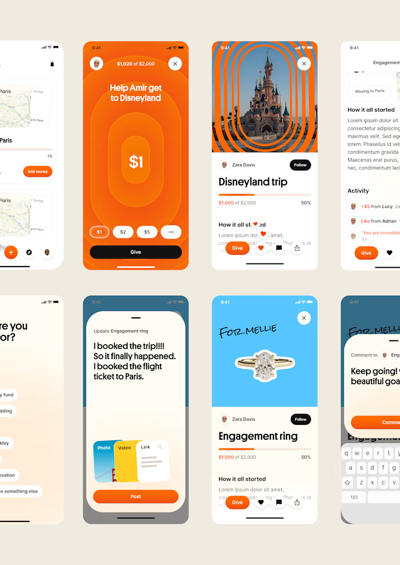

Love it!

HandOff ™. A short robotic study 3D cinematic. Check it out


That's stunning James great job your animations and visuals is unbelievable 🔥🔥🔥🔥🔥

NEOL. Making of the Hero
NEOL develops CuGlide™, a copper-based lubricant technology that reduces wear between metal parts.
I recently designed their website. The hero was the hardest part: two gears in contact, with a thin copper film where they meet. That's why I built it in 3D instead of generating it: AI video can't give that level of control and precision.
From the first draft to the live site.


Sleek work!