The network for creativity
Join 1.25M professional creatives like you
Connect with clients, get discovered, and run your business 100% commission-free
Creatives on Contra have earned over $150M and we are just getting started
Back to feedPost

A startup I recently worked with was managing almost their entire business through Excel sheets.
Leads.
Sales.
Appointments.
KPIs.
Ad performance.
Operations.
Everything.
One day they got hacked.
And just like that:
months of business data disappeared.
But honestly?
That wasn’t even the biggest problem.
The real issue was that they were already making decisions almost blind.
Their dashboards were just giant spreadsheets full of random metrics, duplicated data and badly represented graphs that gave no real visibility about what was actually happening inside the business.
So they were:
• scaling wrong campaigns
• misunderstanding performance
• missing bottlenecks
• making decisions based on incomplete or messy data
A lot of businesses think:
“we have dashboards”
when in reality they just have colorful spreadsheets.
There’s a huge difference.
The best systems today are moving toward:
→ centralized cloud data
→ structured pipelines
→ secure environments
→ real visualization layers
Personally, I think the current best combo is:
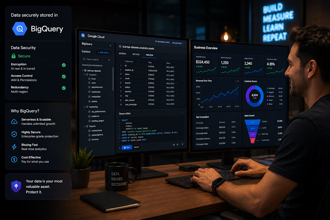
• BigQuery for scalable and secure data storage
• Claude Code to structure and manage workflows
• Custom React dashboards for clean visualization
Because data is not only about storing numbers.
It’s about being able to actually understand your business clearly enough to make good decisions.
Good visualization changes how companies operate.
Bad visualization quietly destroys them.
The network for creativity
Join 1.25M professional creatives like you
Connect with clients, get discovered, and run your business 100% commission-free
Creatives on Contra have earned over $150M and we are just getting started




Related posts

Everyone thinks a data dashboard should look complicated.
I think that is exactly why most of them fail.
I just finished Helios, a tool that tracks solar energy assets in real time. Dozens of sites, live output, verification records, a wall of numbers. The kind of screen people drown in.
Most designers would make it feel technical. More lines, more glow, more charts. I did the opposite. Every number had to answer one question in half a second, is this good or is this a problem. If it could not, it lost its place.
Because design is not decoration, it is closer to math. It is deciding what to remove until only the truth is left.
Complexity was never the enemy. Confusion is.
Get that right, and people trust you before you have said a word.
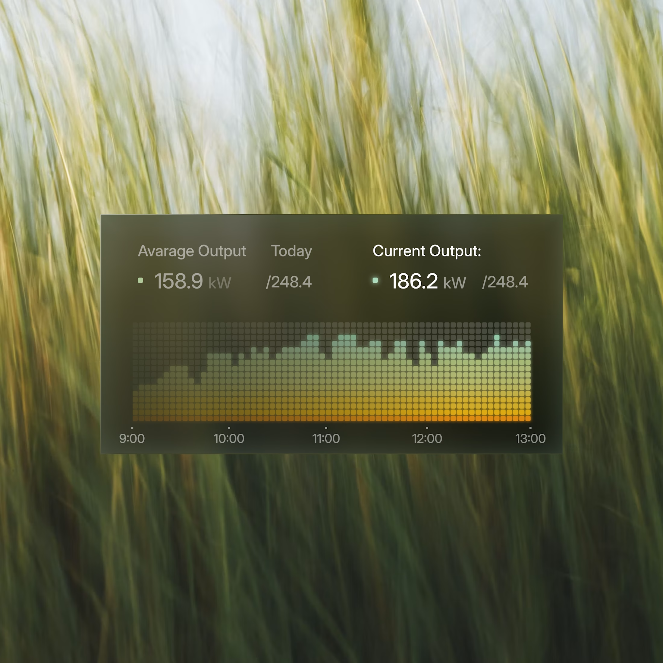
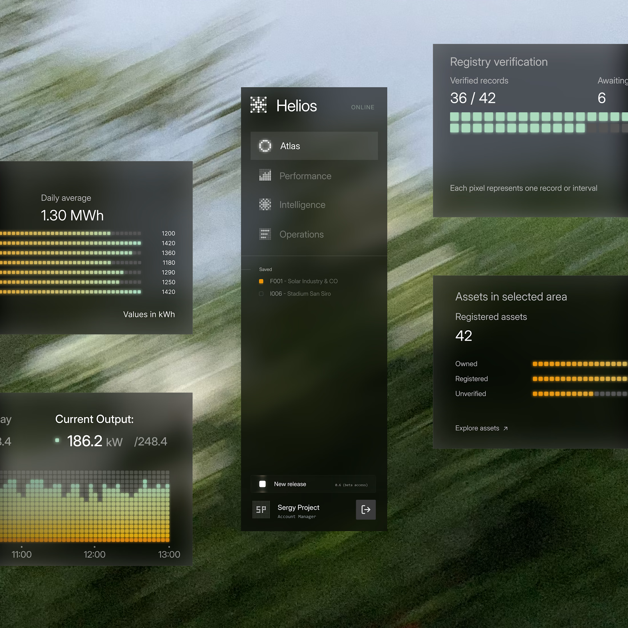

These components are perfectly executed, and the background is perfect for them.

Energy communities need to manage a lot at once: consumption, generation, members, billing, reports, alerts, and operational changes.
Wattbank explores a clearer SaaS dashboard experience for energy community operators. The interface brings key metrics, energy balancing, participant distribution, billing, reporting, and insights into one workspace that is easy to scan and act on.
The goal was to move away from heavy energy software and create something more visual, human, and operationally useful.


Which style wins for you? 🤔
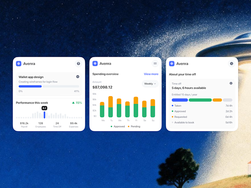
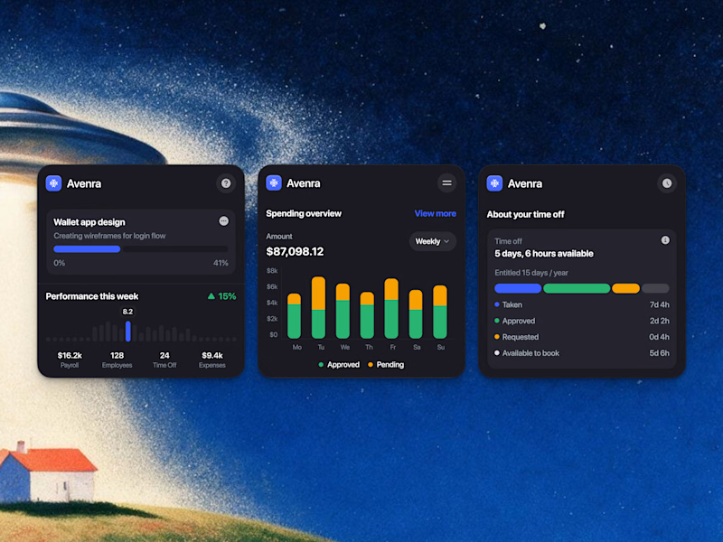
We’re testing out two theme directions for Avenra’s dashboard component cards; featuring real-time spending breakdowns, project progress metrics, and time-off tracking.
Curious to hear your thoughts! 💬
8 voted
42%
11 voted
58%
19 votes
Closed