The network for creativity
Join 1.25M professional creatives like you
Connect with clients, get discovered, and run your business 100% commission-free
Creatives on Contra have earned over $150M and we are just getting started
Back to feedPost
Taste Test
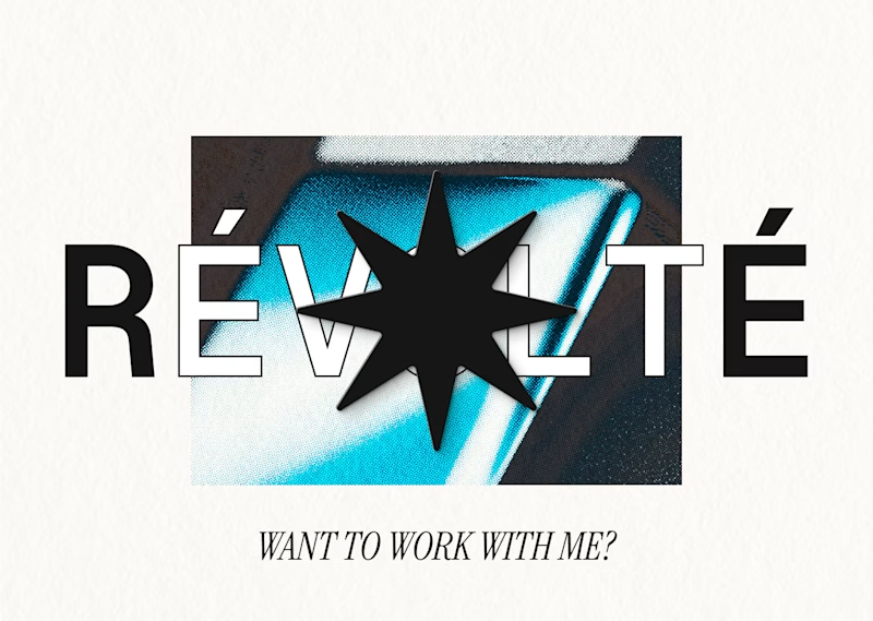
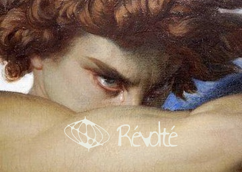
Guys, I need your opinion! I'm currently doing a rebranding of my personal brand (logo+branding) here the two that made the cut, which you prefer?
A) Grainy and 3d
B) Handwritten logo and classic art reference
32 voted
38%
52 voted
62%
84 votes
Closed
Handwritten doing work 🙌
Awesome representation.
A. is giving renaissance and historic (minimalist)
B. is giving retro vibes (freestyling the layout and cool vibes)
Nice work
Amazing!
Team "handwritten logo" here!!
I love both, tbh. However, I think grainy and 3d vibe is looking too conventional. Handwritten one has more personality.
My only suggestion would be making your handwritten logo more prominent compared to the other elements.
I would go to A.
I feel like B has the most personality!
The network for creativity
Join 1.25M professional creatives like you
Connect with clients, get discovered, and run your business 100% commission-free
Creatives on Contra have earned over $150M and we are just getting started
Related posts
Some of you guys might not know, but I'm doing a challenge called "Markdaily": 30 days, one brand a day. I'm currently at 27/30 and wondering which brand should be the last one on day 30, so why not let you choose?
A) Streetwear brand, chromium/mercury heavy aesthetic, rebellious
B) Pan-Asian cuisine brand, with visual language rooted in the material culture of mid-century Southeast and East Asian commercial print
17 voted
57%
13 voted
43%
30 votes
Closed
Congratulations on hitting day 27! 🔥
I’m leaning toward Option A. A 'chromium/mercury heavy' aesthetic is the perfect playground for 3D-infused layouts and high-contrast visuals. It’s a high-stakes style that really stress-tests a brand's ability to stay premium while being rebellious.
Can’t wait to see the final ship!
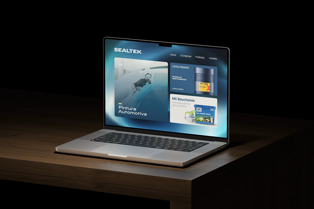
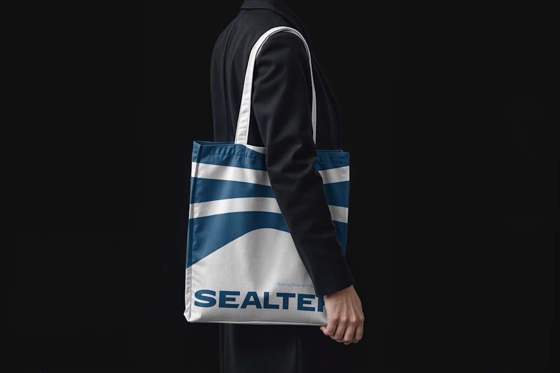
We are happy to share a new case study!!
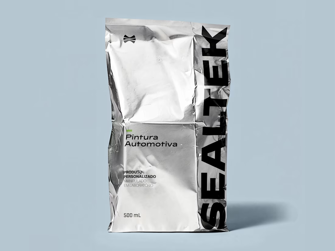
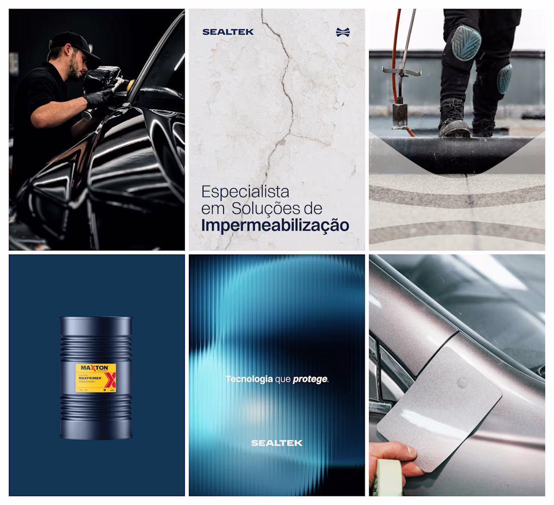
Naming and Brand Identity for Sealtek
Sealtek is a company that operates across two complementary fields: waterproofing solutions for civil construction, and automotive paint services and sales.
great job 👌
Old vs. New! 🎨 I recently took this existing logo and gave it a modern concept redesign.
My goal was to refine the visual identity, making it cleaner and more scalable while preserving the brand's core essence. But I’d love to hear from this community!
Take a look at the comparison and let me know: Does the new version hit the mark, or does the original still hold up?
3 voted
50%
3 voted
50%

6 votes
Closed
Both look great and the old still works
Trending
Claude
Claude has entered the design space. How are you using Claude Design?
Contra University
Learn from expert creatives how to earn more using next-gen AI tools.
creativeaiflow
Creative AI workflows are evolving. What tools do you use, and what are their strengths and weaknesses?
portfolioreview
The best portfolios tell a story, not just show a grid. Share yours for feedback.
freelancerlife
Freelancer life is wins, pivots, and everything in between. What’s yours right now?