The network for creativity
Join 1.25M professional creatives like you
Connect with clients, get discovered, and run your business 100% commission-free
Creatives on Contra have earned over $150M and we are just getting started
Back to feedPost
Taste Test

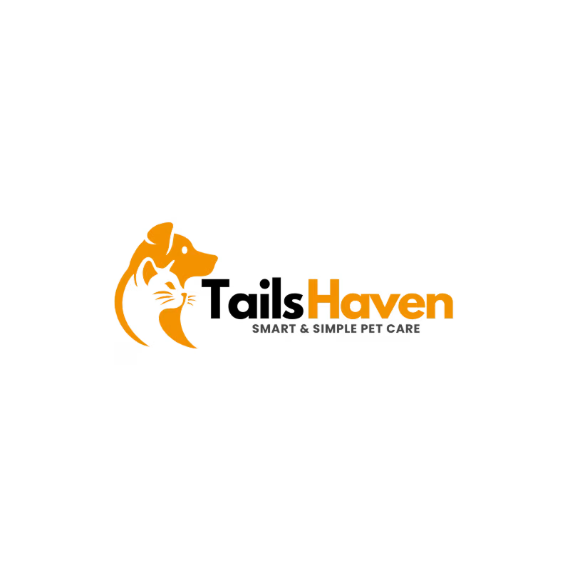
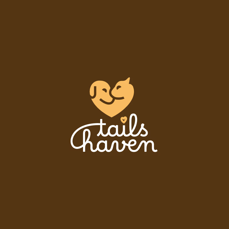
Old vs. New! 🎨 I recently took this existing logo and gave it a modern concept redesign.
My goal was to refine the visual identity, making it cleaner and more scalable while preserving the brand's core essence. But I’d love to hear from this community!
Take a look at the comparison and let me know: Does the new version hit the mark, or does the original still hold up?
3 voted
50%
3 voted
50%
6 votes
Closed

Nice!

Both look great and the old still works
The network for creativity
Join 1.25M professional creatives like you
Connect with clients, get discovered, and run your business 100% commission-free
Creatives on Contra have earned over $150M and we are just getting started





Related posts


Collage


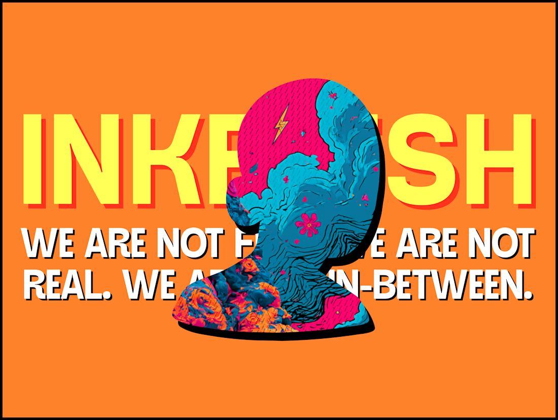
The INKFLESH mark I designed starts with an empty profile avatar. A deliberately plain shape for an identity full of strange characters.
The characters needed room to change. The identity also had to work on a woven label or an app icon, where a detailed illustrated face has very little space to do its job.
I kept the silhouette and palette constant, then let the artwork change around them. The mark can hold an illustration, appear as a solid stamp, or sit on its own at a small size. Each version still has the same shape underneath.
That was the useful constraint: decide what someone should recognise when the most expressive part of the design disappears.
If your identity depends on a detailed illustration, try its smallest application before approving the whole world around it.

Super bold and creative! Love the vibrant colors. 🔥

Ceya Logo & Visual Identity, 2025.
Two offset circles, one idea: a partner that’s always alongside you. 🟢🔵
Full case study in my portfolio.
Got a project ? Let's talk about it.

Great visual identity it was so attractive and unique 🎉🎉🔥🔥