The network for creativity
Join 1.25M professional creatives like you
Connect with clients, get discovered, and run your business 100% commission-free
Creatives on Contra have earned over $150M and we are just getting started
Back to feedPost
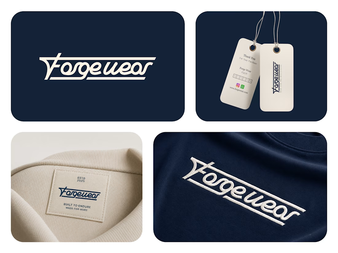
Forgewear — Built to Endure.
A bold and refined visual identity created for a modern clothing brand built around strength, durability, and timeless style.
The custom wordmark combines strong geometric structure with fluid lettering to create a distinctive and memorable brand signature. The extended lines give the logo a sense of movement and continuity while reinforcing the idea of durability and craftsmanship.
The identity is designed to work seamlessly across apparel, woven labels, hangtags, embroidery, packaging, and digital applications.
Brand: Forgewear
Industry: Fashion / Apparel
Focus: Logo Design & Brand Identity



Interesting logotype 🔥

Thanks mate
The network for creativity
Join 1.25M professional creatives like you
Connect with clients, get discovered, and run your business 100% commission-free
Creatives on Contra have earned over $150M and we are just getting started




Related posts


Some logos try to say everything.
The best ones say just enough.
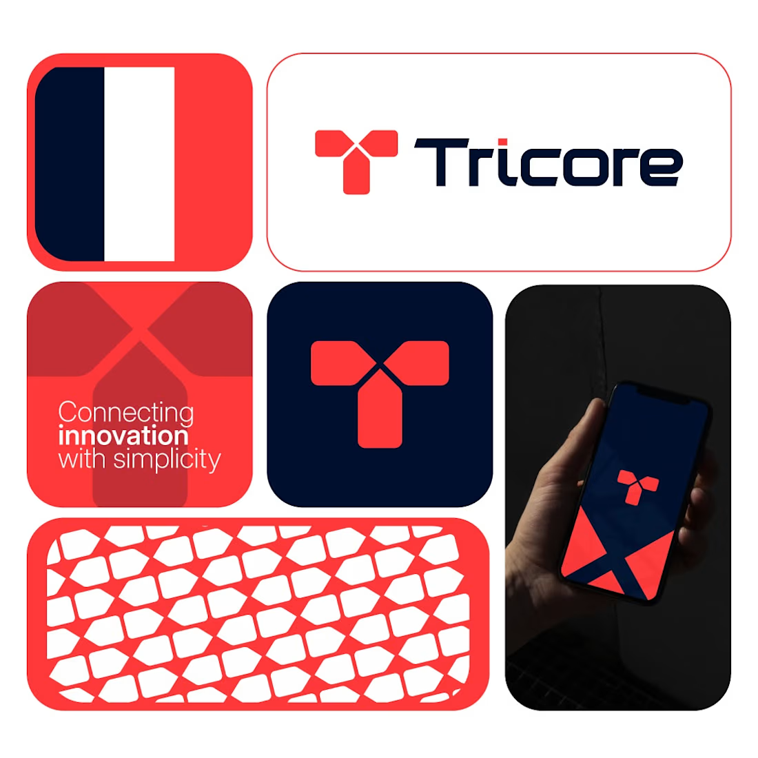
Tricore was built around a simple visual concept:
three connected elements working together as one system.
No unnecessary details.
No visual noise.
Just a clean identity designed to be memorable across screens, products, and future brand applications.
A strong logo should still be recognizable when:
• Scaled down
• Viewed quickly
• Seen from a distance
That's the standard I try to design for.
What's your first impression of this identity?
👇 One word only.


Cohesive.
A logo should feel like the industry it belongs to.
Before reading the name, you should already get an idea of what the brand represents.
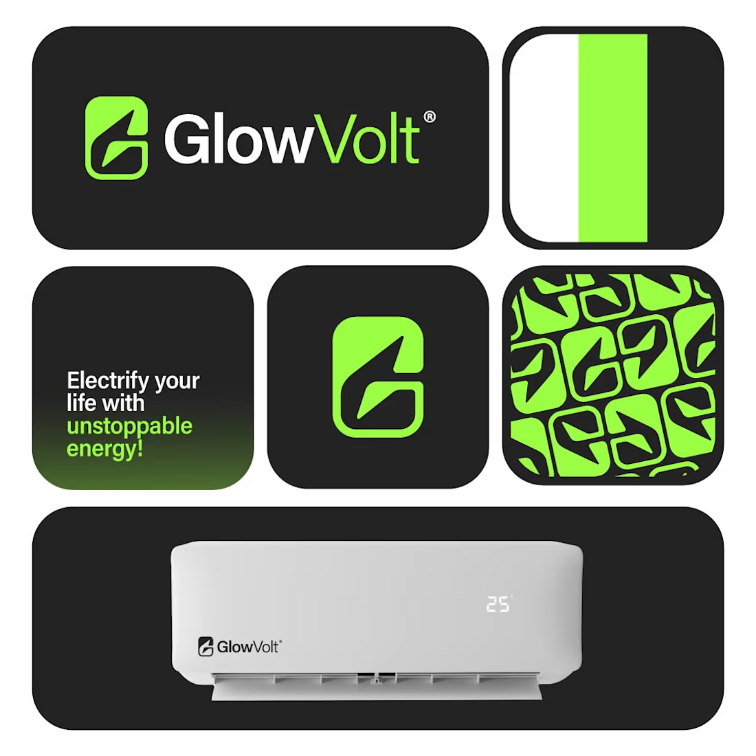
For GlowVolt, the objective was to create something that communicates:
⚡ Energy
⚡ Innovation
⚡ Reliability
without relying on obvious symbols or unnecessary complexity.
The result is a clean, modern identity that can scale across digital platforms, products, packaging, and future marketing materials.
Strong branding isn't about decoration.
It's about recognition.
What industry would you guess this brand belongs to before reading the name?
👇 Curious to hear your answers.
#LogoDesign
#BrandIdentity
#VisualIdentity
#Branding
#GraphicDesign
#LogoDesigner
#ModernLogo
#CreativeDesign
#BrandStrategy
#Designsburner

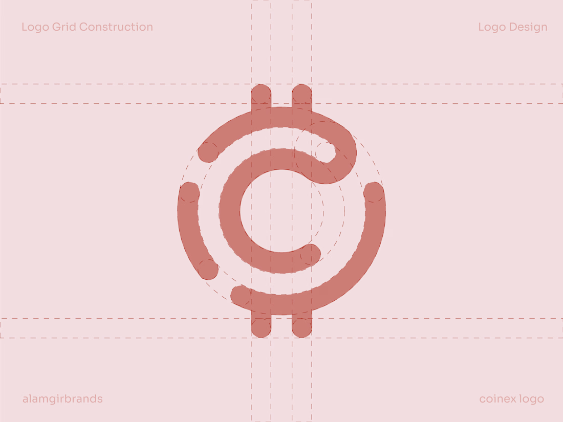
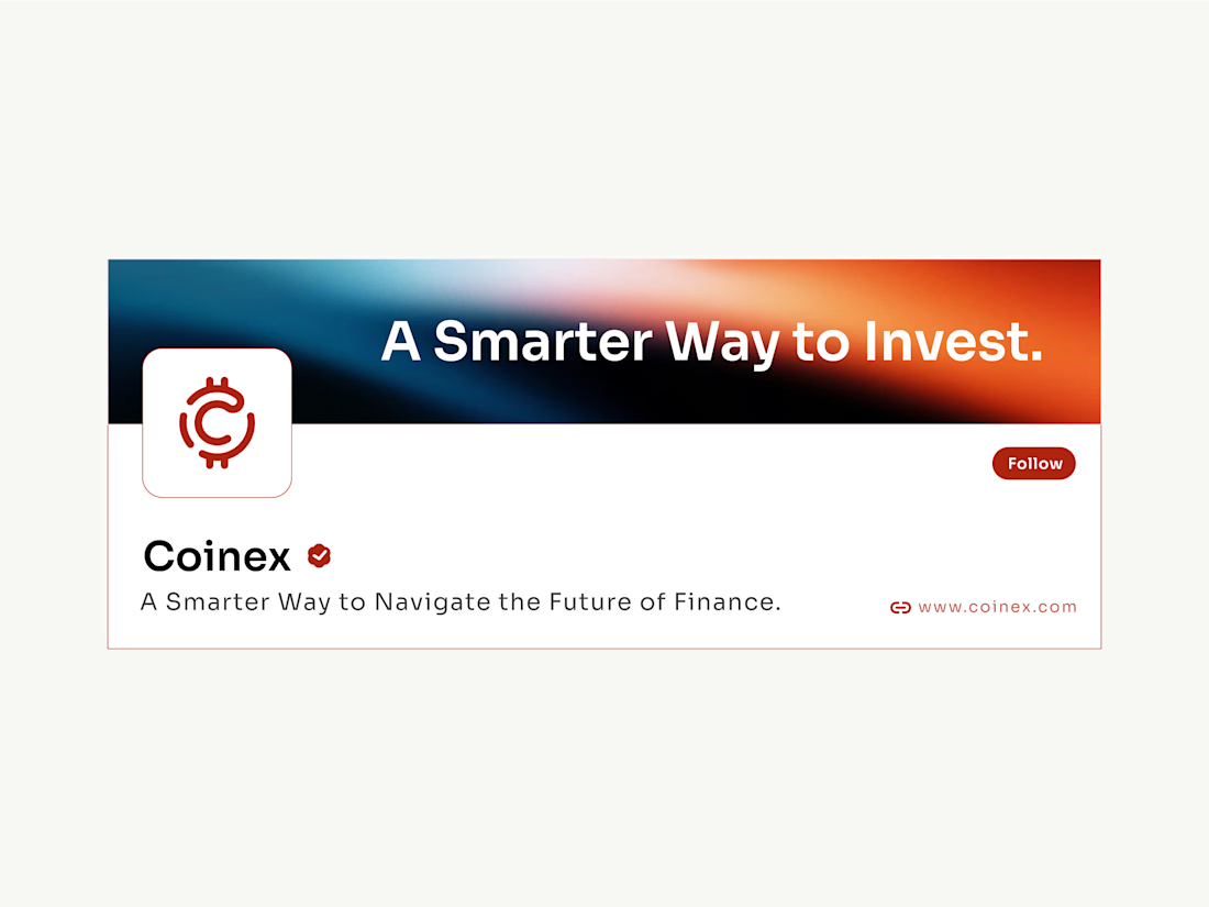
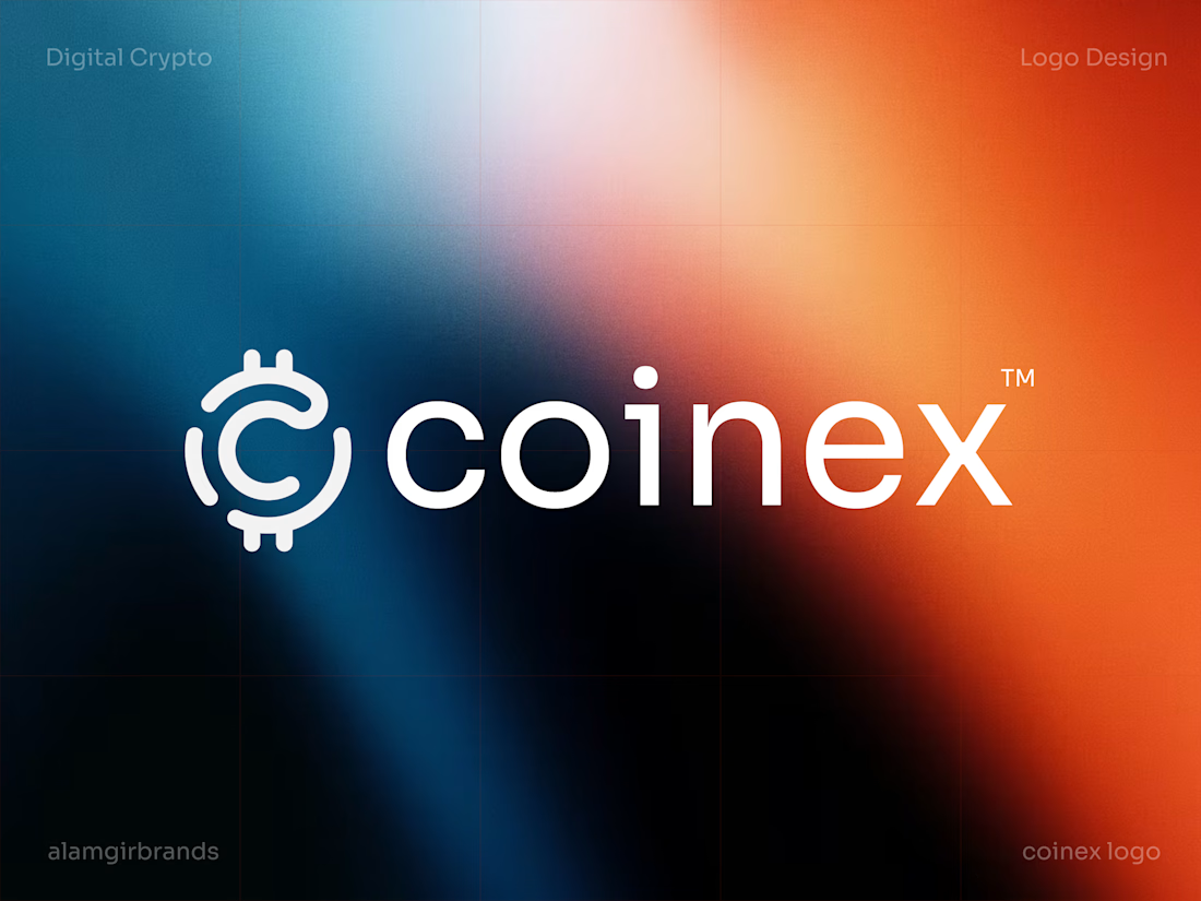
A closer look at the Coinex logo I designed.
The mark builds off a coin silhouette, with the two bitcoin-style ticks anchoring top and bottom while a looping "C" spirals in from the outer ring. It reads as a coin and a currency symbol at once, without spelling either out too literally.
The wordmark stays low and steady underneath, so the mark carries all the motion. Everything's drawn as a single continuous stroke with rounded caps, which lets it sit clean and legible at icon size, even before you add in the gradient it lives on in the wider identity.