The network for creativity
Join 1.25M professional creatives like you
Connect with clients, get discovered, and run your business 100% commission-free
Creatives on Contra have earned over $150M and we are just getting started
Back to feedPost
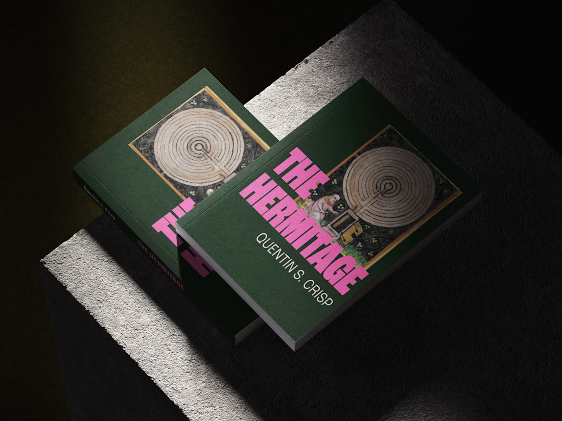
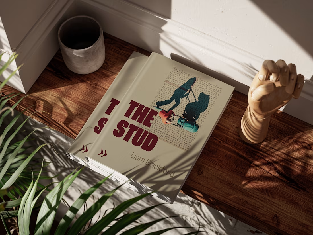
How do you give a publisher's fiction titles a recognisable identity while allowing each book to retain its own character?
For Verdurin, I developed a visual direction for a fiction title and created a design system to guide future fiction projects. The work brought cover design, typography, and colour into a consistent framework, giving the publisher a repeatable approach to future titles rather than a one-off design.



Great work!!

Thank you so much!!😊
The network for creativity
Join 1.25M professional creatives like you
Connect with clients, get discovered, and run your business 100% commission-free
Creatives on Contra have earned over $150M and we are just getting started

Challenges
View all


Related posts

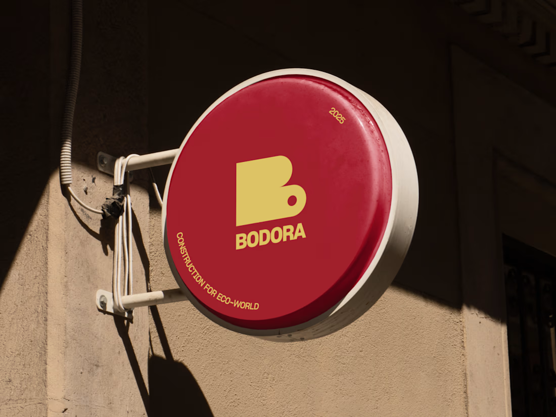
Real Estate Agency Logo
A brand identity concept for a modern real estate agency, designed to create a professional and recognizable presence across digital and physical touchpoints.
The logo system focuses on simplicity, scalability and distinctiveness — allowing the identity to work across property listings, signage, stationery, social media and web applications.
The goal was to create a mark that feels established without falling into familiar real estate branding clichés.
Design focus:
• Logo Design
• Real Estate Branding
• Brand Identity
• Visual Identity
• Brand Applications
• Art Direction
Designed by WaxyWeb.
Brand DesignGraphic DesignAdobe IllustratorAdobe PhotoshoprealestatelogoLogo Designbrandinggraphicdesign

Good!

SYSTEM IN MOTION — Exploring Responsive Graphic Design
What happens when a visual identity moves beyond static composition and becomes a dynamic, responsive design system?
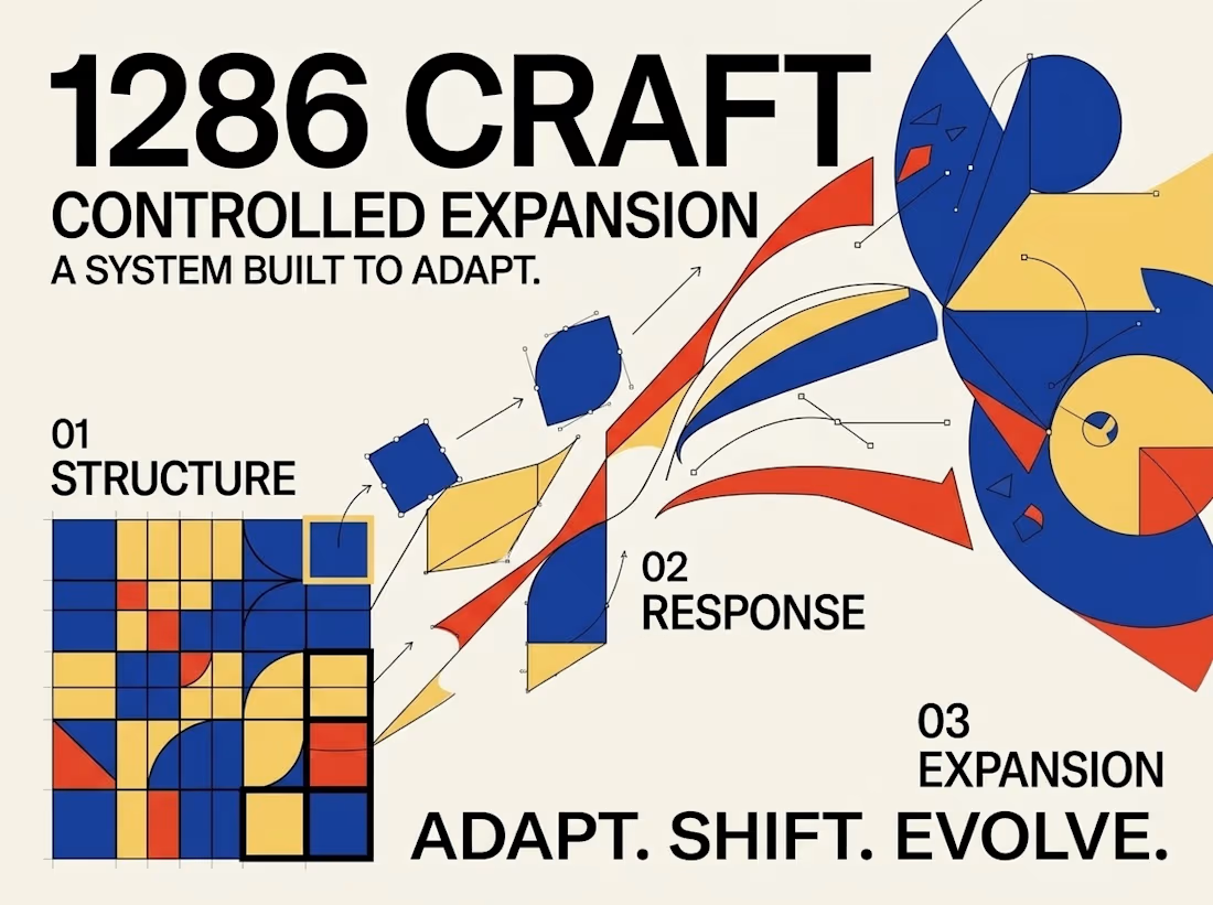
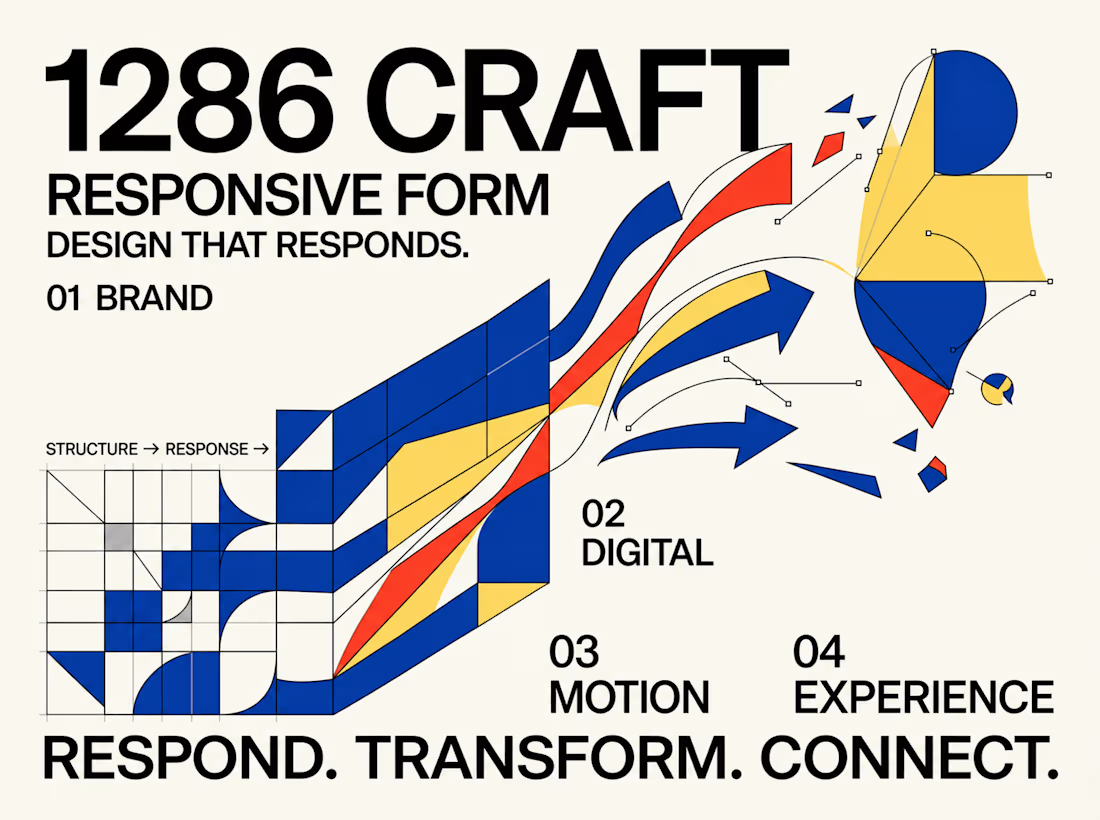
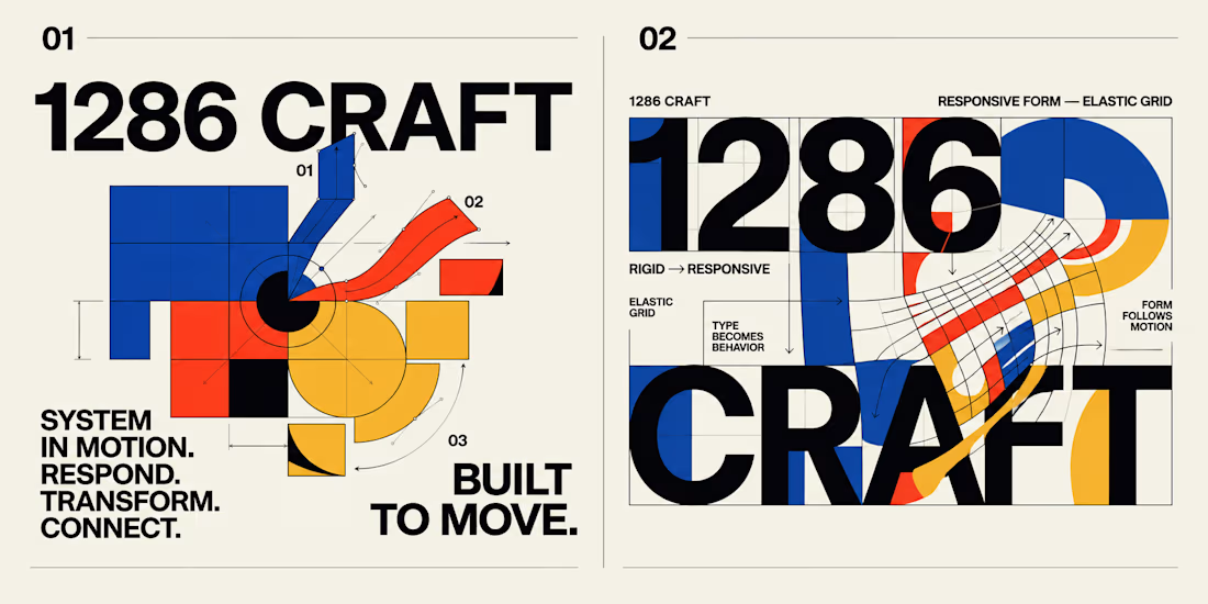
This experimental graphic design project for 1286 CRAFT explores the relationship between bold typography, geometric structures, elastic grids, and kinetic motion.
Built around a distinctive visual language of cobalt blue, vibrant red-orange, warm yellow, and high-contrast black, the project transforms rigid graphic elements into expressive, adaptable compositions.
The Creative Direction
The concept begins with structured grids, modular geometry, and strong typographic hierarchy. These foundational elements gradually evolve into fluid forms, curved pathways, directional movements, and interconnected visual systems.
Each composition investigates a different aspect of transformation, demonstrating how consistent design principles can support both precision and creative flexibility.
From Static Design to Motion
The project extends beyond traditional poster design through a short motion sequence that brings the visual system to life.
Geometric forms expand, intersect, rotate, and transition into flowing compositions, creating a seamless relationship between static graphic design and motion-driven storytelling.
The Design Philosophy
Great visual systems should do more than look consistent. They should communicate, respond, evolve, and create meaningful connections across different formats and experiences.
This exploration brings together experimental typography, editorial composition, modular design, and motion principles to demonstrate how a single creative direction can become a cohesive visual language.
RESPOND. TRANSFORM. CONNECT.
BUILT TO MOVE. DESIGNED TO EVOLVE.
Creative Direction & Visual Design — 1286 CRAFT
#GraphicDesign #BrandIdentity #MotionDesign #VisualSystems #Typography #CreativeDirection #1286CRAFT



When the grid starts bending into those curved pathways, what keeps it reading as 1286 CRAFT, the palette or the type? Curious which one you treated as the non-negotiable.

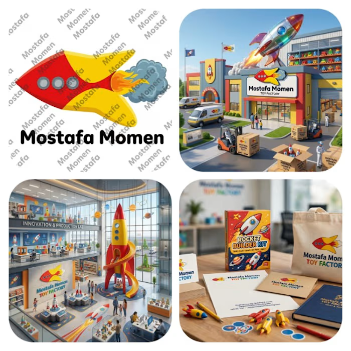
That's my modern minimalist joyful logo that's my case study for it Everything has its joy and kids toys has its own I design this logo because I want to try something different
This logo is mix between vibrant pure yellow and red colors with bold curvy cartoony rocket with cartoony fire and smoke
this logo focus on emotion fun and joy it help to solve the problem of (building trust, showing professionalism & value of brand, memorization, recognition) specially creating attention to attract kids and potential clients