The network for creativity
Join 1.25M professional creatives like you
Connect with clients, get discovered, and run your business 100% commission-free
Creatives on Contra have earned over $150M and we are just getting started
Back to feedPost

Meet POISE Pilates. ✨
A space where strength meets softness, movement becomes mindful, and balance turns into a way of life.
Inspired by the harmony of body and mind, POISE is designed to make every movement feel intentional and every step feel empowering.
I’d love to hear your thoughts! Does this visual identity capture the feeling of a Pilates studio to you? And which element stands out to you the most? 🤍
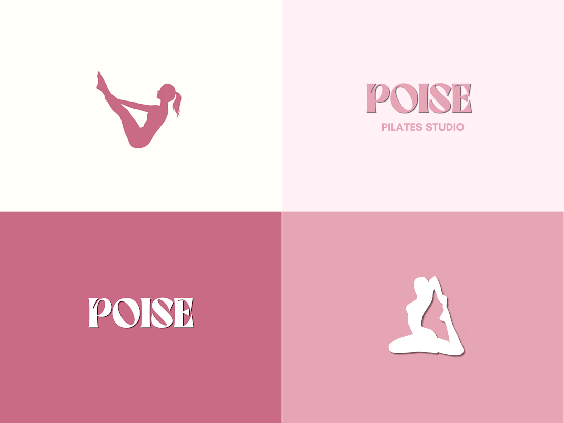
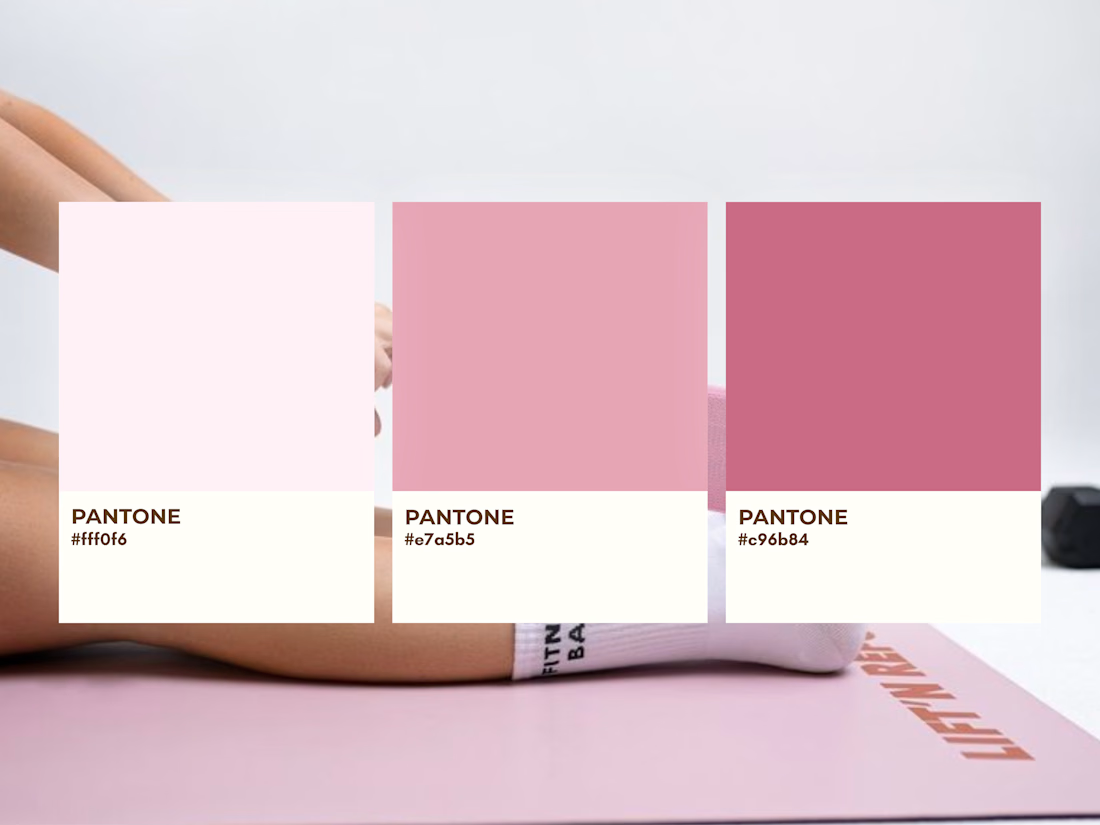

Yes, it captures the Pilates feeling really well. The rose palette with the Pantone cards and that meditative pose mark is the standout for me, it reads strength meeting softness exactly like your brief.
Thank you so much! 🤍 I’m so happy that feeling comes through in the visuals!
The network for creativity
Join 1.25M professional creatives like you
Connect with clients, get discovered, and run your business 100% commission-free
Creatives on Contra have earned over $150M and we are just getting started






Related posts

Which ZVEZRA logo direction do you prefer? 👀
I’ve been exploring two variations of the wordmark. Both follow the same visual direction, but each has its own character.
Vote below!
I’d love to hear your thoughts! 👇

39 voted
53%
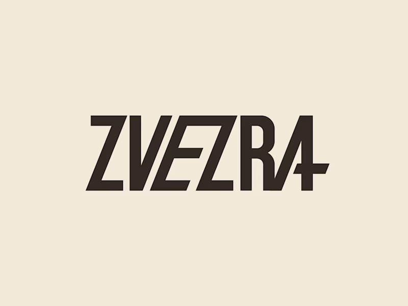
34 voted
47%
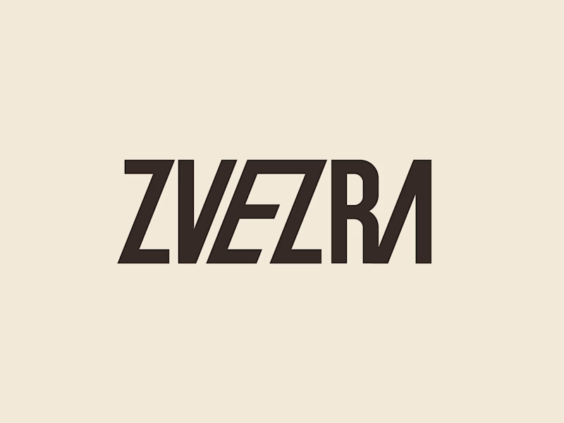
73 votes
Closed

Option 1 for me, it has a bit more personality. Both are strong though, tough call



Professional work. Keep it up.

That's really great Brand identity 🎉🎉
good job Maellie 🔥🔥