The network for creativity
Join 1.25M professional creatives like you
Connect with clients, get discovered, and run your business 100% commission-free
Creatives on Contra have earned over $150M and we are just getting started
Back to feedPost

An artisanal African home and furniture brand needed an identity that honored its cultural roots while feeling fresh, warm, and deeply livable.
Drawing from West African heritage, the Ubuntu icon was built around a powerful concept — wood cut in half to form furniture, a symbol of craftsmanship, support, and the warmth every home deserves.
A rich palette of chocolate brown, vibrant orange, soft cream, and olive green brings the natural world indoors, while a custom Adinkra-inspired pattern system gives the brand a visual language that is entirely its own.
From app interface to business card to living space, Ubuntu lives beautifully across every touchpoint, celebrating African craftsmanship through a lens that feels completely contemporary.


The network for creativity
Join 1.25M professional creatives like you
Connect with clients, get discovered, and run your business 100% commission-free
Creatives on Contra have earned over $150M and we are just getting started



Related posts

Rofella - Brand Expressions



The serif wordmark against that warm, textured paper feels so confident and timeless, and the deep burgundy gives the whole identity real character. Beautifully restrained work, keep going! Did the paper texture come from a real scan or did you build it digitally?

What if coffee packaging had a personality? 🐾
I designed Moku’s whole world, from bags and cold brew cans to drip packs and cups, around a cat who’s always having a better day than you.
See the full project and let me know what you think!
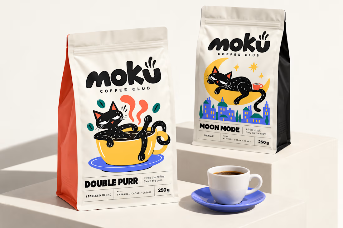
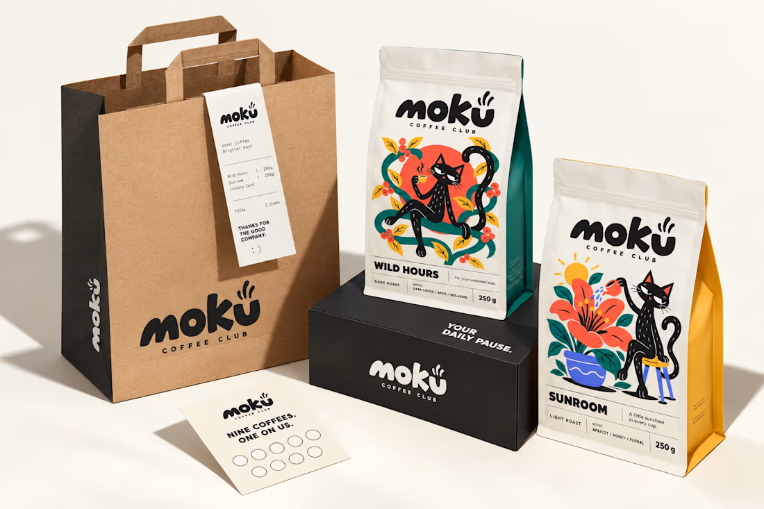
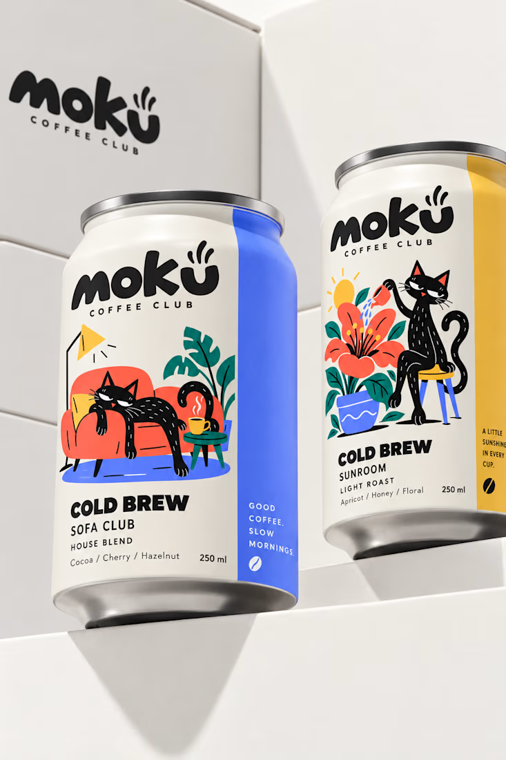

Woow Jerin that's stunning🔥🔥
The colors was so vibrant that's unbelievable

Are you still designing Brand Guidelines presentations from scratch?
I created this Mini Brand Guidelines template as a modular, editorial-style system built to help designers and studios present brand identity work with structure and clarity in no time.
Whether you’re delivering a new identity to a client or documenting internal brand assets, this template provides a confident, consistent framework.
Tap the link above to get it.

Clean and smooth, love it