The network for creativity
Join 1.25M professional creatives like you
Connect with clients, get discovered, and run your business 100% commission-free
Creatives on Contra have earned over $150M and we are just getting started
Back to feedPost

One of the strangest compliments a brand designer can receive is seeing a competitor copy a client’s new look.
I worked on a rebrand last year, and a few months after the new identity launched, one of the client’s direct competitors introduced a very similar colour direction.
My first thought was that the client needed to understand what this meant.
Of course, seeing another business adopt a similar visual style can be frustrating. You put time into understanding the business, exploring concepts, making design decisions, and building an identity that gives the brand its own place in the market. Then someone else comes along and appears to take a shortcut using similar ideas.
But I encouraged the client to look at it from another angle.
The similarity suggested that the new identity had made an impression within the category. The competitor may have noticed the direction and decided to move closer to it. We couldn’t know their exact intentions, but the timing and resemblance were worth paying attention to.
This is something I think more designers and business owners should consider.
When a brand looks and sounds like every other business in its industry, it gives people very little reason to remember it. Familiar colours, predictable typography, and the same visual conventions can make a brand feel safe, but they can also make it easy to overlook.
Taking a more distinctive direction comes with its own risks. Some people may need time to understand it, and competitors may eventually adopt similar visual cues. That doesn’t automatically mean the original work has lost its value.
What matters is whether the brand has built enough recognition beyond a colour palette or a logo. Its positioning, messaging, customer experience, and consistency all contribute to what people associate with the business.
If someone copies your colours, they haven’t automatically copied the thinking behind your brand.
As designers, we should aim to create identities that are recognisable for more than one visual element. And as business owners, we should keep building the brand even after the initial excitement of a rebrand has passed.
The goal is to give people a clear reason to recognise and remember your business, even when someone else starts looking similar.
I’d love to hear from other designers and business owners: Have you ever noticed a competitor adopting a similar visual direction after a rebrand? How did you handle it?
#BrandDesign #BrandStrategy #BrandIdentity #Branding #GraphicDesign

The network for creativity
Join 1.25M professional creatives like you
Connect with clients, get discovered, and run your business 100% commission-free
Creatives on Contra have earned over $150M and we are just getting started



Related posts


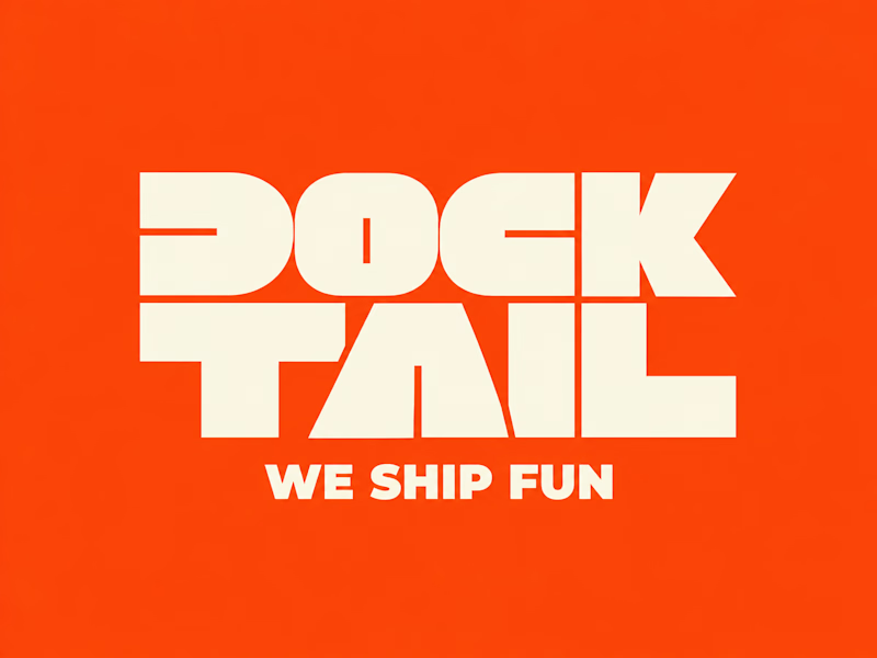
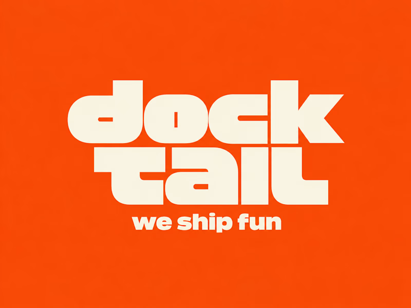
DockTail approached me with a fun idea: make us look nothing like what we do.
As strange as it sounds, I think this is one of the most exciting creative challenges. When branding a business, the primary objective is usually to communicate what it does. But what happens when you deliberately take that away?
After a few days of brainstorming, experimentation, and using Curative Intelligence, I arrived at these two concepts.
One is ALL CAPS, the other is all lowercase. Both carry the same personality, but express it through two entirely different approaches.
Now I'm curious: Which one do you like more?
22 voted
65%
12 voted
35%
34 votes
Closed

Second one!!

Brand work for Boofi, DeFi platform
We are working on visual direction, motion and animations


So cute! Love it!

Text on album covers is tacky? Whatever 🤌🏼 Vienna Starlight Boom 😒
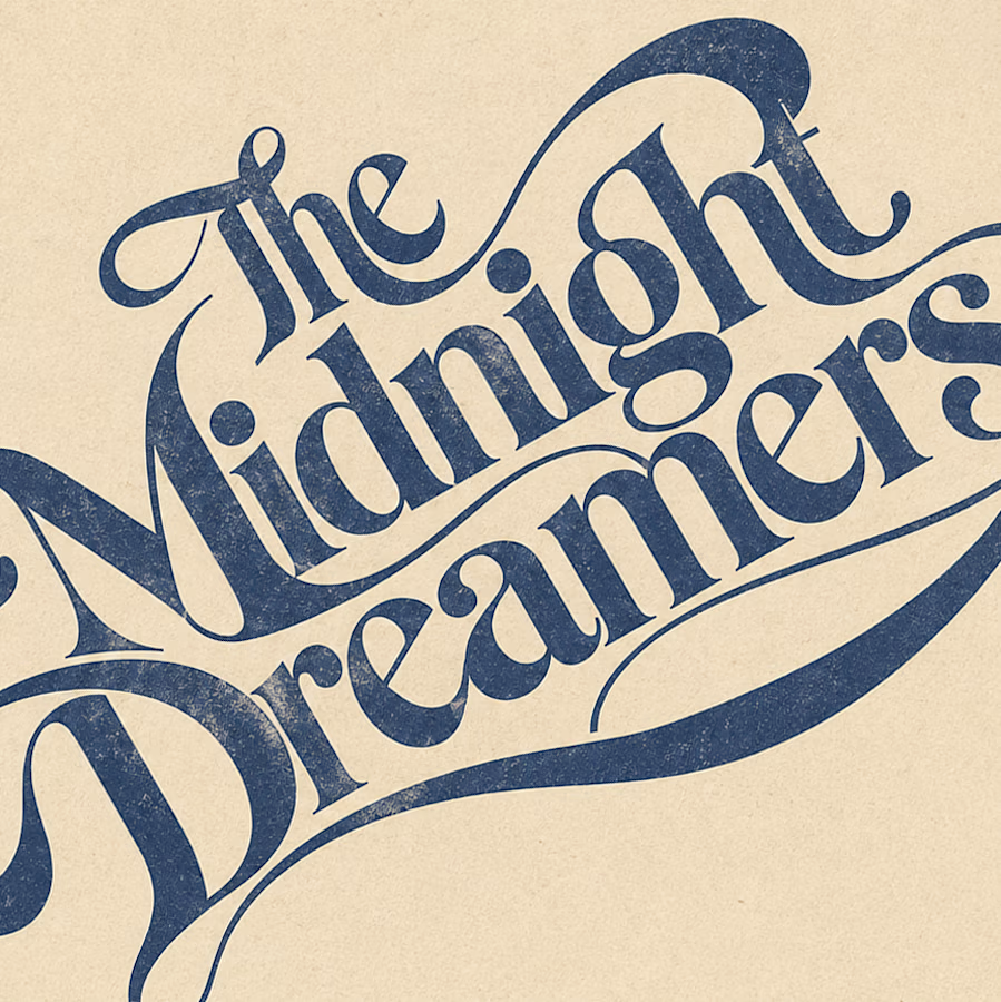
Typography can ABSOLUTELY make an album cover.
During the pandemic, I got obsessed with album cover design. I'd spend hours looking at covers, researching the designers behind them, and trying to understand the decisions and creative processes that made them work.
It was one of those design rabbit holes I could never get tired of. 💀
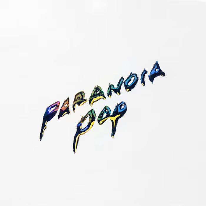
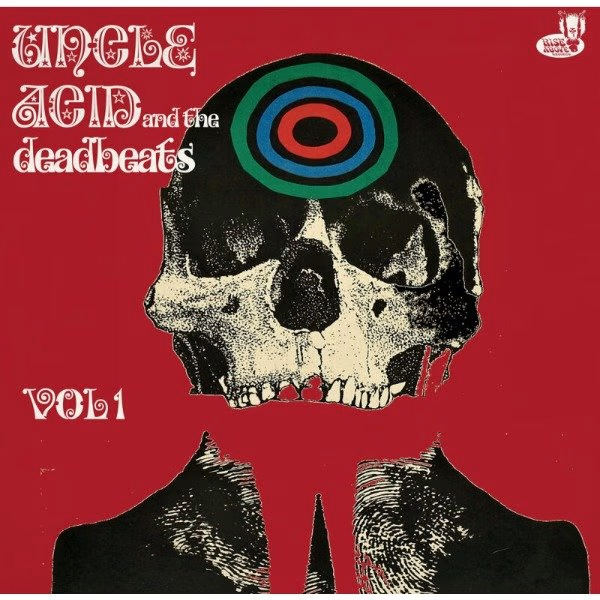
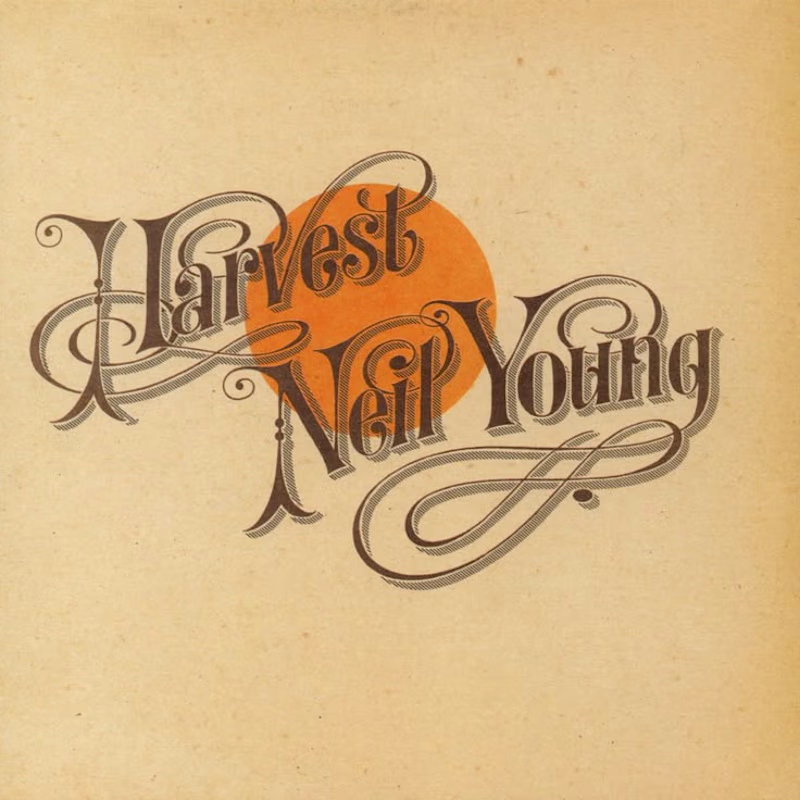
I'm bringing that interest back with a new cover inspired by the music I love, including Neil Young's Harvest, Bandalos Chinos' Paranoia Pop and Uncle Acid & The Deadbeats' Vol. 1.
Looking at these alongside other great album covers, one thing stands out: typography CAN be the image!
I took inspiration and designed one as well!
What's an album cover where the typography is impossible to separate from the artwork? Show me your favorites.

Reid Miles' Blue Note covers are my pick, where the cropped oversized lettering carries as much mood as any photo could. Your Paranoia Pop treatment has that quality too, the letterforms feel poured into the image rather than placed on it.