The network for creativity
Join 1.25M professional creatives like you
Connect with clients, get discovered, and run your business 100% commission-free
Creatives on Contra have earned over $150M and we are just getting started
Back to feedPost
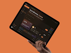
A job search lives across five different tools that don’t talk to each other. So I made one that does.
It’s called HeffOS. One place for the whole thing: tracking roles, cold outreach, the materials you have to write, project management, and interview prep. All of it sharing the same context, so you’re never starting from scratch.
The thing I kept running into is how disconnected it all is. The role you’re tracking already knows enough to draft the outreach. The contact you saved already has what it needs for the email. The interview you’re prepping for is the one you’re actually applying to. That’s the entire point of HeffOS.
I designed the whole system end to end, the flows, the structure, the interaction model, and built it into a real, working app with Claude Code.
Full case study in the comments.
#productdesign #uidesign #uxdesign


This is amazing😍

Thank you Anna!

Great project!
Much appreciated Nataly!
The network for creativity
Join 1.25M professional creatives like you
Connect with clients, get discovered, and run your business 100% commission-free
Creatives on Contra have earned over $150M and we are just getting started







Related posts

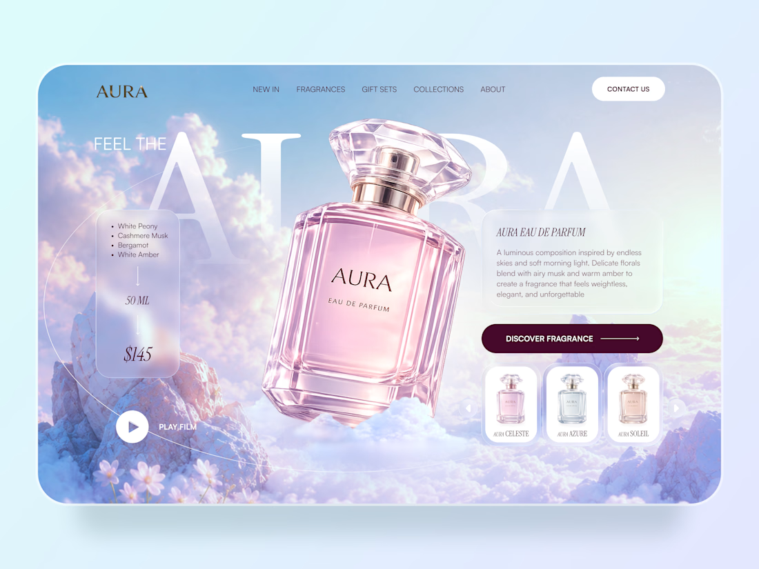
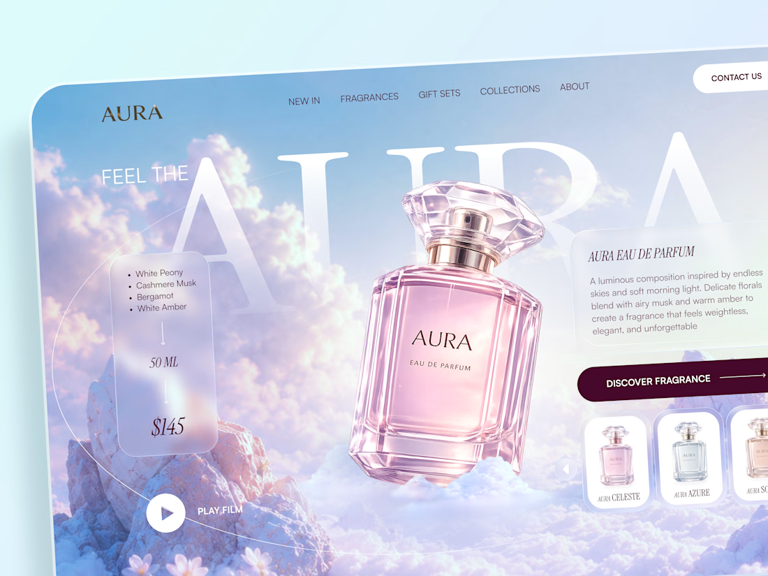
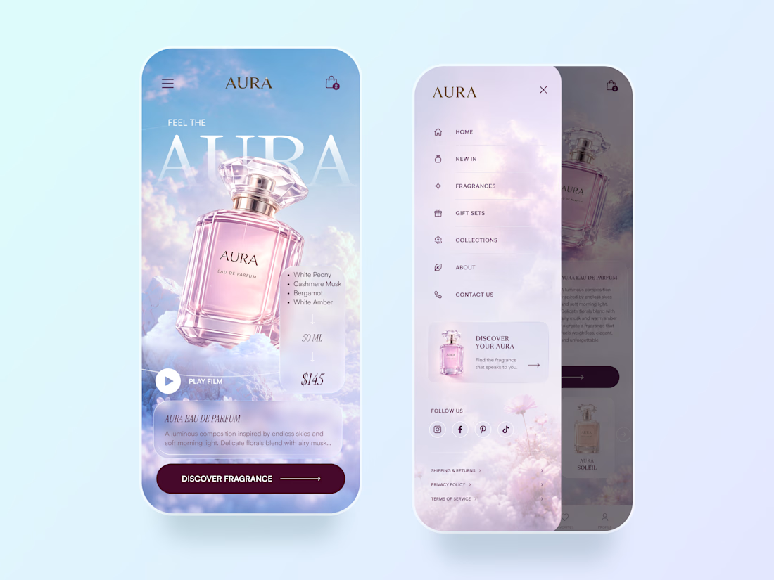
AURA — Luxury Fragrance Website 🌸✨
AURA is a luxury fragrance website concept built around softness, atmosphere, and product storytelling.
The goal was to make the perfume feel almost weightless — combining dreamy skies, delicate pastel tones, translucent UI elements, and an oversized product visual to create an emotional first impression.
Special attention was given to:
• a product-focused hero that makes the fragrance the main visual anchor
• soft glassmorphism cards for fragrance notes, pricing, and product details
• an airy pastel palette inspired by clouds, light, and floral notes
• elegant typography that adds a premium editorial feel
• a fragrance selector that introduces different scents without distracting from the hero
• clear product discovery and shopping actions
• a mobile experience that keeps the same immersive visual atmosphere
• a lightweight mobile menu with product discovery and social touchpoints
The result is a soft, premium digital experience that combines luxury storytelling with clear e-commerce functionality.
Looking to create a distinctive website for your beauty, fragrance, or lifestyle brand? Let’s create something memorable ✨



The typography fits the fragrance vibe perfectly 🌷

🚀 How I Use AI in UX/UI Design: 7 Real Workflows from My Projects
There’s a lot of hype right now around AI replacing designers.
I don’t think that’s the case. In the right hands, AI can complement a good designer and make them stronger and more efficient.
In this article, I want to share my experience using AI in UX/UI design.


Good read! ❤️

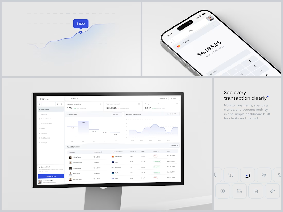
Novent - Payment Processing Platform
The quietest fintech dashboard I've designed in a while. And that's the point.
One blue. That's the entire accent system. When a "Failed" status tag shows up in red it hits immediately because nothing else in the interface is using warm colors. Red means problem. Everything else means fine. You don't need a legend to understand that hierarchy.
The "Boost with AI" nudge tucked into the sidebar bottom is smart placement. It's visible but never blocking. You see it on your 10th visit, not your first.
#Fintech #SaaS #DashboardDesign #UIDesign #ProductDesign