The network for creativity
Join 1.25M professional creatives like you
Connect with clients, get discovered, and run your business 100% commission-free
Creatives on Contra have earned over $150M and we are just getting started
Back to feedPost

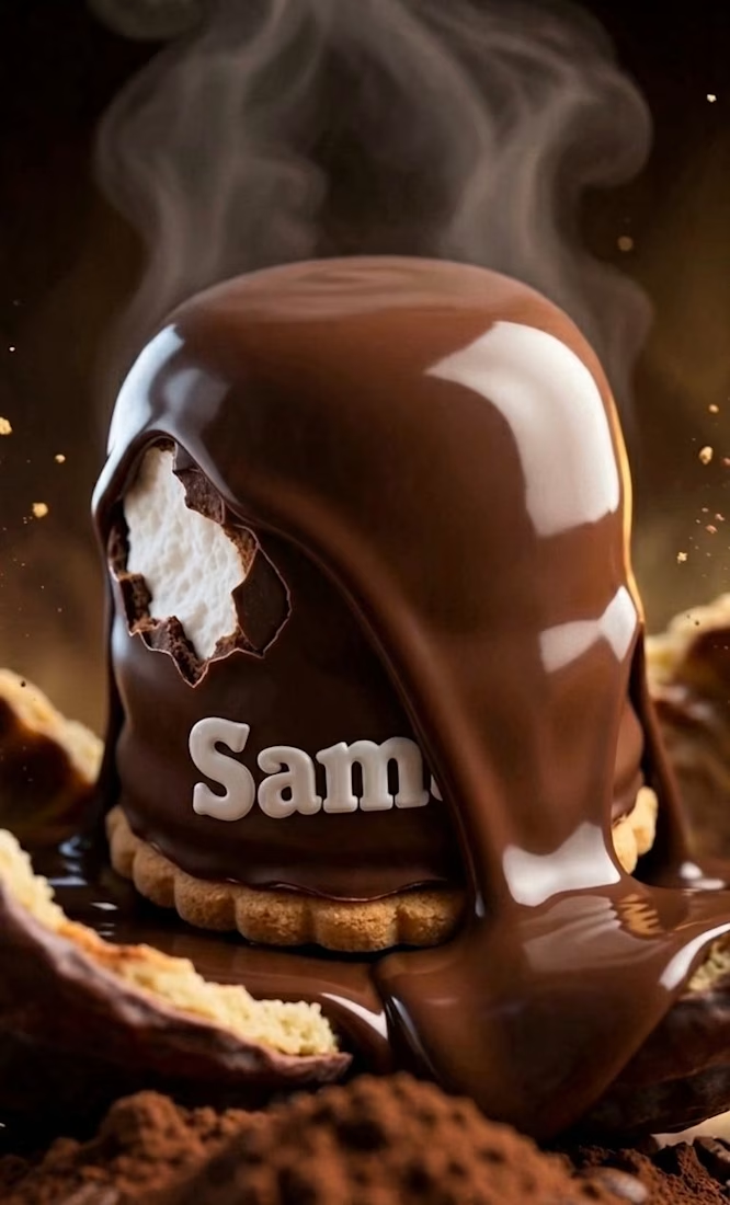
Visual Storytelling through Color Grading 🎨🍫
Excited to share this latest piece from my portfolio for Sambo. To bring out the rich texture of the chocolate and the warmth of the cocoa, I took this project into DaVinci Resolve for a dedicated color grading session.
Key Adjustments:
Warmth & Contrast: Enhanced the brown tones to evoke a premium, sensory feel.
Texture Highlighting: Refined the highlights on the melting chocolate to make it look as appetizing as possible.
Atmospheric Depth: Balanced the steam and background shadows for a cinematic look.
It’s amazing how a professional grade can transform a shot from a simple visual into a "tasty" experience.
#DaVinciResolve #ColorGrading #VideoEditing #PostProduction #VisualArts #ChocolateDesign

The network for creativity
Join 1.25M professional creatives like you
Connect with clients, get discovered, and run your business 100% commission-free
Creatives on Contra have earned over $150M and we are just getting started


Related posts

Great beauty campaigns don't just showcase products; they create an experience.
For this Umberto Giannini project, I focused on product presentation, smooth transitions, and engaging visuals to bring the haircare collection to life.
What makes a beauty product video stand out to you: the editing, visuals, or product presentation?
#VideoEditing #BeautyCampaign #ProductVideo #HaircareMarketing #CommercialVideo #MotionGraphics #BrandStorytelling #BeautyMarketing #VideoProduction #Contra


How do you make a construction brand feel consistent from a business card to a building site?
Brixon’s identity brings angular lettering, an assembled geometric symbol, and a lime, black, and white palette together.
I carried those elements into stationery, brand guidelines, team identification, social graphics, and site signage, then brought the system into motion with Adobe After Effects.
The connecting decision: keep the geometry and layout structure consistent while the logo details, messages, and application previews change within the animated panels.
My contribution covered brand design, graphic design, and motion design.
What draws your attention first: the wordmark, the lime palette, or the rotating symbol?
See the full Brixon case study. If you’re shaping a construction or development brand, I’m available for brand identity and motion projects.

Incomparable work!




I love it too