The network for creativity
Join 1.25M professional creatives like you
Connect with clients, get discovered, and run your business 100% commission-free
Creatives on Contra have earned over $150M and we are just getting started
Back to feedPost

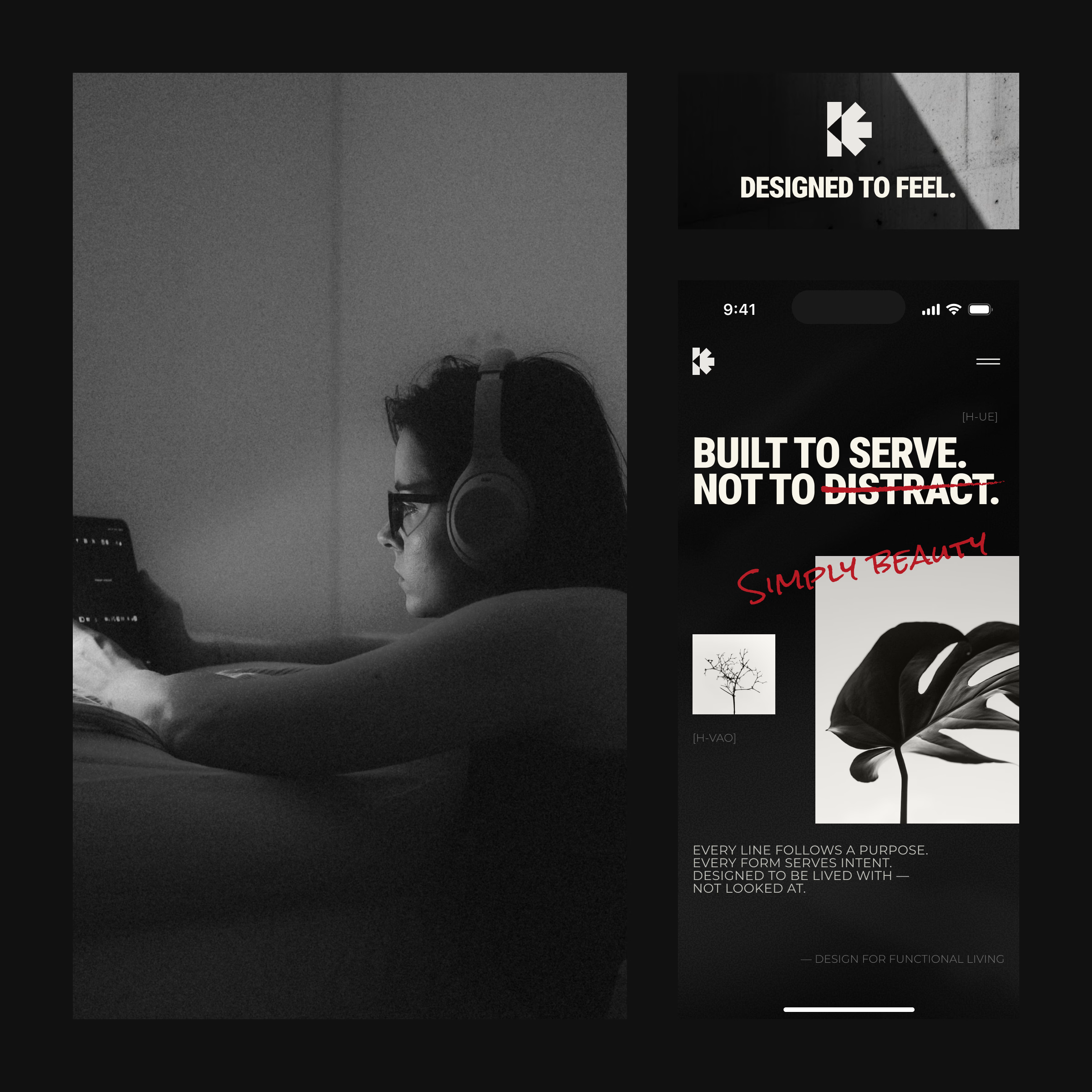
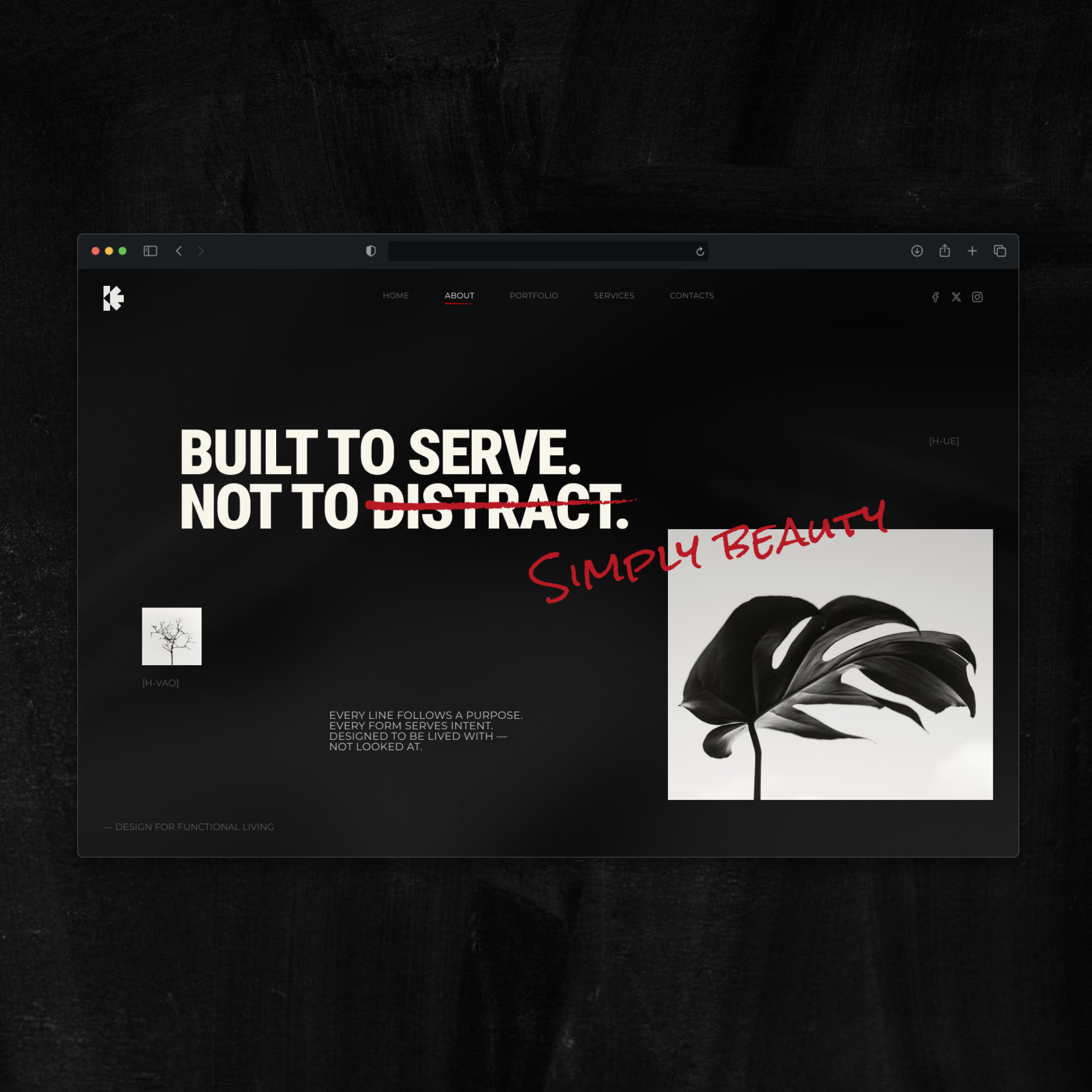
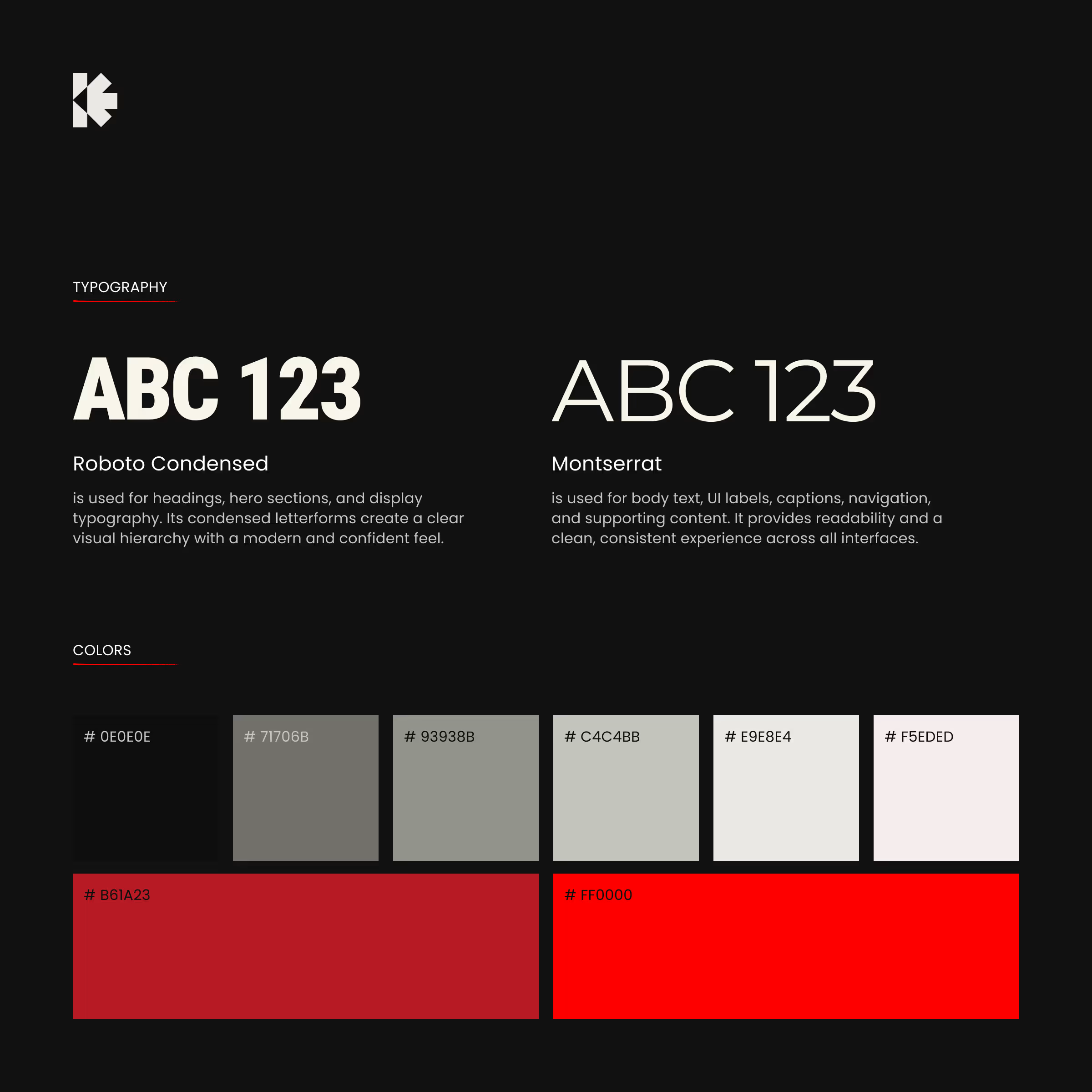
Had this idea stuck in my head for weeks. What happens when you strip a brand down to literally just what it needs - and nothing else.
No gradients. No textures. No "let's add a subtle pattern to fill the space." If something's on the screen, it earned its spot.
The red was the fun part. I kept fighting the urge to use it everywhere because it's such a good red. But the whole point is restraint, so it only shows up when something actually matters. Turns out that makes it hit 10x harder when it does appear.
"Built to serve. Not to distract" started as a line in my notes and ended up becoming the whole philosophy of the project. Sometimes the copy writes the brand for you if you let it.
Designed to feel. Not just to look.
#brandguidelines #uxdesign
The network for creativity
Join 1.25M professional creatives like you
Connect with clients, get discovered, and run your business 100% commission-free
Creatives on Contra have earned over $150M and we are just getting started
Trending

Claude
Claude has entered the design space. How are you using it?

Contra University
Learn from expert creatives how to earn more using next-gen AI tools.
Brand Design
The best brand designers are on Contra. Scroll to see what's trending in brand design. What are you building?
creativeaiflow
Creative AI workflows are evolving. What tools do you use, and what are their strengths and weaknesses?
freelancerlife
Freelancer life is wins, pivots, and everything in between. What’s yours right now?






Related posts


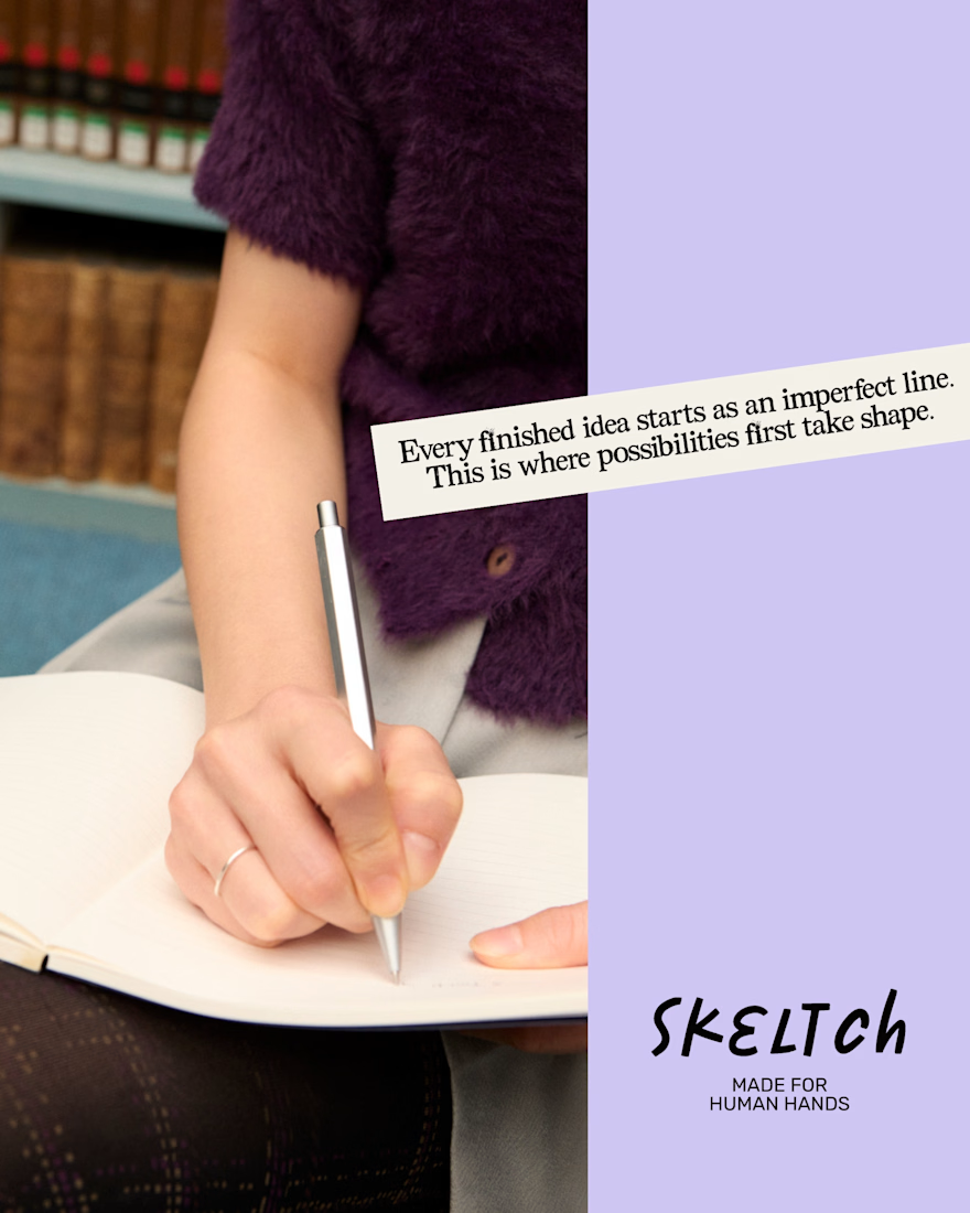
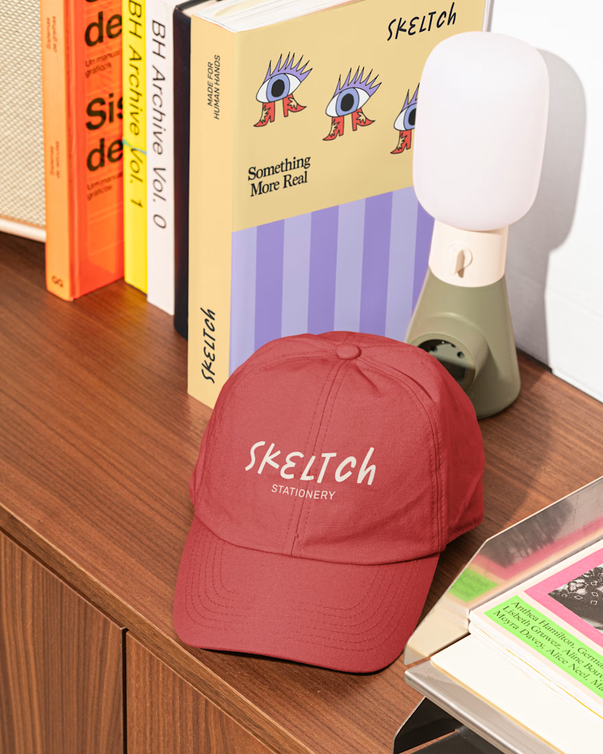
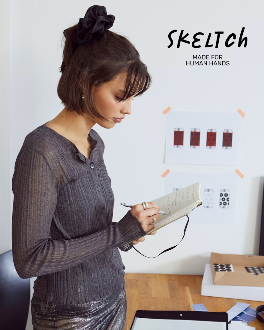
Skeltch - Contemporary Stationery Brand
Skeltch believes in the power of pen on paper and strictly commit to human artistry.
The wordmark logo reflects the spontaneity and expressive nature of analog creativity. The secondary typeface is a typewriter font, which adds a touch of nostalgia.
The notebook covers are designed to each celebrate a different aspect of the artistic process. Here, notebooks are not categorized by function, but as an object is inspiration to creators.
Let me know if you guys like it! 👇🏼

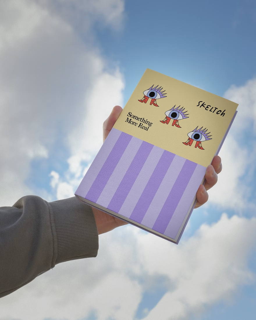

Categorizing the notebooks by what inspires the creator instead of by function is a smart reframe, it changes how someone actually shops for them. The typewriter secondary type pairs well with that analog, handmade feel too.


Bento reads best when the tiles vary in weight so the eye gets an anchor before it hits the dense cells; on a data-heavy dashboard like this, giving the pipeline card clear priority over the smaller metric tiles is what keeps it from feeling like a wall of equal boxes.

Sharing something I'm working on right now.
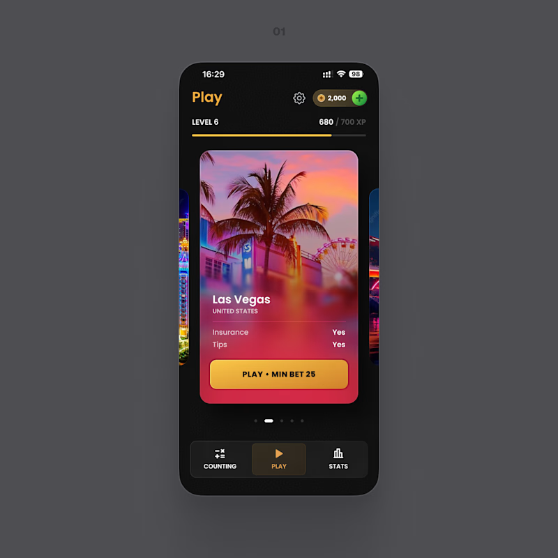
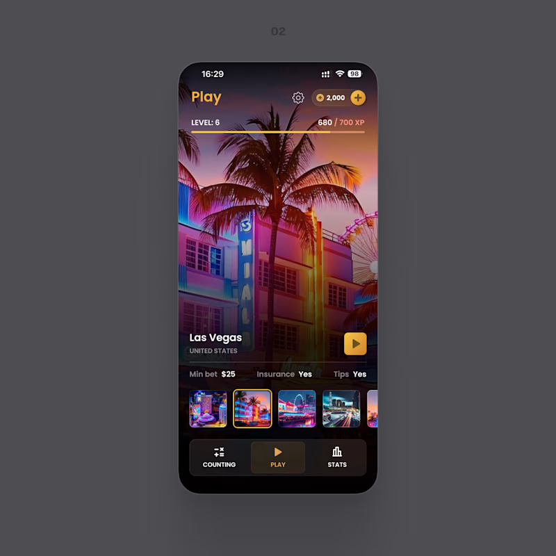
Two directions for the same screen. One keeps everything in a focused card – the button and the conditions right where you look. The other turns the whole screen into the place: more atmosphere, less interface.
Which one feels easier to use? And if the prettier one isn't the easier one for you, tell me in the comments – that's the part I'm stuck on.
8 voted
42%
11 voted
58%
19 votes
Closed

Both of looks clean and well thought out. How long did it take you to bring everything together?