The network for creativity
Join 1.25M professional creatives like you
Connect with clients, get discovered, and run your business 100% commission-free
Creatives on Contra have earned over $150M and we are just getting started
Back to feedPost
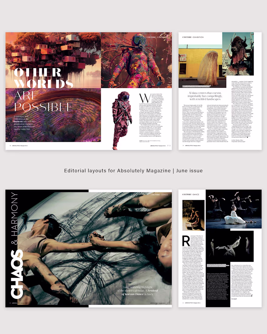
One of the things I enjoy most about editorial design is finding flexibility within an existing visual identity.
For these two June culture features for Absolutely Magazine, I worked with the publication’s established typography system while pushing it in different directions through scale, tracking, spacing and pacing.
Although both layouts use the same core typefaces, each story required a completely different atmosphere.
For “Other Worlds Are Possible”, the goal was to create something cinematic and expansive — using fragmented typography, negative space and rhythm to echo the speculative, futuristic tone of the exhibition.
For “Chaos & Harmony”, I leaned into movement and tension, allowing the typography to feel more expressive and performative in response to the subject of contemporary dance.
I’m always interested in how subtle typographic decisions can completely shift the emotional tone of a story while still remaining faithful to a publication’s visual language.
You can view the full June issue here: https://issuu.com/zestmedialondon/docs/absolutely_kensington_chelsea_may_2026
The network for creativity
Join 1.25M professional creatives like you
Connect with clients, get discovered, and run your business 100% commission-free
Creatives on Contra have earned over $150M and we are just getting started
Related posts
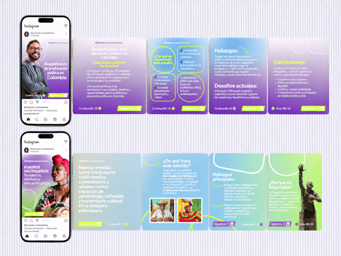
😍 This project involved four consulting sessions where, together with a team, we restructured the visual content strategy to better align with the brand’s identity.
The work focused on redefining how content is presented across digital platforms, including social media prototypes, typography systems, visual textures, photography direction, CTAs and overall content style.
We developed a cohesive approach that ensured consistency between visual design and messaging, improving clarity and engagement.
The magazine is part of the research division of Universidad Simón Bolívar in Barranquilla, Colombia.
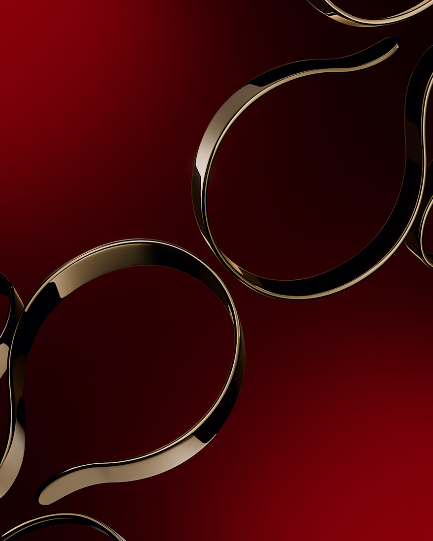
PROJECT
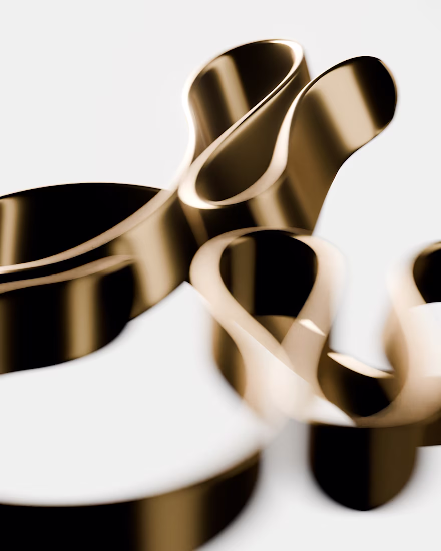
MAMMII: explores the tension between softness and realism, translating
an intimate, feminine moment into a refined digital form. Through
sculptural abstraction and high-fidelity rendering, the work captures a
timeless ideal, preserving emotion and presence in a
perfected virtual state.
This looks clean and well thought out. How long did it take you to bring everything together?
Trending
Claude
Claude has entered the design space. How are you using Claude Design?
Contra University
Learn from expert creatives how to earn more using next-gen AI tools.
creativeaiflow
Creative AI workflows are evolving. What tools do you use, and what are their strengths and weaknesses?
portfolioreview
The best portfolios tell a story, not just show a grid. Share yours for feedback.
freelancerlife
Freelancer life is wins, pivots, and everything in between. What’s yours right now?