The network for creativity
Join 1.25M professional creatives like you
Connect with clients, get discovered, and run your business 100% commission-free
Creatives on Contra have earned over $150M and we are just getting started
Back to feedPost
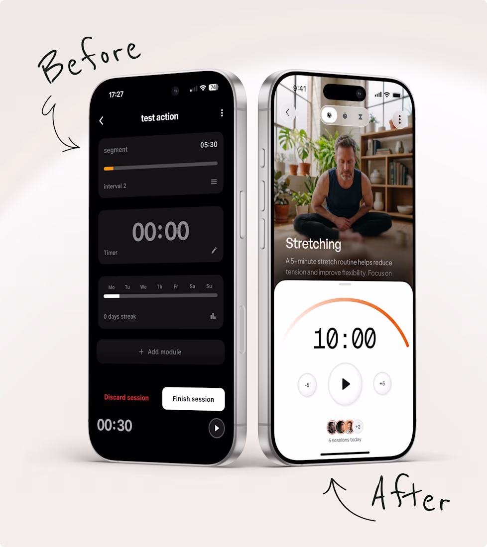
Every consumer app I work on has the same conversation at some point. "Can we add the advanced project management? The custom workspace?" The thing only 5% of users will ever touch.
After a decade of designing these products, here's the question that ends most of those conversations: what percentage of your users actually benefit from this?
If it's 5%, you're overwhelming the other 95% to serve a handful. If it's 50% or more, that's a different conversation entirely.
The trap is that every feature sounds reasonable on its own. A tagging system. Categorization. Assigning users to groups. Each one is defensible. Then you stack twelve of them and the product becomes a maze nobody can navigate.
This is how products end up in the state I get called in to fix. Not one bad decision. A hundred reasonable ones, added one at a time, none of them removed.
You can keep the power. You just have to be smart about what you show and when.
A simple tool people understand beats a powerful tool people abandon.
The 'hundred reasonable decisions' framing is the most honest description of how apps get unmanageable. The percentage question is a good forcing function. What you don't say here is how you actually get stakeholders to remove things they already shipped, which is usually the harder part of that conversation.
Removing something is a completely different conversation than not adding it. Shipped features come with defenders. Two things that help: reframe it from 'should we remove this' to 'where should this live' because most features belong somewhere, just not in the main flow. And...
Huge difference
This is such a good reminder for product design. Simplifying an app is not just about removing things, it’s about making the important actions feel easier and more natural. A cleaner experience usually creates more confidence for users, and this explains that really well.
The network for creativity
Join 1.25M professional creatives like you
Connect with clients, get discovered, and run your business 100% commission-free
Creatives on Contra have earned over $150M and we are just getting started
Related posts
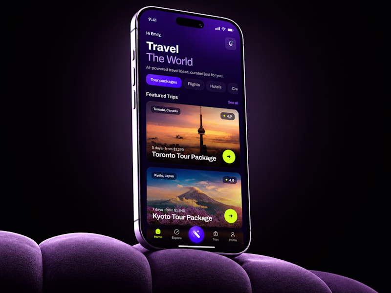
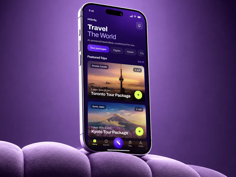
SMALL MOCKUP TEST. BIG DIFFERENCE. 👀
Same AI Travel App UI.
I changed only the background.
Not the UX.
Not the flow.
Not the product logic.
Just the visual context.
And the darker version instantly made the app feel more premium, focused, and easier to read.
That is why presentation matters in mobile app design.A weak frame can make good UI look average.
A strong frame can make the product feel more valuable before the user even taps anything.Expected impact:`
+35-45% first-screen engagement
+25-30% trip card interaction
+20-28% faster package discovery
+30-40% perceived product value
Sometimes design is not about adding more.Sometimes it is about removing what steals attention.
🟢 Book a Mobile App Strategy Session
https://calendly.com/asol_design/book-diagnostic-call-linkedin-clone
26 voted
67%
13 voted
33%
39 votes
Closed
Love this approach. It's fascinating how design can completely change how people feel while using a product.
Every established founder I've worked with knew their brand had become a problem.
But none of them had ever calculated how much that problem was costing them.
They’d say things like:
"We look like a small shop. But we're not."
"I've been trying to grow for two years, but something keeps blocking me."
"They don't take us seriously."
It was clear what wasn't working. The cost wasn't.
Because nobody had ever stopped to ask the right question:
How many clients did you lose last year because they didn't trust what they saw?
How many dismissed you before you even got to speak?
When you look like an amateur, people assume your product is too. It's that simple.
My job doesn't start with design. It starts by figuring out what "looking small" is actually costing you, what keeping your current identity is costing you.
Only then does the design conversation make sense.
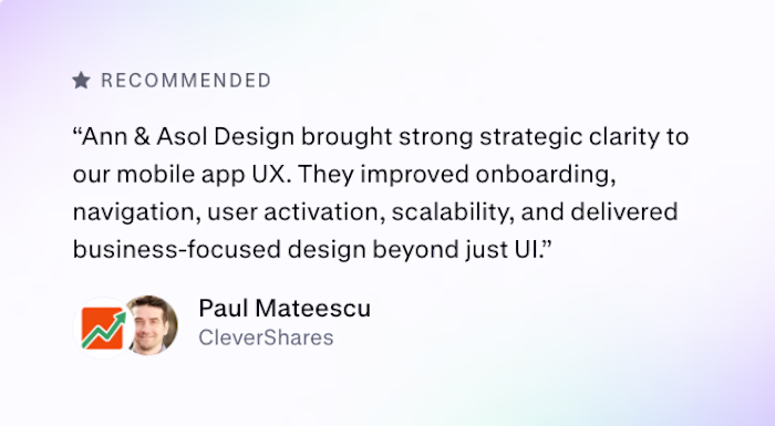
The best feedback is when the client wants to continue.
After the first stage of work with CleverShares, we’re moving into the next phase of the mobile app redesign.
This project was never just about making the interface look better. We worked on the onboarding, navigation, user activation, scalability, and overall UX structure - the things that actually make the product clearer and easier to grow.
Happy to see this reflected in the client’s feedback.
Excited for what’s next.
#MobileAppDesign, #UXUIDesign, #MobileUX, #AppRedesign, #ProductStrategy, #UXStrategy, #GrowthDesign, #AIProductDesign, #OnboardingUX, #UserActivation, #UXAudit, # AsolDesign
That review says everything. When a client specifically calls out "strategic clarity" and "business-focused design beyond just UI," you know the work landed where it needed to. Congrats on the continued engagement, that's a strong signal.
Challenges
View allTrending
Claude
Claude has entered the design space. How are you using Claude Design?
Contra University
Learn from expert creatives how to earn more using next-gen AI tools.
MagicPath
The canvas is infinite, and exploration is becoming the workflow. How are you using MagicPath?
creativeaiflow
Creative AI workflows are evolving. What tools do you use, and what are their strengths and weaknesses?
freelancerlife
Freelancer life is wins, pivots, and everything in between. What’s yours right now?