The network for creativity
Join 1.25M professional creatives like you
Connect with clients, get discovered, and run your business 100% commission-free
Creatives on Contra have earned over $150M and we are just getting started
Back to feedPost

A lot of performance issues on websites start long before development 👀
Heavy layouts, oversized media, too many moving elements and unclear hierarchy usually create more problems later during the build phase.
Good performance is not only about optimization tools. It starts with better design decisions from the beginning.
A few things I try to keep in mind on most projects:
→ Use motion with intention
→ Keep layouts easy to scan
→ Avoid oversized assets unless they add real value
→ Design for responsiveness early, not at the end
Here is a recent project where balancing visuals and performance was important
https://contra.com/p/RQqMR6AZ-ui-ux-website-design-for-a-cx-platform?
Curious what is usually the biggest performance issue you notice on modern websites?

The network for creativity
Join 1.25M professional creatives like you
Connect with clients, get discovered, and run your business 100% commission-free
Creatives on Contra have earned over $150M and we are just getting started



Related posts

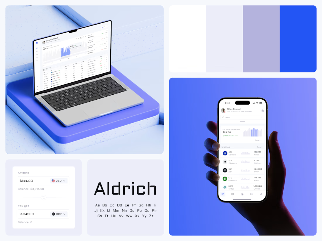
Crypto Portfolio Dashboard
Blue means one thing here: the range you are looking at.
The value chart is a row of thin gray bars, and only the selected date range fills in blue. You read the period that matters and keep the months around it as context.
The phone carries the same chart above the holdings list. Each coin gets its own small bar chart between the name and the amount, so you can scan the whole portfolio for movement without opening a single coin.
Trading screens get busy fast. This one stays light and calm, so the numbers lead: total value, realized and unrealized P&L and open positions, all on one screen.
Designed by the Hue & Machine team.
#Crypto #Fintech #DashboardDesign #TradingPlatform #DataVisualization #UIDesign #ProductDesign #WebApp #MobileDesign #FigmaDesign



Nice Ui Dmytro


A great website should make the right first impression before the journey even begins.
Just completed a website project for Nash Transportation, a luxury transportation service offering professional chauffeur experiences in Nashville.
The focus was on creating a clean, premium digital experience that communicates comfort, reliability, and professionalism while making it easy for customers to book their next ride.
I'd love to hear your thoughts:
What makes you choose a private transportation service, comfort, reliability, pricing, or the overall experience?
Let's discuss in the comments!
#WebDesign #Webflow #UXDesign #WebsiteDevelopment #LuxuryTransportation #WebDesigner



Amazing work!


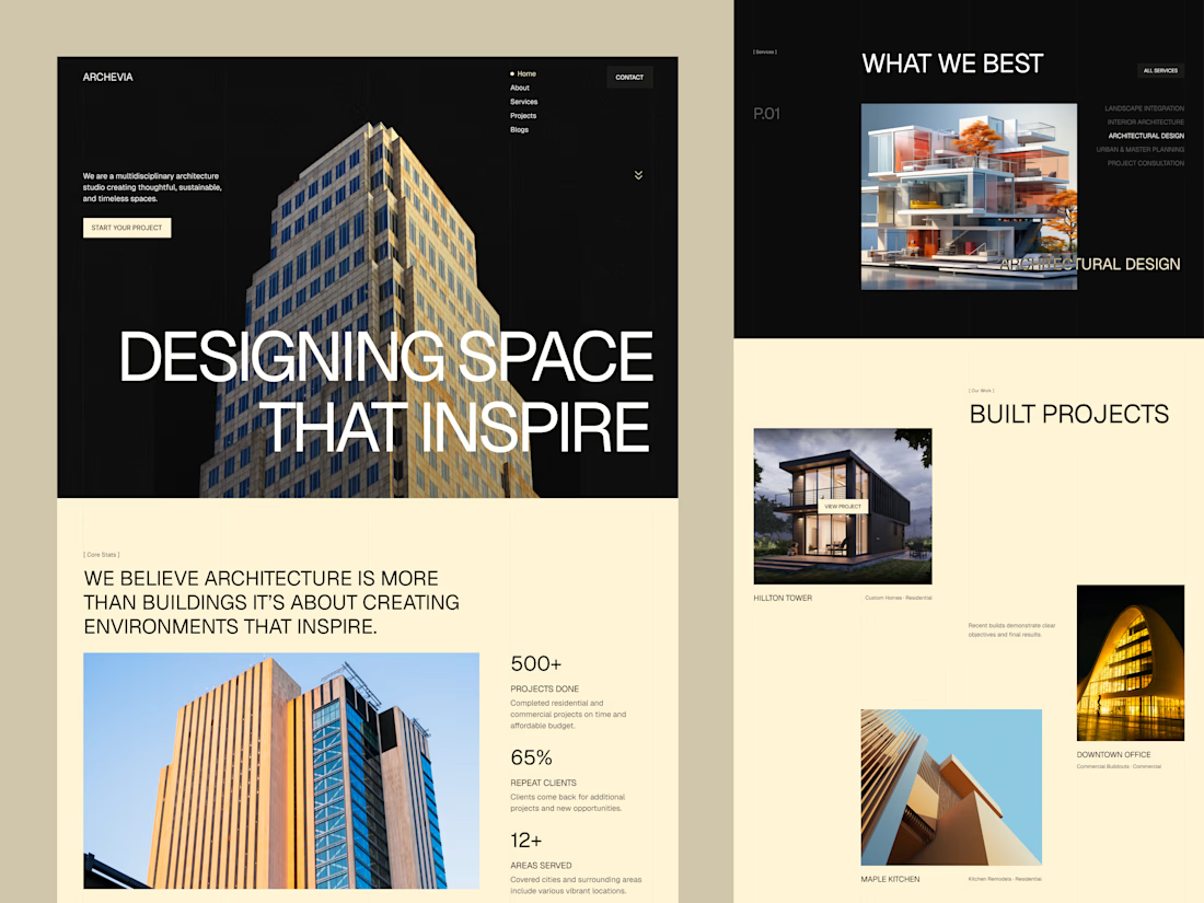
Archevia, Architecture & Design Website Template.
An editorial-style template built for architecture studios.
It features a CMS-powered project portfolio, service pages, testimonials, a contact form, and a blog.
Archevia is a device-friendly template with gallery-first layouts.
This is perfect for visual storytelling for design-led studios.
Check the comment.


nice work