The network for creativity
Join 1.25M professional creatives like you
Connect with clients, get discovered, and run your business 100% commission-free
Creatives on Contra have earned over $150M and we are just getting started
Back to feedPost
I believe in the power of motion, clarity, and precision. Our latest showreel is a collection of projects where strategy meets high-end execution.
🔥 Drop your showreels in the comments — I’m genuinely curious to see what you’ve been building lately. Let’s inspire each other! 👇


Amazing work


Thanks)

Strategy meets execution perfectly in this showreel. The clarity and precision in every project really shows. You can tell a lot of thought goes into the motion and layout decisions. This is the kind of work that builds trust with clients right away.
Thanks, Stephanie! I believe a great design should always be backed by a solid strategy. Glad to see that resonated with you. Let’s stay connected!
Your welcome 😊
Just gave you a follow

wonderful!
Thank you, Adonis! Really appreciate the kind words

Clean layout and strong hierarchy
Thanks, Atif! Precision and hierarchy are always my top priorities. Appreciate you noticing that!

damn, this is rlly good
Thanks a lot! Happy you enjoyed it. More to come soon, stay tuned!

Strong showreel. You can really feel the mix of strategy and high-end execution, very inspiring work.
Thank you, Juan! Coming from you, that means a lot. I’m always trying to push the boundaries of high-end execution. Excited to be part of the community here!

cool
Thank you! I put a lot of focus on the finer details to ensure that 'polished' feel. Glad to see it stands out! Feel free to follow along for more of our studio’s process

this looks super polished 👌
Thank you so much! 🙌

Precision is exactly the right word for this. Every frame feels intentional and high-end. Your Webflow and Figma skills are clearly at a top-tier level. Solid work, Yurii!
Really appreciate that, Rana! Using Webflow and Figma to their full potential is what we're all about. Precision is definitely the goal. Let's stay connected!

Nice work

This is amazing work!
Thank you so much, Gloria! I really appreciate the kind words. Feel free to follow for more Webflow insights and studio projects!

Huge inspo as always!
Thanks a lot! Happy to provide some inspiration to the community. Stay tuned and follow for more — we’ve got some exciting new cases coming up

Great work Yurii! 🔥

Nice presentation, love it 🔥

that showreel is absolutely fire Yurii. the motion is so smooth and every transition just flows perfectly. this is the kind of work that makes people stop scrolling!
Thanks so much, Faith! Really appreciate the kind words. I put a lot of heart into those transitions, so I'm glad they stood out. Feel free to follow my profile here — I'll be sharing more of my latest work and Webflow animations!

They are so nice !
Thank you, Louise! Glad you enjoyed the aesthetics. Follow along for more updates from our studio

These are so smooth! Great job!
Thanks, Henry! Cheers, glad you enjoyed the showreel

Awesome Work

This is a world class and thoughtful website. Every detail is done with great precision. This is the kind of website that keeps users(clients) glued and amazed.

looks sick

Clarity is non negotiable when it comes to design and your showreel executing effortlessly

Love this! the motion is so smooth!

Really cool. Clear flow, contrast and smooth animation.

@Jitter #jitter


This is clean design that users will actually enjoy 🔥

The network for creativity
Join 1.25M professional creatives like you
Connect with clients, get discovered, and run your business 100% commission-free
Creatives on Contra have earned over $150M and we are just getting started









Related posts

Behind the scenes of the Treal Studio brand film.
Built in one week, from creative direction to sound design.


Love the overall feel, looks amazing 👌🏼
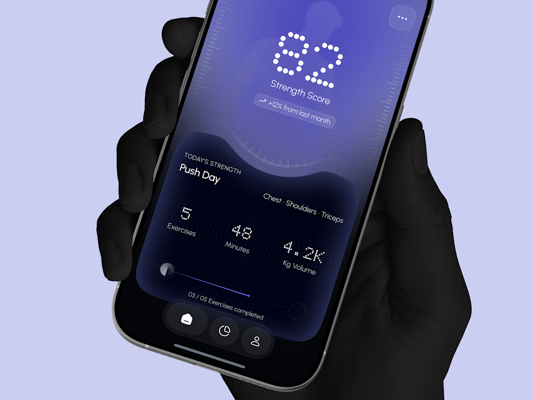
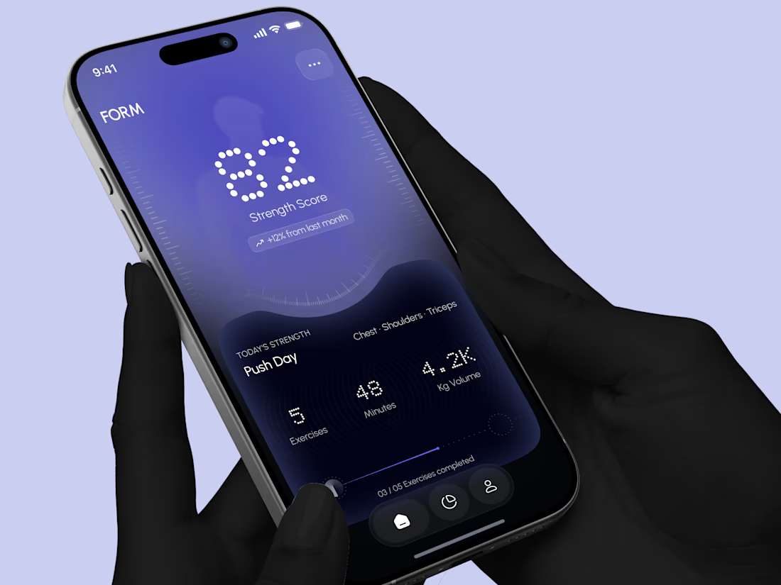
Designed a modern Strength Training Mobile App.
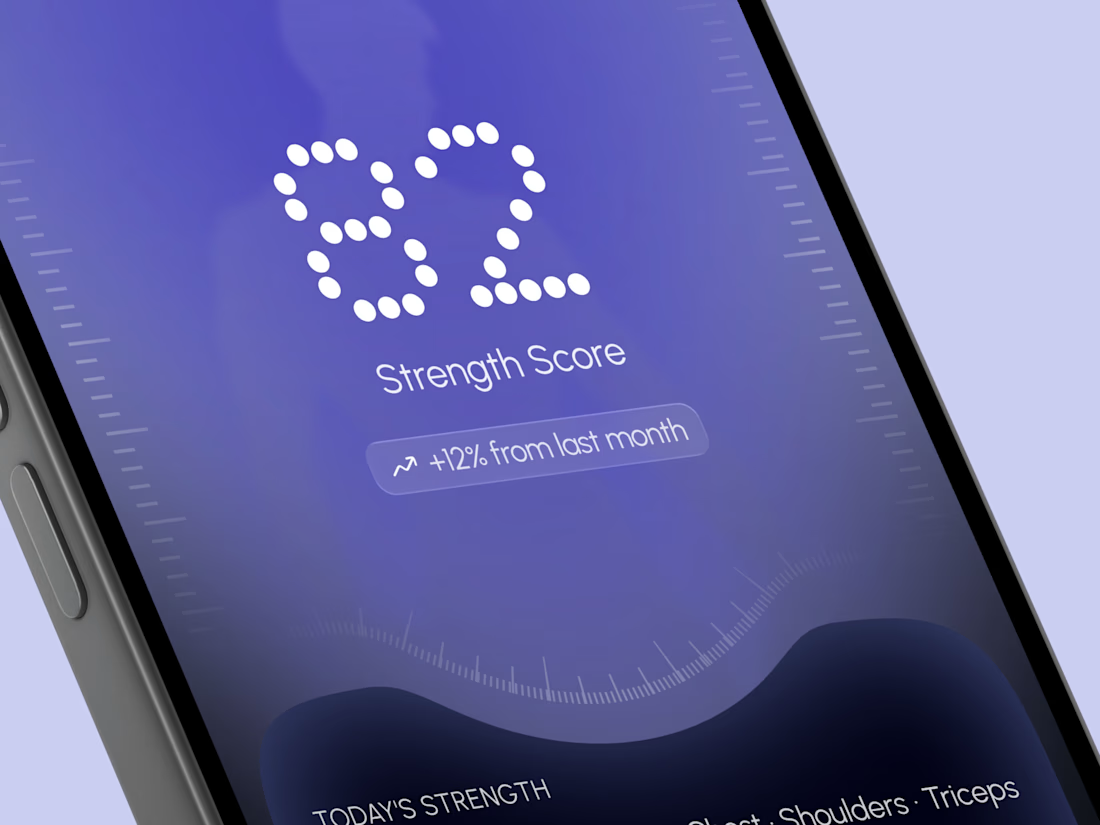
A deep indigo and violet gradient with a soft body silhouette and dotted display numbers for a bold and focused first impression.
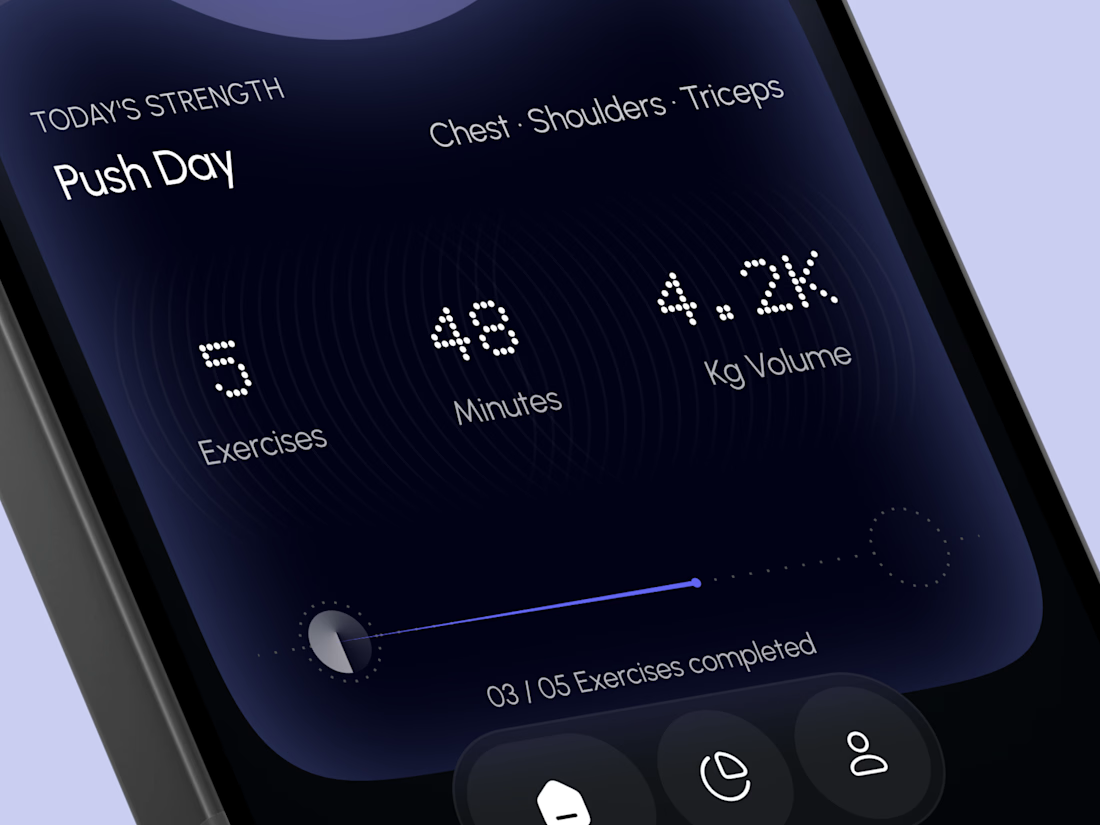
A glowing strength score, a clear workout card with exercises, minutes, and volume, plus a simple progress bar make every training session easy to follow. A curved dark panel, fine tick marks, and a floating tab bar keep the whole app sleek, modern, and easy to use.

High end execution

Santa Monica Tile & Stone E-Commerce Design, 2025.
Buying tile online is mostly guesswork, so I designed a concept store where every page answers one buyer question. Shoppable rooms show how it looks, a coverage calculator tells you how much you need, and free samples let you see it first. Deep green, warm gold, and an AI tile scan that turns inspiration photos into products. Open for e-commerce and web design projects.
Full case study on my Contra Profile

TOP!!