The network for creativity
Join 1.25M professional creatives like you
Connect with clients, get discovered, and run your business 100% commission-free
Creatives on Contra have earned over $150M and we are just getting started
Back to feedPost
Taste Test
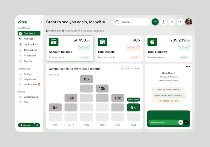
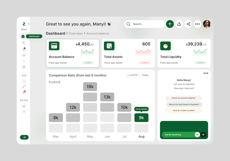
I recently designed a fintech mobile app called Zitro Digital Banking, a next-generation platform that simplifies how users manage their finances and liquidate assets. Combining secure digital banking with intelligent financial tools, Zitro enables users to transfer funds, monitor transactions, verify assets, and access seamless banking services.
The AI Assistant is an intelligent virtual companion that provides personalized financial guidance, answers banking questions, assists with asset liquidation, tracks transactions, and helps users make informed financial decisions in real time.
However, the app dashboard has 2 proposed directions I'd like to implement. Can you tell me which direction will greatly improve the user experience, i.e 'Expanded Nav-Tabs' or ' Collapsed Nav-Tabs'?
6 votes
Ends in 17h

Collapsed Nav but I would combine the two, so when the user goes over the navbar it would expand as in the expanded version. Wouldn't limit the user experience.

That's a good possibility and that can also be helpful. Thank you!


I'd go with the collapsed nav. It feels cleaner and keeps the focus on what matters.
Thank you for your feedback 🙏
The network for creativity
Join 1.25M professional creatives like you
Connect with clients, get discovered, and run your business 100% commission-free
Creatives on Contra have earned over $150M and we are just getting started
Trending

Claude
Claude has entered the design space. How are you using it?

Contra University
Learn from expert creatives how to earn more using next-gen AI tools.
Brand Design
The best brand designers are on Contra. Scroll to see what's trending in brand design. What are you building?
creativeaiflow
Creative AI workflows are evolving. What tools do you use, and what are their strengths and weaknesses?
freelancerlife
Freelancer life is wins, pivots, and everything in between. What’s yours right now?




Related posts

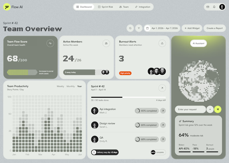
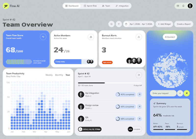
Testing two color directions for an AI sprint dashboard — which reads better at a glance?

21 voted
40%
31 voted
60%
52 votes
Closed
Blueberry looks better here, why dont you try the matcha version with a nice light shade of black with that green. I think it would look amazing here and see that green really pop how it should.

Which homepage would make you explore the store first?
Not every eCommerce store needs more colors.
Sometimes better hierarchy, spacing, and product-first layouts do the heavy lifting.
Here's a small preview of a concept we've been crafting.
Left Label: Product Listing
Right Label: Homepage
6 voted
35%
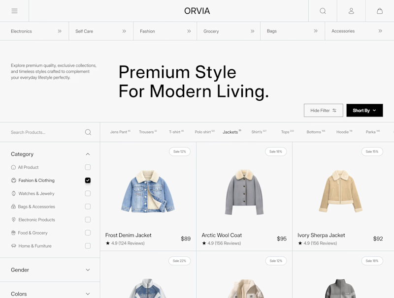
11 voted
65%
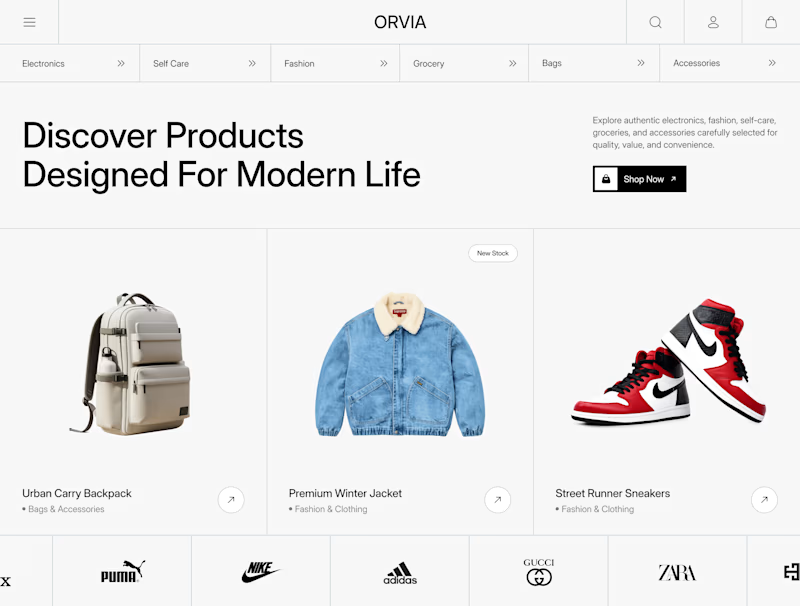
17 votes
Closed

I’d explore the homepage first; the strong hierarchy and curated product highlights make the store feel instantly engaging.


We're exploring two interaction patterns for a services section.
Option 1 - Direct Navigation. Users preview a service on hover and navigate directly on click.
Option 2 - Progressive Disclosure. Users expand the card first, explore additional details, and then decide whether to continue.
Both approaches aim to reduce uncertainty before navigation. The trade-off is simple: speed vs. exploration.
Which pattern would you choose, and in what situations would you use the other one?


53 voted
65%
29 voted
35%
82 votes
Closed

Option 2 is not actually bad, but it may be difficult for users to navigate. From what I’m seeing, users would need to place their cursor over the section before they realize that a feature is hidden there.