The network for creativity
Join 1.25M professional creatives like you
Connect with clients, get discovered, and run your business 100% commission-free
Creatives on Contra have earned over $150M and we are just getting started
Back to feedPost
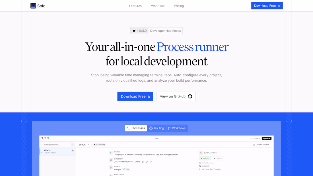
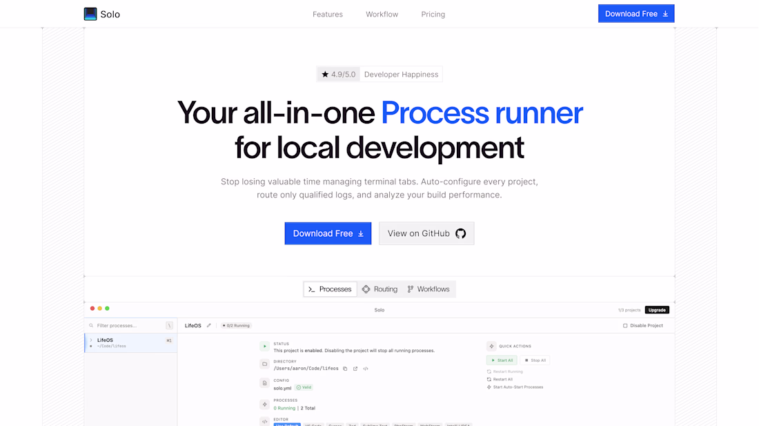
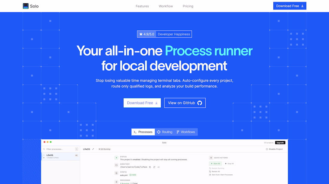
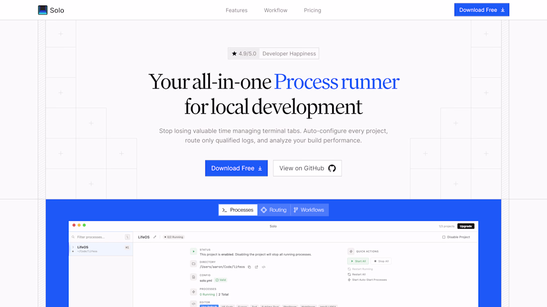
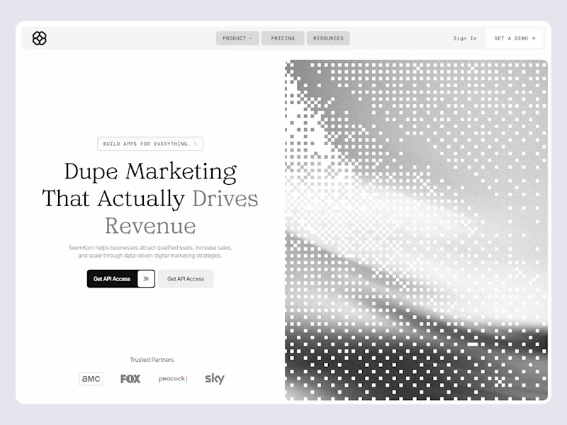
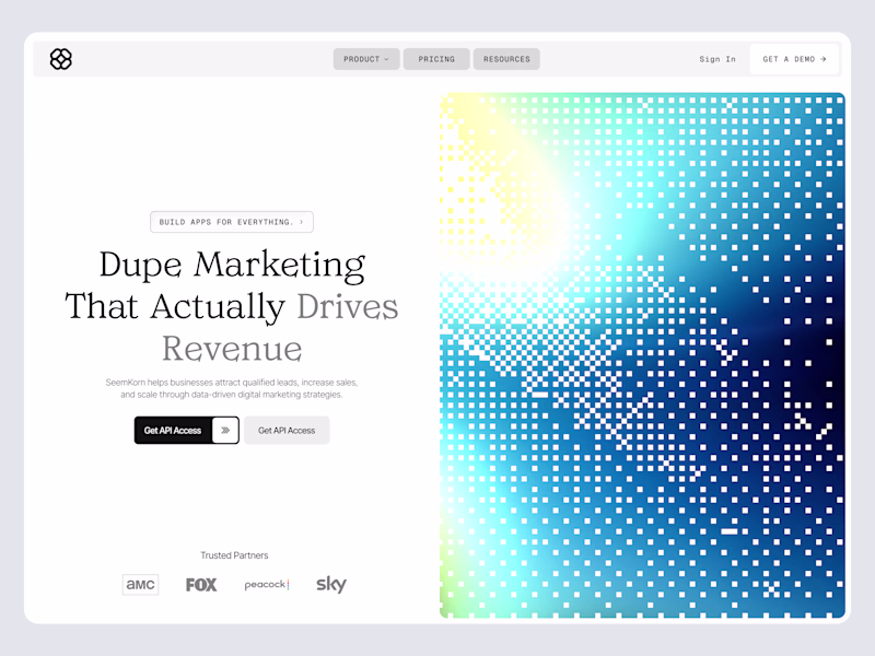
Taste Test
Started with a dark mode direction.
Tried a light version to explore contrast and now I am genuinely confused.
5 voted
56%
4 voted
44%
9 votes
Closed
Thanks Harish, I think I agree
Thank you!
Awesome work!
Thank you Sohail
Hard choice, but the contrast on the light version makes the copy way easier to scan at a glance. Looks great!
Thanks Sahil, I agree
The network for creativity
Join 1.25M professional creatives like you
Connect with clients, get discovered, and run your business 100% commission-free
Creatives on Contra have earned over $150M and we are just getting started
Related posts
A small update to my portfolio. Light mode ☀️ / Dark mode 🌙
One of those small details that makes browsing a little more enjoyable.
Check it out: https://badretdinov.com
Nice work
every project starts with exploring few different design directions, we did same for SOLO too.
Trending
Claude
Claude has entered the design space. How are you using Claude Design?
Contra University
Learn from expert creatives how to earn more using next-gen AI tools.
creativeaiflow
Creative AI workflows are evolving. What tools do you use, and what are their strengths and weaknesses?
freelancerlife
Freelancer life is wins, pivots, and everything in between. What’s yours right now?