The network for creativity
Join 1.25M professional creatives like you
Connect with clients, get discovered, and run your business 100% commission-free
Creatives on Contra have earned over $150M and we are just getting started
Back to feedPost
Taste Test


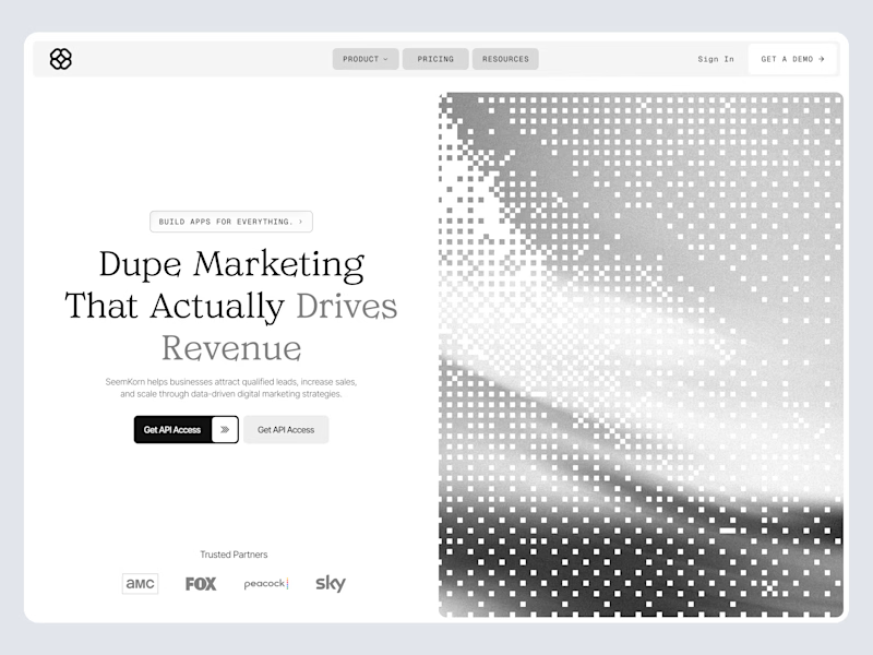
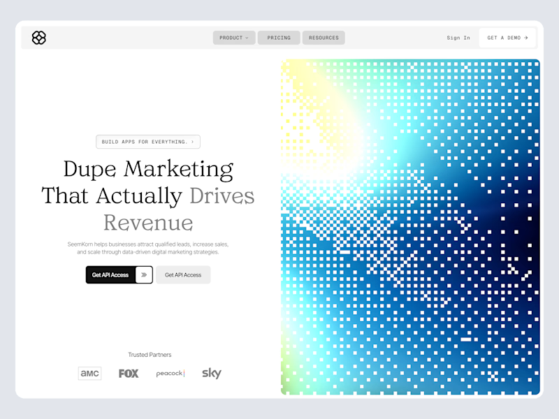


I like monochrome theme so much but the monochrome version kills the spul in this one. I will go with colored!

Thankyou! Appreciated!

Yeah it is! Thankyou

Appreciated your thoughts on it, yet this was not the final version.🙌

Color Contrast for sure! The gradient grabs attention faster and feels way more modern for a marketing page, while B&W feels a bit too quiet.
Thankyou! Appreciated

the black and white version more like a wireframes
Thankyou! Appreciated, this was not the final version but i loved your feedback on it.

Color contrast🔥
Appreciated!👍

Color
Appreciated!
The network for creativity
Join 1.25M professional creatives like you
Connect with clients, get discovered, and run your business 100% commission-free
Creatives on Contra have earned over $150M and we are just getting started







Related posts

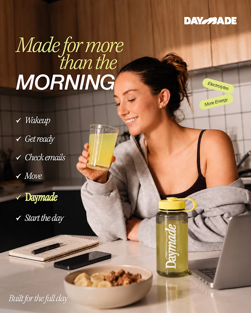
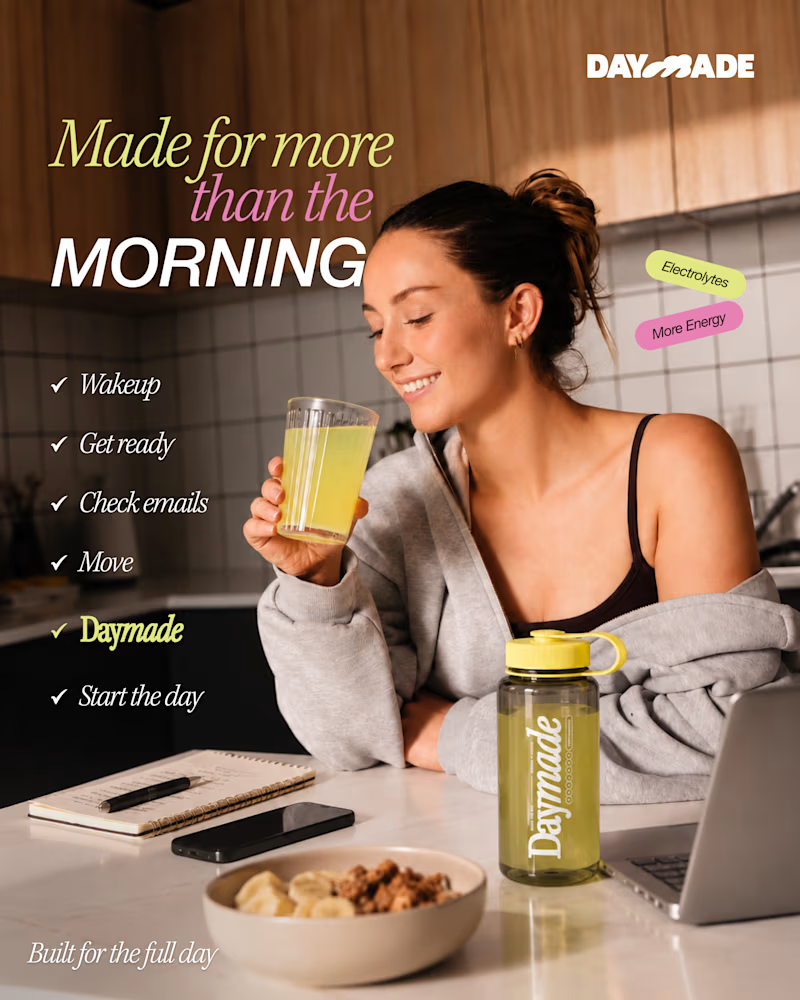
✨ Two styles. One campaign. Which Daymade design hits differently?
I explored two creative directions for Daymade, combining lifestyle storytelling with bold typography and fresh, energetic colors. ☀️🥤
💛 Option 1: Fresh & Minimal 💗 Option 2: Bold & Playful
Which one grabs your attention? 👀
Cast your vote! 🗳️👇
25 voted
26%
73 voted
74%
98 votes
Closed

Option 2 looks better

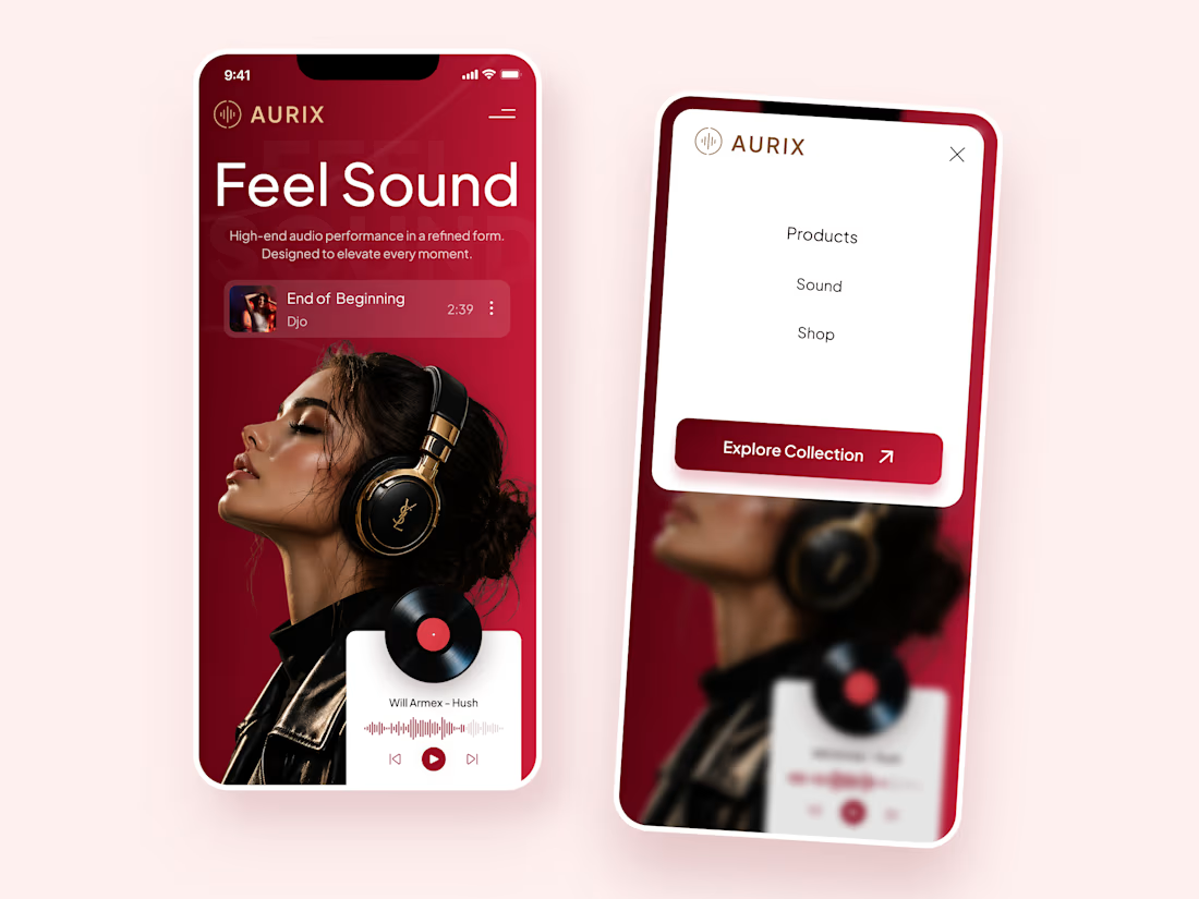
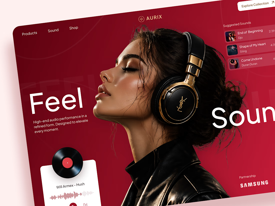
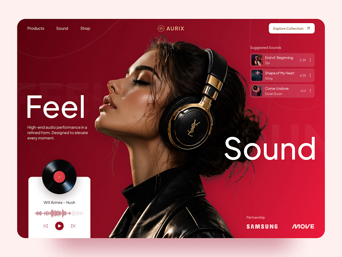
AURIX — Premium Headphones Landing Page 🎧❤️
A bold landing page concept for a premium audio brand, combining luxury headphones, music, and a strong lifestyle aesthetic
The design brings together deep red tones, elegant black and gold details, oversized typography, and immersive lifestyle imagery to create a modern, fashion-inspired experience
Special attention was given to:
• Bold lifestyle-focused hero composition
• Rich red and gold color palette
• Clean, oversized typography
• Music player and suggested tracks
• Premium product presentation
• Responsive mobile experience
• Minimal navigation and clear CTA
The result is a stylish, immersive landing page that connects premium audio with fashion, music, and everyday lifestyle ✨


Love the style!


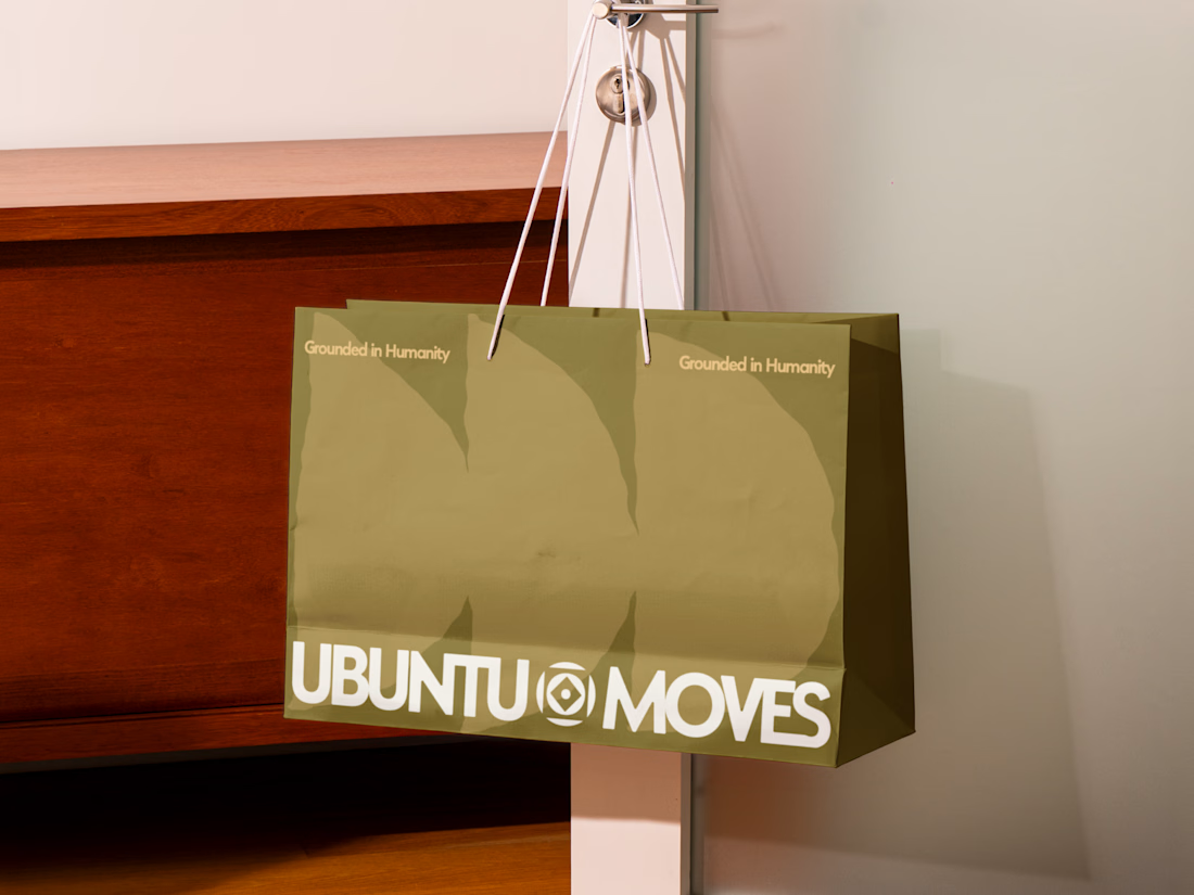
Grounded in humanity, made for movement.
Packaging and custom Framer website design for Ubuntu Moves, a wellness brand inspired by the belief that “I am because we are.”
Earthy colors, expressive patterns, and bold typography bring its sense of connection into the physical and digital experience.
Thanks @Can Girgin for the Framer development💫


The olive shopping bag with the wordmark split around that circular emblem looks great in the warm light, and the big tonal arches printed behind it add movement without shouting.