The network for creativity
Join 1.25M professional creatives like you
Connect with clients, get discovered, and run your business 100% commission-free
Creatives on Contra have earned over $150M and we are just getting started
Back to feedPost

I'm a creative digital designer passionate about turning ideas into impactful visual content.
🎬 Video Editing: Engaging content for Instagram Reels, TikTok, YouTube Shorts, and promotional videos.
🎨 Graphic Design: Logo design, brand identity, social media posts, posters, flyers, thumbnails, and other creative visuals.
💡 Creative Content: Helping creators, brands, and businesses communicate their ideas through compelling videos and eye-catching designs.
My goal is to combine creativity, quality, and attention to detail to help brands stand out in the digital space.
I'm always open to connecting with creators, entrepreneurs, and businesses looking for creative solutions.
Let's bring your ideas to life! 🤝🔥
The network for creativity
Join 1.25M professional creatives like you
Connect with clients, get discovered, and run your business 100% commission-free
Creatives on Contra have earned over $150M and we are just getting started











Related posts

Which mockup platforms are you sourcing your mockups from ?
These are my favorite ones ✨
Share yours below.

This is very useful, and of course very beautiful

An existing brand identity showcased across a new campaign. This was one of my favourite projects ever!

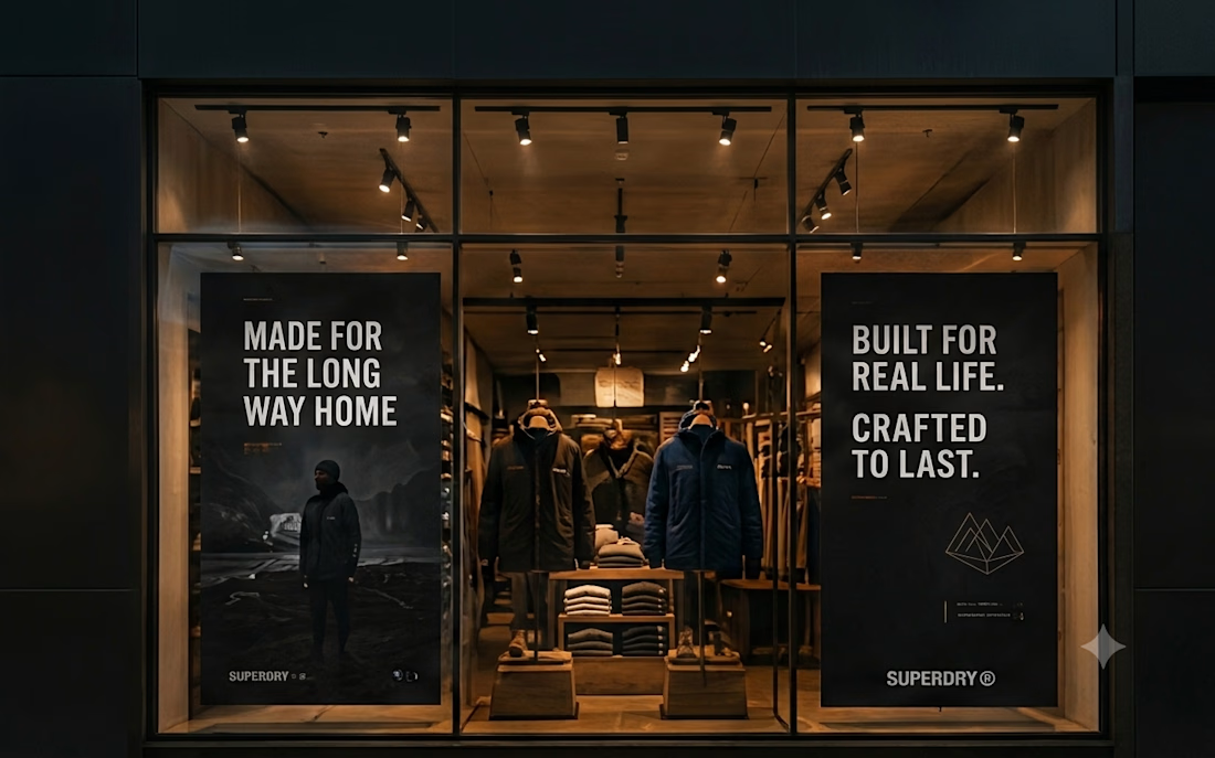
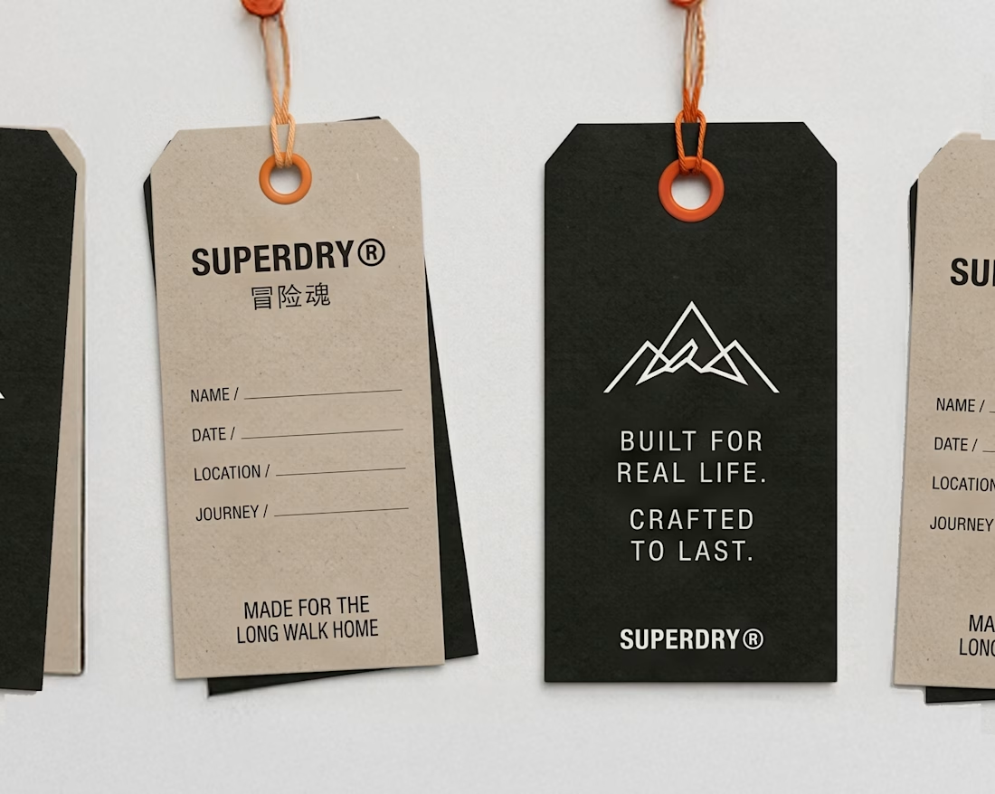
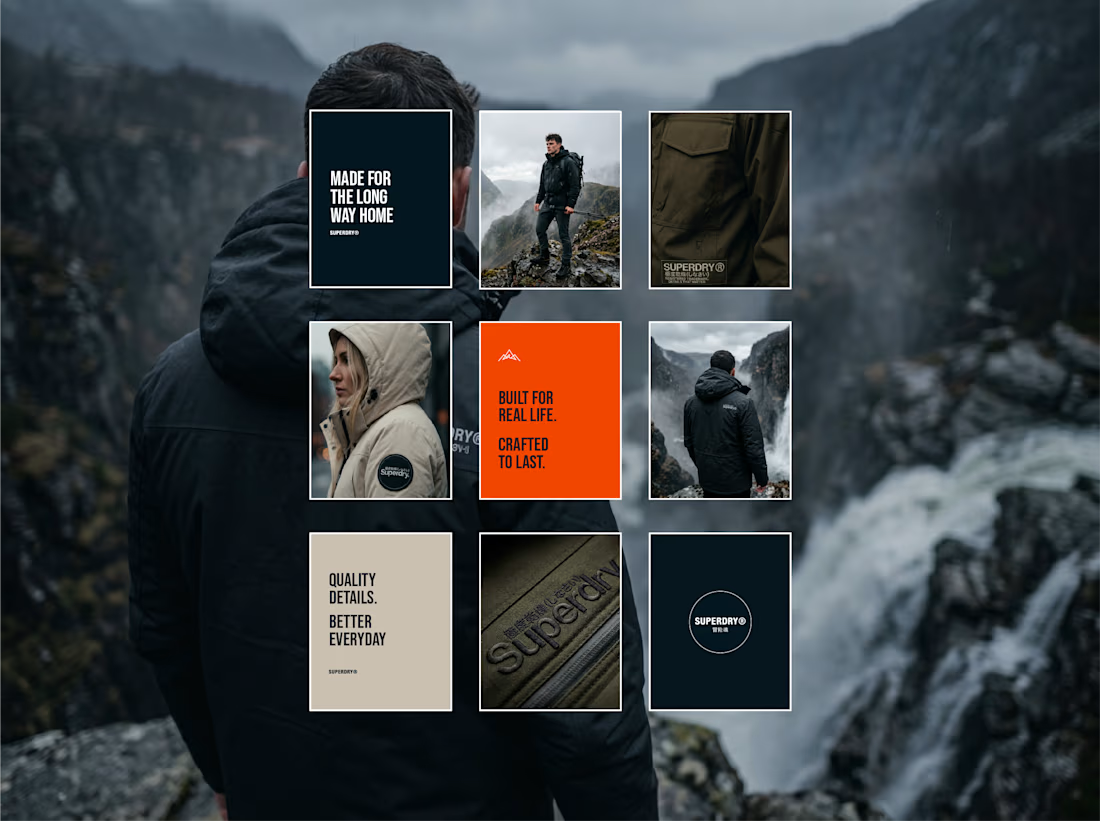
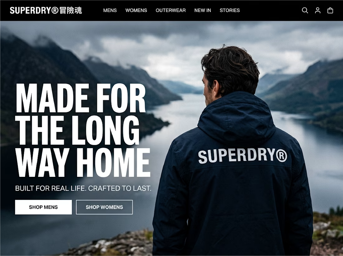

Taking an existing identity and stretching it across a whole new campaign is such a good test of a system. This looks like one of those projects where everything just clicked.

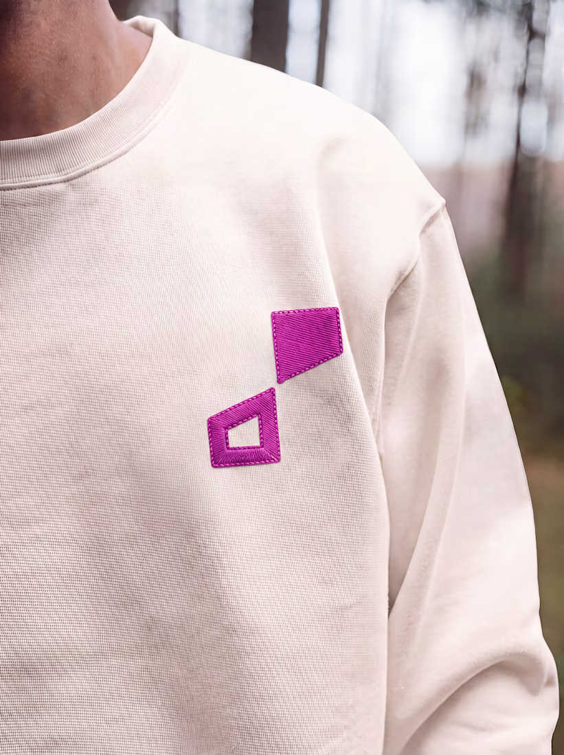
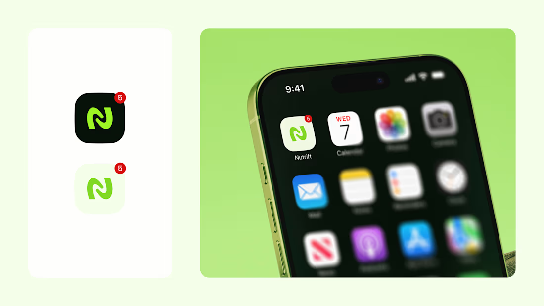
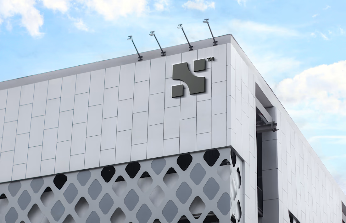
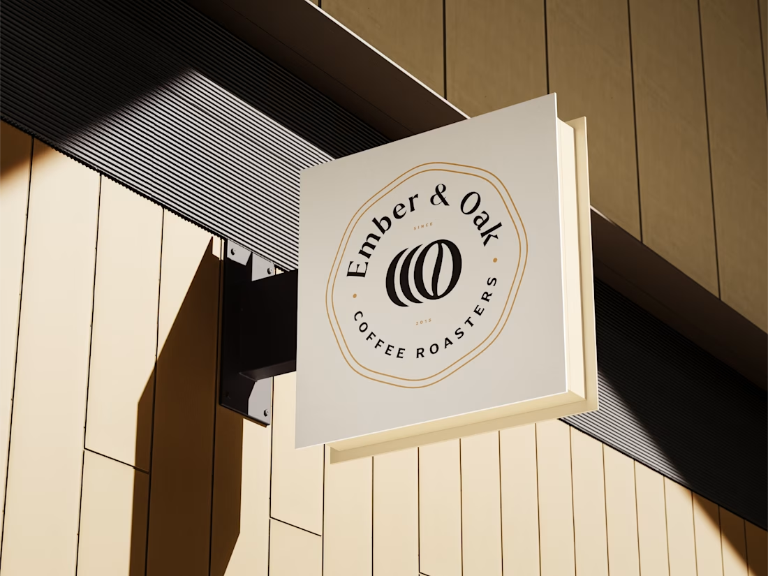
Logos from my archive.
A good logo doesn't really have to tell what you do; it's meant to tell a story. Here are some with their unique stories.
¹ Unik Mindz — inspired by Michelangelo’s 'Creation of Adam'; human creativity sparked by a higher source.
² Nutrift — reflecting the idea of weekly cycles and continuous meaningful progress.
³ Nestform — built to reflect furniture that adapts and transforms to different living spaces.
⁴ Ember & Oak — built around the truth that coffee is defined by its transformation, with the mark capturing the entire roasting journey.

Do you usually find the story first and draw toward it, or does the story get written once the mark takes shape? The weekly-cycle idea behind Nutrift reads like it could have gone either way.