The network for creativity
Join 1.25M professional creatives like you
Connect with clients, get discovered, and run your business 100% commission-free
Creatives on Contra have earned over $150M and we are just getting started
Back to feedPost
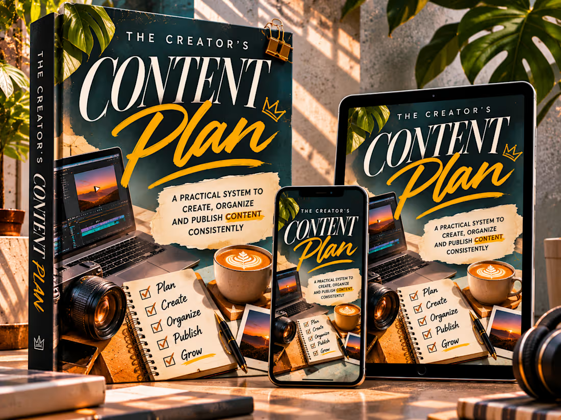
The Creator's Content Plan — Editorial eBook Cover Design
A visually expressive eBook cover concept that transforms the world of digital content creation into a cohesive, premium editorial identity.
The Creator's Content Plan is a self-initiated digital publishing concept exploring how thoughtful typography, purposeful imagery, and sophisticated product presentation can elevate an educational eBook into a visually distinctive product.
The project was developed to showcase an approach to cover design that combines strong visual storytelling with practical considerations for digital publishing, product presentation, and cross-device consistency.
The Creative Vision
The central concept was to capture the creative process behind planning, producing, organizing, and publishing digital content.
Rather than relying on a traditional portrait-led book cover, the design brings together recognizable elements from a creator's working environment.
A laptop displaying a video-editing timeline, a camera lens, a planning notebook, photography, and carefully arranged stationery establish a visual language directly connected to the book's subject.
These elements create an immediate connection between the cover and its intended audience: content creators looking to develop a more organized and intentional creative process.
Art Direction & Visual Identity
The cover combines deep teal, warm golden accents, soft cream typography, and tactile editorial textures to create a distinctive visual atmosphere.
The dark background establishes depth and contrast, allowing the expressive headline typography and creative imagery to command attention.
Photographic details introduce realism, while layered paper textures, handwritten elements, and subtle graphic accents give the composition a crafted editorial character.
Every visual element contributes to the subject of content creation, balancing creative energy with the structure suggested by the book's title.
Typography & Cover Composition
Typography forms the primary visual identity of the project.
The word CONTENT uses oversized, high-contrast editorial serif lettering to establish authority and immediate recognition.
The word Plan introduces movement and personality through expressive script lettering, creating a contrast between structured planning and creative freedom.
Supporting typography provides a clear description of the book's purpose without overwhelming the central composition.
The design establishes a recognizable hierarchy that remains consistent across the different product formats.
Multi-Device Product Presentation
An important part of this project was demonstrating how the cover translates across multiple viewing environments.
The finished presentation includes:
Physical book mockup: Showcases the cover's visual impact, typography, and overall editorial composition.
Tablet display: Demonstrates the cover's appearance in a larger digital reading format.
Smartphone display: Shows how the cover's identity remains recognizable on a smaller screen.
Maintaining a coordinated visual identity across these formats reinforces the professionalism and versatility of the design.
Creative Details & Visual Storytelling
The composition incorporates several recognizable elements from a content creator's workflow.
The editing interface references digital production, the camera introduces visual content creation, and the notebook communicates planning and organization.
Together, these elements establish the relationship between creativity and structure.
The surrounding environment was art-directed to create a premium product presentation, allowing the eBook to feel like a complete digital publishing concept rather than an isolated graphic.
Final Outcome
The completed concept demonstrates how a digital product cover can combine expressive typography, recognizable subject matter, and polished multi-device presentation.
It showcases the ability to develop a coherent cover identity that works across different formats while maintaining visual impact.
The goal was to make a practical content-planning guide feel like a distinctive, professionally presented digital publication — one that communicates its purpose before the reader even opens it.
Self-initiated portfolio concept created to demonstrate editorial eBook cover design, digital product presentation, and visual storytelling.



Great 👍🏻

Thank you🙏🏾
The network for creativity
Join 1.25M professional creatives like you
Connect with clients, get discovered, and run your business 100% commission-free
Creatives on Contra have earned over $150M and we are just getting started
Related posts


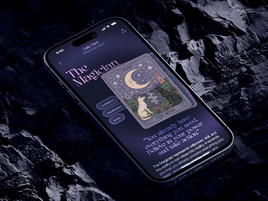
Just in time for Halloween! 🎃🔮 Excited to share this mystical tarot reading app concept, inspired by a little spooky season magic. Would love to hear your thoughts! ✨


Excellent work!

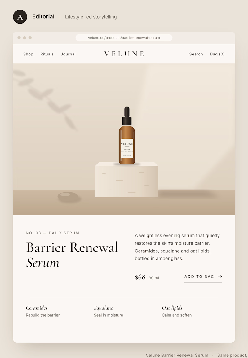
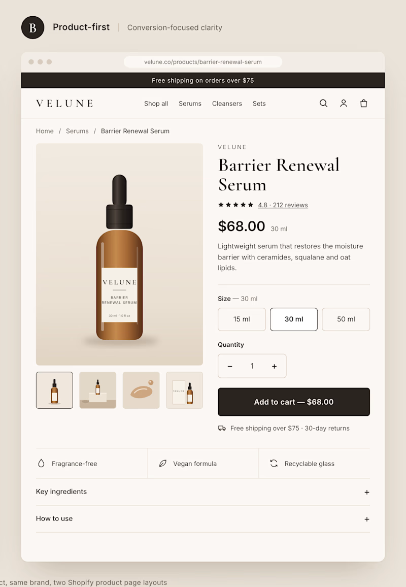
Two different approaches to the same Shopify product page.
Option A: Editorial layout. Large imagery, generous spacing, and a stronger focus on brand storytelling.
Option B: Product-first layout. Clear pricing, visible product options, and a prominent Add to Cart button.
Both can look great, but they create very different shopping experiences.
If you were building a premium DTC brand, which direction would you choose?
A or B? And why?
1 voted
11%
8 voted
89%
9 votes
Closed


Kids don’t read brand guidelines. They poke things.
So every creature in Little Fen has eyes. On the site, they follow you.
Case study is live.