The network for creativity
Join 1.25M professional creatives like you
Connect with clients, get discovered, and run your business 100% commission-free
Creatives on Contra have earned over $150M and we are just getting started
Back to feedPost

1. Brief & Concept
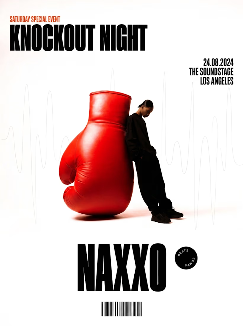
Brief: Design a promotional event poster for a Saturday special event titled "KNOCKOUT NIGHT" featuring the main performer NAXXO at The Soundstage, Los Angeles.
Concept: Surrealist Metaphor of Music & Sports. The concept bridges the intensity of combat sports with the pulse of live music. An oversized boxing glove serves as a direct visual metaphor for the event title, implying a musical experience that delivers an unforgettable visual and auditory punch.
2. Art Direction
Visual Style: Modern Swiss Brutalism. This style integrates a strict grid layout, dominant bold typography, and modern urban graphic elements such as circular badges and barcodes.
Photographic Approach: Fashion Editorial Surrealism. The image features a model in all-black streetwear leaning casually against an object scaled to an unrealistic proportion. This creates a composed, high-fashion, and intriguing visual identity.
Mood: Masculine, contemporary, minimalist, and edgy.
3. Composition & Hierarchy
Composition: Center-Weighted Vertical Balance. The central artwork is positioned directly along the vertical axis, framed by heavy blocks of typography at the top and bottom to create structural stability.
Visual Hierarchy:
Primary Focal Point (Level 1): The oversized bright red boxing glove in the center, which immediately commands attention through scale and color saturation.
Secondary Focal Point (Level 2): The performer's name NAXXO at the bottom and the event title KNOCKOUT NIGHT at the top.
Tertiary Focal Point (Level 3): Supporting details including the date, venue location, circular "BEATS BANGS" badge, subtle background soundwave lines, and the barcode at the base.
4. Typography
Primary Typeface (Title & Artist Name): Ultra-Condensed Extra-Bold Sans-Serif. The characters are tall, heavily weighted, and tightly spaced. This typeface creates a solid, heavy architectural presence that dominates the layout.
Secondary Typeface (Event Details): Geometric Sans-Serif. Applied to the date, location, and event tag in a smaller scale to ensure clean legibility.
Text Treatment: All-Caps Formatting. Used across all major text elements to maintain an authoritative, bold, and modern tone.
5. Color Palette & Layout
Color Palette:
Dominant Base: Stark White (#FFFFFF) background providing extensive negative space.
Structural Base: Deep Jet Black (#000000) applied to the typography, model's outfit, badge, and barcode for strong contrast.
Accent Color: Bright Crimson Red (#FF1E27) used intentionally only on the boxing glove and the sub-header tag "SATURDAY SPECIAL EVENT" to guide visual entry.
Layout:
Three-Tier Grid System: Structured cleanly into top (Header/Title), middle (Primary Artwork), and bottom (Footer/Artist & Details) zones.
Negative Space: Strategic use of expansive white space maintains a clean, premium, and uncluttered aesthetic.


The network for creativity
Join 1.25M professional creatives like you
Connect with clients, get discovered, and run your business 100% commission-free
Creatives on Contra have earned over $150M and we are just getting started
Trending
retrofuturism
Share your favorite designs from the past exploring the distant future. Or your own take on the aesthetic 🚀
halftone
Dots. Texture. Grain. Let's see your designs using the halftone technique.

Midjourney
Creatives are showing off what they're making with Midjourney.
colorgrade
Video editors sound off: How do you enhance the mood of your video in color grading?





Related posts

Sagelet is an AI communication platform that routes each prompt to the language model best suited to handle it.
The challenge was making that complexity feel simple and approachable. We built a visual identity around clarity, accessibility, and a more human way of introducing AI to everyday users.
The system combines a vivid visual language, accessible iconography, and Sova, a friendly owl mascot that became part of the brand's personality.
What we did
→ Brand Identity
→ Art Direction
→ Visual System
→ UX / UI
→ Iconography
→ Mascot Design


🔥 🔥

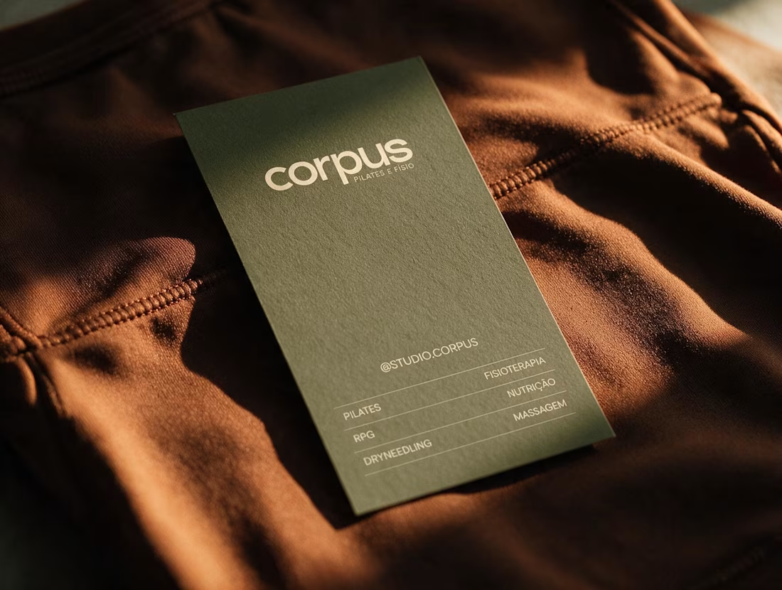
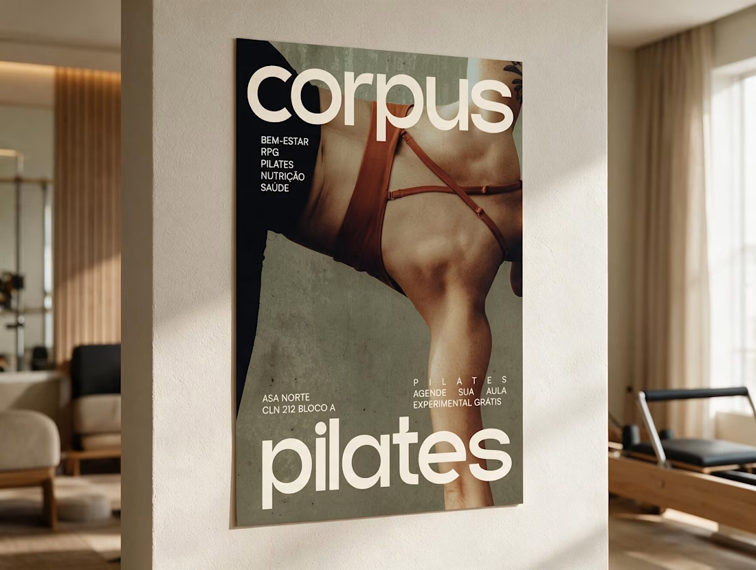
Branding for Corpus, a Pilates and physiotherapy studio. I developed a warm and contemporary identity focused on movement, wellbeing and a more refined, tactile approach to the brand across physical and digital applications.

Branding 🤩 😍

Most new fashion brands launch loud.
I designed Marvèle's to be the opposite, quiet, considered, unmistakably premium.
Thoughtfully made. Beautifully considered.
Which design screams premium louder — A or B?
Candid votes below 👇
3 voted
38%
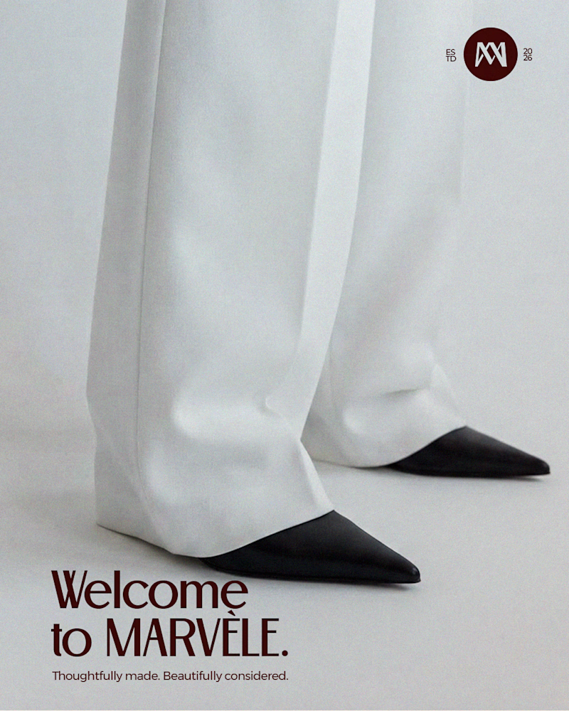
5 voted
62%
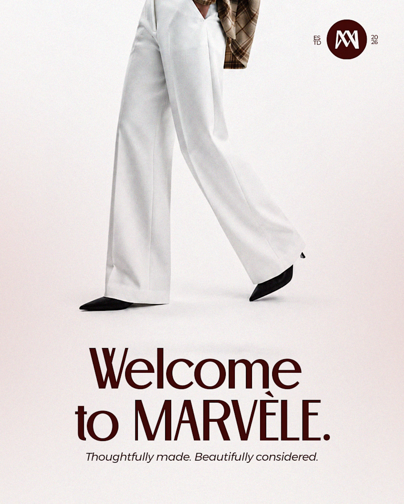
8 votes
Closed

To be honest really hard to settle on one but I love the A better because of the close up shot on the design