The network for creativity
Join 1.25M professional creatives like you
Connect with clients, get discovered, and run your business 100% commission-free
Creatives on Contra have earned over $150M and we are just getting started
Back to feedPost


The network for creativity
Join 1.25M professional creatives like you
Connect with clients, get discovered, and run your business 100% commission-free
Creatives on Contra have earned over $150M and we are just getting started

Challenges
View all


Related posts

Most real estate brands look like they were designed not to offend anyone. Arcova was designed to be impossible to ignore.
Electric lime. Forest green. A house mark that owns a building facade as confidently as it owns a tote bag. "Build where others only look." "What we build today is what stands tomorrow."


This is really Creative.
It really stands out.

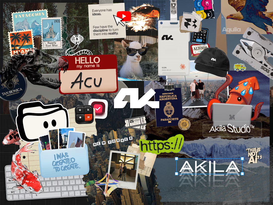
What's on the moodboard of the person you became?
This is my creative story in a collage
"Everyone has ideas. Few have the discipline to turn them into reality"
This is Akila. This is Acu. This is not AI.
What three must-have things would be on yours?


Thank you!

Just came across this website and really liked the way they’ve combined clean design with immersive interactions.
The smooth animations, typography, transitions, and product storytelling make the whole experience feel premium without being overwhelming.
Website: otsuka-air.jp
What stood out to me:
• Smooth and thoughtful interactions
• Clean visual hierarchy
• Strong product storytelling
• Minimal yet engaging UI
• Great use of motion throughout the experience
Would love to know what you guys think about this design approach.
What’s your favorite detail on this site? 👀


Amazing!