The network for creativity
Join 1.25M professional creatives like you
Connect with clients, get discovered, and run your business 100% commission-free
Creatives on Contra have earned over $150M and we are just getting started
Back to feedPost

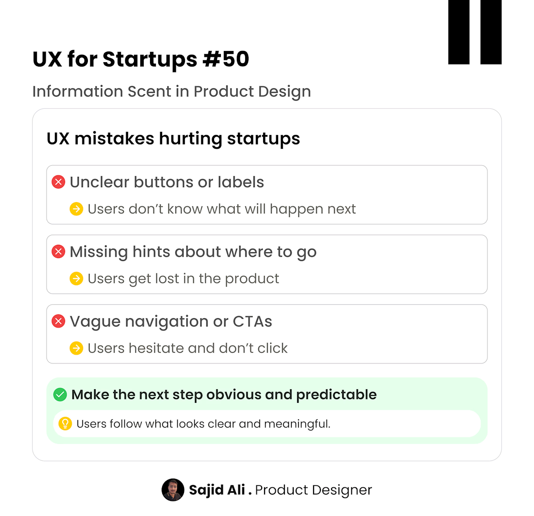
Users don’t explore products randomly. They follow clues.
If a button, label, or section doesn’t clearly show what will happen next, users hesitate or ignore it.
That clarity the small signals that guide users forward is called information scent.
When the scent is strong, users feel confident clicking and exploring. When it’s weak, they get lost or drop off.
Good UX makes every action predictable and easy to understand without explanation.
I help startups design product experiences that improve clarity, navigation, and user engagement.
DMs open for product design collaborations.

Oh, where did this come from? Do you have a particular example?
Oh yeah. I've seen that all the time like, Duolingo also has super good about labelling buttons
The network for creativity
Join 1.25M professional creatives like you
Connect with clients, get discovered, and run your business 100% commission-free
Creatives on Contra have earned over $150M and we are just getting started
Trending

Claude
Claude has entered the design space. How are you using it?

Contra University
Learn from expert creatives how to earn more using next-gen AI tools.
Brand Design
The best brand designers are on Contra. Scroll to see what's trending in brand design. What are you building?
creativeaiflow
Creative AI workflows are evolving. What tools do you use, and what are their strengths and weaknesses?
freelancerlife
Freelancer life is wins, pivots, and everything in between. What’s yours right now?
Related posts

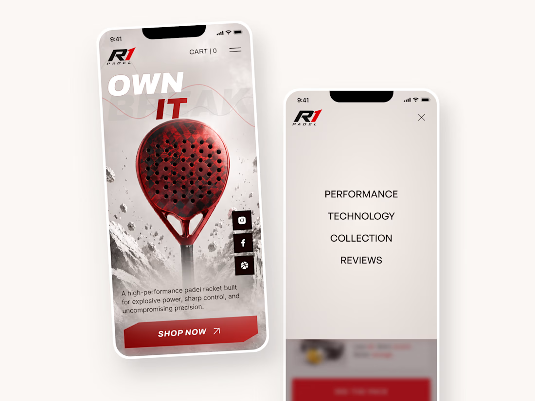
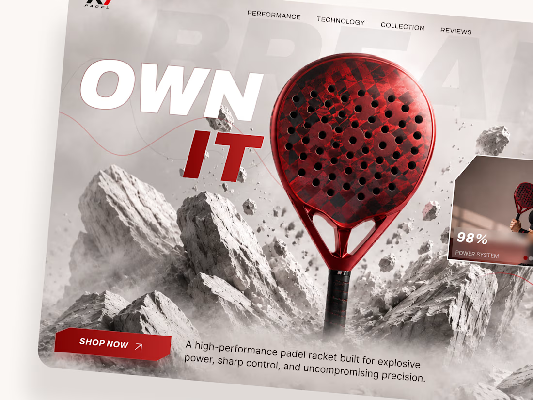
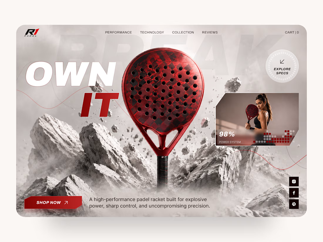
R1 Padel — High-Performance Sports Equipment Landing Page 🎾
Performance starts long before the first match.
This landing page concept for R1 Padel was designed to capture the energy, precision, and premium quality behind a high-performance padel racket. The goal was to create a bold digital experience that immediately communicates speed, power, and confidence while keeping the product at the center of attention.
The design combines dramatic visuals, strong typography, and a clean interface to deliver an immersive shopping experience for athletes and sports enthusiasts.
Key design highlights:
• a cinematic hero section focused entirely on the product;
• dynamic visual composition inspired by movement, impact, and performance;
• premium product presentation with detailed specifications and feature highlights;
• responsive desktop and mobile layouts for a seamless shopping experience 📱;
• bold call-to-action elements that naturally guide users toward purchase;
• clean navigation and intuitive content hierarchy for effortless browsing;
• a modern visual language that reinforces a premium sports brand identity.
The result is a conversion-focused landing page that blends impactful storytelling with ecommerce usability, helping transform visitors into customers while strengthening the brand's premium positioning.
Looking to create a modern ecommerce experience or product landing page for your sports brand? Let's build something that performs as well as your product. 🚀



WOW!! 🔥

Every product starts with a choice.🚀
🎨 Custom or ⚡ Template.
One gives you complete flexibility.
The other gets you to market faster.
There isn't a wrong answer.
It all depends on what you're building.
Which would you choose? 👇
#Webflow #NoCode #WebDesign #ProductDesign #UXDesign #Startups #Freelancing #BuildInPublic

3 voted
75%
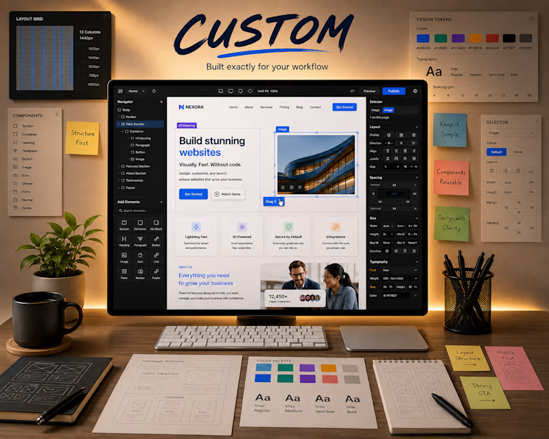
1 voted
25%
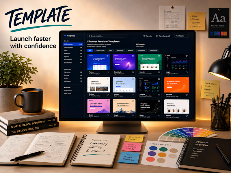
4 votes
Closed


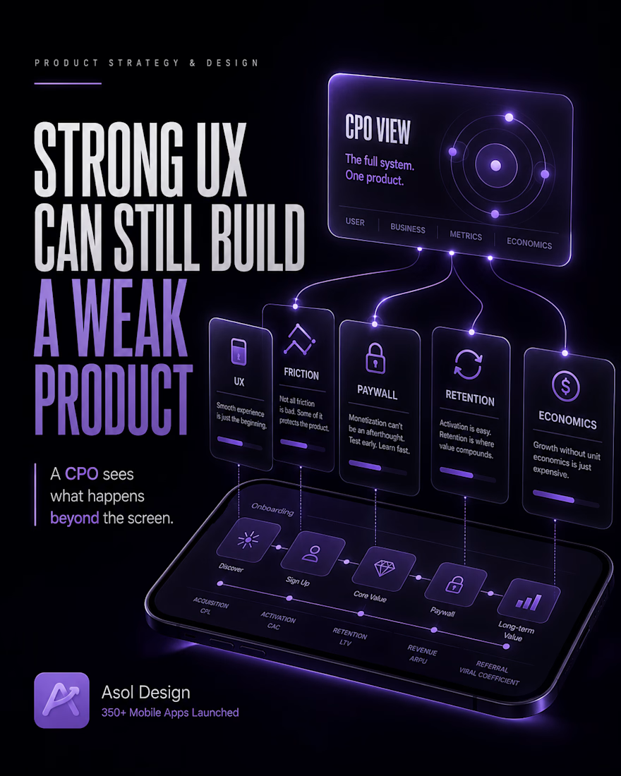
WHAT WORKING AS A CPO TAUGHT ME ABOUT MOBILE PRODUCTS
I completed 60+ design courses and worked on 350+ mobile apps.
That taught me how to create strong UX.
Working as a CPO taught me something harder:
Strong UX alone does not create a strong product.
🔴 A designer tries to shorten onboarding.
🟣 A CPO knows that shorter onboarding can improve completion while reducing retention and revenue if users never understand enough value to stay or pay.
🔴 A designer tries to remove friction.
🟣 A CPO knows that some friction is a filter. It protects the product from low-intent users, poor-fit customers, and acquisition that will never pay back.
🔴 A designer avoids showing the paywall too early.
🟣 A CPO knows that a startup cannot postpone testing willingness to pay forever.
A team can spend months improving a free experience only to discover that there was never a viable paid product underneath it.
🔴 A designer tries to increase conversion.
🟣 A CPO knows that higher conversion can also mean more refunds, lower LTV, higher support costs, and the wrong users.
🔴 A designer optimizes an individual flow.
🟣 A CPO sees the entire AARRR system:
Acquisition
Activation
Retention
Revenue
Referral
Improving one metric can damage the next stage.
More acquisition can weaken retention.
More trials can reduce revenue.
More active users can increase losses if serving them costs more than they generate.
🔴 A designer searches for the best solution within the existing product logic.
🟣 A CPO challenges the logic itself.
❓ Should this flow exist at all?
❓ Who should enter it, and who should be filtered out?
❓ Which metric reflects real value, and which one only looks good in analytics?
A designer improves the experience.
A CPO-level product partner sees the whole product and understands how each decision affects retention, monetization, and business economics.
Pixel-perfect screens built on weak product logic only help a team execute the wrong decision faster and at a higher cost.
The rare skill is understanding which screens should never be created, where the product is losing money, and which decision will change not just the interface, but the business.
#MobileProductStrategy #MobileAppDesign #ProductDesign #UXDesign #MobileApps #CPO #ProductEconomics #AsolDesign


Great, it looks amazing. 3D like stuffs, i like it.


