The network for creativity
Join 1.25M professional creatives like you
Connect with clients, get discovered, and run your business 100% commission-free
Creatives on Contra have earned over $150M and we are just getting started
Back to feedPost
One more project shipped 🚀
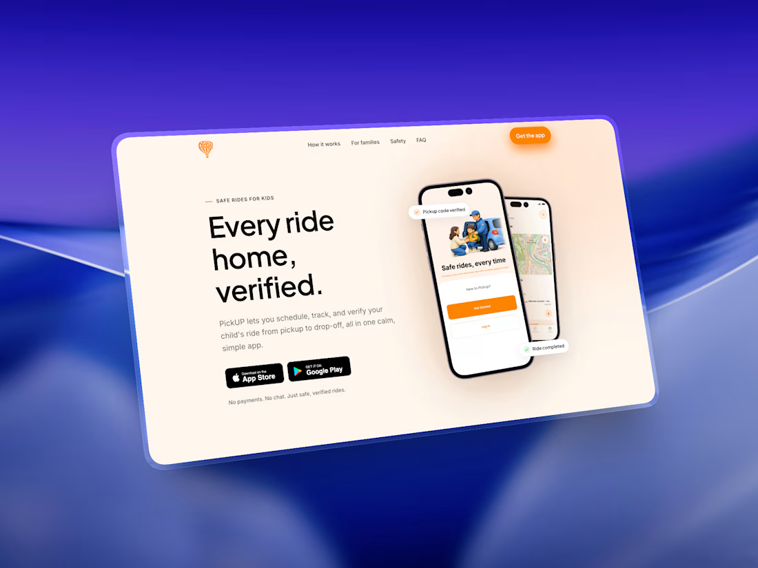
Just completed and launched the responsive landing page for PickUP, a mobile app that’s already built and currently going through testing before its upcoming App Store and Google Play launch.
The goal was to keep the website simple, clear, and focused on showcasing the product without overcomplicating the experience.
Now I’m curious 👀
What’s the first thing you noticed when you opened the landing page?
The visuals? The app showcase? The layout? Or the overall flow?
Would love to know what stands out to you.


More about the project here - https://contra.com/p/kgosUWNr-pick-up-app-landing-page
The network for creativity
Join 1.25M professional creatives like you
Connect with clients, get discovered, and run your business 100% commission-free
Creatives on Contra have earned over $150M and we are just getting started







Related posts


Okaaaayy, new profile picture and a new project! 🥳
This is one i'm really proud of and shows the development in our studio. Not just a brand or a website, but 120+ app screens + full IOS development for Mercury 🌍
I'm super proud of this project! Please check it out :)) 👇


Huge congrats Chris! 🎉 120+ screens + full IOS dev for Mercury is massive! Love the growth of your studio - from brand to full product. The editorial typography card looks premium. Big inspiration for us building in the app space! Checking it out now 👏

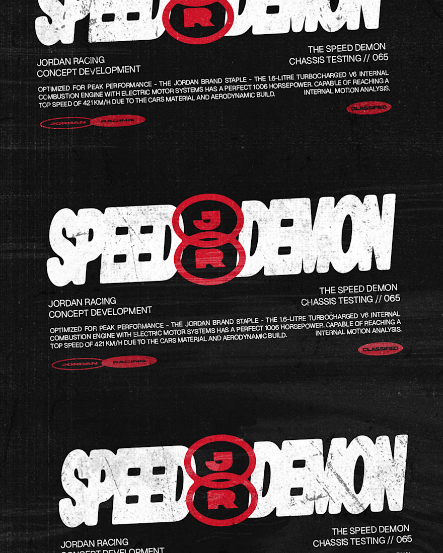
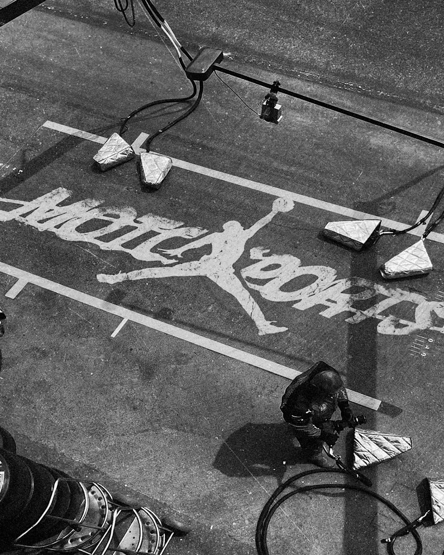
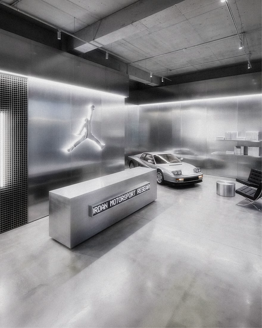
Jordan Racing concept.
What if Jordan Brand launched its own racing team? We imagined the full launch, from the Speed Demon campaign and posters to a telemetry inspired website, racing streetwear and a flagship research facility. Basketball heritage meets Formula 1 speed.
Designed by Studio /03
Concept project, not affiliated with Nike or Jordan Brand.
Art Direction, Brand Identity, Campaign Design, Web Design, Poster Design, Apparel Graphics, Motorsport, Concept


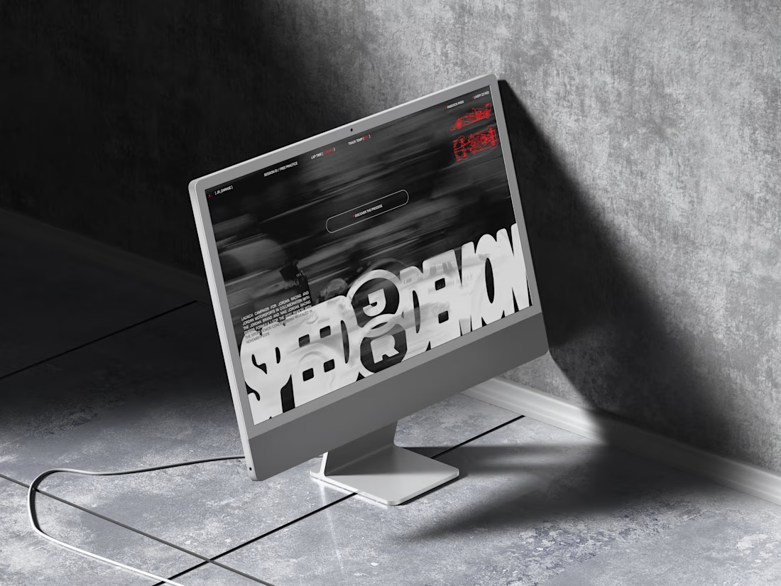

The grayscale with that one red accent keeps the whole system tight. Telemetry style site is a smart touch.


A logo reveal created in Blender, where simple geometric shapes come together to form the Geisleris Studio identity.


Nice


