The network for creativity
Join 1.25M professional creatives like you
Connect with clients, get discovered, and run your business 100% commission-free
Creatives on Contra have earned over $150M and we are just getting started
Back to feedPost
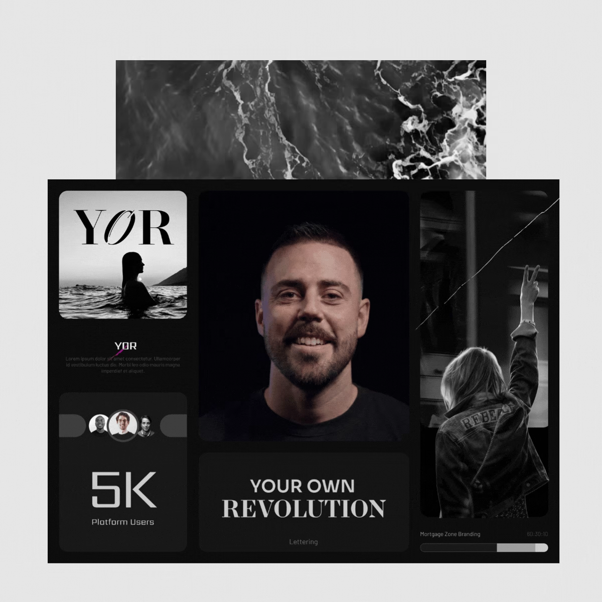
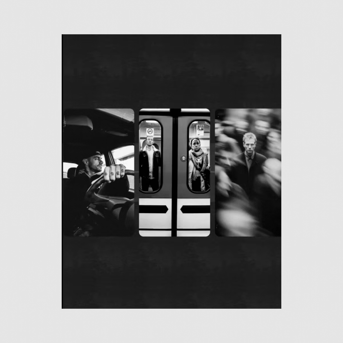
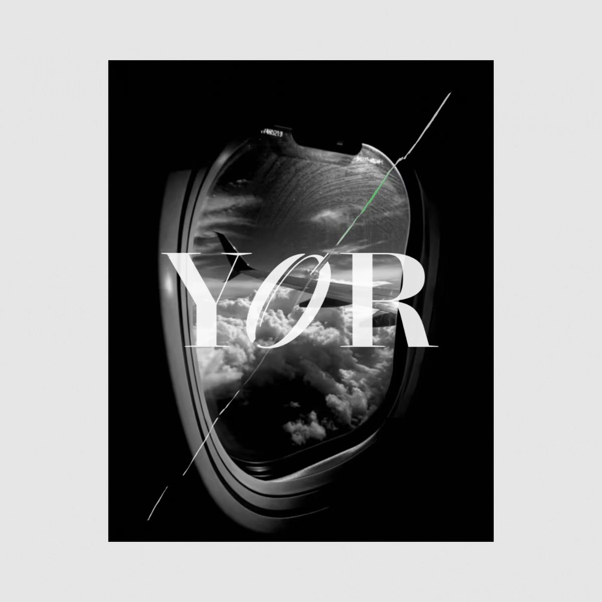
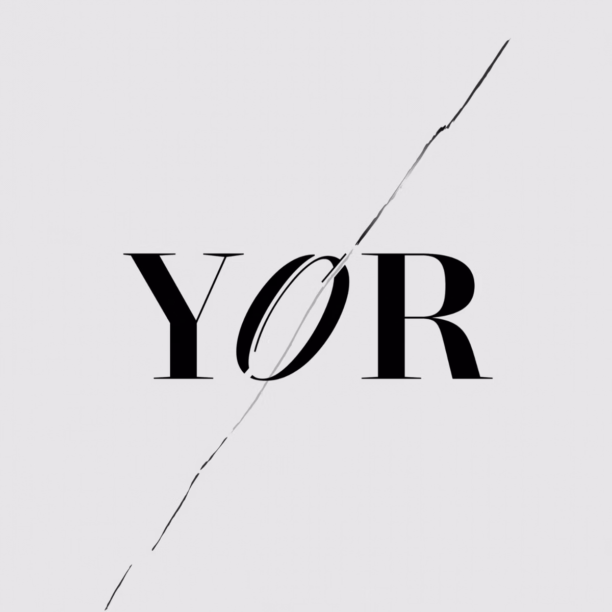
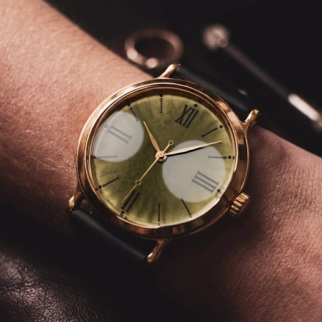
Brand design for YOR that stands for freedom. You’re not broken. You’re just living inside a system that was never built for you. Noise is control. Clarity is rebellion.
Brand carries a true Outlaw vibe. The logo is built around a single idea: clarity through wholeness.
The “O” is inspired by the Zen Enso, a hand-drawn circle that represents presence, truth, and completion. In Zen philosophy, the Enso is drawn in one uninterrupted movement, symbolizing a moment where mind, body, and intent align.
This directly reflects YOR’s core belief:
alignment cannot be forced — it emerges when identity, body, and direction come into coherence.
Case study coming soon!
The network for creativity
Join 1.25M professional creatives like you
Connect with clients, get discovered, and run your business 100% commission-free
Creatives on Contra have earned over $150M and we are just getting started
Related posts
Designing objects that feel like they already belong in the world — before they even exist
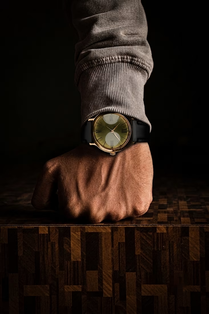
This project explores a complete brand identity and marketing system designed for a customer who values discretion, confidence, and quiet status — rather than loud communication.
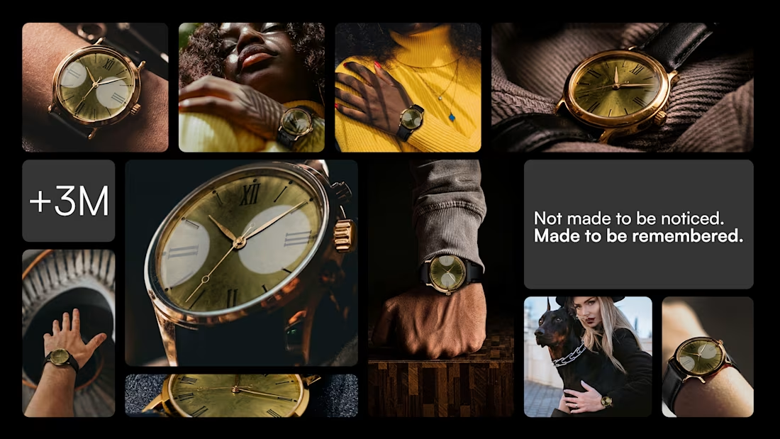
The level of craftsmanship here is incredible. The premium feel isn't just visible - it's something you can genuinely sense throughout the entire presentation. Beautifully executed. 👏
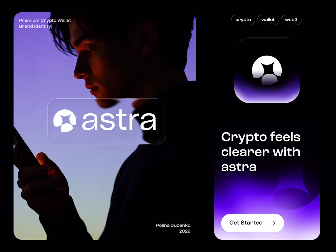
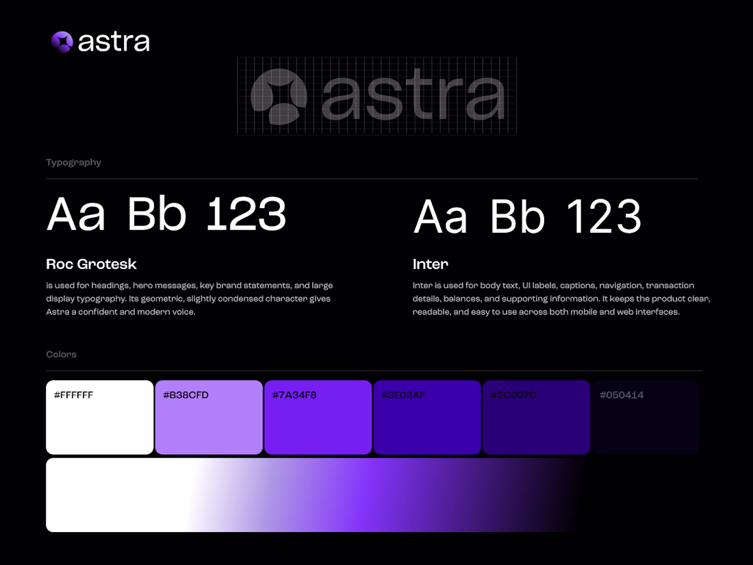
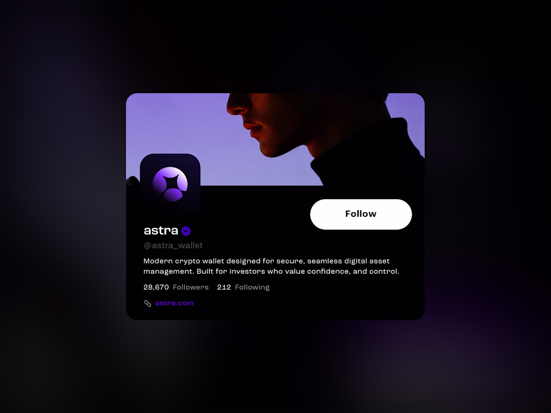
Designed a New Crypto / Fintech Brand: Astra Wallet ⭐
A premium crypto wallet brand built around simplicity, security, and trust.
The visual direction combines a minimal geometric logo, dark fintech aesthetics, and atmospheric violet gradients to create a brand that feels secure, digital, and future-facing.
Full product case study coming soon — including mobile UI, user flows, and additional brand applications. 👀
#BrandIdentity #LogoDesign #Fintech #Crypto #Web3 #Branding #VisualIdentity #ProductDesign #UIDesign
This feels like a really polished direction for a wallet product. I like how the concept balances security with a more future-facing, modern experience. It doesn’t feel overly complicated, which is exactly what makes a finance product feel more trustworthy and usable.
Just wrapped up this logo design for Dupeawaay.
The goal was to create a clean, memorable identity that feels modern, trustworthy, and easy to recognize across digital platforms. I explored a simple geometric approach, focusing on balance, scalability, and a strong visual presence without overcomplicating the mark.
Always enjoy the challenge of turning an idea into a logo that feels both distinctive and timeless.
Would love to hear your thoughts 👇
The geometric mark works well here. Pairing it with that clean wordmark keeps it readable at small sizes without losing the character. How does it hold up in single-color applications?
Trending
Claude
Claude has entered the design space. How are you using Claude Design?
Contra University
Learn from expert creatives how to earn more using next-gen AI tools.
MagicPath
The canvas is infinite, and exploration is becoming the workflow. How are you using MagicPath?
creativeaiflow
Creative AI workflows are evolving. What tools do you use, and what are their strengths and weaknesses?
freelancerlife
Freelancer life is wins, pivots, and everything in between. What’s yours right now?