The network for creativity
Join 1.25M professional creatives like you
Connect with clients, get discovered, and run your business 100% commission-free
Creatives on Contra have earned over $150M and we are just getting started
Back to feedPost

Why I start with real brushwork before opening Illustrator.
For this Japanese calligraphy logo study, I started with physical brush and ink rather than a brush font.
I explored the form by hand first, then selected the stroke that had the right balance, movement, and character before refining it digitally into a usable brand mark.
The goal wasn’t to preserve every imperfection.
It was to decide which imperfections gave the mark personality — and which ones needed to be refined for clarity and reproduction.
That balance between handcrafted expression and practical identity design is what interests me most.
Real brush → digital refinement → brand identity.
Which do you find more interesting — the raw brushwork or the refined mark?
The network for creativity
Join 1.25M professional creatives like you
Connect with clients, get discovered, and run your business 100% commission-free
Creatives on Contra have earned over $150M and we are just getting started








Related posts

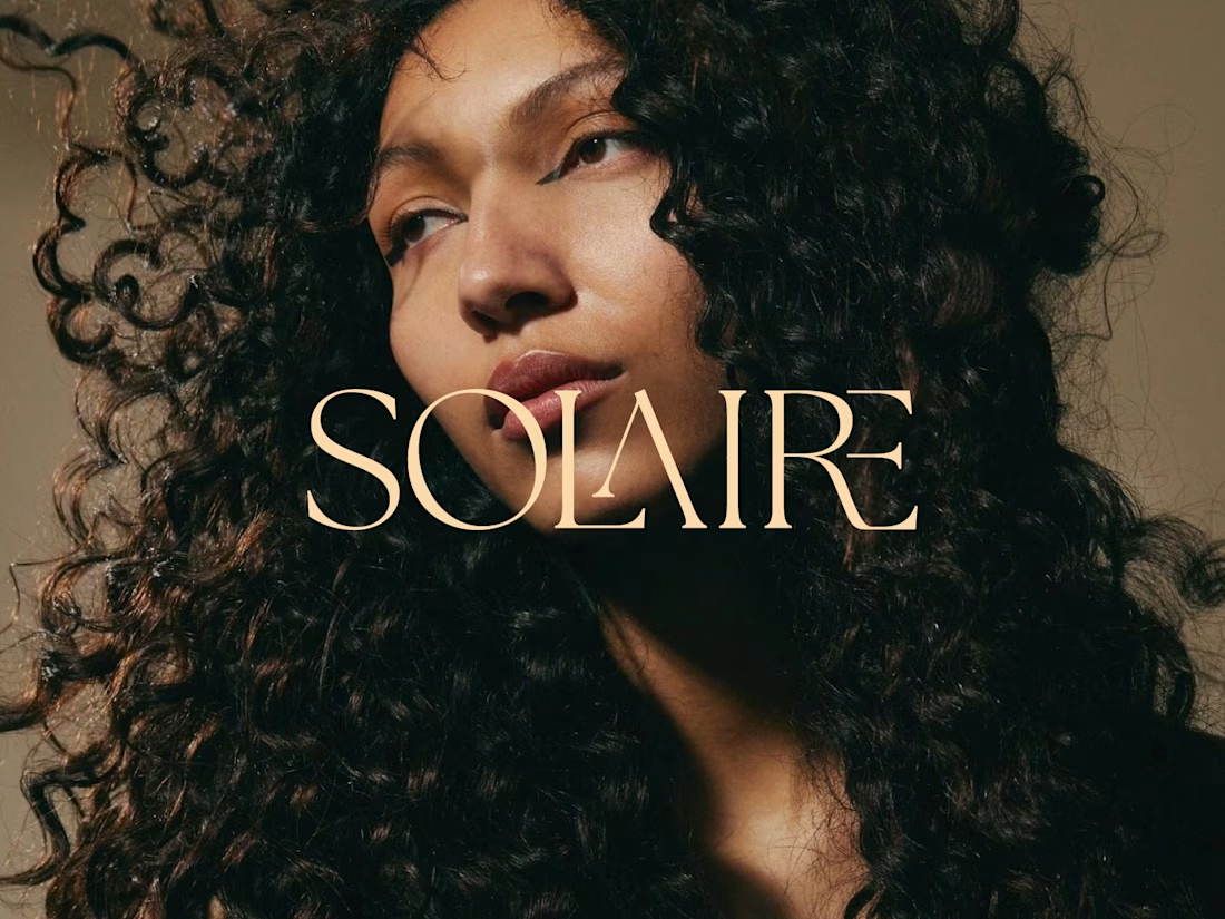
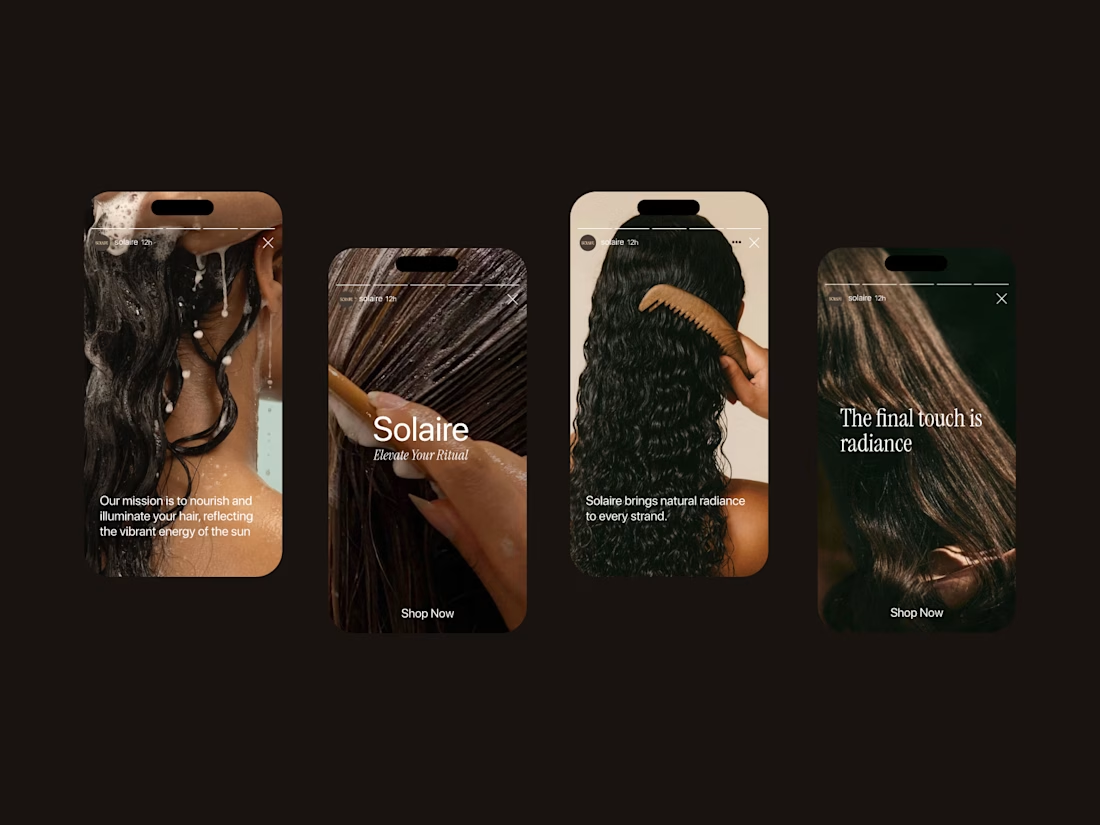
Solaire: a haircare brand identity rooted in warmth, texture, and light.
For this project, I wanted the brand to feel as dimensional as the hair it celebrates. The custom serif wordmark has elegant, ligature-style details where the letters overlap and intertwine, echoing the movement of a curl. The warm champagne tone against rich, golden-hour photography keeps everything feeling sun-kissed and confident rather than clinical.
The goal: a brand that feels luxurious but never precious, made for people who wear their texture proudly.
Brand identity • Logo design • Art direction


nice work


For Vetti, a pet-health startup, our team made orange the signature colour and kept it out of the product’s data states.
Orange could carry the brand in a campaign. Inside the product, the colour attached to a score needed its own meaning. Using the same colour for recognition and an alert would ask someone to work out which job it was doing.
So the guidelines gave the data palette a separate role. Scores came with plain-language states, and the alert-copy rule was to state the observation, then give the next step.
Those decisions belong together. A calm sentence can be undermined by a colour treatment that suggests urgency.
If you’re reviewing an identity for a product, put a marketing layout beside a screen that communicates status. Ask what each colour means in each place.


This is beautiful work, and the orange colour choice was a good one, it really ties it all together ♥️


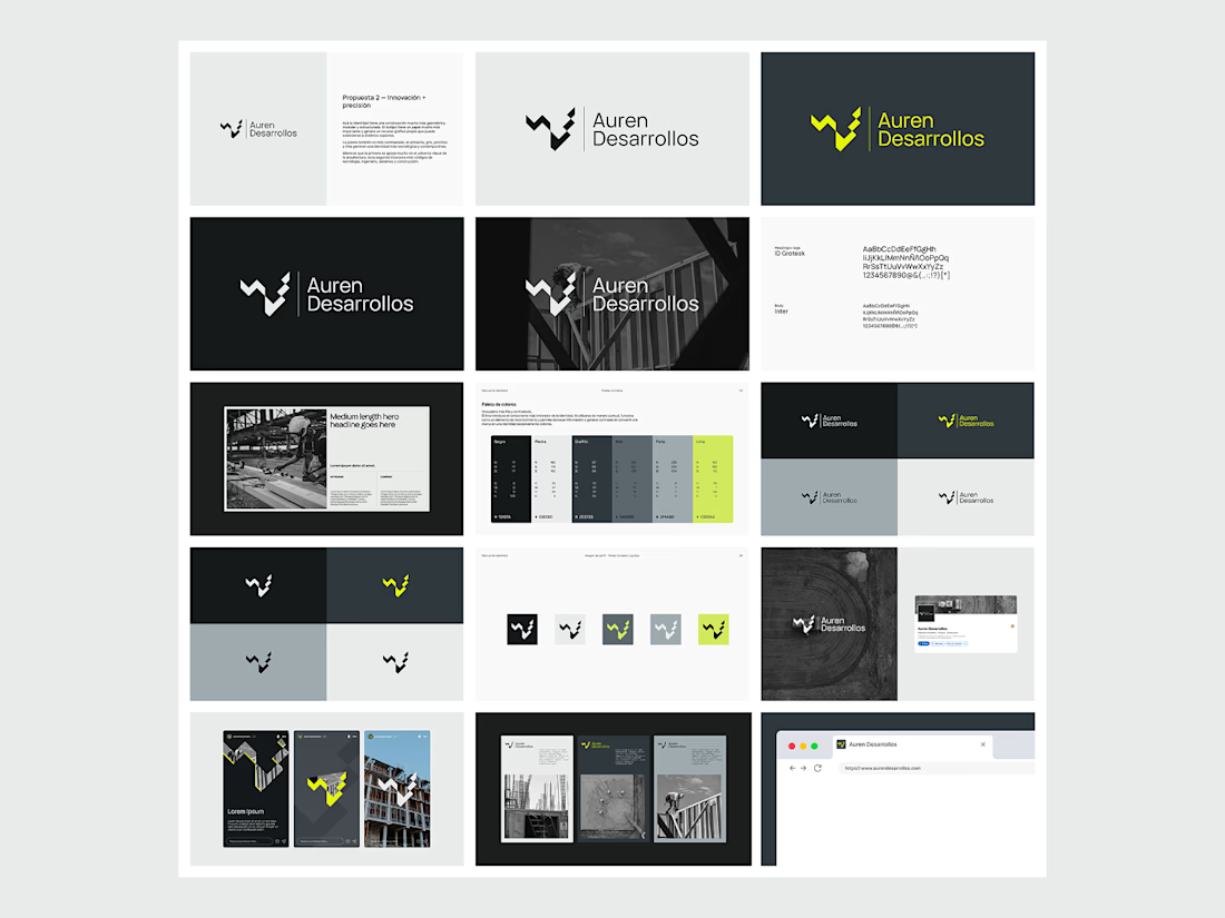
Not every direction makes it to the final brand.. this was one of the directions we explored for Auren Desarrollos, a new construction and development company we’re currently working with on its branding and website.
I’ll be sharing the final result soon, and I think the difference will be interesting to see.
What do you think?


Great!