The network for creativity
Join 1.25M professional creatives like you
Connect with clients, get discovered, and run your business 100% commission-free
Creatives on Contra have earned over $150M and we are just getting started
Back to feedPost


For Vetti, a pet-health startup, our team made orange the signature colour and kept it out of the product’s data states.
Orange could carry the brand in a campaign. Inside the product, the colour attached to a score needed its own meaning. Using the same colour for recognition and an alert would ask someone to work out which job it was doing.
So the guidelines gave the data palette a separate role. Scores came with plain-language states, and the alert-copy rule was to state the observation, then give the next step.
Those decisions belong together. A calm sentence can be undermined by a colour treatment that suggests urgency.
If you’re reviewing an identity for a product, put a marketing layout beside a screen that communicates status. Ask what each colour means in each place.


How you even decide these pleasing compositions and colours. These are crazy good. 😍

Amazingg work 🔥

This is beautiful work, and the orange colour choice was a good one, it really ties it all together ♥️

Thanks a lot, Michael.


Keeping orange out of the score states is such a disciplined call; the separate data palette makes the product screens read far more calmly.


this is so playful @Daniel G Bright

beautiful work

Great job Daniel your work are great ❤️❤️

this looks fantasticc!

This is well done 👍

The mockups in this are super cool. Well done.

The network for creativity
Join 1.25M professional creatives like you
Connect with clients, get discovered, and run your business 100% commission-free
Creatives on Contra have earned over $150M and we are just getting started





Related posts


Twenty-five years of credits, finally on a website that looks the part.
Just take a look at what kind of web we create ✨👇
Reflection of the brand history with taste, precision, and premium branding.
Scroll responsibly: https://productionportugal.com 😉🔥


Wow! Nice setup 🎥
The test for a tagline is simple. Can someone who's never heard of your company read it and tell you what you sell?
If they can't, it's not doing work. It might be doing something else. Setting a mood. Sounding confident. Filling space on a hero section.
But it's not helping a buyer understand what you do.
The best taglines I've seen in B2B are almost boring. They describe the category, name the buyer, or state the outcome. No metaphor. No wordplay. Just clarity.
"Accounting software for small businesses." You know exactly what it is and who it's for.
If your tagline needs an explanation, the tagline is the explanation.


Spot on. A tagline should explain the product not act as a puzzle buyers have to solve.

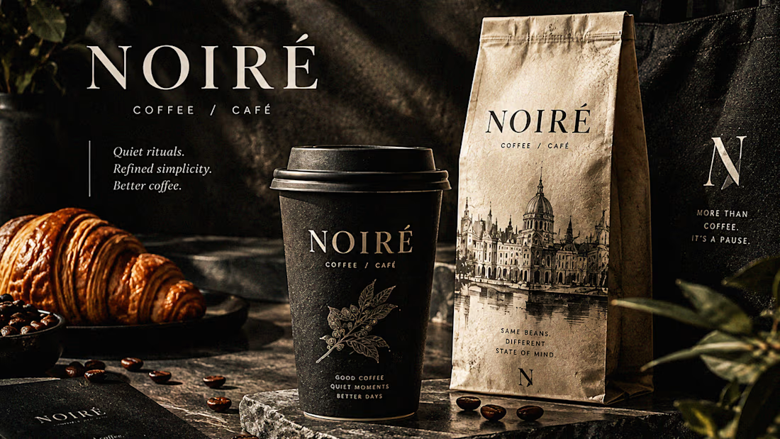
I Just Created NOIRÉ 🔥
A Coffee Brand Built Around the Pause.
NOIRÉ is a premium café brand built around a simple idea:
Great coffee should feel like a moment of pause, not another part of the
routine.
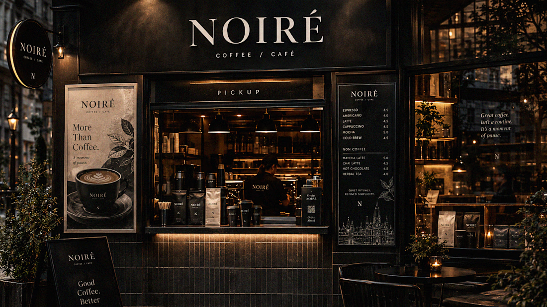
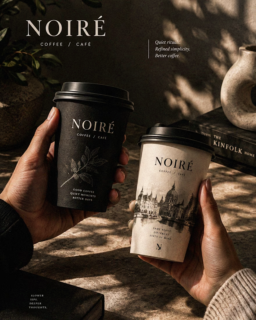
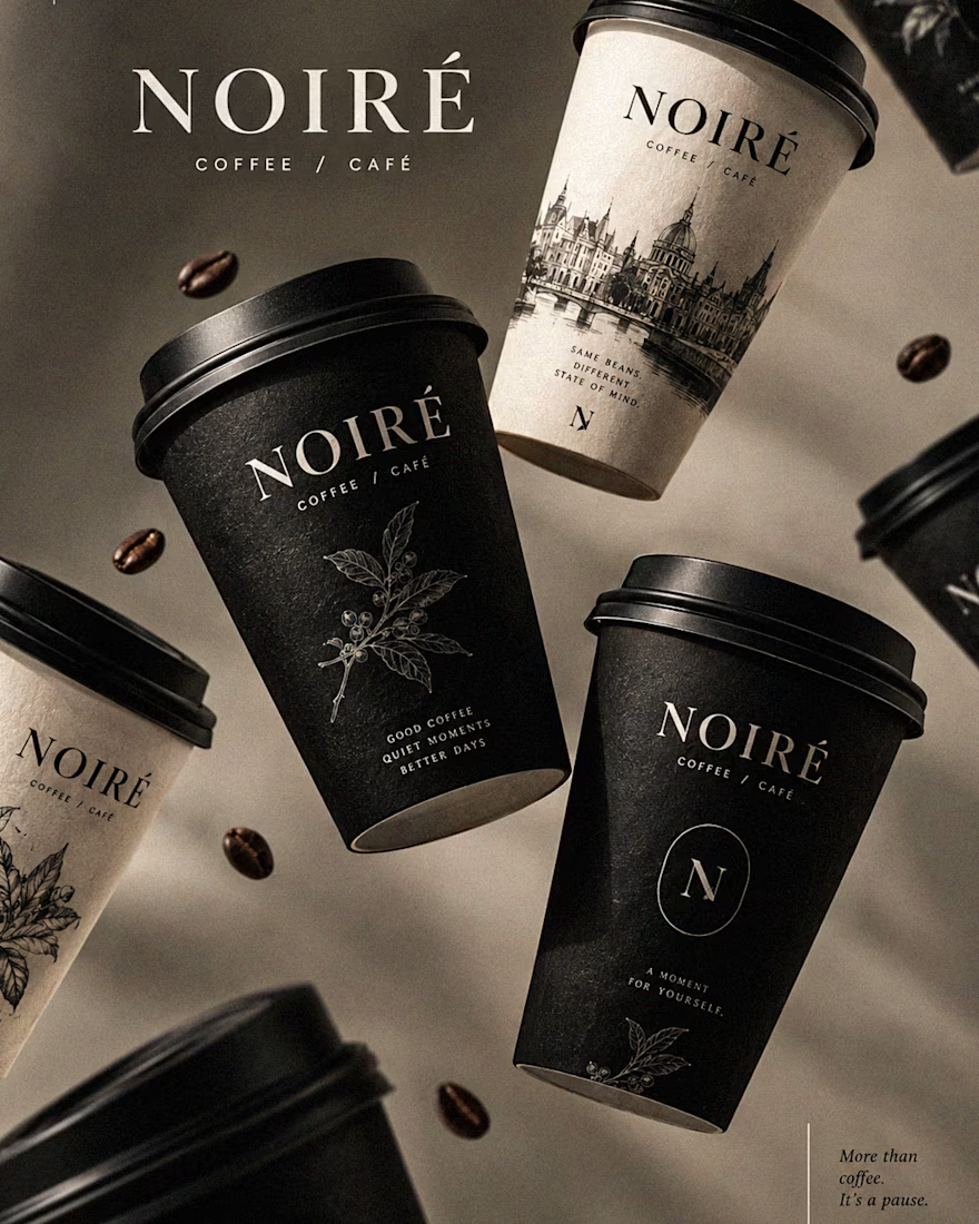
The project explores a complete visual identity, packaging
system, takeaway cups, coffee bags, tote bags, menu design, café applications and lifestyle campaign direction.
Instead of relying on the usual loud coffee aesthetics, I
built NOIRÉ around deep charcoal, warm ivory, soft graphite, refined
typography, subtle botanical illustrations and quiet editorial compositions.
The visual language is intentionally dark, tactile, and understated - giving every touchpoint the feeling of a slow morning, a quiet table, and coffee worth taking your time with.
From the cup in your hand to the café around you, every detail was designed to make the brand feel like a ritual.
Waiting for your thoughts in the comments 🙌🔥
branddesignertastetestBrand DesignGraphic DesignPackaging DesignAdobe IllustratorAdobe InDesignAdobe Photoshop