The network for creativity
Join 1.25M professional creatives like you
Connect with clients, get discovered, and run your business 100% commission-free
Creatives on Contra have earned over $150M and we are just getting started
Back to feedPost
Been pushing asymmetrical layouts a bit more this week and seeing how far they can go before they start feeling off.
There’s a structure underneath everything, but it’s not obvious. Most of it comes down to spacing, alignment, and letting hierarchy guide the composition instead of forcing balance.
I tried to keep the elements minimal and let the tension between them do the work. The goal was to make the layout feel dynamic without losing clarity.
Still experimenting with this direction, open to feedbacks.
The network for creativity
Join 1.25M professional creatives like you
Connect with clients, get discovered, and run your business 100% commission-free
Creatives on Contra have earned over $150M and we are just getting started
Related posts
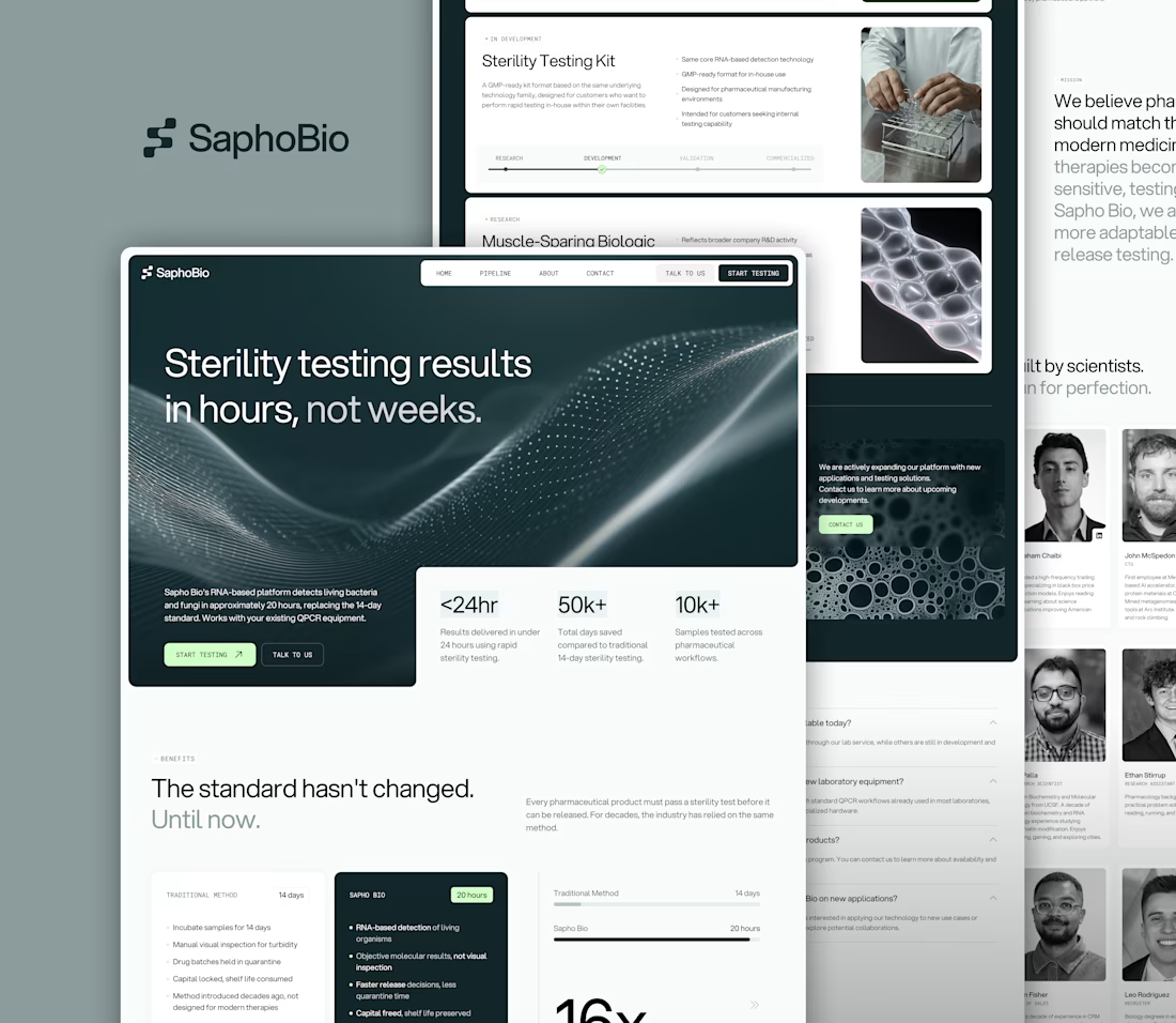
Partnered with SaphoBio, a San Francisco based biotech company developing next-generation microbiological testing, to design their branding, logo, and website.
The goal: translate complex science into a clear, credible, investor- and client-ready experience, enabling stronger conversations with pharmaceutical partners.
Website live → saphobio.com
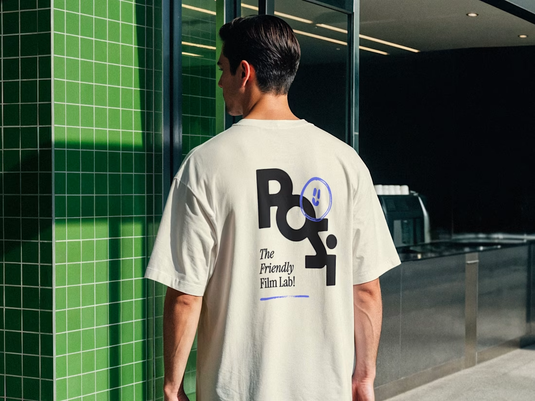
Just posted one of our latest branding projects 📸
A super creative one in the film photography industry 💜
looks fantastic 👌
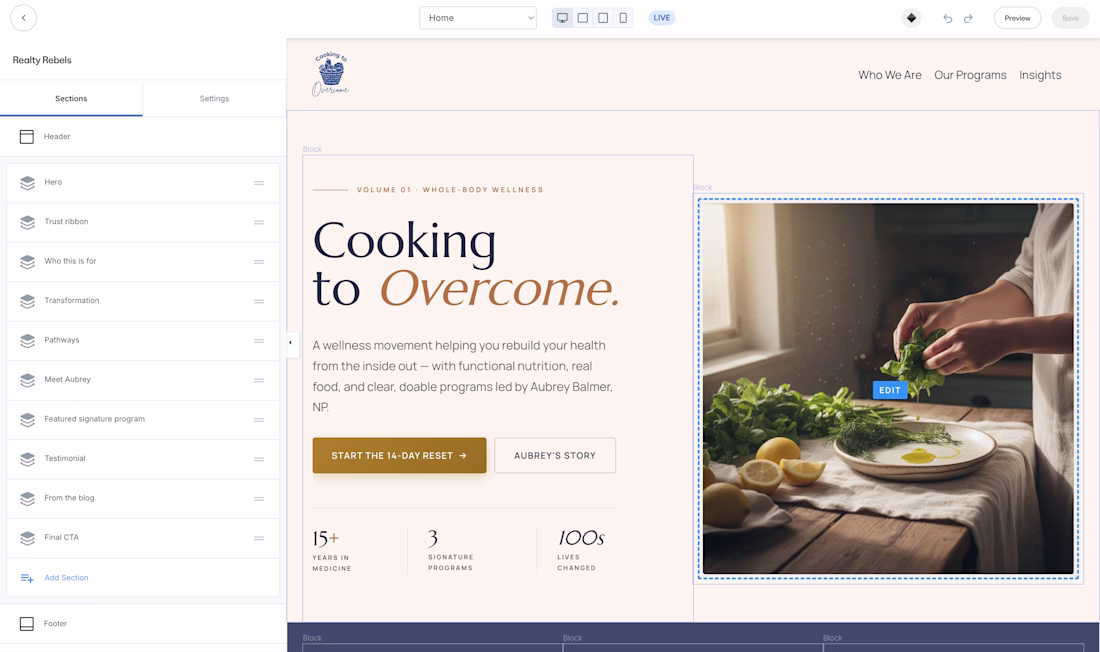
Question for designers/developers who build on Kajabi
If you had a tool that could generate a full Kajabi website from a prompt, let you preview it, make changes, and then export a real Kajabi-ready theme zip, would that be useful in your workflow?
I’ve been building this to help people create custom-feeling Kajabi websites much faster instead of starting from scratch every time. It’s still early, but I’m getting close enough that I’d love to know who would be interested if I opened up a small beta.
I am interested
Trending
Runway
AI video generation is exploding. What are you dreaming up in Runway?
Contra University
Learn from expert creatives how to earn more using next-gen AI tools.
creativeaiflow
Creative AI workflows are evolving. What tools do you use, and what are their strengths and weaknesses?
portfolioreview
The best portfolios tell a story, not just show a grid. Share yours for feedback.
freelancerlife
Freelancer life is wins, pivots, and everything in between. What’s yours right now?