The network for creativity
Join 1.25M professional creatives like you
Connect with clients, get discovered, and run your business 100% commission-free
Creatives on Contra have earned over $150M and we are just getting started
Back to feedPost
Swiss Poster Explorations
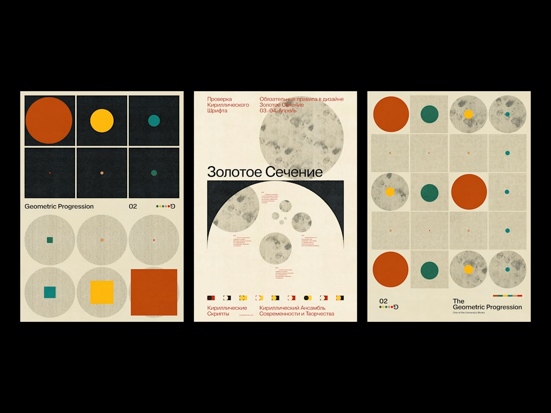
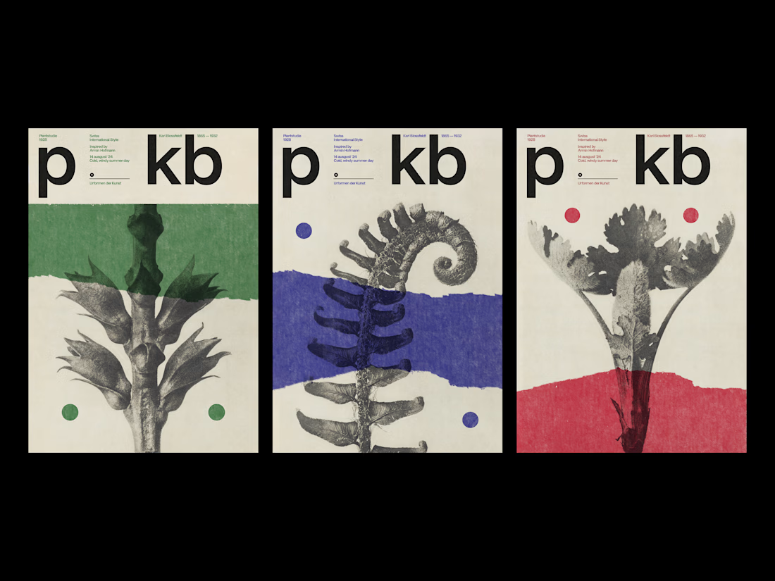
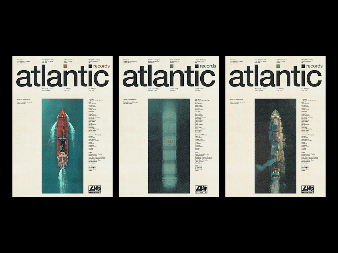
The starting point for each series was a source problem: what happens when you take material that already has its own visual logic Blossfeldt's botanical photographs, Soviet constructivist geometry, a record label's back catalog and subject it to the strict horizontal and vertical of the Swiss grid?
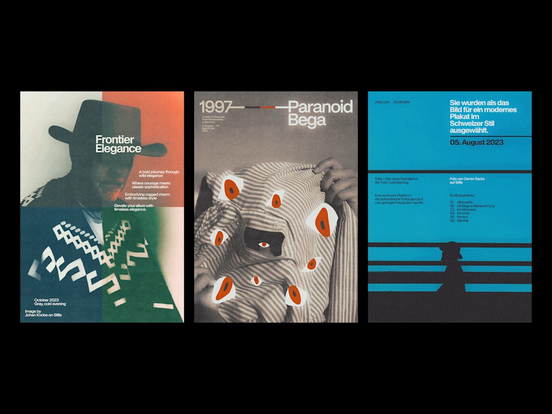
The four series were made without a brief. The Plantstudie posters pair Karl Blossfeldt's 1928 plant studies with the compositional principles of Armin Hofmann, a single block of flat color interrupting the image at a different height each time. The Atlantic Records work asks what the label's identity might look like if it had been designed in Zurich rather than New York. The geometric series works the other direction entirely: pure form, no photography, a palette of rust, ochre, and teal arranged on a grid that becomes increasingly hard to ignore.
The halftone work came last, and pushed furthest. Photography as raw material rather than subject. Color as punctuation rather than atmosphere.



Loveeee these!

Thank you Bella!

Thak you so much!
The network for creativity
Join 1.25M professional creatives like you
Connect with clients, get discovered, and run your business 100% commission-free
Creatives on Contra have earned over $150M and we are just getting started








Trending

Claude
Claude has entered the design space. How are you using Claude Design?

Contra University
Learn from expert creatives how to earn more using next-gen AI tools.
creativeaiflow
Creative AI workflows are evolving. What tools do you use, and what are their strengths and weaknesses?
freelancerlife
Freelancer life is wins, pivots, and everything in between. What’s yours right now?
Related posts

Designed 3 posters for a local bar's Sunday jam nights, with Envato as my toolkit. 🎸🎤
Envato gave me hero images, background texture, and animated video. But none of it works on its own. Someone still has to make the calls.
Human by Design: AI got me fast raw material. Making it feel like this bar took real decisions - recoloring and chroma-keying a stock video before animating, chasing a grimy texture over a clean AI render, picking one generated scene out of several for its energy - then building the composition and type myself.
Toolkit: @Envato Elements, Envato AI, After Effects, Illustrator.




this is awesome dina!! love the designs

Another concept from our archives that we're still proud of.
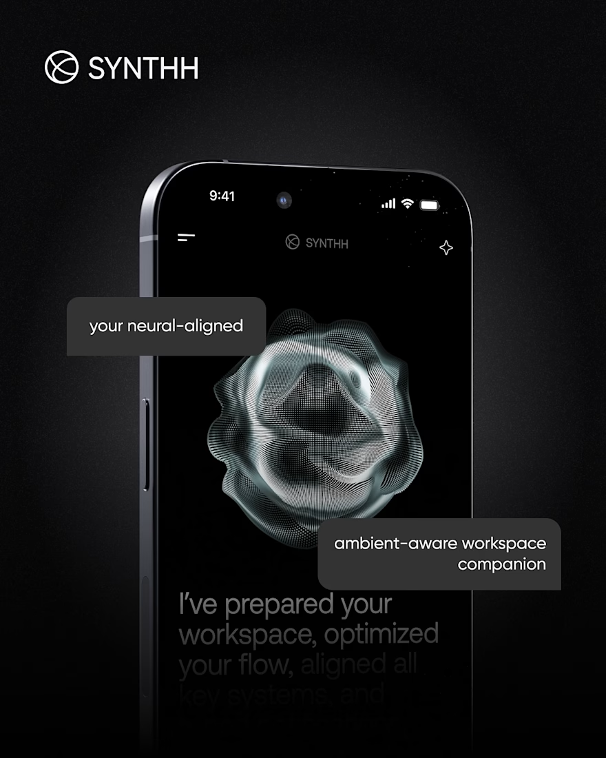
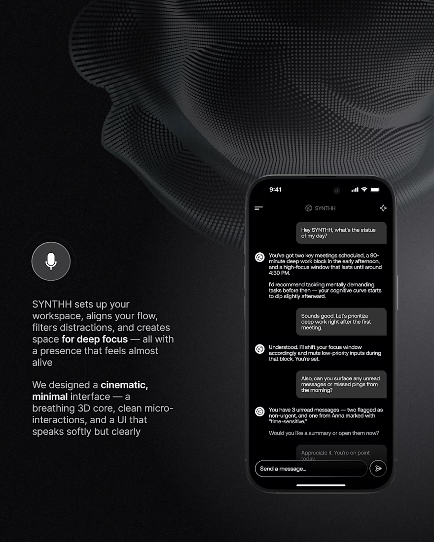
SYNTHH was our take on what an AI workspace assistant could feel like if it was designed around focus instead of constant notifications.
Instead of another chat interface, we explored a calmer experience with cinematic visuals, subtle motion, and an interface that fades into the background while helping you stay in flow.
We wanted every interaction to feel intentional, from the ambient UI to the conversational experience and the overall visual language.
It's always fun looking back at concepts like this and seeing ideas that are becoming more relevant today than when we first designed them.



Amazing work!

They said "You have to start somewhere"
Started building "StyleFlow"
The app will be live on App Store & Google Play soon.
We Need to focus on helping a local business then we do multi salon.
Interviewed real people in person to gather feedback and improve the app.
The app is live, and the salon is actively using it. They love how smooth it is and how much it has helped automate tasks for both customers and salon owners.
💯 Just DM me to get the access code and explore the Manage Your Salon feature, since the salon is currently using the app.
Live: https://styleflow-hub.base44.app/
Thank you for those who are supporting the app.

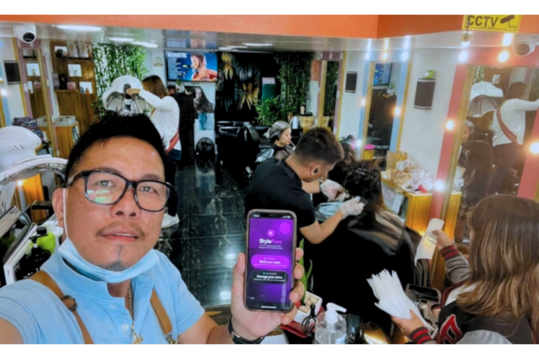
WE INTERVIEW AND INTRODUCE OUR PRODUCT TO REAL LOCAL BARBERSHOP BUSINESS.
Yes! you read it right. We are confident with the product and show it to public....