
Kuvvat Ashyrov
Graphic and Communication Designer


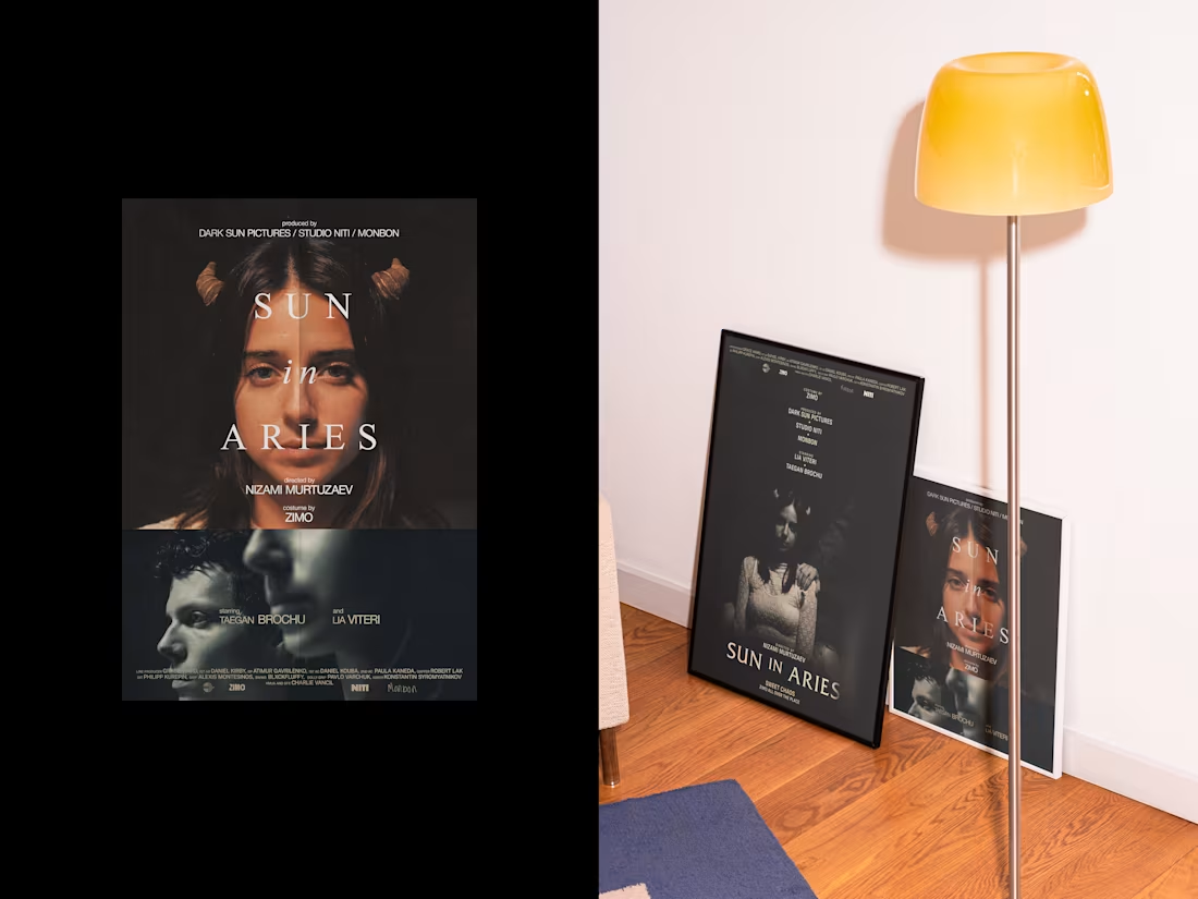
Sun in Aries.
The first treats the film as a classical object: serif type, centered hierarchy, restraint that lets the photography lead. The second applies Swiss grotesque and horizontal structure, the credits becoming typographic texture rather than information. Different systems, same photograph. The darkness in the image held up to both.
1
267
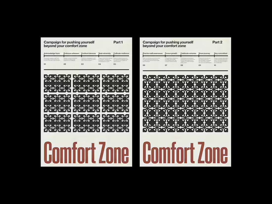
Found Subjects.
Every project here starts with something that already exists — an album, a painting, a philosopher, an idea — and asks what visual system it actually deserves.
The sources are deliberately unrelated. A 1790 Dutch painting by Johannes van Dregt. Seneca the Younger. A Berlin electronic music night. A two-part campaign about discomfort. What connects them isn't subject matter but method: find the logic inside the material, build a system around it, and hold that system until it either proves itself or breaks.
Sometimes that means Swiss grid and grotesque type. Sometimes it means serif and archive. Sometimes the illustration takes over and the grid has to negotiate. The work doesn't resolve into a single style — that's not the point. The point is that each subject gets a visual language precise enough to be its own.
1
287
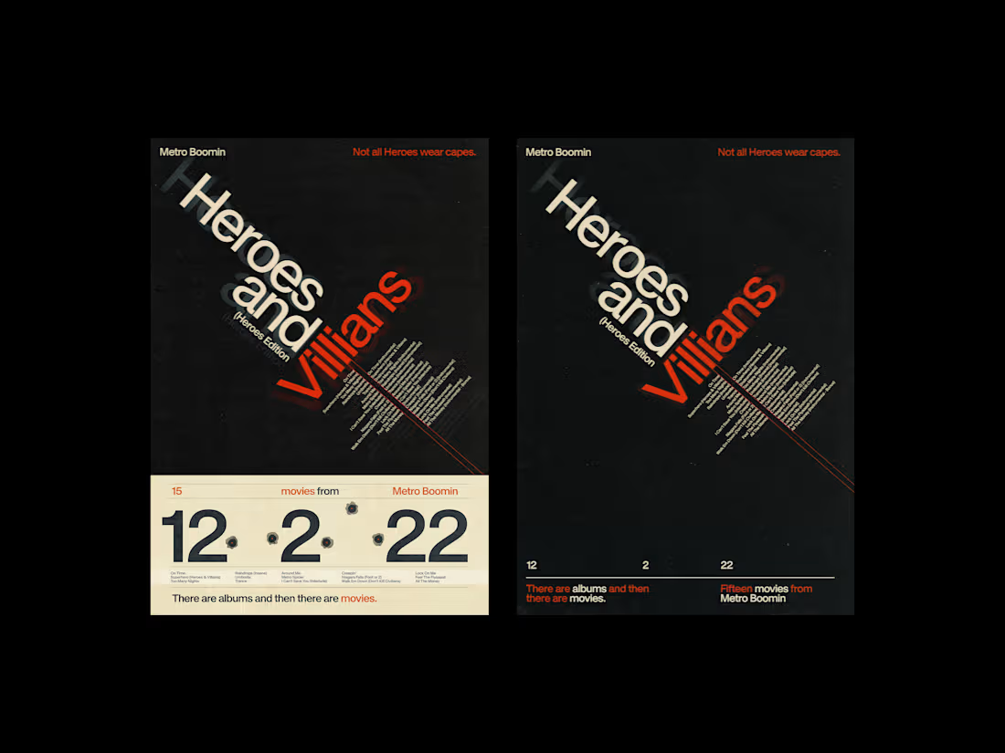
Heroes & Villians — Swiss Poster Series
0
6
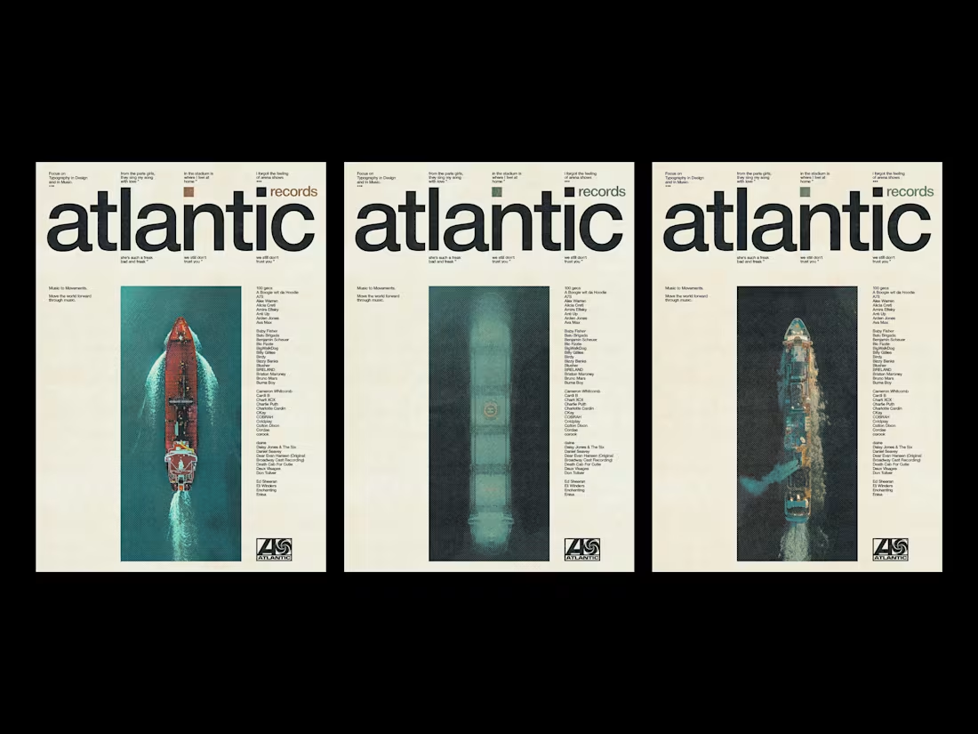
Swiss Poster Explorations
The starting point for each series was a source problem: what happens when you take material that already has its own visual logic Blossfeldt's botanical photographs, Soviet constructivist geometry, a record label's back catalog and subject it to the strict horizontal and vertical of the Swiss grid?
The four series were made without a brief. The Plantstudie posters pair Karl Blossfeldt's 1928 plant studies with the compositional principles of Armin Hofmann, a single block of flat color interrupting the image at a different height each time. The Atlantic Records work asks what the label's identity might look like if it had been designed in Zurich rather than New York. The geometric series works the other direction entirely: pure form, no photography, a palette of rust, ochre, and teal arranged on a grid that becomes increasingly hard to ignore.
The halftone work came last, and pushed furthest. Photography as raw material rather than subject. Color as punctuation rather than atmosphere.
4
7
445